When it comes down to brands and businesses, the packaging is an undeniable part of product delivery which is why it has to be attractive enough to capture the customer’s attention. For this reason, attractive packaging has become a significant brand component. The packaging has to be visible from farther distances but color schemes cannot be neglected. Every professional packaging company like Zenpack understands the importance of selecting appropriate color schemes for their products, as they play a crucial role in attracting customers and creating a lasting impression.
This is because for choosing the packaging color, it’s a must to consider how there is specific color psychology to consider because it’s extremely conditional and personal. So, if you are new to designing product packaging or product display boxes, it’s important to make sense of color schemes and we are sharing all about the packaging colors in this article!
Choosing The Right Packaging Colors
The colors are highly evocative because they have the capacity to trigger thoughts and feelings (be they negative or positive thoughts). In addition, colors can be extremely associative because a person’s experience can shape the reactions in different colors. That’s to say because the colors have the capability to induce perception and emotions about products before customers know something.
To be honest, if you want the colors to communicate to the customers, it has to be chosen after considering the target customers and the product because it should show off the relevant details for both sides. That being said, if you want to create a unique identity among the crowd of customers and capture attention, choosing the right colors is more crucial than you can imagine.
-
Thinking About Buyers
Whenever you are choosing the color palette for your products, you must think about the buyers because they need to connect with the colors before they buy your product. For this reason, the target market has to be focused and their needs have to be understood. Some of the considerations include their education, economic status, age, and gender.
-
Product Representation
In some cases, the brands have to tell the customers about the product contents and that has to be done through packaging. For instance, a pink shampoo bottle represents the berry flavor while a green bottle will represent herbal shampoo; do you get it now?
-
Standing Apart
No brand wants their product to just blend on the shelf because if you want to increase the sales funnel, you have to stand out on the shelf. For this purpose, you should choose a different and unique color because a unique color scheme has the capacity to get your products remembered and noticed. For instance, Pepsi has blue packaging while Coca-Cola uses red color, so it’s the perfect example of using colors as a contradictory factor.
-
Communicating The Purpose
The color of the packaging should communicate the message that’s intended for the customer. For instance, if you want them to think about your packaging as fun, opt for bright colors but if you want to show off luxury and sophistication, opt for matte black or classic white.
-
Consider The Brand
While you are on the railroad of choosing the right colors, don’t forget to communicate the brand’s voice. This is because the brand story has to flow easily through the packaging design and colors. For instance, while every network carrier was using red, black, and blue colors for their logo, T-Mobile opted for a hot pink color to stand out in the crowd.
-
Talk About Culture
In particular, we are talking about cultural preferences because colors often have their cultural meanings integrated into them. For this purpose, it is crucial to understand the heritage and culture of the consumers to ensure you choose the right color combination.
-
Consistency
When it comes down to choosing the packaging color, you have to ensure consistency in fonts and designs. This is because the colors have to gel properly with the design and font on the packaging. To be honest, it might seem extremely simple but you must keep your creativity on hold because you only need a pinch of it while ensuring consistency in packaging.
-
Sticking To Brand Colors
When you are creating the product packaging, experimenting might seem like a good idea but you have to maintain brand identity and color consistency throughout the packaging. This is because the customers should be able to identify the brand by looking at the packaging and color has an essential role to play. In addition, you can stick to the brand by optimizing the packaging shades and tints.
For the most part, there are multiple factors that have to be considered while choosing packaging colors, such as printing surface, finish, and printing technology. Still, the decision of choosing the right packaging color is crucial and it has been understood by considering color psychology.
The Color Psychology Behind Packaging
As a brand, it’s essential to acknowledge that different colors can influence human emotions and behaviors in various manners. Keep in mind a person’s response to specific colors has an involuntary triggering and is generally caused by psychology. For instance, bright colors will reduce packaging’s seriousness while black improve the sophistication and pink integrates the feminine touch.
In addition to colors, tint and shade can play a crucial role while means different tones of bright and dull colors can have different meanings as well. In the section below, we are talking about some colors and what perceptions are associated with them;
- White – it shows elegance, simplicity, and purity. White packaging generally means that the brand is conventional, safe, and simple
- Black – it shows strength, sophistication, and authority. Black packaging delivers an image of luxury while evoking elegance and class
- Blue – it shows honesty, harmony, and strength. Truth be told, blue is the most secure color that can be used by the brands and reflects reliability
- Red – it shows strength, passion, and excitement. This color is widely used by professional and luxurious brands and the overall perception can be enhanced by adding silver or gold embellishments
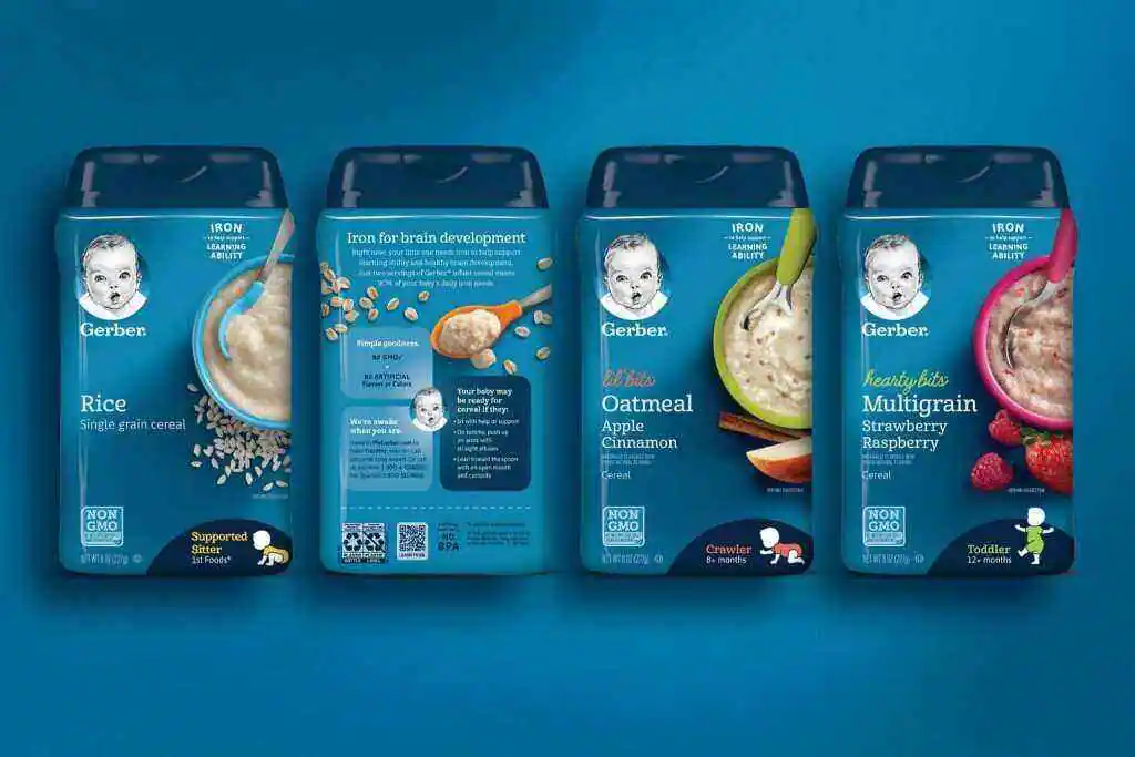
- Green – it shows security, harmony, and growth. This brand has become an ultimate choice for brands believing in healthy ingredients and eco-friendly/natural services
Apart from this, you can also read Entertainment, Tech, and Health related articles here: Dengue Fever, 777 Angel Number, September 8 Zodiac, Kissasian, 666 Angel Number, 333 Angel Number, Holiday Season, Samsung Galaxy Z Flip 3 review, PUBG Launch Date in India, Covaxin vs Covishield, Sears Credit Card, GoDaddy Email, Free Fire Redeem Code, Mangago, Project Free TV, Jio Rockers, Best Record Players, August 27 Zodiac, August 26 Zodiac, Best Hindi Movies on Amazon Prime, New iPhone 13, Vivo Y53s Review, Eye Shapes, M4uHD, Fever Dream, Moon water, Oppo Reno 6 Pro Review, iPhone Headphones, Best gaming desks, Spanish Movies, Hip dips, M4ufree, NBAstreams XYZ, CCleaner Browser review, Avocado Calories, Bear Grylls net worth, Rihanna net worth 2021, Highest Paid CEO, The 100 season 8, Sundar Pichai net worth, Grimes net worth, F95Zone, Microsoft Office Suite, How to Share Netflix Account, how to change Twitch name, Sherlock Season 5, Homeland Season 9, Salvation season 3.