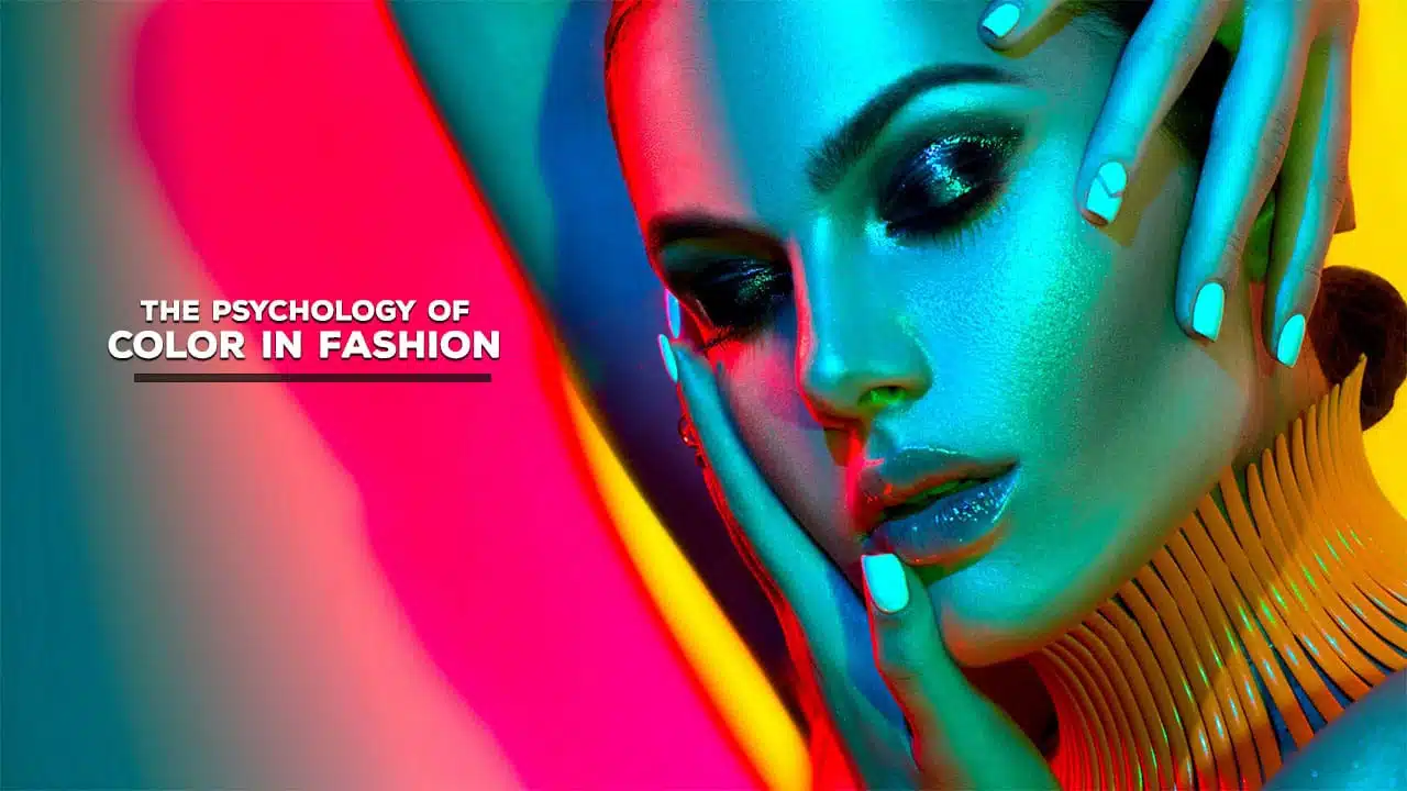
Have you ever wondered why you feel more confident in a red dress or relaxed in a blue shirt? The colors we wear profoundly impact our emotions, behaviors, and perceptions. Color psychology, an interdisciplinary field blending psychology, neuroscience, cultural studies, and visual arts, explores how different hues affect our moods and how others perceive us.
In fashion, this translates to understanding how color choices in our wardrobe can communicate powerful non-verbal messages about our personality, intentions, and social status.
This comprehensive guide will delve into the basics of color psychology, exploring the effects of individual colors, the significance of cultural considerations, and practical applications for choosing the right colors to suit various contexts.
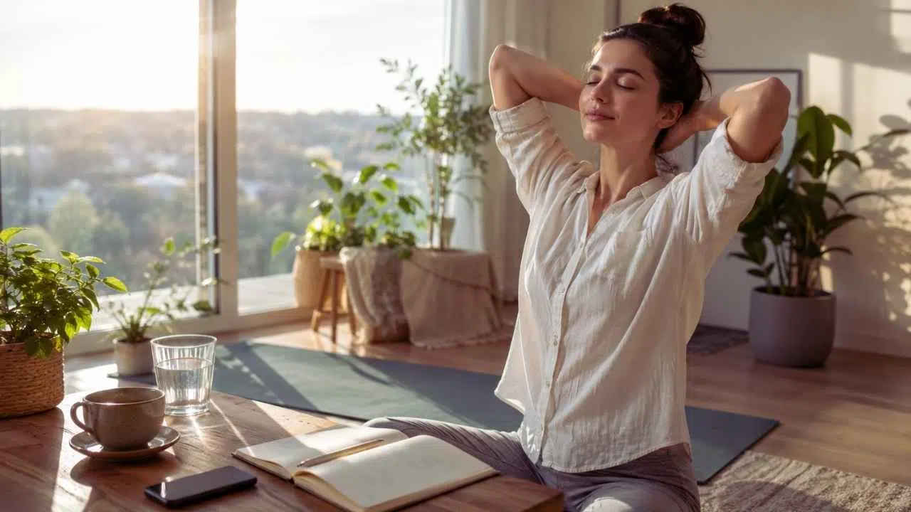
Whether dressing for a job interview, a romantic date, or a casual outing, understanding the psychology of color can help you make more intentional and impactful fashion choices.
The Basics of Color Psychology
Before we dive into the specifics of how different colors affect our perceptions and behaviors in the context of fashion, it’s crucial to understand the foundations of color psychology.
What is Color Psychology?
Color psychology studies how colors affect human behavior, emotions, and perceptions. It’s an interdisciplinary field combining psychology, neuroscience, cultural studies, and visual arts elements. In fashion, color psychology explores how the colors we wear influence our feelings and moods and the decisions we make about others.
The Science Behind Color Perception
Our perception of color is a complex process involving our eyes, brain, and cultural conditioning. When light hits an object, some wavelengths are absorbed while others are reflected. Our eyes detect these reflected wavelengths, and our brain interprets them as color.
But it’s not just a physiological process. Our interpretation of colors is heavily influenced by personal experiences, cultural backgrounds, and even evolutionary factors. For instance, our ancestors learned to associate specific colors with danger or safety, and these associations still influence our reactions today.
The Power of Color
Colors have a remarkable power to:
- Evoke emotions: Different colors can trigger various emotional responses, from excitement to calmness.
- Influence mood: Colors can affect our mood and energy levels, sometimes in subtle ways we may not even consciously notice.
- Communicate messages: Colors can convey non-verbal messages about our personality, intentions, and social status.
- Affect perception: The colors we wear can influence how others perceive us, including judgments about our competence, approachability, and attractiveness.
- Impact physiological responses: Some colors can affect our physical state, influencing heart rate, blood pressure, and even appetite.
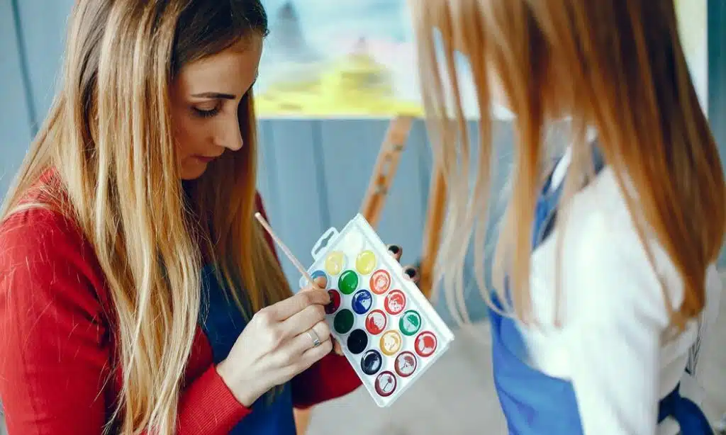
Color Theory in Fashion
Understanding basic color theory is crucial for applying color psychology to fashion choices. Here are the key concepts:
- Primary Colors: Red, blue, and yellow. These are the base colors from which all other colors are created.
- Secondary Colors: Green, orange, and purple. These are created by mixing two primary colors.
- Tertiary Colors: Colors made by mixing a primary and a secondary color, such as blue-green or red-orange.
- Color Harmony: How different colors work together in an outfit. This includes concepts like complementary colors (opposites on the color wheel) and analogous colors (next to each other on the color wheel).
- Warm vs. Cool Colors: Warm colors (reds, oranges, yellows) are generally energizing, while cool colors (blues, greens, purples) are typically calming.
Cultural Considerations
It’s crucial to remember that color associations can vary significantly across cultures. What’s considered lucky in one culture might be associated with mourning in another. For example:
- In Western cultures, white is often associated with purity and weddings, while in many Eastern cultures, it’s a color of mourning.
- Red symbolizes good luck and prosperity in China but can represent danger or warning in Western contexts.
- Purple was once reserved for royalty in many cultures due to the rarity and expense of purple dye.
Understanding these cultural differences is essential when interpreting the psychology of color in a global context or when traveling to different parts of the world.
The Psychology of Individual Colors in Fashion
Now that we’ve covered the basics let’s explore the psychological associations and effects of specific colors in fashion:
1. Red: The Color of Power and Passion
Red is one of the most psychologically stimulating colors. It’s bold, attention-grabbing, and laden with solid associations.
Psychological Associations:
- Confidence and assertiveness
- Passion and romance
- Energy and excitement
- Power and dominance
- Danger and warning (in specific contexts)
Effects on the Wearer:
- Boosts confidence in social situations
- Increases perceived attractiveness
- Elevates heart rate and energy levels
How Others Perceive It:
- Can make the wearer appear more confident and assertive
- May be seen as more attractive or sexually appealing
- Can be perceived as threatening in some contexts
In Fashion:
- Power suits for business settings
- Glamorous evening wear
- Statement accessories for a pop of color
- Sportswear for an energetic look
Cultural Considerations:
- Symbolizes good luck and prosperity in China
- Associated with brides in India
- Can represent danger or warning in Western cultures
Wearing red can be a powerful choice to stand out, make a strong impression, or boost your confidence. However, it’s essential to consider the context and use red judiciously, as it can be overwhelming in large quantities.
2. Blue: The Color of Trust and Serenity
Blue is often cited as the most popular color globally. It’s associated with the sky and sea, evoking a sense of calmness and stability.
Psychological Associations:
- Calmness and serenity
- Trust and dependability
- Intelligence and professionalism
- Stability and harmony
- Sadness (in specific contexts, hence “feeling blue”)
Effects on the Wearer:
- Reduces stress and promotes relaxation
- Increases feelings of trust and reliability
- Improves focus and productivity
How Others Perceive It:
- Often seen as trustworthy and competent
- Can make the wearer appear more approachable
- Associated with professionalism in many contexts
In Fashion:
- Business attire, especially in conservative industries
- Casual wear for a relaxed, approachable look
- Accessories for a pop of calming color
- Widely used in uniforms to convey trustworthiness
Cultural Considerations:
- Associated with masculinity in many Western cultures
- Considered a protective color in Turkey and Greece
- Symbolizes immortality in China
Blue is a versatile color in fashion, appropriate for many occasions. It’s an excellent choice when you want to appear trustworthy, calm, and competent, making it popular in professional settings.
3. Green: The Color of Growth and Balance
Green, the color of nature, is often associated with growth, renewal, and balance.
Psychological Associations:
- Growth and renewal
- Balance and harmony
- Health and vitality
- Nature and the environment
- Wealth and prosperity (significantly darker shades)
Effects on the Wearer:
- Promotes feelings of balance and harmony
- Reduces anxiety and promotes calmness
- Can enhance creativity and innovation
How Others Perceive It:
- Often associated with eco-friendliness and health
- Can make the wearer appear balanced and growth-oriented
- Darker shades may be associated with wealth and prestige
In Fashion:
- Casual wear for a fresh, natural look
- Accessories to add a touch of vitality to an outfit
- Increasingly popular in eco-friendly and sustainable fashion lines
- Business wear, especially in creative or environmental fields
Cultural Considerations:
- Associated with Ireland and St. Patrick’s Day
- Has religious significance in Islamic cultures
- Can symbolize infidelity in some Western contexts
Green is an excellent choice to convey a sense of growth, balance, or connection to nature. It’s becoming increasingly popular as environmental concerns dominate global discourse.
4. Yellow: The Color of Optimism and Creativity
Yellow, the color of sunshine, is often associated with happiness, optimism, and mental stimulation.
Psychological Associations:
- Optimism and happiness
- Creativity and innovation
- Energy and enthusiasm
- Youthfulness and playfulness
- Caution (in specific contexts, like traffic signs)
Effects on the Wearer:
- Boosts mood and promotes positive thinking
- Stimulates creativity and mental activity
- Increases visibility and attracts attention
How Others Perceive It:
- Can make the wearer appear more cheerful and approachable
- May be associated with creativity and innovation
- In large amounts, it can be overwhelming or even anxiety-inducing
In Fashion:
- Statement pieces to add a pop of cheerful color
- Summer and spring collections for a fresh, sunny look
- Creative and artistic fashion expressions
- Activewear for an energetic appearance
Cultural Considerations:
- Associated with mourning in some Middle Eastern cultures
- Symbolizes courage in Japan
- Considered sacred in some Hindu traditions
Yellow can be a powerful tool for boosting mood and creativity. However, it’s a color that can be overwhelming in large doses, so it’s often best used as an accent color or for specific occasions where you want to stand out and convey optimism.
5. Purple: The Color of Luxury and Creativity
Purple has long been associated with royalty and luxury, conveying a sense of creativity and uniqueness.
Psychological Associations:
- Luxury and sophistication
- Creativity and imagination
- Mystery and spirituality
- Royalty and power
- Uniqueness and individuality
Effects on the Wearer:
- Can boost feelings of self-worth and dignity
- May enhance creative thinking
- Can create a sense of mystery or intrigue
How Others Perceive It:
- Often associated with creativity and unconventional thinking
- Can convey a sense of luxury and sophistication
- May be seen as mysterious or spiritual
In Fashion:
- High-end and luxury fashion items
- Evening wear for a touch of sophistication
- Accessories to add a regal touch to an outfit
- Increasingly popular in business wear for creative industries
Cultural Considerations:
- Traditionally associated with royalty in many cultures due to the historical rarity of purple dye
- Can symbolize mourning in some Latin American countries
- Associated with spirituality and mysticism in some New Age philosophies
Purple is an excellent choice to convey creativity, luxury, or uniqueness. It’s particularly effective in settings where standing out sophisticatedly is advantageous.
6. Orange: The Color of Enthusiasm and Adventure
Orange, a blend of red and yellow, combines the energy of red with the cheerfulness of yellow.
Psychological Associations:
- Enthusiasm and excitement
- Adventure and risk-taking
- Friendliness and sociability
- Confidence and extroversion
- Affordability (in marketing contexts)
Effects on the Wearer:
- Boosts energy and enthusiasm
- Promotes a sense of adventure and spontaneity
- Can increase appetite and sociability
How Others Perceive It:
- Often seen as friendly and approachable
- Can make the wearer appear confident and adventurous
- May be associated with creativity and uniqueness
In Fashion:
- Activewear and sports clothing
- Casual wear for a fun, energetic look
- Accessories to add a pop of vibrant color
- Popular in fashion for younger demographics
Cultural Considerations:
- Associated with Halloween in the United States
- Symbolizes courage and strength in Native American cultures
- Represents the House of Orange in Dutch culture
Orange is a great choice to appear friendly, energetic, and adventurous. It’s particularly effective in casual or social settings where you want to stand out and convey enthusiasm.
7. Pink: The Color of Nurturing and Femininity
Pink, often seen as a tint of red, has a unique psychological profile.
Psychological Associations:
- Nurturing and compassion
- Femininity and romance
- Calmness and relaxation
- Youthfulness and playfulness
- Love and kindness
Effects on the Wearer:
- Can promote feelings of calmness and nurturing
- May enhance feelings of femininity (in Western cultures)
- Can create a sense of youthfulness and playfulness
How Others Perceive It:
- Often associated with femininity in Western cultures
- Can make the wearer appear more approachable and compassionate
- May be seen as less severe or professional in conservative settings
In Fashion:
- Feminine and romantic styles
- Casual wear for a soft, approachable look
- Popular in lingerie and intimate apparel
- Increasingly used in men’s fashion to challenge gender norms
Cultural Considerations:
- Strongly associated with femininity in many Western cultures
- Considered a masculine color in some cultures until the mid-20th century
- Used in prisons in some countries due to its calming effect
Pink can be a powerful color choice when you want to appear nurturing, compassionate, or youthful. It’s increasingly being used across genders to challenge traditional color associations.
8. Black: The Color of Sophistication and Mystery
Black, the absence of color, holds a unique place in fashion psychology.
Psychological Associations:
- Sophistication and elegance
- Power and authority
- Mystery and intrigue
- Formality and professionalism
- Mourning and sadness (in many Western cultures)
Effects on the Wearer:
- Can boost feelings of confidence and power
- May create a sense of emotional safety or distance
- Often has a slimming effect
How Others Perceive It:
- Generally seen as sophisticated and elegant
- Can convey authority and professionalism
- May be perceived as unapproachable or intimidating in some contexts
In Fashion:
- Formal wear and evening attire
- Professional business attire
- Versatile wardrobe staples
- Popular in avant-garde and edgy fashion styles
Cultural Considerations:
- Associated with mourning in many Western cultures
- Symbolizes rebirth and rejuvenation in some African cultures
- Represents evil or negativity in some contexts
Black is a powerful color choice in fashion, conveying sophistication and authority. It’s versatile enough to be appropriate in various settings, from formal events to casual outings.
9. White: The Color of Purity and Simplicity
White, the presence of all colors, has strong associations with fashion.
Psychological Associations:
- Purity and innocence
- Cleanliness and simplicity
- New beginnings and fresh starts
- Clarity and focus
- Peace and tranquility
Effects on the Wearer:
- Can create a sense of cleanliness and order
- May promote feelings of peace and calm
- Can make the wearer feel fresh and renewed
How Others Perceive It:
- Often associated with cleanliness and purity
- Can make the wearer appear approachable and open
- May be seen as high-maintenance or impractical in some contexts
In Fashion:
- Bridal wear in many Western cultures
- Summer fashion for a cool, fresh look
- Minimalist and contemporary fashion styles
- Professional wear, especially in medical and scientific fields
Cultural Considerations:
- Associated with weddings in Western cultures
- Symbolizes mourning in many Eastern cultures
- Represents peace in many global contexts
White is an excellent choice to appear clean, pure, or open. It’s particularly effective in settings where cleanliness and simplicity are valued, such as in healthcare professions or minimalist design environments. However, it’s essential to consider the practicality of white clothing, as it can be challenging to keep clean and may not be suitable for all occasions.
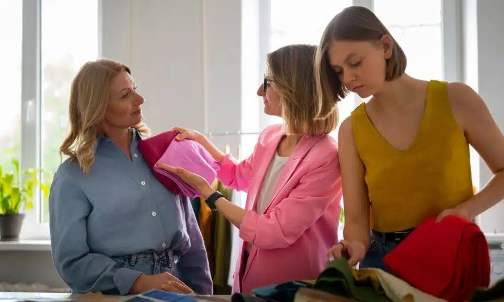
Color Combinations and Their Effects
While individual colors have their psychological associations, combining colors can create new effects and messages. Understanding color harmony is crucial for creating impactful outfits.
1. Monochromatic Combinations
Using different shades and tints of the same color creates a harmonious, sophisticated look.
Effects:
- Creates a slimming, elongating effect
- Conveys a sense of coordination and thoughtfulness
- Can be calming and easy on the eyes
Example: Various shades of blue, from light sky blue to deep navy, can convey professionalism and trustworthiness while creating a cohesive look.
2. Complementary Color Combinations
Pairing colors opposite each other on the color wheel creates a bold, energetic look.
Effects:
- Creates high contrast and visual interest
- Conveys confidence and creativity
- Can be attention-grabbing and memorable
Example: Combining blue and orange can create a vibrant, exciting outfit that balances cool and warm tones.
3. Analogous Color Combinations
Using colors next to each other on the color wheel creates a cohesive, balanced look.
Effects:
- Creates a harmonious, pleasing aesthetic
- Conveys a sense of order and peacefulness
- Can be sophisticated and elegant
Example: Pairing green, blue-green, and blue can create a serene, nature-inspired outfit that’s both calming and put-together.
4. Triadic Color Combinations
Using three colors evenly spaced on the color wheel creates a vibrant, dynamic look.
Effects:
- Creates a balanced yet colorful aesthetic
- Conveys creativity and confidence
- Can be playful and energetic
Example: Combining purple, green, and orange can create a lively, artistic outfit that showcases creativity and boldness.
Color Psychology in Different Settings
The impact of color in fashion can vary significantly depending on the context. Let’s explore how color psychology applies in various settings:
1. Professional Settings
In professional environments, color choices can significantly impact how you’re perceived:
- Dark colors like navy, charcoal, and black convey authority and competence.
- Light blue or beige colors can appear more approachable and friendly.
- Red accents can convey confidence and assertiveness but should be used sparingly.
- Too much bright color may be seen as unprofessional in conservative industries.
Tips:
- Consider power colors like navy or dark gray for important meetings or presentations.
- Use color accents to stand out subtly, like a colorful tie or scarf with an otherwise neutral outfit.
- More colorful choices may be acceptable and even encouraged in creative industries.
2. Social Settings
In social situations, your color choices can affect how approachable and engaging you appear:
- Bright colors can make you appear more outgoing and approachable.
- Softer colors can make you seem more relaxed and easy-going.
- Bold color combinations can make you stand out and appear more confident.
Tips:
- Don’t be afraid to use bright colors to express your personality for parties or social gatherings.
- Consider the event’s tone – a casual barbecue might call for different colors than a formal dinner party.
- Use color to set the mood you want to convey, whether fun and energetic or calm and sophisticated.
3. Romantic Settings
In romantic contexts, color can play a significant role in attraction and setting the mood:
- Red and pink are often associated with romance and passion.
- Softer colors like lavender or light blue can appear more nurturing and gentle.
- Black can convey mystery and sophistication.
Tips:
- Consider colors that make you feel confident and comfortable for a first date.
- Avoid overwhelming colors that might distract from your personality.
- Remember that personal grooming and fit are often more critical than specific colors in romantic settings.
4. Athletic and Fitness Settings
In sports and fitness environments, color can affect both performance and perception:
- Red has been shown to provide a competitive advantage in some sports.
- Blue can have a calming effect, which might be beneficial in some fitness contexts.
- Bright, high-visibility colors are often used for safety in outdoor sports.
Tips:
- Choose colors that make you feel energized and confident for workouts.
- Consider the practical aspects of outdoor activities, like visibility and heat absorption.
- In team sports, colors often carry specific meanings and associations, so be aware of these when choosing workout gear.
Cultural Differences in Color Psychology
It’s crucial to remember that color associations can vary significantly across cultures. What conveys one message in one culture might send an entirely different signal in another. Here’s a deeper look at how color perceptions differ around the world:
Western Cultures
White is often associated with purity, weddings, and new beginnings.
- Black is frequently used for formal wear and can also symbolize mourning.
- Red is often linked with passion, danger, and excitement.
- Blue is generally seen as calming and professional.
Eastern Cultures
- White is often associated with mourning and funerals in many Asian countries.
- Red is considered lucky and used in celebrations in China and other Asian cultures.
- Yellow was historically reserved for royalty in China and is still seen as an imperial color.
- Green has religious significance in Islamic cultures and is often featured in national symbols.
African Cultures
- Red often symbolizes life and health.
- Blue is associated with love, harmony, and peace in some North African cultures.
- Green is linked to fertility and growth in many African traditions.
- Gold represents high status and is often used in traditional clothing and art.
Latin American Cultures
- Purple is associated with death and mourning in some countries.
- Yellow can represent death in some cultures, particularly in Mexico.
- Red is often seen as a protective color.
- Green is associated with independence in Mexico.
Middle Eastern Cultures
- Green has vital religious significance in many Islamic countries.
- Blue is often a protective color, believed to ward off the evil eye.
- White is associated with purity and peace.
- Gold represents luxury and wealth.
Understanding these cultural differences is crucial when interpreting color psychology in a global context or traveling to different parts of the world. Researching local color associations when dressing for international business or social events is always a good idea.
The Evolution of Color in Fashion
The use and perception of color in fashion have evolved significantly over time, influenced by technological advancements, social changes, and cultural shifts.
Historical Perspective
- Ancient Times: Certain colors were reserved for royalty and the elite due to the rarity of certain dyes. Purple, for instance, was extremely expensive to produce and thus associated with royalty.
- Middle Ages: Colors often had symbolic meanings in European cultures. For example, blue was associated with the Virgin Mary and thus purity.
- Renaissance: With new dyes and pigments developed, a more comprehensive range of colors became available, leading to more colorful fashion choices.
- Industrial Revolution: The invention of synthetic dyes in the mid-19th century democratized color in fashion, making vibrant hues accessible to the masses.
- 20th Century: Each decade saw distinct color trends. For example, the psychedelic 60s embraced bright, clashing colors, while the 80s were known for neon hues.
Modern Trends
- Minimalism: In recent years, there has been a trend towards minimalism in fashion, focusing on neutral colors and simple palettes.
- Sustainable Fashion: The rise of eco-conscious fashion has increased the use of natural, earthy tones and dyes.
- Digital Influence: The rise of social media has influenced color trends, with “Millennial Pink” and “Gen Z Yellow” becoming popular partly due to their photogenic qualities.
- Pantone Color of the Year: Since 2000, Pantone’s annual color selection has significantly influenced fashion and design trends.
Future of Color in Fashion
- Technology Integration: Advances in technology may lead to color-changing fabrics and garments that can adapt to different environments or moods.
- Personalization: With the rise of AI and big data, we might see more personalized color recommendations based on individual skin tones, personalities, and preferences.
- Cultural Fusion: As the world becomes more interconnected, we may see more blending of color associations from different cultures, creating new global color trends.
- Sustainability Focus: As sustainability continues to be a significant concern, we might see more innovations in natural and low-impact dyes, influencing color palettes in fashion.
Practical Applications of Color Psychology in Fashion
Understanding color psychology can help you make more informed fashion choices. Here are some practical ways to apply this knowledge:
Dressing for Success
- Choose colors that align with the impression you want to make. For instance, wear blue for job interviews to convey trustworthiness and competence.
- Consider the context and cultural setting. What works in a creative agency might not be appropriate in a conservative law firm.
- Use color combinations to create balance or make a statement, depending on your goals.
Personal Branding
- Consistently using specific colors can become part of your brand. Think of how some celebrities or public figures are associated with particular colors.
- Choose colors that reflect your personality and values. If you’re energetic and outgoing, bright colors might be a good choice.
- Use color to stand out in your industry or social circle, making yourself more memorable.
Mood Enhancement
- Wear colors that boost the mood you want to cultivate. Wearing a cheerful yellow might help lift your spirits if you’re feeling low.
- Use color to counteract negative emotions or energy. Calming blues or greens might help on a stressful day.
- Experiment with different colors to see how they affect your mood and confidence.
Seasonal Dressing
- Adapt your color choices to the seasons—lighter, brighter colors for spring and summer; deeper, richer tones for fall and winter.
- Consider how different colors interact with your skin tone in various types of light.
- Use color to create visual interest in monochromatic winter outfits.
Body Shape Enhancement
- Use color strategically to enhance your body shape. Darker colors can have a slimming effect, while brighter colors draw attention.
- Create visual balance by using color to emphasize or de-emphasize different parts of your body.
- Experiment with color blocking to create flattering silhouettes.
Takeaways
As we conclude our vibrant journey through the psychology of color in fashion, it’s evident that the colors we choose to wear are more than just aesthetic preferences—potent tools of non-verbal communication and personal expression.
Each color, from the assertive red to the calming blue, carries its unique psychological profile, influencing how we feel and how others perceive us. Understanding these associations allows us to make more intentional and impactful wardrobe choices to boost confidence, enhance professionalism, or express creativity.
While color psychology provides valuable insights, the most crucial factor remains how these colors make you feel. Confidence in color choices will shine through and positively impact those around you.
As fashion trends evolve, embracing the power of color can help you stay ahead of the curve, painting your personal and professional life with hues that resonate with your true self. So, the next time you open your wardrobe, remember that each garment is a part of your color story, uniquely yours, waiting to unfold.