
Many websites are hard to use for people with disabilities. Problems like poor color contrast, missing captions, or tricky navigation can frustrate users and hurt your site’s reputation.
These issues also make your website less inclusive. Web accessibility is about making the web easy to use for everyone. Following simple tips can improve user experience and meet legal standards, like the Americans with Disabilities Act (ADA).
This blog shares 10 Web Accessibility Tips To Make Your Site More User-Friendly. These steps will help you reach more users and avoid costly mistakes. Keep reading to learn how!
1. Ensure Proper Color Contrast
| Text Size | Minimum Contrast Ratio | Example Colors |
|---|---|---|
| Small text (below 18pt) | 4.5:1 | Black (#000000) on white (#FFFFFF) |
| Large text (18pt and above) | 3:1 | Dark blue (#00008B) on light gray (#D3D3D3) |
| Graphical elements | 3:1 | Ensure all UI elements have proper contrast |
Proper color contrast makes websites easier to read for everyone. Text should have a contrast ratio of at least 4.5:1, according to WCAG standards. This is especially important for users with low vision or color blindness.
Use tools like Color Contrast Analyzer to check your site’s contrast levels. Choose colors that stand out from each other, like dark text on a light background. Avoid placing light text on bright or pale backgrounds as it lowers readability significantly.
2. Add Descriptive Alt Text to Images
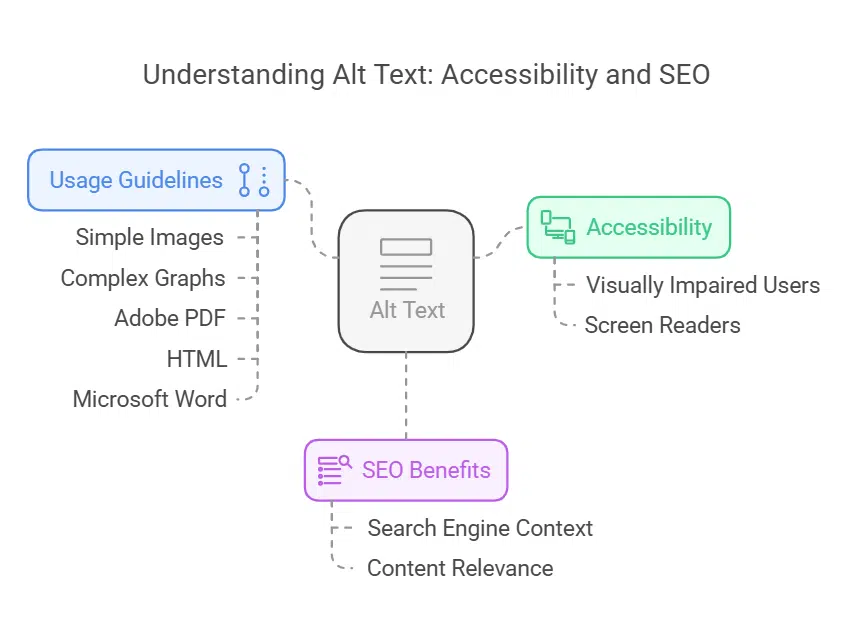
Alt text helps visually impaired users understand images with screen readers. Write short, clear descriptions to convey an image’s purpose. For example, “A red apple on a wooden table” tells what it shows without guessing.
Keep simple pictures brief but use detailed alt text for complex graphs or charts.
Search engines also benefit from alt tags. These tags improve SEO by providing context about the content of your images. Use them in Adobe PDF, HTML, and Microsoft Word documents for better accessibility compliance.
Alt text supports assistive technology while ensuring your site meets web accessibility standards like WCAG 2.1 guidelines!
3. Make Your Site Keyboard-Friendly
Ensure users can easily use keyboard navigation. Provide visible focus indicators, like outlines or highlights, to show where the cursor is on screen. Add a “skip to main content” link for faster access.
Use ARIA landmarks and proper HTML markup for better compatibility with assistive technologies.
Test your site with only a keyboard to check usability. Try functions such as tabbing through menus and pressing enter on buttons. Test mobile accessibility too—some devices rely solely on keyboards or voice recognition tools.
Make navigation simple and predictable. Place menus or links in the same spot on every page. Use clear, easy-to-understand labels for buttons and tabs. Avoid confusing layouts that leave users lost.
Offer multiple ways to browse your site, like a menu bar and search box. Provide feedback when users click buttons so they know their actions worked. Consistency helps everyone, especially those with cognitive disabilities or vision problems.
5. Provide Captions and Transcripts for Multimedia Content
| Content Type | Accessibility Feature | Purpose |
|---|---|---|
| Videos | Captions & transcripts | Help users with hearing impairments |
| Podcasts | Transcripts | Provide text-based access to audio content |
| Images | Alt text | Describe content for screen reader users |
| Animations | Pause/Stop controls | Prevents distraction and seizure triggers |
Add closed captions to all videos. They help people who are hard of hearing or have auditory impairments. Transcripts for audio make information accessible for everyone, including users with disabilities or those in quiet spaces.
Follow Web Content Accessibility Guidelines (WCAG) for multimedia. Captions improve user experience and search engine optimization (SEO). You meet accessibility standards and boost usability at the same time.
6. Add Labels to Form Fields for Clarity
Labels make forms clear and easy to use. Each form field should have a visible, descriptive label. For example, instead of “Name,” write “First Name” or “Full Name.” This tells users exactly what to enter.
Strong labels also help accessibility tools like screen readers. Properly labeled fields guide users with visual or cognitive disabilities through the process. Accessibility standards like WCAG recommend adding these labels for better usability and compliance.
7. Avoid Relying Solely on Color to Convey Information
People with color blindness or low vision may not see colors the same way. About 8% of men and 0.5% of women have some form of color blindness. Using only color to show information can create barriers for these users.
Add text, symbols, or patterns to assist everyone. For example, mark required fields in forms with an asterisk (*) instead of just red text. WCAG SC 1.4.1 advises using non-color cues to ensure equal access for all users on accessible websites.
8. Provide Controls for Auto-Playing Content
Auto-playing videos or sounds can distract users. Offer clear controls like play, pause, and stop buttons. Follow WCAG rules 1.4.2 for audio control and 2.2.2 for stopping content.
Avoid loud autoplay ads or flashing images to prevent discomfort for visual disabilities or cognitive disabilities users. Add visible options to mute sound or stop animations on all pages of your website design for better access to information.
9. Optimize for Mobile Accessibility

| Issue | Solution | Example |
|---|---|---|
| Small tap targets | Increase button size to at least 48×48 pixels | Ensure easy clickability for users with motor disabilities |
| Zoom restrictions | Allow pinch-to-zoom functionality | Avoid disabling zoom via meta tags |
| Poor contrast | Use high-contrast colors | Ensure text is readable in bright light |
| Inconsistent navigation | Keep menus simple and intuitive | Use standard mobile navigation patterns |
Make sure your site works well on smartphones. Use responsive web design with fluid grids and media queries. This helps your content adjust to different screen sizes and resolutions.
Include simplified navigation, such as hamburger menus. Keep font size readable—at least 16 pixels—for better usability. Mobile-friendly websites improve user experience (UX) and meet accessibility standards like WCAG guidelines.
Skip links help users jump straight to the main content. They are useful for people using screen readers or keyboard navigation. These links sit at the top of webpages and can be hidden visually but readable by assistive technology.
Add multiple skip links for larger sites with different sections. Test these links with accessibility tools to ensure they work well. Following Web Content Accessibility Guidelines (WCAG) makes them even more effective.
Skip links improve user experience for everyone, including those with physical disabilities or visual impairments.
11. Use Descriptive and Understandable Link Text
Use clear, meaningful link text. Avoid phrases like “click here” or “read more.” Instead, describe where the link goes or what it does. For example, use “Download the accessibility guidelines PDF” instead of generic terms.
Descriptive links help screen readers and improve website usability. They provide context for users with cognitive disabilities or visual impairments. This small change creates a better user experience (UX) for everyone.
12. Avoid Flickering or Flashing Content
Flashing content can harm users with photosensitivity. It may trigger seizures or migraines. Avoid flashes that occur more than three times per second. This frequency breaks WCAG 2.2 guidelines and is non-compliant.
If flashing elements are essential, add a pause button or warning notice for user safety. Blinking content should only exist if users can stop it easily. Accessible design improves website usability for everyone, including those with cognitive disabilities or visual stress issues.
Test Accessibility Regularly with Tools and Users
Testing accessibility ensures your site works for everyone. Both tools and real users can help spot problems.
- Use tools like Recite Me Accessibility Checker to find issues quickly. These tools scan your site for missing alt text, low color contrast, and more.
- Test your site with assistive technology (AT), such as screen readers or keyboard navigation. This shows how people with disabilities use your website.
- Get feedback directly from users with visual disabilities, hearing loss, or physical disabilities. They give valuable insights that automated tools may miss.
- Check captions and transcripts for multimedia content like videos and podcasts. Ensure they are accurate and easy to follow.
- Review forms for clarity and functionality using accessible forms testing methods. Confirm labels are clear, and each field works well with AT.
- Adjust font sizes and contrast ratios to meet accessibility standards like WCAG guidelines. These small changes improve readability for everyone.
- Test on mobile devices to ensure support for touchscreens, voice commands, or other accessibility features used in mobile commerce platforms.
- Run checks often—every few months or after major updates—to maintain compliance with legal requirements like ADA standards.
- Combine automated testing with manual checks by users to cover gaps machines can overlook.
- Share results with your team to make fixes a top priority in UX design workflows.
- Pay attention to flashing elements that may affect those with cognitive disabilities or epilepsy risks during the review process.
- Verify if skip links work smoothly across all pages of your website usability test runs.
- Ensure mouse hover effects don’t block critical information when tested on different devices or browsers.
- Evaluate landing pages since they’re often the first impression new visitors get of an accessible website’s inclusivity approach.
- Document findings as part of ongoing checks so future teams stay aligned on improving web usability through testing efforts consistently!
Follow WCAG Guidelines and Best Practices
WCAG 2.1 makes websites easier for everyone, especially people with disabilities. It builds on WCAG 2.0 and ensures sites follow clear accessibility standards. The guidelines focus on making content perceivable, operable, understandable, and reliable (POUR).
These rules help users with visual disabilities, cognitive challenges, or physical limitations access content without trouble.
The W3C Accessibility Guidelines Working Group maintains these rules to ensure fairness online. Success criteria in WCAG are testable across technologies like HTML and ARIA. Following these helps meet ADA requirements while enhancing user experience (UX) design.
For example, using proper contrast ratios improves readability for color blindness and low vision users alike!
Continuously Improve Based on Feedback
Use feedback from users to make your website better. Focus groups and developer interviews can show what needs fixing. Surveys and online comments help you learn user needs fast.
Design a simple feedback form for visitors to share ideas. Keep it short but clear for all users, including those with cognitive disabilities. Test changes often using accessibility tools like screen readers or keyboard navigation checks.
Repeat this process to meet web accessibility standards while improving user experience (UX).
Takeaways
Making your site accessible helps everyone. It improves user experience and keeps your site inclusive. Follow these tips to meet accessibility standards like WCAG. A user-friendly website benefits all visitors, including those with disabilities.
Keep improving for a better web!
FAQs on Web Accessibility Tips To Make Your Site More User-Friendly
1. What is web accessibility, and why does it matter?
Web accessibility ensures that everyone, including people with visual, auditory, physical, or cognitive disabilities, can use the web easily. It improves user experience (UX) for all and helps websites meet legal compliance standards.
2. How can I make my site accessible to screen readers?
Use proper alt text for images so screen readers can describe them to visually impaired users. Follow Web Content Accessibility Guidelines (WCAG) when adding tagged PDFs or other content.
3. Why is color contrast important in website design?
Good color contrast makes text easier to read for people with visual impairments like color blindness. Use tools to check your contrast ratio and ensure it meets WCAG standards.
Keyboard-friendly navigation lets users move through a site without a mouse—essential for those using assistive devices like wheelchairs or eyeglasses with tech aids.
5. Are there tools available to test website accessibility?
Yes! Accessibility testing tools help you find issues on your site related to forms, font size, white space (or whitespace), and more—all critical for inclusive design.
6. Can improving website accessibility boost SEO?
Absolutely! Accessible websites often perform better in search engine optimization because they follow best practices like clear structure and rich metadata such as alt texts or closed-captioning transcripts.