
Typography is a fundamental aspect of website design that significantly influences user experience, readability, and overall aesthetics.
A well-designed website with thoughtful typography can improve engagement, enhance brand perception, and encourage visitors to stay longer.
Whether you’re designing a personal blog, an e-commerce platform, or a corporate website, mastering typography is essential to create a visually appealing and functional design.
In this guide, we’ll explore the 10 best typography tips for a beautiful website design, helping you achieve a seamless balance between style and readability.
We’ll provide practical examples, industry trends, and key insights to ensure your website typography is optimized for engagement and accessibility.
Why Typography Matters in Website Design
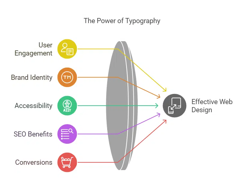
Typography is more than just choosing a fancy font; it’s about ensuring text is legible, engaging, and aligned with your brand identity. Here’s why typography plays a crucial role in web design:
- User Engagement: Clear and attractive typography improves readability, reducing bounce rates.
- Brand Identity: Fonts convey emotions and personality, reinforcing your brand’s image.
- Accessibility: Proper typography ensures inclusivity, making content readable for all users.
- SEO Benefits: Well-structured text with optimized typography enhances search engine rankings.
- Conversions: A well-optimized font choice can drive call-to-action engagement and improve user retention rates.
Now, let’s dive into the 10 best typography tips for a beautiful website design that will make your website stand out.
10 Best Typography Tips for a Beautiful Website Design
Typography plays a crucial role in web design, influencing both aesthetics and readability. A well-chosen typeface, proper spacing, and a clear hierarchy can elevate your website’s design and improve user experience.
Here are ten essential typography tips to create a visually appealing and highly readable website.
1. Choose the Right Typeface for Your Brand
Selecting the right typeface is essential for consistency and readability, as it directly impacts how users perceive and interact with your content. The typeface you choose should not only be aesthetically pleasing but also align with your brand identity, ensuring a seamless user experience.
A well-selected typeface enhances professionalism, improves comprehension, and increases engagement. Here’s what you need to consider:
Key Factors to Consider:
- Serif vs. Sans-serif: Serif fonts (e.g., Times New Roman) are traditional and formal, while sans-serif fonts (e.g., Arial) are modern and clean.
- Readability: Avoid overly decorative fonts that may hinder legibility.
- Web-friendly Fonts: Google Fonts and Adobe Fonts offer excellent choices optimized for online use.
- Brand Messaging: The typography you choose should align with your brand’s voice and message.
Comparison of Popular Web Fonts:
| Font Name | Type | Best For | Characteristics |
| Roboto | Sans-serif | Blogs, Tech Websites | Modern, Clean, Neutral |
| Open Sans | Sans-serif | Corporate, E-commerce | Professional, Easy to Read |
| Lora | Serif | Magazines, Creative Sites | Elegant, Classic, Refined |
| Montserrat | Sans-serif | Startups, Portfolios | Bold, Attention-Grabbing |
| Playfair Display | Serif | Luxury, Fashion Brands | Stylish, High-end Appeal |
Example: Many tech companies like Google and Apple use sans-serif fonts to convey a modern and sleek brand identity.
2. Maintain a Clear Font Hierarchy
A structured font hierarchy enhances content flow and readability, ensuring that users can easily scan and comprehend the information presented. Establishing a logical order of text elements allows for better visual organization, guiding the reader naturally through the content.
By properly differentiating headings, subheadings, and body text, you create a seamless reading experience that enhances user engagement.
Best Practices for Font Hierarchy:
- Headings (H1, H2, H3): Use distinct sizes and weights to create contrast.
- Body Text: Stick to a comfortable reading size (16-18px).
- CTA Buttons: Use bold and large fonts for visibility.
- Visual Structure: Larger fonts for headings, medium for subheadings, and standard sizes for body text ensure a natural reading experience.
Font Hierarchy Breakdown:
| Text Type | Recommended Size (px) | Best Practices |
| H1 | 36-48 | Use for main headlines |
| H2 | 28-36 | Subheadings with emphasis |
| H3 | 22-28 | Supporting subheadings |
| Body Text | 16-20 | Readable across devices |
| CTA Text | 18-24 | Make it bold and noticeable |
Example: News websites like BBC and CNN maintain a strong font hierarchy to enhance content readability and improve engagement.
3. Keep the Font Size Readable on All Devices
Ensuring text is legible across different screen sizes is critical for providing a seamless user experience. With the rise of mobile browsing, it’s essential that typography remains consistent, readable, and accessible on all devices.
Proper font scaling, adaptable line spacing, and optimized contrast can make a significant difference in user engagement and comprehension.
Recommended Font Sizes for Different Devices:
- Desktop: 18-22px for body text, 32-48px for headings.
- Tablet: 16-20px for body text, 28-40px for headings.
- Mobile: 14-18px for body text, 24-36px for headings.
Optimal Font Sizes for Different Devices:
| Device | Body Text (px) | Heading (px) |
| Desktop | 18-22 | 32-48 |
| Tablet | 16-20 | 28-40 |
| Mobile | 14-18 | 24-36 |
Additional Best Practices:
- Use relative units: (em, rem) instead of fixed pixel values to ensure scalability.
- Enable viewport meta tags: Allows for proper scaling and readability on different screens.
- Accessibility considerations: Ensure text can be enlarged without breaking layout or readability.
Example: Websites like Medium optimize font size dynamically for readability across devices.
4. Limit the Number of Fonts Used
Using too many fonts can make a website appear cluttered and unprofessional, confusing visitors and diminishing the user experience. To maintain visual harmony, designers should adhere to the Rule of Three:
- Primary Font: Used for headings.
- Secondary Font: Used for body text.
- Accent Font: Used for highlights or callouts.
Sticking to a maximum of two to three fonts per website ensures consistency and readability while maintaining a cohesive brand identity.
Optimal Font Combinations:
| Primary Font | Secondary Font | Best Use Case |
| Montserrat | Open Sans | Startups, Modern Blogs |
| Lora | Roboto | Magazines, Creative Websites |
| Playfair Display | Poppins | Luxury, Fashion Brands |
Additional Tips:
- Use fonts that complement each other rather than clashing styles.
- Keep the same font family for a more cohesive appearance.
- Avoid excessive variations in weight and style to maintain readability.
Example: Airbnb uses a clean and minimal font selection to enhance user experience and brand identity.
5. Optimize Line Spacing and Letter Spacing
Proper spacing enhances readability and ensures a pleasant reading experience. Adjusting line height (leading) and letter spacing (tracking) prevents text from appearing too cramped or too loose, making it easier for users to scan and absorb information.
Best Practices for Spacing:
- Line Height: A general rule is to maintain a ratio of 1.5x the font size for comfortable reading, though this may vary based on font type and context.
- Letter Spacing: Slightly increase the spacing for capitalized text to prevent a crowded appearance. Sans-serif fonts often need less spacing, while decorative or script fonts may require more.
Recommended Spacing Guidelines:
| Font Size (px) | Line Height | Letter Spacing |
| 16-20 | 1.5-1.75x | 0.02-0.05em |
| 21-28 | 1.4-1.6x | 0.01-0.04em |
| 29+ | 1.3-1.5x | 0.01-0.03em |
Example: Apple’s website balances line and letter spacing meticulously, achieving a clean and premium look that enhances readability without overwhelming users.
6. Use Contrasting Colors for Readability
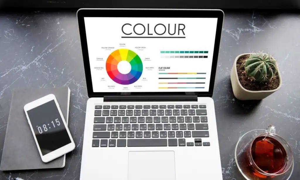
Color contrast plays a crucial role in making text easy to read, particularly for users with visual impairments. Poor contrast can make content difficult to decipher, leading to poor user experience and accessibility issues.
Key Contrast Guidelines:
- Dark text on a light background is the most readable format.
- Avoid low-contrast combinations (e.g., yellow text on a white background) that strain the eyes.
- Use WebAIM’s Contrast Checker to ensure your text meets WCAG accessibility standards.
Ideal Contrast Ratios:
| Text Color | Background Color | Contrast Ratio |
| Black | White | 21:1 |
| Dark Gray | Light Gray | 7:1 |
| Blue | White | 12:1 |
Example: Government websites and accessibility-focused platforms, such as Wikipedia, use high contrast to enhance readability for all users.
7. Enhance Readability with Proper Alignment
Text alignment affects how quickly users can scan and comprehend content. Poor alignment disrupts reading flow, while proper alignment improves visual balance.
Best Alignment Practices:
- Left-aligned text: Ideal for body content, as it supports natural reading flow.
- Centered text: Suitable for headlines, short quotes, or call-to-action elements but should be used sparingly.
- Justified text: Avoid in web design—it creates uneven spacing, making text harder to read.
Text Alignment Guide:
| Alignment | Best For | Considerations |
| Left | Body text | Most readable option |
| Centered | Titles, Quotes | Use minimally |
| Justified | Print media | Creates uneven spacing |
Example: Most blogs and news websites, like The New York Times and Medium, use left-aligned text for maximum readability.
8. Ensure Mobile-Friendly Typography
As mobile browsing dominates, typography must be adaptable across various screen sizes. A responsive approach ensures that users can read content comfortably on any device.
Key Mobile Typography Best Practices:
- Use relative units (em, rem) instead of fixed pixels to maintain scalability.
- Enable viewport meta tags to ensure proper scaling across devices.
- Avoid tiny fonts—keep a minimum font size of 16px for body text.
Mobile Typography Guide:
| Practice | Benefit |
| Use rem/em instead of px | Ensures scalability |
| Optimize line height | Improves readability |
| Avoid tiny fonts | Enhances accessibility |
Example: Google’s Material Design Guidelines emphasize mobile-friendly typography to enhance user experience across all screen sizes.
9. Leverage White Space for a Clean Design
White space, or negative space, is a crucial design element that prevents clutter and improves content legibility.
It creates breathing room around text and visual elements, leading to a more elegant and professional layout.
Benefits of White Space:
✔ Improves focus on key content by reducing visual noise.
✔ Enhances readability by preventing text blocks from appearing too dense.
✔ Creates a premium aesthetic often seen in modern web design.
White Space Utilization Guide:
| Type of White Space | Effect |
| Margins | Creates breathing room |
| Line Spacing | Improves readability |
| Padding | Enhances focus on elements |
Example: Apple’s minimalist website design is a perfect example of how well-utilized white space contributes to a sophisticated and uncluttered interface.
10. Test and Optimize Your Typography
Even the best typography choices need testing to ensure they resonate with your audience. Conducting typography tests helps you refine readability and visual appeal.
Ways to Test Typography Effectiveness:
✔ A/B Testing: Compare different font styles, sizes, and line heights to determine what works best.
✔ User Feedback: Collect insights on readability through surveys or analytics tools.
✔ Typography Testing Tools: Utilize tools like Google Fonts, WebAIM, and browser dev tools to analyze font performance.
Typography Optimization Tools:
| Tool | Purpose |
| Google Fonts | Font selection |
| WebAIM | Accessibility testing |
| A/B Testing Software | Performance analysis |
Example: Shopify continuously optimizes its typography choices based on user behavior analytics to improve conversions and engagement.
Takeaways
Typography is a powerful tool in web design that enhances user experience, improves readability, and strengthens branding.
By following these 10 best typography tips for a beautiful website design, you can create a visually appealing, accessible, and SEO-friendly website.
Implement these strategies to make your content more engaging and user-friendly. What typography techniques have worked best for your website? Share your thoughts in the comments!