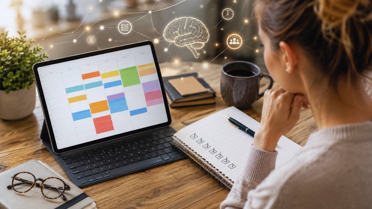
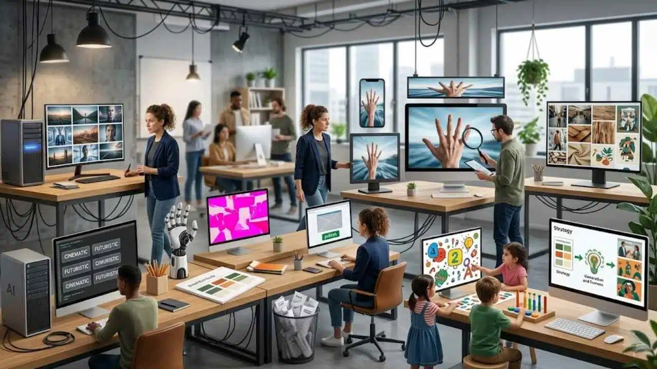
AI art looks same when creators stop directing the image and start accepting whatever the tool gives them. I have seen this problem again and again in publishing, SEO content, social media creatives, and AI visual workflows. The image may look polished at first, but after a while, everything starts blending together: the same glossy faces, the same neon glow, the same futuristic desks, the same perfect-but-empty product shots.
At first, AI visuals felt like a breakthrough. Small teams, creators, startups, agencies, and e-commerce brands could suddenly create images faster without waiting days for production. That speed is still valuable. But speed also created a new problem: too many brands are using the same prompts, the same styles, and the same visual shortcuts.
This is not only a design issue. It is a branding issue, a content originality issue, and a trust issue. At Editorialge Media LLC, we are evolving beyond publishing; we are a Digital Venture Studio bridging Technology, Media, and Life through our media platforms, in-house SaaS products, e-learning site, and creative tools like ImagineLab. So for us, visuals cannot be a random decoration.
They need to support the story, improve reader experience, strengthen brand memory, and make the content feel original. AI can create faster, but human direction decides whether the image feels useful, trustworthy, and worth remembering.
What Does It Mean When AI Art Looks Same?
When people say AI art looks same, they usually mean AI-generated visuals share repeated patterns, styles, colors, lighting, compositions, and emotional tones. It does not mean every AI image is identical. It means many AI images feel like they belong to the same visual family, even when they are made for different brands, industries, and audiences.
This is called AI aesthetic uniformity. It happens when different users produce similar outputs because they depend on similar prompts, similar model defaults, similar visual trends, and similar creative shortcuts.
AI art looks same when generated images feel visually interchangeable because they rely on repeated styles, prompts, compositions, lighting, and aesthetic patterns instead of brand-specific creative direction.
Why AI Art Looks Same Everywhere Now
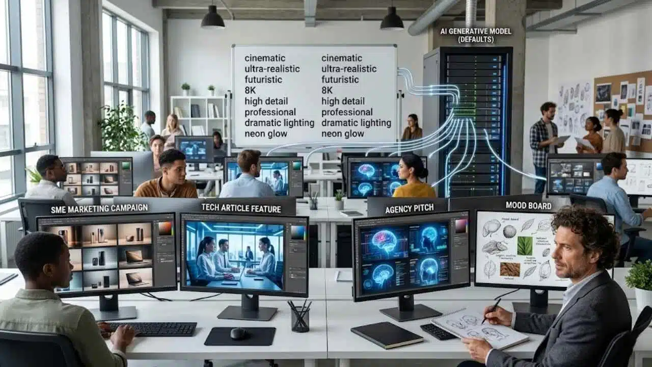
AI art looks same everywhere now for several connected reasons. It is not just the fault of AI models. Human behavior plays a major role. Most users are asking AI tools for the same kind of output. They use similar prompt language, similar style references, and similar visual goals. The model then responds with familiar visual patterns.
1. Everyone Uses the Same Prompt Words
Common AI image prompts often include words like:
- cinematic
- ultra-realistic
- futuristic
- 8K
- professional
- high detail
- dramatic lighting
- neon glow
- premium
- modern
- clean
- award-winning
- realistic studio lighting
These words are not wrong. But they are overused. If thousands of people ask for “a cinematic futuristic marketing team using AI in a modern office,” many outputs will naturally look similar.
2. Models Learn From Existing Visual Culture
Generative AI systems are trained on massive datasets of existing images, design styles, visual patterns, and compositions. That means they often reproduce the visual logic of what already exists.
They do not “understand” brand originality the way a human creative director does. They predict and generate based on learned patterns. This is why many outputs feel like a mix of stock photography, tech ads, concept art, and social media templates.
3. Users Accept the First Good-Looking Output
This is one of the biggest workflow problems. Many teams generate one image, see that it looks polished, and publish it immediately. But polished is not the same as original.
A first output is often the safest output. It reflects the most common interpretation of the prompt. To get something distinctive, you need iteration, editing, brand context, and creative judgment.
4. Creative Teams Are Under Pressure to Produce Fast
Marketers need more images, videos, ads, blog visuals, infographics, and social posts than ever before. Small teams are especially pressured. AI helps solve this pressure, but speed can also weaken strategy. When teams are rushed, they choose visuals that are “good enough.” Over time, good enough visuals become a generic brand identity.
5. Visual Trends Spread Quickly
Once a style becomes popular, everyone copies it.
This happened before AI with:
- Stock photos
- Flat illustrations
- Corporate Memphis style
- Startup gradient graphics
- 3D cartoon mascots
- Neon SaaS dashboards
- Minimal beige lifestyle branding
AI accelerates this trend cycle. Now, a popular visual style can be reproduced at massive speed.
How AI Art Homogenization Affects Brands
AI art homogenization affects brands by making their content look less distinct, less trustworthy, and less memorable. For digital marketing, this matters a lot. People scroll quickly. They make visual judgments in seconds. If your image looks like every other AI-generated image in the feed, the audience has no reason to stop.
Brand Differentiation Becomes Harder
A brand visual should answer:
- Who is this from?
- What does this brand believe?
- Who is this made for?
- What feeling does this create?
- Why should I remember it?
Generic AI images do not answer these questions.
They only say:
“This was made with an AI image tool.”
That is not enough.
Trust Can Drop
Overly polished AI visuals can sometimes feel fake. This is especially risky for industries where trust matters.
Examples include:
- Education
- Parenting
- Health
- Finance
- SaaS
- E-commerce
- News media
- Children’s apps
- Professional services
For Edtech like Edutorial, a child-friendly learning visual cannot simply be cute and colorful. It must feel safe, clear, age-appropriate, and educational.
For creative tools like ImagineLab users, marketing visuals must be attractive but still brand-specific. A generic glossy AI image may look modern, but it may not convert if it does not match the product or audience.
SEO and Content Quality Can Suffer
Google’s guidance says its systems aim to reward helpful, reliable, people-first content rather than content created mainly to manipulate rankings. It also states that AI-generated content is not automatically against its guidelines when it is useful and high-quality.
That principle applies to visuals too. A generic AI image may not directly damage SEO by itself, but a weak visual strategy can reduce engagement. If images do not add clarity, trust, or dwell-time value, they become decoration instead of content support.
For pillar and cluster content, visuals should help the article become more useful. That is why AI image originality matters.
Common Signs of Identical AI Images
Before fixing AI visual sameness, brands need to recognize it.
Here are the most common signs:
| Sign of AI Sameness | What It Looks Like | Why It Hurts |
| Over-polished faces | Smooth skin, perfect lighting, no natural texture | Feels fake or emotionally empty |
| Repeated tech glow | Blue neon, holograms, floating icons | Overused in AI and SaaS visuals |
| Generic office scenes | People looking at screens with no real context | Looks like stock photography |
| Same composition | One subject in the center, blurred background | Predictable and forgettable |
| Fake diversity | Mixed group of people with no specific cultural context | Feels symbolic, not authentic |
| Plastic product mockups | Unrealistic reflections and surfaces | Weakens product credibility |
| Random floating icons | Icons added without meaning | Makes visuals look decorative |
| Too much cinematic lighting | Dramatic but unrelated to the brand | Looks impressive but not useful |
The Most Common AI Visual Trap
The biggest trap is thinking “beautiful” means “effective.”
A beautiful AI image can still fail if it does not:
- Match the brand
- Fit the audience
- Support the article
- Explain the concept
- Build trust
- Feel believable
- Encourage action
For marketing content, beauty is not the final goal. Usefulness is.
Why AI Aesthetic Uniformity Hurts Marketing
AI aesthetic uniformity hurts marketing because marketing depends on differentiation. If your visuals look like everyone else’s visuals, your brand becomes harder to remember.
That affects:
- Click-through rate
- Social engagement
- Landing page trust
- Brand recognition
- Ad performance
- Product perception
- Audience loyalty
- Content dwell time
Marketing Needs Pattern Breaking
People scroll past predictable visuals. A strong marketing image should break the pattern without confusing the audience. That does not mean making something weird for no reason. It means making something specific.
For example, instead of prompting:
Create an AI image of a business team using technology.
A better prompt would be:
Create a realistic scene of a small e-commerce team reviewing AI-generated product visuals on a messy desk, with packaging samples, rejected drafts, customer notes, and a clear contrast between generic mockups and brand-specific creative direction.
The second prompt is more specific. It gives AI a story. Story creates AI-generated content originality.
Commercial Content Needs Visual Trust
For e-commerce brands, identical AI images can hurt product trust.
Customers want to know:
- Is this product real?
- Is this brand reliable?
- Is the visual honest?
- Does the image represent the actual item?
- Does the brand understand my need?
Overly artificial visuals may look premium, but they can create distance. The best AI-assisted visuals should feel polished but believable.
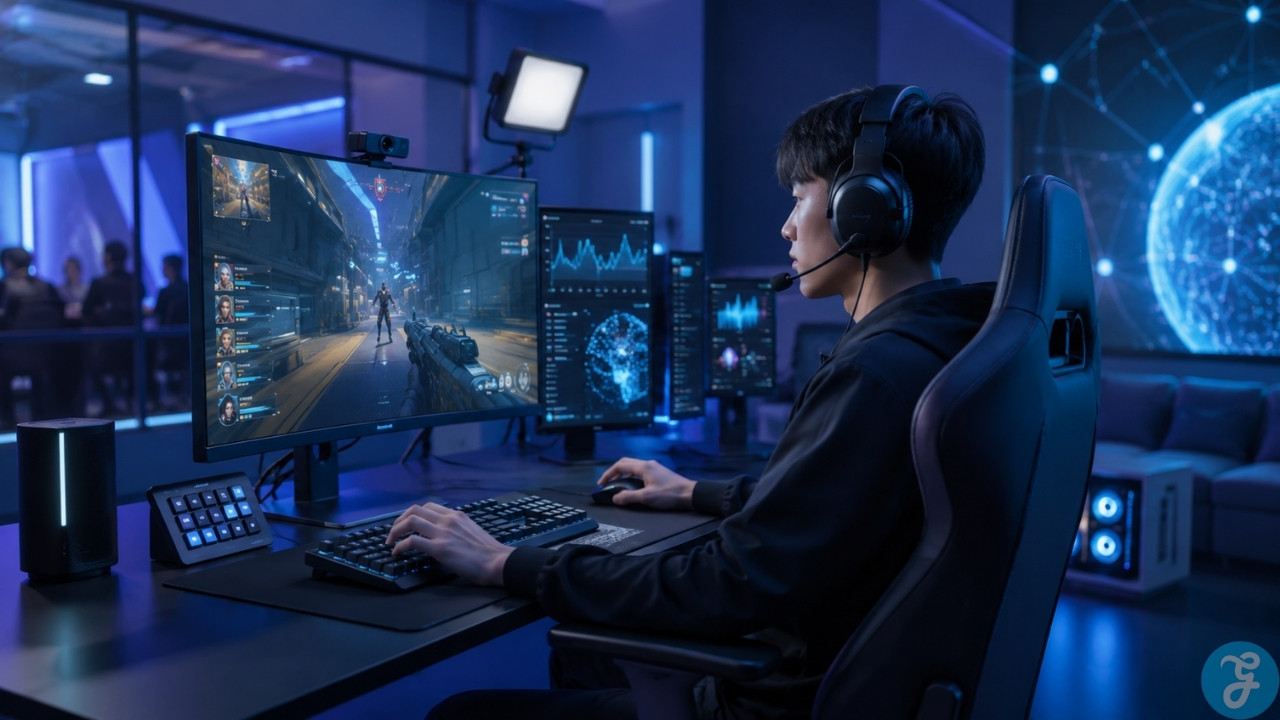
Real-World Examples of Generic AI Visuals
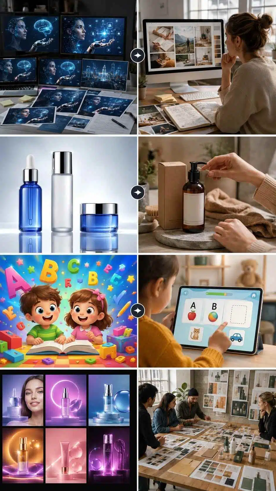
Let’s look at practical examples across different industries. These examples show how AI visuals can look polished at first but still feel generic when they lack brand context, audience understanding, and human creative direction.
Example 1: AI Blog Featured Images
A blog about AI often uses the same visual formula:
- Human face
- Blue hologram
- Robot hand
- Glowing brain
- Futuristic background
- Floating data icons
This visual style is everywhere. A stronger image would show a specific editorial workflow: a writer comparing generic AI drafts with handwritten notes, source materials, and a brand voice guide. That tells a better story.
Example 2: E-Commerce Product Images
Generic AI product visuals often show perfect bottles, perfect backgrounds, and perfect lighting. But customers may trust a more realistic image showing:
- Product scale
- Packaging texture
- Real usage context
- Lifestyle setting
- Brand colors
- Customer environment
For e-commerce, originality often comes from practical detail.
Example 3: Educational App Graphics
A generic AI educational image may show smiling cartoon children, bright colors, and floating letters. But a child-friendly learning visual should consider:
- Letter readability
- Screen simplicity
- Age-appropriate colors
- Safe interaction
- Clear learning task
- Avoiding overstimulation
For Edutorial-style learning apps, the image must support early literacy, memory, problem-solving, or number recognition. It should not simply look cute.
Example 4: Agency Campaign Visuals
Agencies often use AI to create quick campaign concepts. The risk is that every client gets the same style:
- Gradient background
- Abstract shapes
- Glowing product
- Happy model
- Clean typography area
A better agency workflow builds a custom visual system for each client before generating images. That is how AI becomes a creative advantage instead of a sameness machine.
How Creators and Marketers Can Fix AI Visual Sameness
Creators and marketers can fix AI visual sameness by treating AI as a production partner, not a creative director. The process should begin with a human strategy.
Use a Visual Brief Before Prompting
A strong visual brief should include:
| Brief Element | Example |
| Audience | Digital marketers, parents, educators, agency owners |
| Goal | Explain AI visual sameness |
| Emotion | Thoughtful, realistic, slightly critical |
| Brand tone | Modern, useful, trustworthy |
| Visual style | Realistic editorial, not over-polished |
| Key objects | Screens, moodboards, rejected AI outputs, human notes |
| Avoid | Robot clichés, random holograms, fake smiles |
| CTA purpose | Encourage smarter AI creative workflow |
This helps AI understand the assignment.
Create a Brand Prompt Library
Brands should not reinvent prompts every time.
A brand prompt library can include:
- Featured image prompts
- Infographic prompts
- Product image prompts
- Social media creative prompts
- Educational visual prompts
- Ad creative prompts
- Video concept prompts
- Thumbnail prompts
Each prompt should carry brand context.
Use Iteration Intentionally
Do not generate one image. Generate multiple directions:
- Realistic version
- Editorial version
- Minimal version
- Human-centered version
- Product-focused version
- Educational version
- Social-friendly version
- Premium brand version
Then compare. Originality often appears after iteration.
Practical Framework for More Original AI Art
Original AI art needs a repeatable process that starts with a human strategy, not random prompting. This framework will help brands plan, generate, review, and refine AI visuals so the final output feels intentional instead of generic.
Step 1: Define the Message
Ask:
- What is this image supposed to communicate?
- What should the viewer understand in three seconds?
- Is the topic emotional, practical, educational, or commercial?
If the message is unclear, the image will be unclear.
Step 2: Define the Audience
- A visual for parents should make them feel safe and warm.
- A visual for marketers should feel practical and modern.
- A visual for agencies should feel polished and strategic.
- A visual for e-commerce should feel trustworthy and product-focused.
Step 3: Define the Brand Identity
Before generating images, define:
- Colors
- Mood
- Style
- Composition
- Realism level
- Typography space
- Product presence
- Cultural details
- Negative style rules
Step 4: Generate Multiple Concepts
Ask AI for different visual concepts, not just one final image.
Examples:
- One human-centered concept
- One product-centered concept
- One abstract concept
- One educational concept
- One infographic concept
Step 5: Review Like an Editor
Check:
- Is it too generic?
- Is it believable?
- Does it match the brand?
- Does it support the content?
- Does it look like stock AI?
- Would the audience trust it?
Step 6: Edit and Customize
Customize the image through:
- Cropping
- Recoloring
- Brand overlays
- Manual retouching
- Layout adjustment
- Platform-specific formatting
- Combining AI and real assets
Step 7: Measure Performance
Track whether the image improves:
- Clicks
- Engagement
- Time on page
- Shares
- Conversions
- App downloads
- Product interest
- Social saves
A strong AI visual workflow improves over time.
Brand and Business Applications
Different brands face AI visual sameness in different ways, depending on their audience, platform, and business goals. This section shows how creators, marketers, SMEs, e-commerce brands, agencies, and educational companies can use AI visuals without losing originality or trust.
For Content Creators
Creators need visuals that build identity. If every thumbnail, featured image, and infographic looks like generic AI content, the creator becomes forgettable. Creators should build a personal visual style with recurring colors, framing, characters, formats, or moods.
For Digital Marketers
Marketers should use AI visuals for speed, testing, and campaign variations. But they must avoid launching campaigns with generic assets that weaken brand recall. The best marketing visuals should connect to the offer, audience pain point, and conversion goal.
For SMEs
Small businesses benefit heavily from AI creative tools because they often lack big design teams. But SMEs should not copy large-brand aesthetics blindly. A small local brand may perform better with warm, realistic, relatable visuals than with glossy futuristic images.
For E-Commerce Brands
E-commerce visuals must support trust. AI can help create campaign images, product context shots, and ad concepts. But product visuals should not misrepresent real items. Customers notice when images look too fake.
For Agencies
Agencies can use AI to speed up ideation, moodboards, campaign testing, and visual directions. But they should create separate visual systems for each client. If every client gets the same AI look, the agency’s creative value drops.
For Educational App Companies
Educational brands need extra care. Visuals for children should be:
- Clear
- Safe
- Age-appropriate
- Learning-focused
- Not overstimulating
- Easy to understand
- Parent-friendly
UNESCO’s guidance on generative AI in education emphasizes a human-centered approach, long-term policy thinking, and human capacity development so AI supports learners and teachers responsibly. That mindset matters for child-focused app visuals too. AI should support educational design, not replace educational judgment.
Recommended Tools and Workflow
The right tools should help brands move faster without becoming generic. For AI visuals, videos, infographics, audio, and branded marketing content, ImagineLab.art can fit the needs of creators, startups, marketers, SMEs, e-commerce brands, and agencies that want faster production without relying on a large creative team.
But the workflow matters more than the tool alone.
Recommended AI Visual Workflow
| Stage | What to Do |
| Strategy | Define audience, message, and brand style |
| Prompting | Use detailed, brand-specific prompts |
| Generation | Create multiple visual directions |
| Selection | Compare outputs against brand goals |
| Editing | Refine visuals manually or with design tools |
| Publishing | Use the correct format for each platform |
| Measurement | Track engagement and improve future prompts |
Common Mistakes to Avoid
Before using AI for brand visuals, it helps to know where most teams go wrong. These mistakes may seem small, but they can slowly create identical AI images and weaken brand trust.
Mistake 1: Using Generic Visual Prompts
Generic prompts create generic images. If your prompt sounds like everyone else’s prompt, your image will probably look like everyone else’s image.
Mistake 2: Chasing “Premium” Without Purpose
Many brands ask for premium, cinematic, futuristic visuals. But premium visuals do not work if they do not match the audience or message.
Mistake 3: Ignoring Brand Colors and Style
If you do not give AI your brand style, it will invent one. That invented style may look nice but still damage consistency.
Mistake 4: Publishing the First Output
The first output is usually the most obvious interpretation. Better results usually come after testing multiple directions and editing manually.
Mistake 5: Making Every Image Too Polished
Over-polished images can feel fake. Realistic textures, natural lighting, and believable environments often build more trust.
Mistake 6: Forgetting the Platform
A blog featured image, Instagram post, Pinterest pin, and ad banner need different compositions. One image should not be forced everywhere.
Mistake 7: Using AI Images Without Human Review
AI can create visual errors, unrealistic details, or misleading scenes. Human review protects quality and credibility.
Mistake 8: Treating Education Like Decoration
For children’s learning content, visuals must support learning. Cute graphics are not enough if they distract from literacy, numbers, memory, or problem-solving.
Expert Tips for Better AI Visual Originality
Better AI visuals come from better creative direction, not just better tools. These expert tips will help you reduce sameness, avoid stock AI aesthetics, and create images that feel more original, useful, and brand-specific.
Tip 1: Build a Negative Prompt List
Tell AI what to avoid.
Examples:
- no fake smiles
- no random holograms
- no plastic skin
- no excessive neon lighting
- no cluttered background
- no unreadable fake text
- no over-polished stock photo style
This helps reduce AI aesthetic uniformity.
Tip 2: Add Real-World Objects
Specific objects make images feel more believable.
For example:
- printed drafts
- sticky notes
- product packaging
- children’s tracing sheets
- app wireframes
- camera gear
- customer notes
- brand color cards
- sketchbooks
These details add human context.
Tip 3: Create a Reusable Visual System
Use recurring rules for:
- Lighting
- Color palette
- Framing
- Backgrounds
- Character style
- Product placement
- Mood
- Composition
This builds recognition across articles and campaigns.
Tip 4: Ask for Imperfection
Sometimes, perfection is the enemy of trust.
Try prompts with:
- natural lighting
- realistic desk clutter
- authentic human expression
- everyday workspace
- practical business setting
- real-world creative process
Tip 5: Use AI for Ideation, Then Curate Like a Creative Director
AI can create options quickly. But humans should choose the final direction. The best results come when AI handles speed and humans handle taste.
Tip 6: Make the Visual Explain the Article
A featured image should not merely decorate the page. It should visually explain the article’s core idea. For this article, the best visual would show similar AI-generated images on one side and a human creative process on the other.
That contrast tells the story immediately.
Final Thoughts
AI art looks same everywhere because too many people are using AI without enough creative direction. The tools are powerful. The outputs are fast. The visuals are often beautiful. But beauty alone does not create originality. Brands need more than AI-generated polish. They need visual identity, audience understanding, editorial judgment, and human taste. They need to move beyond identical AI images and build content that feels recognizable, useful, and trustworthy.
For marketers, this means creating visuals that support campaigns instead of decorating them. For SMEs, it means using AI to look professional without losing authenticity. For agencies, it means building custom visual systems for clients instead of repeating the same AI style. For educational brands, it means using visuals that support learning, safety, memory, and child-friendly interaction.
The future belongs to teams that use AI for speed but keep humans in charge of meaning.
Frequently Asked Questions (FAQs) About Why AI Art Looks Same
1. Why Does AI Art Look Same Everywhere?
AI art looks same because many users rely on similar tools, prompts, lighting styles, and visual trends. When people ask AI for “cinematic,” “premium,” or “futuristic” images without brand context, the outputs often become visually similar.
2. What Is AI Art Homogenization?
AI art homogenization is the process where AI-generated visuals become increasingly similar across brands, platforms, and creators. It happens when repeated prompts, model defaults, and popular styles create the same aesthetic patterns.
3. Are Identical AI Images Bad for Branding?
Yes, identical AI images can weaken branding because they make a company harder to recognize. If your visuals look like everyone else’s, your audience has less reason to remember your content.
4. How Can I Make AI Art More Original?
You can make AI art more original by using brand-specific prompts, adding audience context, avoiding overused style words, generating multiple directions, and editing outputs manually before publishing.
5. What Is AI Aesthetic Uniformity?
AI aesthetic uniformity means AI images share the same visual style, lighting, composition, color grading, and emotional tone. It makes content look polished but interchangeable.
6. Can AI Tools Still Help Brands Create Original Visuals?
Yes, AI tools can help brands create original visuals when used with strong creative direction. The key is to guide AI with brand identity, audience insight, and human review.
7. Should Educational Brands Use AI-Generated Images?
Educational brands can use AI-generated images, but they need careful review. For children’s learning content, visuals should be safe, clear, age-appropriate, and designed to support learning rather than distract from it.