
In today’s increasingly digital world, websites serve as gateways to information, services, and social connection. While much of modern web design focuses on trends and younger demographics, one important user group is often overlooked: older adults. As the global population ages and more seniors become digitally active, it’s crucial that web designers and developers prioritize accessibility and usability for elderly users.
Designing websites with older adults in mind isn’t just about meeting accessibility standards — it’s about creating an inclusive digital environment that respects the needs and limitations of aging. From diminished vision and hearing to reduced motor skills and less digital literacy, seniors may face unique challenges when navigating the web. But with thoughtful design, these barriers can be minimized or even eliminated.
In this article, we’ll explore 7 best practices for designing websites specifically tailored to elderly users. Whether you’re building a healthcare platform, an e-commerce site, or a community portal, these guidelines will help ensure your design is intuitive, inclusive, and truly user-friendly for older audiences.
Use High-Contrast Colors for Better Visibility
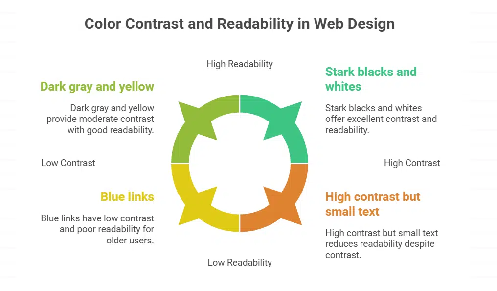
Web designers pick bold color pairs to boost readability. They use CSS and hex codes to meet WCAG standards. Standard text must hit a 4.5 to 1 ratio, and large text needs 3 to 1. A 60-year-old needs three times more light than a 20-year-old to see brightness.
Visual hierarchy jumps when contrast spikes. Inclusive design calls for stark blacks and whites or dark gray and yellow.
Avoid blue for key buttons, links, and calls to action. Older eyes may see blue as faint. Use high contrast on large buttons and small links. Test with VisualEyes Vision Simulator Glasses to spot cataracts or macular degeneration effects.
Check contrast on mobile and desktop under responsive design. This step lifts user experience for seniors.
Ensure Large, Readable Text and Button Sizes
Tiny text feels like a lost key. Make all characters at least 16 px tall. Pick bold sans serif fonts for clear letters and use plain language on labels. High contrast colors pair well with large text and aid visual hierarchy in inclusive design.
Your site can support screen readers and zoom tools in Chrome to help low vision users.
Big buttons fit old fingers. Use responsive design to keep tap targets at least 44×44 px on all devices. Loud + Clear fitness app blew up tap zones in its interface and added wide padding for shaky hands.
That tweak boosts user experience (ux) design for low dexterity and vision impairment.
Design menus with plain language, short words help. Label each icon for quick recognition by the mouse or trackpad. Group similar tasks to cut memory load, and keep menu items to five or six choices.
Apply visual hierarchy with bold headers, simple fonts, and ample white space. Match each menu label to the page title so seniors know where they go. Use large buttons that meet accessibility standards to tackle vision impairment.
Place assistive technologies like screen readers and keyboard navigation in mind when you name each link. Show a short guide on onboarding screens using icons and concise text, it cuts confusion.
Offer a tiny tutorial to explain how to open a menu, how to spot error messages, and how to move through pages. Pick clear labels like Home, Help, or Profile, not technical terms. Test with seniors, watch for usability issues, add more cues if they pause or stray.
Embrace inclusive design, and give users power over menus.
Minimize Complex Interactions and Use Single Clicks
Buttons need one tap or a single click across the web. Users tap large buttons and swipe simple sliders to avoid errors. Site designers add progress indicators for manageable steps in plain language.
Teams follow accessibility standards and inclusive design to help older eyes and trembling hands. Developers enable keyboard navigation, voice control, and screen readers for low-vision users.
Engineers test with trackpads and tablets to refine website accessibility and user experiences. Privacy rules ask for minimal user data, like one email, to protect online privacy.
Avoid Pop-Ups and Disruptive Animations
Pop-ups sneak in like uninvited guests, they block main content and mess with visual hierarchy. They confuse screen readers and slow down keyboard navigation. A timed pop-up that vanishes too soon frustrates many seniors.
Plain language in error messages can clear up the mess. A simple banner works better than a disappearing alert.
Flashing GIFs and bouncing ads can cause cognitive overload, they feel like a jack-in-the-box. Such effects break responsive design flows, they hide large buttons and text. A static SVG icon with alt text gives clear feedback for user actions.
Test pop-ups in Google Chrome and MacOS to spot barriers early. An option to disable animations helps meet accessibility standards and inclusive design goals.
Provide Clear Instructions and Contextual Guidance
Onboarding screens need large text and bold titles to set a clear start. Plain language cuts down tech jargon. Teams follow accessibility standards for color contrast and font size rules.
Arrows and icons guide readers at each step. Progress bars at top show how much is left. Speech output tools read each label for users with vision issues.
Clear error messages pop in red near wrong fields and say how to fix mistakes. A save progress option stops data loss when users log off. Embedded tutorials with short video clips and captions offer just in time help.
A help button next to every form opens a chat or a tooltip window. Keyboard navigation and voice commands drive ease and choice.
Design for Accessibility with Customizable Features
Sites let seniors tweak text size and color contrast. This inclusive design improves readability for vision impairment. Designers build a clear visual hierarchy with big headings. They work with screen readers and simple labels.
Include captions and transcripts for audio or video.
Design large buttons with wide spacing to help shaky hands. Offer alternative input methods like keyboard navigation and voice commands. Use plain language labels and simple error messages.
Add Accessible Rich Internet Applications landmarks to meet accessibility standards. Simplify privacy controls and show clear notices.
Incorporate Voice and Audio Assistance Options

Siri, Alexa, or Google Assistant lets older adults speak to web pages. Designers can add speech commands and spoken progress indicators. People with presbycusis lose speech nuance.
They need captions and transcripts to follow audio prompts.
Autoplay videos should include captions by default. Designers must provide audio guidance for each button click. Screen readers can read instructions, error messages, and link labels.
Web apps and digital products for seniors gain from plain language audio cues and inclusive design.
Test with Elderly Users for Real-World Feedback
Invite seniors to test your site. Ask them to use screen readers and keyboard navigation to meet accessibility standards. Offer a vision simulator and a browser accessibility plugin.
The fitness app Loud + Clear tried this in real sessions. It revealed hard-to-read menus, weak visual hierarchy, and missing progress indicators.
Collect direct feedback after each session. Ask seniors to share views on error messages and plain language labels. Note when they skip steps or miss call to action buttons. Use that input to refine inclusive design, large buttons, and responsive design.
Adjust layouts for vision impairment and glaucoma. Update screens with simplified navigation and clear color contrast. Repeat tests in new rounds for an iterative design cycle.
Avoid Overloading Screens with Information
Seniors lose focus on screens packed with items. Group related tasks into clear chunks to cut cognitive load. Use plain language and let users save progress for later. Add progress indicators to show steps and guide task flow.
Show key actions with a strong visual hierarchy and white space.
Timed disappearing messages frustrate readers and cause errors. Limit content per view and apply responsive design for any screen size. Add keyboard navigation and screen reader support to boost accessibility standards.
Conduct user testing with real seniors to spot clutter and confusion. Then refine layouts to match intuitions and simplify interactions.
Takeaway
Good design helps older adults use sites with ease. We boost visibility with high color contrast and large buttons. Simple menus and plain language cut down confusion. Screen reader support and keyboard navigation add more ways to browse.
We test pages on tablets and phones to check responsive design. Real feedback shapes inclusive design and lifts each user experience.
FAQs on How to Design Senior-Friendly Websites
1. What is inclusive design and why does it help older users?
Inclusive design means you build digital products for seniors with user-centered design. It treats each market segment fairly, including people with disabilities. It is like adding a ramp instead of stairs, so no one trips. It also guides them to social platforms with care.
Use simplified navigation with clear ui design. Place main steps at the top and a clean visual hierarchy. Show friendly error messages when links break. You can gamify progress indicators, like some dating apps, to keep eyes on the prize. Make it responsive design for big or small screens.
3. How do I pick color contrast to help vision impairments?
High color contrast helps the visually impaired. Use strong red, green, and blue combos to make text pop. Add visual cues like bold outlines on buttons. This fights vision impairment and blindness.
4. How do I write text for screen readers and dyslexic readers?
Write in plain language. Drop technical jargon that trips up a reader. Use short lines that a screen reader reads fast. Make text pop in the inbox preview. Use large headings so a dyslexic reader can scan. Meet basic accessibility standards.
Large buttons help a shaky hand tap with ease. Good keyboard navigation lets a user tab from link to link. Add progress indicators to track steps. Let users tweak personalization and privacy settings with ease.
6. How do I pick image file types for speed and clarity?
Use a checklist to pick each file type. Use pngs (bitmap files) when you need crisp edges and an alpha channel. Pick jpeg files (photo files) for full color photos. Try vector files for art that must scale. Avoid big raster images that lag. This helps search engine optimization, so a search engine will rank you high.