Google Maps on Android, iOS, and web platforms recently unveiled a completely redesigned color palette across its maps and user interface. The previous warm, natural tones of greens and browns have been replaced with sleek mint greens and cool-toned grays. This updated minimalist aesthetic aims to declutter the map and improve overall usability for finding directions and exploring. However, the dramatic departure from the familiar color scheme may catch some long-time Google Maps users off guard.
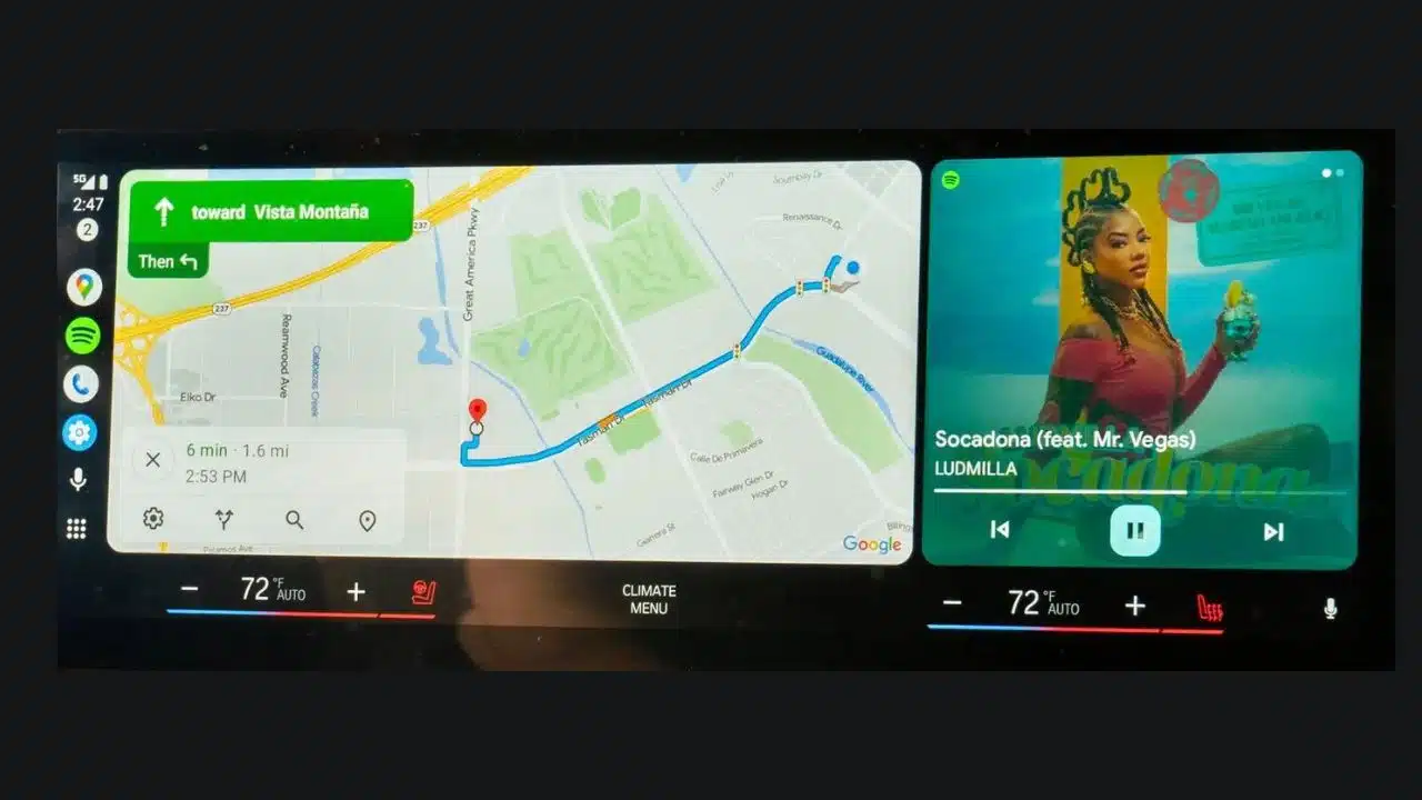
Now, Android Auto users will also experience Google Maps’ fashionable new frosty facelift. The chilled-out pastel mint greens and calming gray roads have gracefully danced their way from the Android mobile app onto the Android Auto in-car display. Not only do the maps feature trendy new colors, but the entire user interface has received a mini-makeover. Text headers and body copy, the bright azure navigation path line, and the direction cards at the top of the interface have all been touched up with the latest shade of blue. Additionally, you can also read about- Google Maps Unveils Immersive View for Routes and Enhanced Search Features
For some, the sleek facelift may take some getting used to after years of familiar, warm, and earthy visuals. However, the pared-down, cool-toned color scheme does feel modern and allows points of interest to pop up on the map. Let us know whether you enjoy Google Maps’ dramatic new style! Over time, the aesthetic may grow on even the most skeptical mapping explorers. Stay stylish!
You May Find Interest: Google Maps Gets New Accessibility Features for Blind Users; iPhone First