
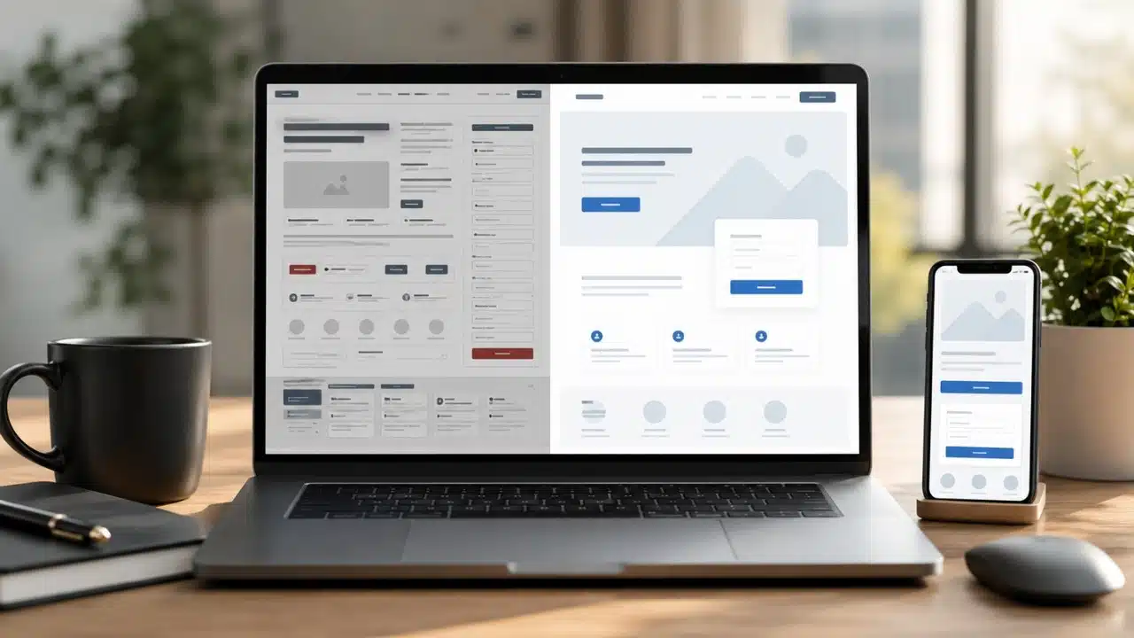
A landing page has one job: turn visiting traffic into qualified leads or paying customers. Yet, even high-budget ad campaigns frequently fail because of subtle design flaws, confusing copy, and performance bottlenecks. Identifying the most common landing page mistakes that kill conversions allows marketers and business owners to remove unnecessary friction, apply proven usability principles, and significantly increase return on ad spend (ROAS).
| Landing Page Mistake | Conversion Impact | Core UX Flaw | Immediate Fix |
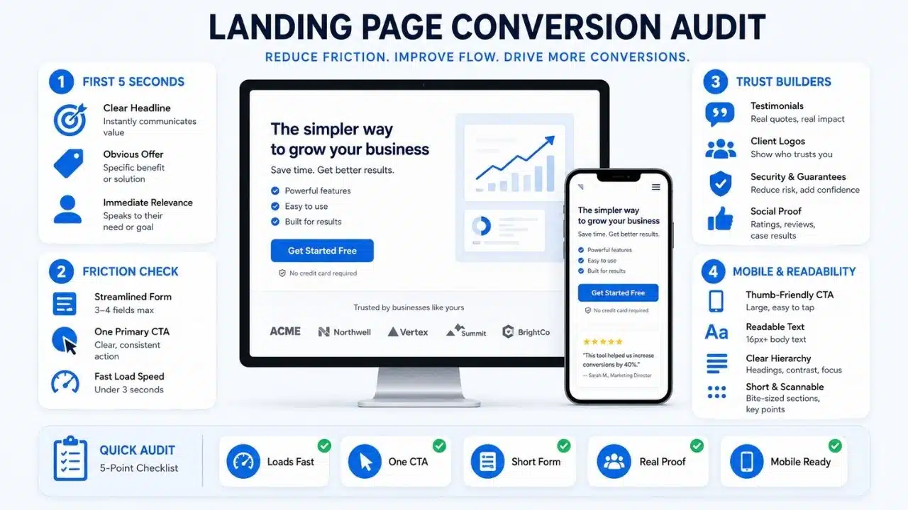
| Vague Value Proposition | High Bounce Rates | Visitors cannot determine what you offer within 5 seconds | Craft a clear H1 stating exact benefit and target audience |
| Sluggish Page Load Speed | Immediate Drop-off | Slow scripts and uncompressed assets frustrate users | Optimize assets to pass page load speed benchmarks |
| Friction-Heavy Forms | High Form Abandonment | Asking for unnecessary personal data upfront | Reduce inputs to 3–4 essential fields |
| Competing CTAs | Decision Paralysis | Multiple conflicting offers distract from primary goal | Limit the page to one unified Call-to-Action |
| Missing Trust Signals | Low User Trust | Lack of social proof, testimonials, or security badges | Add real client reviews, press logos, and security seals |
| Poor Mobile Layout | Mobile User Loss | Misaligned buttons, tiny text, and broken navigation | Implement mobile-first responsive design |
| Weak Visual Hierarchy | High Cognitive Load | Cluttered copy with no clear reading focal points | Use bold headings, bullet points, and high-contrast buttons |
7 Landing Page Mistakes That Kill Conversions
1. A Vague or Unclear Value Proposition Above the Fold
When visitors land on your page, you have roughly five seconds to communicate who you are, what problem you solve, and why they should care. If your main headline relies on vague jargon (“Empowering Next-Gen Synergies”) rather than stating a concrete benefit (“Automate Your Invoicing in Under 5 Minutes”), users will hit the back button. Your headline and sub-headline must deliver an immediate, unambiguous message before any scrolling occurs.
2. Sluggish Page Load Speed and Heavy Assets
Page performance directly dictates user retention. A delay of just two seconds can cause bounce rates to surge past 50%. Large, uncompressed hero images, bloated JavaScript bundles, and redundant third-party tracking scripts slow down rendering speed—especially on mobile networks. Compressing media assets, leveraging browser caching, and minimizing render-blocking code keep load times under the critical two-second threshold.
3. Friction-Heavy Forms Asking for Too Much Information
Requesting a user’s phone number, job title, company size, and street address on a simple newsletter signup or free trial form creates massive friction. Every additional field you add degrades completion rates. Audit your lead forms ruthlessly: request only the minimum information required to start the conversation (often just an email address) and gather additional details later through progressive profiling.
4. Competing Call-to-Action (CTA) Buttons
Offering multiple competing paths—such as “Schedule a Demo,” “Read Our Blog,” “Download Whitepaper,” and “Contact Sales”—confuses prospective buyers. When presented with too many options, users experience choice paralysis and frequently choose nothing at all. Maintain a single, focused CTA throughout the entire page, ensuring button colors contrast sharply against the background.
5. Lack of Authentic Social Proof and Trust Indicators
Visitors arrive at your landing page with natural skepticism. If your page lacks verifiable social proof—such as customer testimonials, star ratings, case study quotes, trust badges, or recognizable client logos—users will hesitate to share financial or contact data. Embed authentic, specific feedback from real clients right alongside key decision points and checkout buttons.
6. Ignoring Mobile-First Responsiveness
With more than half of global web traffic originating on mobile devices, desktop-only optimization is fatal to campaign performance. Common mobile flaws include tiny touch targets, off-screen text, overlapping graphics, and horizontal scrolling issues. Test your landing pages across multiple mobile viewport sizes to ensure fast touch responses, readable fonts, and zero layout shifting.
7. Weak Visual Hierarchy and Wall-of-Text Copy
If your landing page features dense paragraphs of unbroken text, users will not take the time to read it. Modern online readers scan content visually before deciding to read deeper. Use strong visual hierarchy: break copy into digestible chunks using bulleted lists, bold key takeaways, introduce descriptive subheadings, and leverage clean whitespace to guide the visitor’s eye straight toward the primary CTA.
What to Do Next
Run a systematic audit of your active landing pages against these seven friction points. Start by streamlining your primary headline, testing your mobile load times, and removing unnecessary form fields to see immediate improvements in lead volume and campaign ROI.
Frequently Asked Questions (FAQs) on Landing Page Mistakes That Kill Conversions
What is a good conversion rate for a landing page?
While conversion rates vary across industries, an average landing page converts between 2% and 5%. High-performing, specialized landing pages with targeted audience alignment frequently achieve conversion rates of 10% to 15% or higher.
In almost all cases, no. Removing header navigation links, footer directory links, and external social media icons keeps visitors focused entirely on your core conversion path without providing exit routes.
How long should a high-converting landing page be?
The ideal length depends on product complexity and financial commitment. Low-friction offers (like a free eBook download) perform best with short, direct pages. High-ticket enterprise services require longer landing pages with detailed feature breakdowns, comprehensive social proof, and FAQs to resolve objections.