In 2021, we first introduced a bottom search bar for the Google app. However, it wasn’t until late 2023 that we enabled a more modernized version of it.
Google is currently experimenting with a new design for the bottom bar, which includes a search field that is seamlessly integrated.
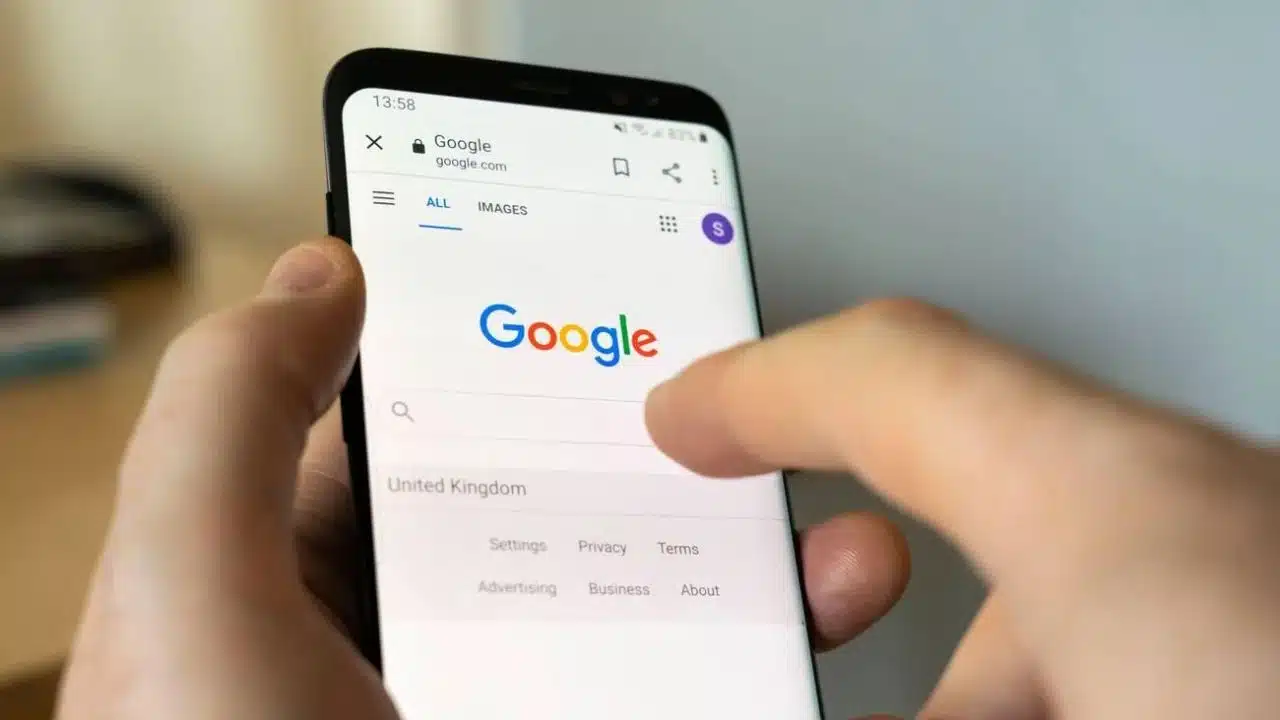
Today, a user came across the new bottom bar redesign in Google Search on Android. First of all, the app now features Material 3 design, including a pill-shaped tab indicator.
This design change was initially introduced on the iOS version but was later removed from the Android version after a short period of availability. (However, the Play Store listing showcases screenshots of the Google app.) That change alone significantly contributes to enhancing the overall consistency of this first-party application.
Located above the bottom bar is the search field, which used to be exclusively found at the top of the Discover feed. Currently, the thicker variant is not visible on the search results page. In the redesign, it stays there for the sake of consistency, even though it still appears humorously oversized. In general, the search field and bottom bar utilize a sheet container.
An issue some users have is that it occupies valuable space that could be dedicated to displaying search results. However, the “Google” logo is no longer positioned at the top, and the search filters are now immediately visible instead.
The default blue tint is used instead of Dynamic Color. It definitely catches your eye on the search results page.
The new bottom search bar redesign has a more modern look, while the Google app has been appearing a bit outdated recently. It would be great if it could be made available to more people.