
A website often serves as the digital front door to a business, but accessibility barriers can prevent many users from entering. People with disabilities may struggle to read content, navigate pages, or complete forms when a site is not properly designed.
This is similar to hosting an open event while unintentionally blocking access for part of the audience. Under Title III of the Americans with Disabilities Act, public-facing businesses are required to ensure equal access, and non-compliance may result in legal action or loss of potential customers.
For example, a visually impaired user relying on a screen reader may encounter issues if images are missing alt text or if page structure is not properly labeled. These barriers can significantly reduce usability and inclusivity.
The Department of Justice enforces ADA requirements to ensure websites provide effective communication for all users. An ADA Compliant Website follows key accessibility practices such as adding alternative text for images, improving color contrast, and ensuring full keyboard navigation support.
Standards outlined in the Web Content Accessibility Guidelines (WCAG) from the World Wide Web Consortium help guide compliance, with Level AA widely considered the benchmark for accessibility.
A clear checklist and regular testing can help identify and remove barriers, creating a more inclusive and user-friendly digital experience for everyone.
What Is ADA Compliance for Websites?
ADA compliance for websites means following the Americans with Disabilities Act of 1990 to make digital content accessible. This law sets rules for web content and mobile apps. It helps people with disabilities use sites without barriers.
Poorly designed websites create hurdles for disabled users. They block access to key info. The ADA demands that sites work with assistive technology, like screen readers and voice recognition software.
Think of it as building a ramp for a building, but online. Website design often adds needless walls. These walls stop folks from getting what they need. ADA rules push for digital inclusion.
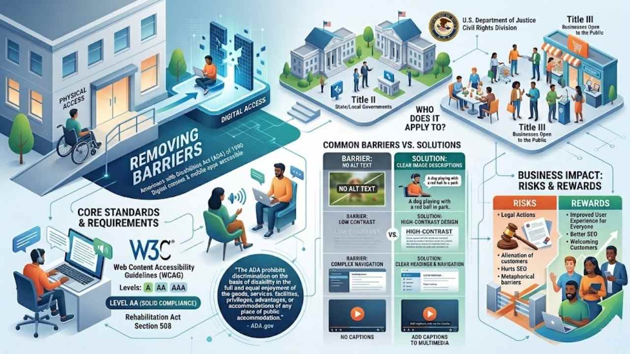
They cover public entities and businesses open to the public. Title II applies to state and local governments. Title III hits places like shops and services. The U.S. Department of Justice Civil Rights Division oversees this.
They link it to the Rehabilitation Act of 1973 and Section 508 standards.
The ADA prohibits discrimination on the basis of disability in the full and equal enjoyment of the goods, services, facilities, privileges, advantages, or accommodations of any place of public accommodation. – ADA.gov
Folks, imagine a site without alt text for images. Blind users miss out big time. Or low contrast ratios that blur text for those with visual impairments. ADA compliance fixes these issues.
It boosts user experience for everyone. Web Content Accessibility Guidelines from W3C guide the way. They offer levels like AA for solid compliance. Businesses, listen up. Lawsuits like Robles v.
Domino’s Pizza show the risks. Skip this, and you alienate customers. Plus, it hurts search engine optimization. Make your site welcoming. Use clear navigation and proper headings.
Add captions to multimedia. This way, digital accessibility shines. It’s about empathy in design, folks.
Why Website Accessibility Matters
People with disabilities face real hurdles online every day. Poorly designed websites create barriers for disabled users, making ADA compliance a critical aspect of web design and development.
Think of it like this, a site without clear and consistent navigation acts as a locked door for someone using a screen reader. The Americans with Disabilities Act (ADA) sets specific requirements to ensure that web content and mobile applications stay accessible to people with disabilities.
Businesses open to the public, under Title III, must follow these rules to promote inclusive design and web accessibility. Websites need optimization to work well with assistive technology such as screen readers, you know, those tools that read text aloud.
Images demand descriptive alt tags to share visual content with folks who have visual impairments. Without them, it’s like describing a painting to someone blindfolded, not fair at all.
Color contrast matters too; sites must provide enough between elements for readability among those with low vision. Oh, and color should only enhance, never act as the sole way to convey info, or you risk leaving people out.
Keyboard accessibility stands as an essential requirement for ADA-compliant websites, letting users navigate without a mouse. Forms require labels and inline messaging to guide users with disabilities through completion.
State and local governments, covered by Title II of the ADA, lead the way in community outreach and disability rights. The Web Content Accessibility Guidelines (WCAG) offer levels like A, AA, and AAA to help meet these standards.
Public accommodations, from shops to services, tie into this under the Civil Rights Act of 1964. Cases like Robles v. Domino’s Pizza highlight the stakes, pushing for better website accessibility.
Multimedia accessibility plays a big role here, with captioning making videos usable for those with hearing issues. Business owners, listen up, the U.S. Chamber of Commerce supports efforts through resources like Chamber Finder.
Web and mobile app accessibility boosts your reach, inviting everyone in. Congress backs this push, with notices of proposed rulemaking (NPRM) in the Federal Register shaping the future.
Entities like Amtrak and Civic Plus show how transportation and local services commit to these ideals in Washington, DC. Level AAA standards raise the bar for top-notch inclusive design.
Poor design setups spawn unnecessary barriers that block people with disabilities from content, plain and simple.
Who Needs to Comply with ADA Requirements?
Hey, if you’re running a site for folks in the U.S., you gotta know the ADA hits state governments and city offices hard under Title II, plus shops and services open to everyone under Title III, like in that eye-opening Robles v.
Domino’s Pizza court fight, and with the notice of proposed rulemaking shaking things up, it’s smart to check if your spot fits the bill—curious for the full scoop? Stick around!
State and local governments (Title II)
State and local governments operate under Title II of the ADA. They must follow rules that keep their websites open to everyone, including folks with disabilities. Poorly designed sites build walls, you know, like invisible fences that shut out users who rely on screen readers or other tools.
The ADA spells out clear steps to fix this, pushing for things like strong color contrast and keyboard-friendly navigation. Think of it as rolling out the welcome mat for all visitors, no exceptions.
The ADA’s promise to provide an equal opportunity for individuals with disabilities to participate in and benefit from State and local government services will only be fulfilled if governments use accessible means to deliver those services. – From the notice of proposed rulemaking by the Department of Justice.
Courts have spotlighted this in cases like Robles v. Domino’s Pizza, showing how barriers in digital spaces hit hard. Governments optimize sites to work with assistive tech, adding alt tags for images and labels on forms.
Color acts just as flair, not the main way to share info. This setup lets everyone navigate smoothly, dodging those unnecessary hurdles that make access tough.
Businesses open to the public (Title III)
Title III of the ADA covers businesses open to the public, like stores, restaurants, and online services. These places must make their websites accessible to people with disabilities.
Think of it as opening the door wide for everyone, not just a select few. The law demands specific steps, such as adding descriptive alt tags to images so screen readers can describe visuals.
Websites also need enough contrast between elements for better readability, especially for those with visual impairments. Clear, consistent navigation helps users move around easily, and keyboard accessibility lets folks browse without a mouse.
Plus, forms require labels and inline messages to guide completion smoothly.
A landmark case, Robles v. Domino’s Pizza, showed how poorly designed websites create real barriers for disabled users. The court ruled that businesses must optimize sites to work with assistive technology, like screen readers.
Color can’t be the only way to share info; use it just for flair. Businesses, you avoid lawsuits and build goodwill by fixing inaccessible forms and ensuring multimedia has captions.
This approach turns potential headaches into smooth sailing for all visitors.
Common Website Accessibility Barriers
You’re trying to shop online with a screen reader, but the site throws up roadblocks like invisible images or buttons that vanish without a mouse—yikes, right, these everyday hurdles can shut out folks with disabilities, so stick around to uncover simple fixes that open doors for everyone.
Lack of alt text for images
Images without alt text act like locked doors for folks with visual impairments. Think about it, you post a funny cat photo on your site, but someone using a screen reader hears nothing.
That silence creates a big barrier. Screen readers rely on descriptive alt tags to explain pictures. Add those tags, and you open up your content to everyone. People with disabilities miss out on key info without them.
Website design flaws like this make access tough or impossible.
Fix this by writing clear alt text for every image. Describe what matters most in the picture. For example, tag a button image as “Search button” instead of leaving it blank. This step boosts ADA compliance and helps assistive tools work smoothly.
Users navigate better, and your site feels welcoming. Poorly designed sites build walls for disabled visitors, so knock them down with simple tags.
Insufficient color contrast
Poor color contrast trips up many sites, creating real hurdles for users with visual impairments. Think of it like wearing sunglasses indoors, everything gets murky and tough to make out.
Websites need strong contrast between text and backgrounds to boost readability, as the ADA demands. You fix this by checking ratios, say aiming for at least 4.5 to 1 for regular text.
Tools like the WebAIM Contrast Checker help spot issues fast.
Don’t rely on color alone to share info, that leaves people out in the cold. Use patterns or labels too, for enhancement. Picture a graph where red means stop and green means go, but without extra cues, it’s confusing for color-blind visitors.
ADA rules push for this balance, keeping everyone in the loop. Grab a contrast tool and test your palette today, it makes a world of difference.
Inaccessible forms
Forms create big headaches for folks with disabilities when designers skip the basics. Think about it, a form without clear labels acts like a locked door with no key, leaving screen reader users stuck and frustrated.
The ADA demands specific fixes, like adding labels and inline messages to guide everyone through. Poorly designed websites build these barriers, but you can dodge them by optimizing forms for assistive tech, such as screen readers that read aloud.
Imagine filling out a job application blindfolded, that’s the mess inaccessible forms cause. Keyboard accessibility plays a key role here, letting users tab through fields without a mouse.
Websites must work hand-in-hand with tools like JAWS or VoiceOver, and forms need those helpful labels to make completion a breeze. Color alone can’t signal errors, use text cues instead for real ADA compliance.
Poor keyboard navigation trips up many users, especially those who rely on keyboards instead of a mouse. Imagine trying to hop from link to link, but everything feels like a messy obstacle course.
People with motor disabilities face this barrier daily, and it blocks them from exploring your site fully. Keyboard accessibility stands as an essential requirement for ADA-compliant websites, folks.
Sites must work smoothly with assistive tech, like screen readers, to avoid these traps. Poorly designed spots create unnecessary hurdles, turning simple tasks into frustrations.
Fix this by building clear paths that let users tab through elements without skips or traps. Think of it as laying out a smooth sidewalk, not a bumpy trail. Developers, you know how vital this is for everyone to access content.
Clear and consistent navigation marks a key step in making websites ADA compliant, after all. Such barriers highlight why ADA compliance plays a critical role in web design, keeping things open for disabled users.
Guidelines for ADA-Compliant Websites
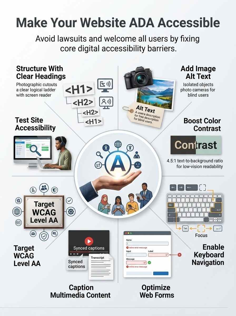
Want your site to welcome everyone, like a cozy front porch for all guests? Follow the Web Content Accessibility Guidelines, or WCAG, which set the gold standard for making web pages work for people with disabilities, from basic fixes in Level A to top-tier tweaks in Level AAA.
Web Content Accessibility Guidelines (WCAG) Overview
WCAG sets the gold standard for making websites accessible, folks. These guidelines, from the World Wide Web Consortium, help creators build sites that everyone can use, no matter their abilities.
Think of them as a roadmap, dodging those pesky barriers that pop up in poor designs. They tie right into ADA rules, pushing for web content and apps that welcome folks with disabilities.
Assistive tools, like screen readers, work best when sites follow these steps.
Levels A, AA, and AAA break it down simply. Start with A for basic fixes, like adding alt text to images. AA amps it up, demanding strong color contrast for better readability. AAA goes all out, with captions for videos and more.
Pick your level based on needs, but aim high to knock down those access walls. Poor setups create real hurdles, so weave in clear navigation and keyboard-friendly paths.
Level A, AA, and AAA Standards
You know, making your website follow WCAG levels can feel like climbing a ladder, each step building on the last to help folks with disabilities access your content without a hitch.
| WCAG Level | What It Means | Key Requirements and Examples |
|---|---|---|
| Level A | This base level sets the minimum bar for accessibility, fixing the biggest barriers that block people with disabilities from your site. |
|
| Level AA | Most sites aim here; it tackles common issues and boosts usability for a wider group, including state and local governments under Title II, plus public businesses under Title III. |
|
| Level AAA | The top tier goes all out for the best access, though it’s tough to hit fully; think of it as the gold standard for empathy in web design. |
|
ADA Compliance Checklist
Picture your website as a welcoming front door that everyone can open, no matter their abilities. Dive right in with these key steps, like adding alt text to pictures and fixing color contrasts, to keep visitors coming back for more.
Use appropriate headings and page structure
Headings and page structure form the backbone of your website’s accessibility. They help users, especially those with disabilities, find their way around without hitting roadblocks.
- Start with logical headings like H1 for main titles, H2 for sections, and so on, because this setup lets screen readers announce content in a clear order, just like a well-organized book guides you through chapters.
- Organize your page with a clean hierarchy that avoids clutter, since poor design creates barriers for disabled users, and clear structure acts as a roadmap for assistive tech like screen readers.
- Add semantic HTML elements, such as
for top navigation and for core content, to boost compatibility with tools that help people with visual impairments read your site aloud. - Keep navigation consistent across pages, a vital move for ADA rules, as it prevents confusion and lets keyboard users jump between sections without extra hassle.
- Skip decorative headings that lack real purpose; instead, use them to break up text meaningfully, turning your site into a smooth path rather than a maze for folks relying on voice output devices.
- Test how headings work with screen readers during development, because websites need optimization for these tools to meet ADA standards and avoid those unnecessary barriers from bad setup.
- Label all structural elements properly, so color alone never conveys info, and users with low vision get the full picture through audio cues or magnified views.
Add alternative text for images
Images play a big role in websites, but they can shut out folks with disabilities if not handled right. Add alt text to fix that, and make your site open to everyone, like a welcoming door instead of a locked gate.
- Descriptive alt tags turn images into words for screen readers, so people with visual impairments get the full picture, no barriers in sight.
- Skip alt text, and you create unnecessary roadblocks, just like fact number one warns about poor website design blocking access for disabled users.
- Alt text must describe the image’s purpose, not just say “image of a cat,” to convey info without relying on color alone, tying into fact nine’s rule on using color only for enhancement.
- Screen readers, those key assistive tools from fact seven, read alt text aloud, optimizing your site for folks who can’t see the visuals.
- Poorly designed sites with missing alt text build barriers, as fact ten points out, making ADA compliance vital to knock those walls down.
- Alt tags boost readability for everyone, much like good contrast from fact four helps those with visual issues spot text against backgrounds.
- Think of alt text as a helpful whisper in the ear, guiding users through content that eyes alone might miss, keeping things fair and inclusive.
Ensure proper color contrast
Color contrast plays a big role in making websites easy to read. It stops barriers for folks with visual impairments, like low vision or color blindness.
- Check your site’s text and background colors against WCAG standards, which call for a ratio of at least 4.5 to 1 for normal text and 3 to 1 for large text, so everyone can spot the words without squinting.
- Use tools like the WebAIM Contrast Checker to test combinations quickly; plug in your hex codes, and it shows if they pass or fail, saving you from guesswork.
- Avoid relying on color alone to share info, such as red for errors or green for success, because some users can’t tell them apart; add icons or text labels instead, like a checkmark with “All good.”
- Pick foreground and background shades that provide enough difference for readability, as the ADA requires this to help people with disabilities access content without extra hassle.
- Test your design in grayscale mode to see if elements still stand out, acting like a quick gut check for those who see colors differently.
- Poor color choices create real roadblocks, turning a site into a maze for disabled users, so aim for contrasts that pop and make navigation a breeze.
Keyboard navigation lets users move through your site without a mouse, a big win for folks with motor disabilities. It ties right into ADA compliance by making sure everyone can access content easily, just like clear paths in a physical store.
- Test your site with tools like JAWS or NVDA to confirm it works well with screen readers, since websites must pair up with assistive tech for full access.
- Add focus indicators that pop up clearly when users tab through elements, helping those who rely on keyboards spot where they are on the page.
- Structure your links and buttons in a logical order, so people can jump from one section to the next without getting lost, like following a well-marked trail.
- Skip complex scripts that block keyboard use, and opt for simple code that keeps navigation smooth and consistent, knocking down those barriers for disabled users.
- Train your team on why keyboard access matters, sharing stories of folks who couldn’t shop online before, to build empathy and drive better web design.
- Check forms for tab-friendly fields with labels that guide users step by step, turning a frustrating maze into a straightforward path.
- Use ARIA labels where needed to boost hidden cues for assistive tools, ensuring no one misses key info during navigation.
Optimize forms for accessibility
Forms play a big role in how users interact with your site, especially those with disabilities. You can make them better by focusing on clear labels and helpful messages to guide folks through.
- Add labels to every form field so screen readers like JAWS or NVDA can announce them clearly, helping users with visual impairments understand what to enter without confusion.
- Use inline messaging for errors and tips, popping up right where needed to guide people step by step, like a friendly whisper saying, “Hey, that email looks off, try again.”
- Check color contrast in forms to meet standards, since low contrast creates barriers for those with low vision, and note that color alone can’t convey key info like required fields.
- Optimize forms to work smoothly with assistive tools, ensuring folks using voice commands or braille displays can fill them out without hitting roadblocks.
- Structure forms with proper headings and groups, making it easy to move around for keyboard users who skip the mouse, because poor setup turns simple tasks into mazes.
- Include descriptive placeholders and instructions that don’t vanish when focused, acting like a helpful map for users with cognitive challenges to complete the process without getting lost.
Make multimedia content accessible with captions
Multimedia content, like videos and audio clips, adds real punch to your website. Captions turn that content into something everyone can enjoy, no matter their hearing abilities.
- Add captions to videos so deaf or hard-of-hearing users follow along, because ADA requirements demand that web content stays accessible to people with disabilities, just like fact two points out.
- Use closed captions that sync with spoken words, think of them as subtitles in a movie, they help screen readers and other assistive tech work smoothly, tying right into fact seven about optimizing sites for those tools.
- Include transcripts for audio files, it’s a simple step that knocks down barriers from poorly designed websites, as fact ten warns, and keeps your site from creating unnecessary hurdles for disabled users per fact one.
- Check color use in captions, avoid relying on it alone to convey info, echo fact nine, since folks with visual impairments need clear text without color tricks.
- Test captions with real users, maybe share an anecdote from a friend who relies on them daily, it shows empathy and ensures your multimedia doesn’t exclude anyone under ADA rules for web content.
Testing Your Website for ADA Compliance
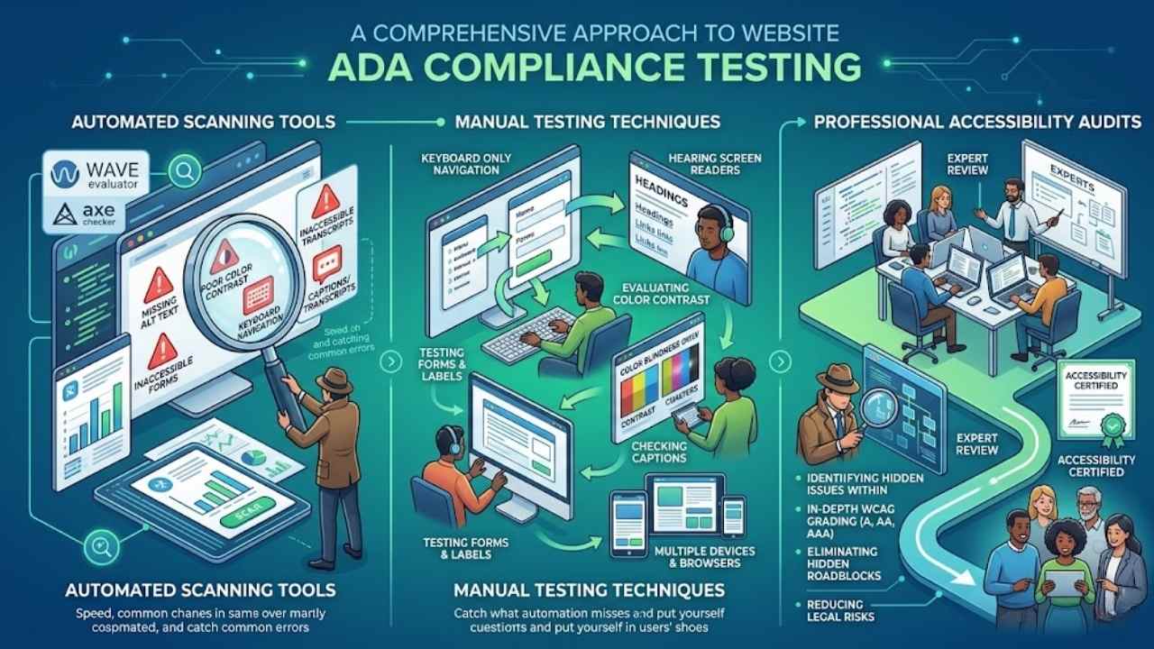
8. Testing Your Website for ADA Compliance: You fixed up your site for better access, so now grab tools like the WAVE evaluator or Axe checker to spot errors fast, pair that with hands-on checks using keyboard controls and screen readers to feel out real user snags, and top it off with expert reviews from pros who dig into tricky spots, like a detective hunting clues in a mystery novel—curious for the full scoop? Stick around.
Automated scanning tools
Automated scanning tools act like digital detectives for your website. They spot accessibility issues fast, such as missing alt text on images or weak color contrast that hurts folks with visual impairments.
Tools like WAVE or Axe run quick checks, highlighting barriers that make content tough for people with disabilities. Imagine them as your first line of defense, catching problems before users face frustration.
You load your site, hit scan, and get a report on spots needing fixes, like poor keyboard navigation or inaccessible forms.
These tools tie right into WCAG standards, helping you meet ADA requirements for state governments and public businesses. They flag issues with multimedia captions or labels on forms, ensuring sites work well with screen readers.
Sure, they’re not perfect, they miss some manual checks, but they save time and guide you toward better design. Think of it as a helpful buddy pointing out hidden traps, so you build a site everyone can use without barriers.
Manual testing techniques
Manual testing lets you catch accessibility problems that automated tools might overlook, like how real users with disabilities experience your site. Think of it as putting yourself in their shoes, spotting barriers firsthand to boost ADA compliance.
- Test keyboard navigation by ditching your mouse and using only the tab key, arrow keys, and enter to move around the site; this reveals if poor keyboard access creates barriers for disabled users, a key ADA requirement, since websites must work with assistive tools like screen readers.
- Check alt text for images by turning off images in your browser or using a screen reader tool, then listen or read to see if descriptive tags make visual content clear; without them, people with visual impairments miss out, turning your site into an unnecessary roadblock.
- Evaluate color contrast with a simple tool or by eye, comparing text and background colors to meet WCAG standards; low contrast hurts readability for those with visual issues, so aim for ratios that follow guidelines and avoid using color alone to convey info.
- Try filling out forms without a mouse, relying on keyboard input, and look for clear labels plus helpful error messages; inaccessible forms frustrate users with disabilities, violating ADA rules that demand optimized setups for easy completion.
- Navigate the site with a screen reader active, like JAWS or NVDA, to hear how headings, links, and structure come across; inconsistent navigation breaks ADA compliance, making it tough for assistive tech to guide users smoothly.
- Play multimedia content without sound or visuals to test captions and transcripts; this step uncovers barriers for deaf or blind users, aligning with ADA needs for accessible media that everyone can enjoy.
- Browse the site on different devices and browsers to spot inconsistent behaviors, such as forms that glitch on mobile; this hands-on check helps eliminate design flaws that create hurdles, keeping your web content open to all under Title III rules for public businesses.
Professional accessibility audits
Professional accessibility audits bring in experts to spot barriers that automated tools might miss. These pros dive deep into your site’s setup, checking things like alt text for images and color contrast ratios.
They test how well forms guide users with labels and messages, ensuring everything works with screen readers. Imagine hiring a detective to uncover hidden issues; that’s what these audits do for ADA compliance.
Experts review keyboard navigation too, making sure no one gets stuck.
Teams often use guidelines like WCAG to grade your site against levels A, AA, or AAA. They catch problems with multimedia captions and poor page structure that block access for people with disabilities.
This step helps fix barriers in web design, turning your site into a welcoming space for all. Plus, it avoids legal headaches down the road.
Final Words
You’ve learned how to spot barriers like missing alt text and poor color contrast, and fix them with WCAG standards. These steps, from adding captions to testing with keyboard navigation, prove simple and quick to apply.
What stops you from checking your site today? Making your website accessible opens doors for everyone, boosts user satisfaction, and avoids legal headaches. Dive into tools like automated scanners or hire experts for audits, and watch your online space thrive.
Frequently Asked Questions (FAQs) about ADA-compliant websites
1. What does ADA mean for my website, and why should I care?
ADA stands for Americans with Disabilities Act, and it pushes for websites that everyone can use, no matter their abilities. Think of it like opening your front door wide, so no one gets left out. Making your site compliant isn’t just nice; it keeps you out of hot water legally, and hey, it boosts your audience too.
2. How can I fix color contrast to make my site accessible?
Start by checking if text pops against backgrounds. Use tools to measure ratios, aiming for at least 4.5 to 1. Poor contrast is like trying to read a whisper in a storm; fix it, and folks with low vision will thank you.
3. What’s the deal with alt text for images?
Alt text describes pictures for screen readers. Write short, clear descriptions that capture the essence. It’s your way of painting a picture with words, ensuring no one misses the show.
4. How do I make sure my site works well with keyboards?
Test navigation without a mouse; use tabs and arrows to move around. Skip the fancy hover effects that need pointing. This setup is a lifesaver for people who can’t use a mouse, turning potential frustration into smooth sailing.