Several factors lead to a better user experience for an online business and make customers happy. Retailers are always looking for ways to boost online revenue, but they often miss one crucial aspect- checkout page optimization.
Instead, many online business owners and managers optimize the website’s front end –– creating attractive designs, user experiences, and merchandising products to guide customers down a purchase funnel.
That’s reasonable. After all, this is your customer’s first impression of your company and your first chance to persuade them to stay, browse, and purchase.
When it comes to purchasing, an online store’s checkout takes precedence over all other website elements, including CTA buttons.
But, first, let us know what a checkout page is?
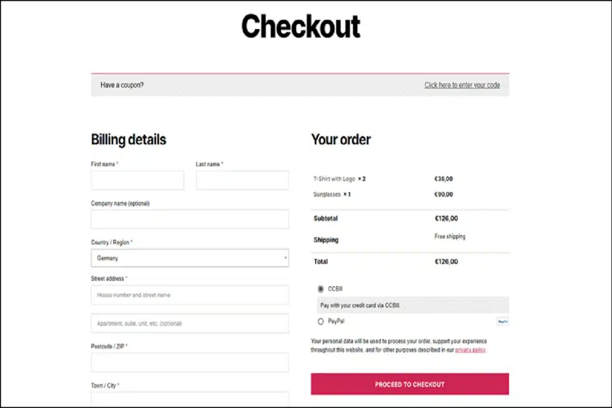
A checkout page is a final page where the transaction is completed. Because online stores frequently experience cart abandonment, making the checkout page as user-friendly as possible is critical.
This is where the customer makes the payment and provides delivery information and the relevant contact information. You can relate the online checkout process similar to any offline checkout process.
It has two variations:
- One-Page Checkout
- Multi-Page Checkout
One-page checkout:
Many companies hope that customers will finish their purchases as soon as possible. Customers can enter all of their information and confirm their purchase without visiting another window, saving them time. The consumers fill in the information on a single window in this checkout process.
Benefits:
- It is quicker. Even though the number of form fields to fill is roughly the same for single-page and multi-page checkouts, the one-page checkout takes less time to complete.
- Customers don’t have to navigate between pages to edit or change the information they entered because all fields are on the same page. It eliminates the possibility of shoppers abandoning their purchases.
Multi-Page Checkout:
Customers navigate through several pages during the checkout process before completing their purchase. Because it’s widely assumed that customers abandon their carts when they have more time to think about their upcoming purchase, this method isn’t as popular as one-page checkout.
However, splitting your checkout process into multiple steps increases your chances of capturing customer data, even if they abandon the cart later.
Benefits:
- It’s much easier to create a clean, minimalistic layout design when the forms are spread across multiple pages, giving the impression that the checkout process is quick and straightforward.
- Even if they abandon the cart later, you have a better chance of capturing customer data.
Each type of checkout page comes with its pros and cons. It depends on the retailers and with what intent they will design the checkout page. But whatever the case is, retailers must ensure that the checkout page should be successful. It must either enable a smooth checkout or gather your relevant customer data.
Regardless of the type of page, there are specific strategies that a retailer must follow to keep the game on point:
- Make the procedure as quick and straightforward as possible. Even if you’re going to go with a multi-page checkout, you can help alleviate some of the hassles.
- Suppose you’re trying to collect more data. In that case, you can also give them the option to log in via social media or Gmail or ask them to register on the thank you page, but be sure to remove the registration barrier to increase conversions.
- As soon as possible, get your customer’s email address. This is the only way to get them to return to the checkout page if they abandon their cart.
- Another essential strategy is to remove any distracting images or text, allowing customers to focus more on their upcoming purchases.
- Minimizing the risks associated with online shopping will encourage your customers to complete their purchases. Add security seals and payment logos and a money-back guarantee or free refunds option.
- Allowing your customers to quickly and easily resume their shopping by offering the option to save the entire cart or individual products for later will increase the likelihood that they will return to complete the order.
So, how do you create the ideal checkout page?
Perfection differs depending on your product and target market. Consider the difference between purchasing a high-end designer item and purchasing office stationery. You’ll want to think about one purchase while paying for the other with a single click. No two eCommerce websites are alike, and neither should their checkout processes.
Final word: The only way to discover your version of perfection is to keep testing to see what works. It’s critical to test the possibilities systematically. You can apply different test methods to improve user satisfaction or know what fits well into your system.