

Mobile SEO best practices are no longer just about making a website “fit” on a phone screen. That was the old version of mobile optimization. In 2026, mobile SEO is about how fast your page feels, how easy it is to read, how cleanly Google can crawl it, and whether the mobile version gives readers the same value as the desktop version. This matters even more for publishers.
A reader may find your article through Google, open it during a commute, skim it between tasks, or leave within seconds if the page feels slow, crowded, or broken. The content may be excellent, but a poor mobile experience can quietly damage performance.
The real goal is simple. Your mobile page should load fast, show the full content, avoid frustrating users, and help search engines understand the page without extra work.
This guide explains mobile SEO in a practical way for publishers, bloggers, editors, and content teams who want stronger technical SEO without turning every article into a developer project.
Why Mobile SEO Still Matters in 2026
Mobile SEO matters because most search journeys now start, continue, or finish on a small screen.
Even when someone does deeper research later on a desktop, the first touch often happens on mobile. They search a question, tap a result, scan the intro, check headings, look at the date, and decide whether the page is worth their time. That decision happens fast.
For publishers, mobile SEO affects more than rankings. It affects engagement, ad performance, newsletter signups, affiliate clicks, and trust. A slow mobile article can lose readers before they even see the main point. A cluttered layout can make a helpful guide feel unreliable. A broken menu can bury important pages that should be easy to reach.
Mobile-first indexing also changed the way publishers need to think. Google mainly uses the mobile version of a page for crawling, indexing, and ranking. That means the mobile version is not a secondary version anymore. It is the version that must carry the content, structure, links, metadata, and user experience properly.
If your desktop page is strong but your mobile page is thin, slow, or poorly structured, you have a technical SEO problem.
What Mobile SEO Means Today
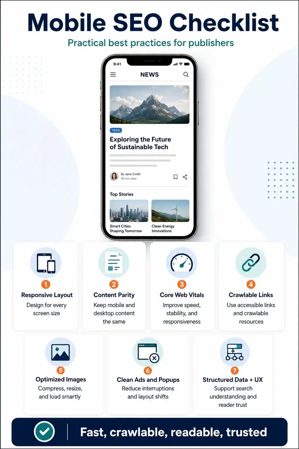
Mobile SEO in 2026 is the practice of making your pages easy to crawl, easy to load, easy to read, and easy to use on mobile devices.
It includes several areas:
- Responsive design
- Mobile-first indexing
- Core Web Vitals
- Internal linking
- Image optimization
- Ad layout
- Navigation
- Structured data
- Readable content formatting
- Crawlable resources
- User experience
The mistake many site owners make is treating mobile SEO as a design issue only. They check whether the page looks acceptable on a phone and stop there. That is not enough.
A page can look fine and still fail mobile optimization SEO. The layout may resize, but the hero image may be too heavy. The article may display, but the internal links may be hidden behind JavaScript. The menu may open, but the tap targets may be too small. The content may exist on desktop, but parts of it may be missing on mobile.
Good mobile SEO connects design, speed, content, and technical structure.
1. Use Responsive SEO as the Foundation
Responsive SEO means your website uses one URL and adapts the layout to different screen sizes. This is usually the cleanest setup for publishers because it avoids the problems that often come with separate mobile URLs or dynamic serving.
With responsive design, the same page can work across desktop, tablet, and mobile. The content stays in one place. The URL stays the same. Internal links are easier to manage. Canonicals are cleaner. Analytics are easier to understand.
For most publishers, this is the right direction. A responsive page should not simply squeeze a desktop layout into a narrow screen. It should be designed from the mobile experience upward.
That means:
- The headline should be readable without zooming.
- The intro should appear quickly.
- Images should resize properly.
- Tables should not break the screen.
- Buttons should be easy to tap.
- Menus should be simple.
- Ads should not push content too far down.
- Paragraphs should be short enough for phone reading.
Responsive SEO is not only a developer decision. Editors also play a role. If your article uses long headings, giant tables, heavy embeds, and oversized images, the mobile experience can suffer even when the theme is responsive. The best mobile pages feel intentionally designed for real readers, not automatically compressed for smaller screens.
2. Keep Mobile and Desktop Content Equivalent
One of the most important mobile SEO best practices is simple: do not give mobile users a weaker version of the page.
If the desktop article has full content, FAQs, author information, images, internal links, structured data, and important supporting sections, the mobile version should not remove those elements in a way that changes the value of the page.
This is especially important for publishers. Many sites hide or remove content on mobile to make the page feel shorter. That can create problems if important context, internal links, or supporting sections disappear from the mobile version. Mobile users should get the same useful information, even if the layout changes.
It is fine to use accordions, tabs, collapsible sections, or reordered layouts when they improve usability. The key is that the content should still be available and accessible.
For example, a publisher may place FAQs inside accordion sections on mobile. That is usually fine if the FAQ content is still present in the HTML and accessible to users. But if the mobile page removes the FAQs entirely while the desktop version keeps them, that creates inconsistency.
The same applies to author bios, publication dates, updated dates, article summaries, image captions, tables, and internal links.
A good rule is this: Design can change between desktop and mobile. Value should not.
3. Make the First Screen Useful and Fast
The first screen on mobile is valuable. It decides whether readers stay or leave. Many publishers waste this space with a huge logo area, oversized ad slot, cookie banner, newsletter popup, large empty gap, or hero image that loads slowly. By the time the reader reaches the first sentence, frustration has already started.
The first mobile screen should answer three questions quickly:
- Am I on the right page?
- Is this content trustworthy?
- Can I start reading without fighting the layout?
You do not need to remove branding or monetization. But you do need balance.
A strong mobile article page usually has:
- A clear headline
- A short visible intro
- A readable font size
- A visible author or publication signal
- A fast-loading main image or no unnecessary hero delay
- No aggressive overlay blocking the content
- Clean spacing
- Simple navigation
For publishers, the intro matters a lot on mobile. Readers often decide within the first few lines whether the article understands their problem. Avoid slow, generic openings. Start with the reader’s pain point and make the value clear.
This also supports SEO because engaged readers are more likely to scroll, click internal links, share the page, and return to the site.
4. Improve Core Web Vitals on Mobile First
Core Web Vitals are not just technical scores. They reflect how a page feels to real users.
For mobile SEO, focus on three areas:
- Largest Contentful Paint, or LCP, measures loading performance.
- Interaction to Next Paint, or INP, measures responsiveness.
- Cumulative Layout Shift, or CLS, measures visual stability.
In practical terms, ask yourself:
- Does the main content appear quickly?
- Can users tap and scroll without delay?
- Does the layout jump while ads, images, or fonts load?
Publisher sites often struggle here because they use ads, analytics scripts, social embeds, recommendation widgets, video players, newsletter popups, and large images. Each one may feel small on its own. Together, they can make a mobile page heavy.
The biggest mobile fixes usually come from:
- Compressing and resizing images
- Avoiding lazy loading for the main above-the-fold image
- Reducing unnecessary scripts
- Loading ads without causing layout shifts
- Setting width and height for images and embeds
- Using faster hosting and caching
- Removing unused CSS and JavaScript
- Limiting third-party widgets
- Preloading important fonts carefully
- Testing real article templates, not only the homepage
Do not judge mobile speed by the homepage alone. Publishers often have fast homepages and slow article pages. Test the templates that bring organic traffic: news posts, evergreen guides, listicles, reviews, category pages, author pages, and tag pages.
Mobile users feel every delay more sharply because their network, device, and attention span vary widely.
5. Make Primary Content Crawlable
Mobile-first indexing means Google needs to access the mobile version clearly. If your main content depends on user actions or blocked resources, you may create indexing problems.
Avoid hiding primary content behind actions that search engines may not trigger. For example, do not require users to tap, swipe, type, or load more just to reveal the main article text.
This matters for:
- Article body content
- Internal links
- FAQ sections
- Product recommendations
- Author details
- Related articles
- Category links
- Pagination
- Images
- Structured content blocks
Lazy loading can help performance, but it must be implemented carefully. Lazy loading below-the-fold images is usually useful. Lazy loading the main content or the main image incorrectly can hurt crawling and page experience.
The same applies to JavaScript-heavy sites. If important article content, links, or metadata appear only after scripts run, test whether search engines and users can reliably access them.
For most publishers, simple HTML still wins. The cleaner your article structure is, the easier it is for search engines, browsers, assistive technologies, and readers to process it.
6. Keep Internal Links Easy to Find and Easy to Crawl
Internal linking is a major part of mobile SEO. It helps readers discover related content and helps search engines understand your site structure.
For example, If you want to strengthen your full site foundation, read our complete guide on technical SEO for publishers.
That kind of link works because it helps the reader move from a specific mobile SEO topic to the broader pillar. On mobile, internal links need extra care. Many publishers hide navigation, related articles, breadcrumbs, and category links too deeply on small screens. This can weaken discovery.
Good mobile internal linking includes:
- Clear contextual links inside the article
- Related articles after useful sections
- Clean category links
- Crawlable menu links
- Readable anchor text
- No empty buttons or icon-only links without context
- No links that rely only on JavaScript click events
- Enough spacing between tappable links
Avoid stuffing internal links into every paragraph. That feels unnatural and can distract readers. A few strong links with clear anchor text are better than many weak links. Mobile readers are often skimming. Put internal links where they match intent.
7. Design Article Templates for Mobile Reading
Mobile SEO is not only about crawlers. It is also about reading comfort. A publisher can have strong content and still lose readers because the mobile layout feels exhausting. Long paragraphs, small fonts, tight line spacing, wide tables, and cluttered side elements can make a page hard to read.
A mobile-friendly article template should support scanning.
- Use short paragraphs.
- Use clear H2 and H3 headings.
- Keep intros tight.
- Use bullets when they make reading easier.
- Break long sections into smaller parts.
- Avoid giant blocks of text.
- Keep tables simple.
- Use summary boxes when useful.
- Make images support the content.
- Avoid decorative clutter.
This is where editorial SEO and technical SEO meet. For example, a 3,000-word evergreen guide can work well on mobile if it has clean sections, practical headings, and short paragraphs. But the same article can feel heavy if every section is dense and slow to scan.
The goal is not to make content shallow. The goal is to make depth easier to read.
8. Optimize Images for Mobile Performance
Images are one of the biggest mobile SEO problems for publishers. A featured image may look good on a desktop but load too slowly on mobile. A listicle may use several large images that increase page weight. An infographic may be unreadable on a small screen. A stock image may add no value but still slow the page. Use images carefully.
For mobile SEO, images should be:
- Compressed
- Properly sized
- Served in modern formats when possible
- Responsive across screen sizes
- Relevant to the content
- Given descriptive alt text when needed
- Loaded in the right order
- Not larger than necessary
- Not causing layout shifts
Avoid lazy loading the image that is likely to become the LCP element. This is often the hero image or main above-the-fold image. If that image loads late, the page feels slower.
For evergreen publisher content, every image should earn its place. A practical screenshot, simple diagram, comparison visual, or original infographic can improve the page. A generic decorative image usually does less.
Also, check image captions on mobile. Captions can build trust, especially for data, charts, product images, and original visuals.
9. Be Careful With Ads, Popups, and Sticky Elements
Publishers need revenue. Ads are part of the business. But on mobile, ads can quickly damage user experience. The problem is not the ads themselves. The problem is intrusive placement.
Common issues include:
- Ads pushing the main content too far down
- Sticky ads covering text
- Popups blocking the intro
- Newsletter forms are appearing too early
- Video ads are autoplaying aggressively
- Ad slots are causing layout shifts
- Multiple monetization widgets are stacking on small screens
A reader who arrives from a search wants the answer first. If they have to close two pop-ups, wait for ads, and scroll past a large banner before reading, the page feels low quality. A better approach is to make monetization predictable and controlled.
- Reserve space for ad slots.
- Avoid sudden layout jumps.
- Delay non-essential popups.
- Keep sticky elements small.
- Make close buttons easy to tap.
- Do not block the main content immediately.
- Review ad density on real phones.
This is especially important for evergreen content. Evergreen articles are meant to keep earning traffic over time. If the mobile experience is annoying, the page may underperform even if the content is strong.
10. Use Structured Data Consistently on Mobile
Structured data helps search engines understand the page. For publishers, this may include Article, NewsArticle, BlogPosting, BreadcrumbList, FAQPage where appropriate, Organization, Person, and image properties.
The key is consistency. The structured data should match the visible content on the page. Do not mark up content that users cannot see. Do not add fake FAQs, fake ratings, or irrelevant schema just because a plugin allows it.
For mobile SEO, check that structured data is not only present on desktop templates. It should also be available on the mobile version.
Important publisher checks include:
- Headline matches the article title.
- Author information is accurate.
- Published and modified dates are correct.
- Images are crawlable.
- FAQ markup matches visible FAQs.
- Breadcrumb data reflects the real site structure.
- Organization details are accurate.
- The schema is not duplicated by multiple plugins.
Structured data will not guarantee rich results. But clean markup can help search engines understand your content better.
Navigation is often where mobile SEO quietly breaks. Desktop sites have more room. They can show menus, categories, search bars, breadcrumbs, sidebars, and related posts. Mobile sites usually hide these behind icons, drawers, accordions, or footer menus.
That is fine if the navigation still works. But if users cannot find your main categories, or Google cannot crawl important links, the mobile version becomes weaker.
A publisher’s mobile menu should include:
- Main categories
- Search option
- Homepage link
- Important pillar pages
- About page
- Contact page
- Author or editorial policy links if relevant
- Clear labels
- Crawlable links
Avoid making the menu too deep. A reader should not need five taps to find your main sections. Also, review your footer. On mobile, the footer can become an important navigation area. Use it wisely, but do not overload it with hundreds of links.
For large publisher sites, mobile navigation should support topical authority. If you have strong clusters around SEO, business, health, technology, or gaming, users and search engines should be able to move through those areas easily.
12. Handle Tables, Videos, and Embeds With Care
Evergreen articles often include tables, videos, charts, social embeds, calculators, and comparison blocks. These can improve content quality, but they can also damage mobile usability. Tables are a common issue. A desktop table may look clean, but on mobile it can overflow, shrink text too much, or force horizontal scrolling.
Use tables only when they truly help. Keep columns limited. For large comparisons, consider a stacked mobile layout instead of a wide table. Videos can also slow pages. Embed only useful videos. Use lightweight embeds where possible. Avoid autoplay. Add text around the video so the page still has value even if the video does not load.
Social embeds can be heavy. A single embedded post may load several external scripts. Use them only when they add real evidence or context.
For mobile SEO, every extra element should pass one test: Does this help the reader enough to justify the load? If not, remove it.
13. Optimize for Search Intent on Mobile
Mobile users often search differently. They may use shorter queries, voice search, question-based searches, or urgent informational searches.
For this topic, a reader may search:
- What are mobile SEO best practices?
- How does mobile-first indexing work?
- Is responsive design enough for SEO?
- How do I improve mobile Core Web Vitals?
- Why is my mobile page slower than the desktop?
- How do publishers optimize mobile article pages?
Your article should answer these naturally. Do not over-optimize by repeating the same phrase too often. Use the focus keyword in important places, but write for the human reader first.
A strong mobile SEO article should include:
- A direct answer near the top
- Clear explanations
- Practical examples
- Step-by-step fixes
- Publisher-specific advice
- Common mistakes
- FAQs
- Internal links to related guides
This is also useful for AI-driven search experiences, where clear structure and direct answers can help systems understand and summarize your content.
14. Test Mobile SEO Like a Real Reader
Tools are useful, but they do not replace real testing. A page can pass a technical check and still feel bad on a phone. That is why publishers should test important pages manually.
Open your article on a real mobile device and check:
- Does the page load quickly on mobile data?
- Can you read the first paragraph without closing anything?
- Is the font comfortable?
- Do images resize properly?
- Do ads shift the layout?
- Can you tap links easily?
- Does the menu work?
- Can you reach related articles?
- Does the page feel trustworthy?
- Is the answer easy to find?
Then use tools to confirm what you see. Check Google Search Console for Core Web Vitals groups. Use PageSpeed Insights for field and lab data. Use URL Inspection for crawling and indexing checks. Use the Rich Results Test for structured data. Use browser developer tools to test different screen sizes.
The best audits combine human judgment and technical data.

Mobile SEO Checklist for Publishers
Use this checklist before publishing or updating an important article.
- The page uses responsive design.
- The mobile version has the same main content as the desktop.
- The headline and intro are visible quickly.
- The main image is optimized for mobile.
- The LCP element is not lazy-loaded incorrectly.
- Fonts are readable on small screens.
- Paragraphs are short and scannable.
- Internal links use clear anchor text.
- Menu links are crawlable.
- Related articles are visible and useful.
- Ads do not block the main content.
- Popups do not appear too early.
- Images and embeds have fixed dimensions where needed.
- Structured data matches visible content.
- The page passes basic Core Web Vitals checks.
- Important resources are not blocked.
- Tables work properly on mobile.
- FAQ content is visible to users.
- Author and date information are clear.
- The page is tested on a real phone.
This checklist is simple, but it catches many real problems.
Common Mobile SEO Mistakes to Avoid
Mistake 01: Assuming responsive design automatically solves everything
It does not. Responsive design is the foundation, not the full strategy.
Mistake 02: Hiding important content on mobile
If the mobile page removes sections that help the article rank, users and search engines both get a weaker page.
Mistake 03: Overload mobile pages with ads and pop-ups
Revenue matters, but aggressive monetization can reduce trust and engagement.
Mistake 04: Slow images
Many article pages use oversized featured images that look good but load poorly on mobile.
Mistake 05: Poor internal linking
If mobile users cannot find related articles, your content clusters become weaker.
Mistake 06: Test only the homepage
This misses the real issue. Organic traffic usually lands on article pages, not just the homepage. Test the pages that matter most.
A Strong Mobile Page Is a Strong Search Page
Mobile SEO best practices in 2026 are not about chasing one technical trick. They are about building pages that work cleanly for both readers and search engines.
For publishers, the winning formula is practical:
- Use responsive SEO as the base.
- Keep mobile and desktop content equivalent.
- Improve Core Web Vitals.
- Make content easy to read.
- Keep links crawlable.
- Control ads and popups.
- Use structured data honestly.
- Test real article pages on real phones.
The best mobile optimization SEO does not feel technical to the reader. It simply feels smooth. The page opens fast. The headline makes sense. The article is easy to scan. The links help. The layout does not fight the reader.
That is what search engines are also trying to reward: useful pages that people can access, understand, and trust.
If your mobile page gives readers the full value of your content without friction, your technical SEO foundation becomes much stronger.
Frequently Asked Questions About Mobile SEO Best Practices
1. What are the most important mobile SEO best practices in 2026?
The most important mobile SEO best practices are responsive design, equivalent mobile and desktop content, fast loading speed, strong Core Web Vitals, crawlable links, optimized images, readable layouts, clean structured data, and non-intrusive ads or popups.
For publishers, article templates matter a lot. A slow or cluttered article page can hurt the reader’s experience even when the content itself is useful.
2. Is responsive design enough for mobile SEO?
Responsive design is important, but it is not enough by itself. A responsive site can still have slow images, poor Core Web Vitals, hidden content, bad internal links, intrusive popups, or broken mobile navigation. Think of responsive design as the base. Mobile SEO also needs speed, usability, crawlability, and strong content structure.
3. What is mobile-first indexing?
Mobile-first indexing means Google mainly uses the mobile version of a page for crawling, indexing, and ranking. The mobile version should contain the same valuable content, metadata, links, images, and structured data as the desktop version. If your mobile page is weaker than your desktop page, it can create SEO problems.
4. How can publishers improve mobile Core Web Vitals?
Publishers can improve mobile Core Web Vitals by compressing images, reducing unused scripts, controlling ad layout shifts, avoiding heavy embeds, using caching, improving server response time, setting image dimensions, and testing article templates regularly. The biggest gains often come from fixing article pages, not just the homepage.
5. Do popups hurt mobile SEO?
Pop-ups can hurt mobile experience when they block the main content, appear too early, or are hard to close. This is especially frustrating on small screens.
Use pop-ups carefully. Delay them, keep them small, make close buttons easy to tap, and never block the reader from accessing the content immediately.
6. Should mobile content be shorter than desktop content?
Mobile content does not need to be shorter. It needs to be easier to read. You can publish long, evergreen guides on mobile if the layout is clean, paragraphs are short, headings are clear, and the page loads well. Do not remove important content only because the user is on mobile.
7. How often should publishers audit mobile SEO?
Publishers should audit mobile SEO after major theme changes, plugin changes, ad layout changes, Core Web Vitals drops, traffic declines, or large content updates. For important evergreen pages, a quarterly mobile check is a smart habit. High-traffic article templates should be tested more often because one template issue can affect many pages.