
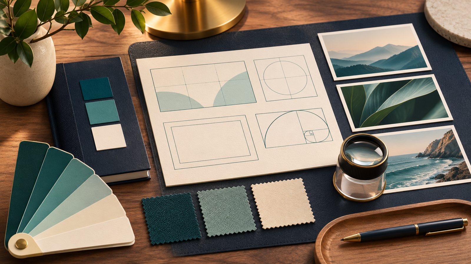
To build an AI image acceptance checklist, turn each relevant rule in your brand style guide into something you can check in the finished image. Name the required objects, define the usable space, decide how closely colors must match, and set the export dimensions. Then give every requirement a pass, fail, or unresolved result before anyone approves the file.
A teal mug on a cream background can look exactly right for a brand and still be wrong for its website. That happened in the example prepared for this guide: the image had the requested objects and a convincing visual style, but its proportions and object placement missed the brief.
Those are easy mistakes to overlook when the first question is “Do you like it?” A better question is “Can this image do the job we agreed on?” Here is how to make that decision clear enough for your designer, founder, and publishing team to reach the same answer.
Start with the job the image needs to do
Before opening an image tool, gather your current brand guide, any reference assets you have permission to use, and the specifications for the destination. You also need an approver: someone who can resolve disagreements or authorize a change to the brief.
Write a one-sentence purpose. For the worked example, it is: “Create a wide website image with two objects on the right and room for an HTML headline on the left.” That sentence tells you why empty space matters. It also makes clear that the headline will be added on the webpage, rather than baked into the picture.
Be specific about the output. “Landscape” leaves room for several different shapes; “16:9” does not. Keep aspect ratio, minimum pixel dimensions and file-size limits in separate fields. If your mobile layout needs a different crop, treat that crop as another deliverable.
The broader principle is to evaluate an output in its intended context. NIST’s AI Risk Management Framework provides voluntary guidance for incorporating trustworthiness into AI design, development, use and evaluation. The visual checks below are an editorial application of that general approach, not a NIST-approved scoring system.
1. Turn brand adjectives into visible requirements
Most style guides mix precise instructions with language that needs interpretation. “Use teal #147D78” is relatively concrete. “Feel calm, confident and uncluttered” leaves more to the designer.
Translate that second instruction before generating anything. For this brief, “uncluttered” means two objects, no extra props and a clear area for the headline. “Calm” becomes diffuse lighting and restrained shadows. These choices belong to this example; your brand may express the same mood differently.
| Brand direction | Rule for this image | Review method |
|---|---|---|
| Teal and cream palette | Teal mug; cream notebook and surroundings | Visual comparison, with recorded pixel samples |
| Simple composition | Exactly one mug and one closed notebook; no other props | Count objects in the full-size image |
| Space for the headline | Left 40% free of objects; both objects entirely in the right half | Place vertical guides at 40% and 50% |
| Clean editorial treatment | Diffuse light, restrained shadows and complete objects | Inspect lighting, edges and cropping |
| Logo-free sample | No visible logos, text, numbers or watermarks | Check the whole image, including small details |
Keep subject requirements separate from style. A polished ceramic texture cannot compensate for a missing notebook. Editorialge’s explanation of AI style transfer provides useful background on the distinction between an image’s content and its visual treatment.
2. Decide what blocks approval
A mandatory requirement is a condition the image must meet before release. Wrong dimensions, an extra product or an object covering the headline area are straightforward examples. A failure stays a failure even if the rest of the image is excellent.
Preferences need a different conversation. One reviewer may favor warmer lighting; another may prefer a cooler finish. Give them a reference and ask for a concrete reason. “The shadow makes the left side too busy” is useful feedback. “It doesn’t feel right” needs another question before it becomes a revision request.
Decide how exact the color needs to be
A brand-colored rectangle and a photographed-looking mug should not automatically face the same color test. The rectangle can use a fixed RGB value throughout. The mug has shading, reflections and darker areas around its handle.
For a flat graphic, specify the exact color and the area to sample. For a realistic object, decide whether a visual palette match is enough or whether you need a defined color-measurement method. Agree on any tolerance before reviewing the result. Otherwise, a team can keep moving the target until its favorite image passes.
The example below uses teal and cream as visual direction. Its pixel samples document what appeared in the file; they do not establish an exact-color pass.
3. Save the brief before you run it
Give the brief a version number and save the actual prompt. When a revision changes the object count, layout or palette, update that version. This small habit prevents someone from rejecting an image against instructions that were added afterward.
The November 16, 2026 test used brief AC-01, version 1.0. The generation prompt included these instructions:
Create a logo-free fictional brand editorial still life, landscape 16:9. Exactly one plain matte teal ceramic mug with one handle and exactly one closed cream notebook, both entirely inside the right half of the frame, on a flat warm cream background. No other objects. No hands, people, plants, pens, logos, text, letters, numbers, symbols or watermarks. Leave the entire left 40 percent completely empty warm cream background for a future HTML headline. Use brand palette teal #147D78 for mug and cream #F5F0E8 for notebook and background. Soft diffuse light, restrained shadows, simple realistic editorial product photography. Entire mug and notebook visible, no cropping. Palette references indicate direction; exact pixel color will be evaluated separately. Produce only the image.
Alongside the prompt, retain the model identifier, requested ratio, reference files if any, job identifier and original output. Record a seed or model build only when the service exposes it. A reproducible workflow lets someone repeat your process and inspect your reasoning; it does not promise an identical image on the next run.
This test used ImagineLab.art Image Lab’s connected generation service, with model identifier gpt-image-2 and a requested 16:9 ratio. One output was evaluated. No reference image was uploaded; the mug and notebook were fictional, unbranded sample objects.
ImagineLab.art is part of Editorialge Media LLC’s business group. The test ran on an admin-credit account, so it does not verify the features or limits of a retail subscription. The acceptance rules apply equally to outputs from other services.
4. Check the file, not just the preview
Download the original and inspect its dimensions before discussing aesthetics. Then look at the full image for object count, unwanted details and placement. Use guides for spatial rules rather than estimating from memory.
The result below explains why that order helps. The mug is teal, the notebook is cream, and the left side offers plenty of open space. At a glance, it fits the idea. The file checks tell a more specific story.
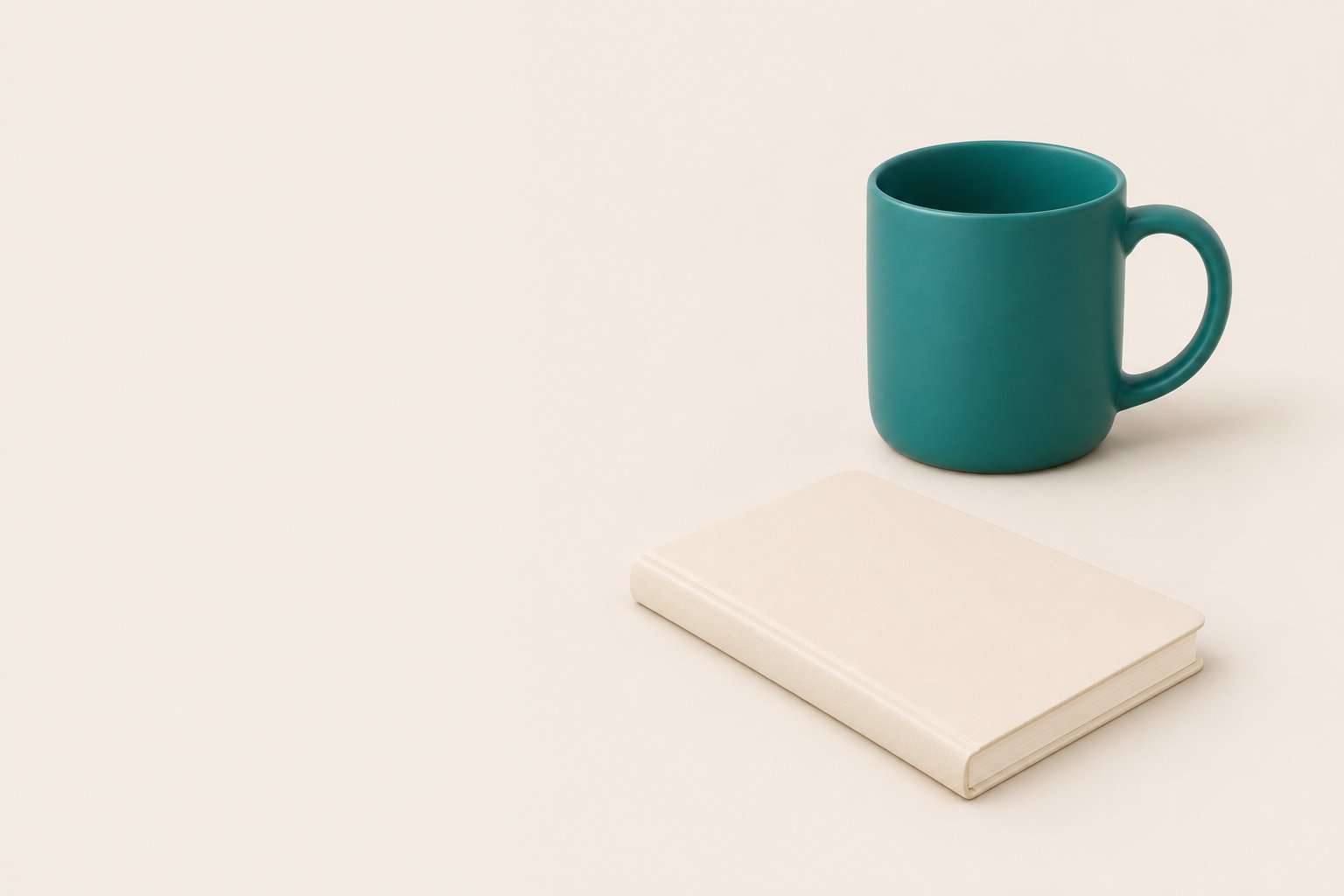
| Requirement | What the review found | Result |
|---|---|---|
| 16:9 output | The original PNG measures 1536 × 1024: a 3:2 image | Fail |
| One mug and one closed notebook | Both objects are visible; no extra props identified | Pass on visual inspection |
| Both objects entirely in the right half | The notebook extends left of the midpoint | Fail |
| Left 40% clear of objects | No objects identified inside that area | Pass on visual inspection |
| No visible text, logos or watermarks | None identified in the reviewed image | Pass on visual inspection |
| Teal and cream palette | The visual direction is present; sampled pixels differ from the prompt’s hex values | Visual match only |
The two placement results are worth pausing over. The left 40% can be empty while part of the notebook still crosses the 50% line. Both statements are true. Combining them into a loose “enough space on the left” judgment would hide a failed requirement.
What the color samples show
Three individual pixels were sampled from the original PNG, using coordinates measured from the top-left corner. The mug at (1100, 350) returned RGB (40, 121, 119); the background at (200, 200) returned (244, 235, 227); and the notebook at (1000, 700) returned (240, 228, 213).
These values describe those pixels only. They are not surface averages or measurements of physical materials. For this brief, the decisive problems were the ratio and placement. The output was held for revision.
Check whether the controls support your request
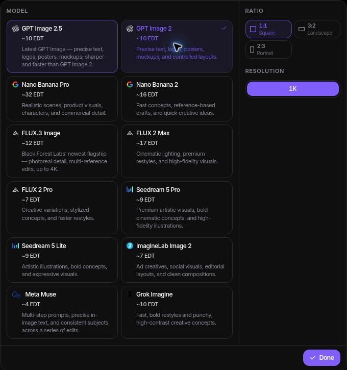
During the later interface check, the model menu showed 1:1, 3:2 and 2:3 ratio options. That is a useful reason to check the generation route before trying again. It does not establish why the connected request returned 3:2. The screenshot shows the inspected controls, while the saved request records the 16:9 instruction used for the test.
5. Write a correction someone can act on
A rejection note should point to the failed rule and the required change. For this image, the note is simple: “Deliver a true 16:9 file, and move the entire notebook to the right of the midpoint.” The designer does not have to guess which part of the image caused the hold.
Choose the repair based on the problem. If a tool setting was wrong, correct it. If the service cannot produce the required shape through that route, use a supported route or an agreed finishing step in a design editor. Keep the change in the version record.
Stretching 3:2 into 16:9 would alter the objects’ proportions. Cropping could remove part of the mug or notebook. Extending the canvas may be a better option, but it creates a new version that needs review. None of those repairs was performed in this single-output test.
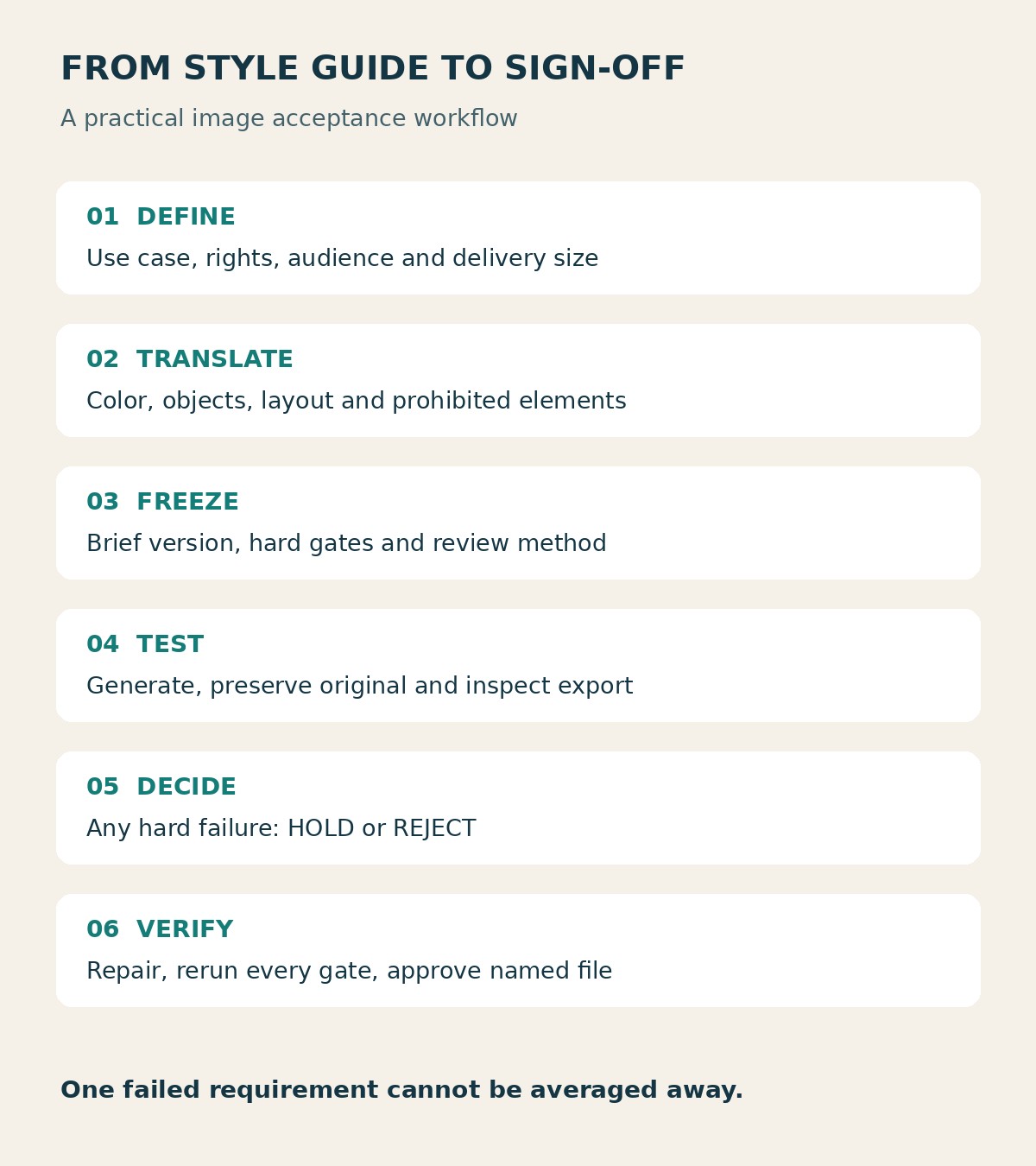
6. Use a short AI image acceptance checklist for sign-off
You do not need a complicated scoring system. A small approval record is enough if it identifies the file, the checks and the person responsible for the decision. Copy this structure into your project tracker:
- Brief and image version: which instructions and file were reviewed?
- Intended use: where will the image appear, and is it illustrative or a factual product representation?
- Required checks: dimensions, objects, prohibited details, layout and color.
- Result for each check: pass, fail or unresolved, with the evidence location.
- Revision request: the exact change needed and who owns it.
- Approval: approver, date and approved filename, left blank while mandatory checks remain open.
For the worked example, the decision reads: “AC-01 v1.0, original output: hold. Ratio and right-half placement failed.” That is short enough to scan and specific enough to explain the decision later.
Keep “unresolved” as a real option. If you cannot confirm permission for a supplied reference, do not mark it as passed because the image looks harmless. Route the question to the person responsible for the asset.
7. Review the export in its final setting
After a repair, run the full checklist again. Then inspect the delivery file after compression and resizing. Confirm the filename and dimensions so an older version does not slip into the publishing queue.
For a website image, check the actual page at desktop and mobile widths. A theme can crop a correctly composed file in a way that removes the subject or crowds the headline. If the headline is live HTML, inspect it together with the image; empty space in the source file alone does not prove the finished layout works.
Editorialge’s guide to AI image generation mistakes offers a broader publishing review. Keep the acceptance record focused on this brief, and use the Artificial Intelligence hub for related production workflows.
What this test can—and cannot—tell you
The test demonstrates how explicit criteria expose problems in a plausible-looking image. It covers one brief, one generation route and one output. It is not a reliability benchmark, a comparison of image models or a measurement of campaign performance.
The original PNG was retained, and its dimensions, visible composition and selected pixels were checked. No revised version was approved. A seed and provider build were not verified. The sample also represents fictional objects; it should not be presented as a photograph proving what a real product looks like.
Your checklist can organize permissions and factual checks, but it cannot resolve them automatically. A logo-free result, for example, does not establish permission to use every reference that might have gone into another project.
Make approval about the agreed brief
The useful part of an AI image acceptance checklist is the conversation it settles. A reviewer can point to the wrong ratio or an object crossing a guide, and the next person knows what needs fixing. Keep room for creative judgment, but make mandatory requirements explicit. Approve the named delivery file only when those requirements are satisfied.
FAQs
What if your brand guide does not define image composition?
Add a project-specific layout rule and have the approver agree to it before generation. Record it as part of the brief rather than pretending it already exists in the brand guide. Repeated decisions may later become useful additions to the guide.
Who should settle a disagreement between reviewers?
Use the approver named in the brief. Ask reviewers to separate a measurable failure from a preference, then document the decision. If the approver changes a mandatory requirement, update the brief version and review the image against that version.
Can one approval cover a whole campaign?
Reuse the checklist, but review each deliverable. A desktop banner, square social image and mobile crop can differ in layout and detail. Record their filenames and results separately, even when they come from the same source image.
When should you revisit the checklist?
Revisit it when the brand guide, destination template or production workflow changes, or when a missed defect reveals an unclear rule. Preserve older versions so you can still explain why an earlier image was approved.