AI image generation mistakes usually do not look like mistakes at first. That is the tricky part. The image may look polished, cinematic, colorful, and “good enough” inside the generator. But once you place it in a blog post, social media graphic, featured image, carousel, AI video workflow, or brand campaign, the problems become obvious.
The face looks slightly wrong. The fingers are strange. The text is broken. The image does not fit the platform. The style changes from one visual to another. The background is too busy. The subject is too close to the edge. Or worse, the image looks beautiful but does not support the article at all.
I have learned to treat AI image generation like a production workflow, not a random art experiment. At Editorialge Media LLC, we are working across media, technology, SaaS, e-learning, and creative tools. That means AI images are not just decoration. They support articles, social posts, video production, image-to-video workflows, and brand communication.
I also discussed this in my broader AI video creation guide, because strong AI videos often begin with strong AI images. So this guide is not about “how to make pretty AI images.” It is about how to avoid the mistakes that make AI visuals look amateur, unreliable, or unusable.
Why AI Image Generation Mistakes Matter
AI image tools are powerful, but they do not automatically understand your content strategy. They follow patterns, prompts, references, and instructions. If your input is vague, your output becomes a guess. And before generating any image, understanding AI image aspect ratios helps avoid bad cropping and platform-fit problems.
For beginners, that means the biggest problem is rarely the tool alone. The problem is usually the workflow.
A good AI image needs:
| Element | Why It Matters |
| Clear purpose | The image must support the article or content goal |
| Correct aspect ratio | Prevents bad cropping on platforms |
| Specific prompt | Reduces random or irrelevant output |
| Clean composition | Makes the image usable in real layouts |
| Brand consistency | Keeps visuals connected across the article |
| Human review | Catches errors that AI does not understand |
| Legal awareness | Reduces copyright and trust risks |
| Final editing | Makes the image publish-ready |
The generator is only one part of the process. The creator still has to direct, review, refine, and publish responsibly.
When I need a clean, controlled base visual for an article, social post, or image-to-video workflow, I usually start with an AI image creation tool like ImagineLab. It helps me create visuals with better composition, cleaner subjects, and stronger platform fit before I move into editing, publishing, or video generation.
Mistake 1: Starting Without A Clear Purpose
The first mistake is generating images before knowing what the image needs to do.
Beginners often start with a prompt like:
Create a futuristic AI image.
That may produce something attractive, but attractive is not the same as useful.
Before generating an image, I ask:
- Is this a featured image?
- Is this an infographic?
- Is this a social media post?
- Is this for image-to-video animation?
- Is this for a blog section?
- Is this for a product or SaaS concept?
- Is this for brand trust?
- Is this for education?
A featured image needs emotional clarity. An infographic needs readability. A social image needs a fast impact. An image-to-video base image needs a stable composition. A Pinterest image needs vertical discovery value. If you do not define the purpose, the AI will create a visual without a job.
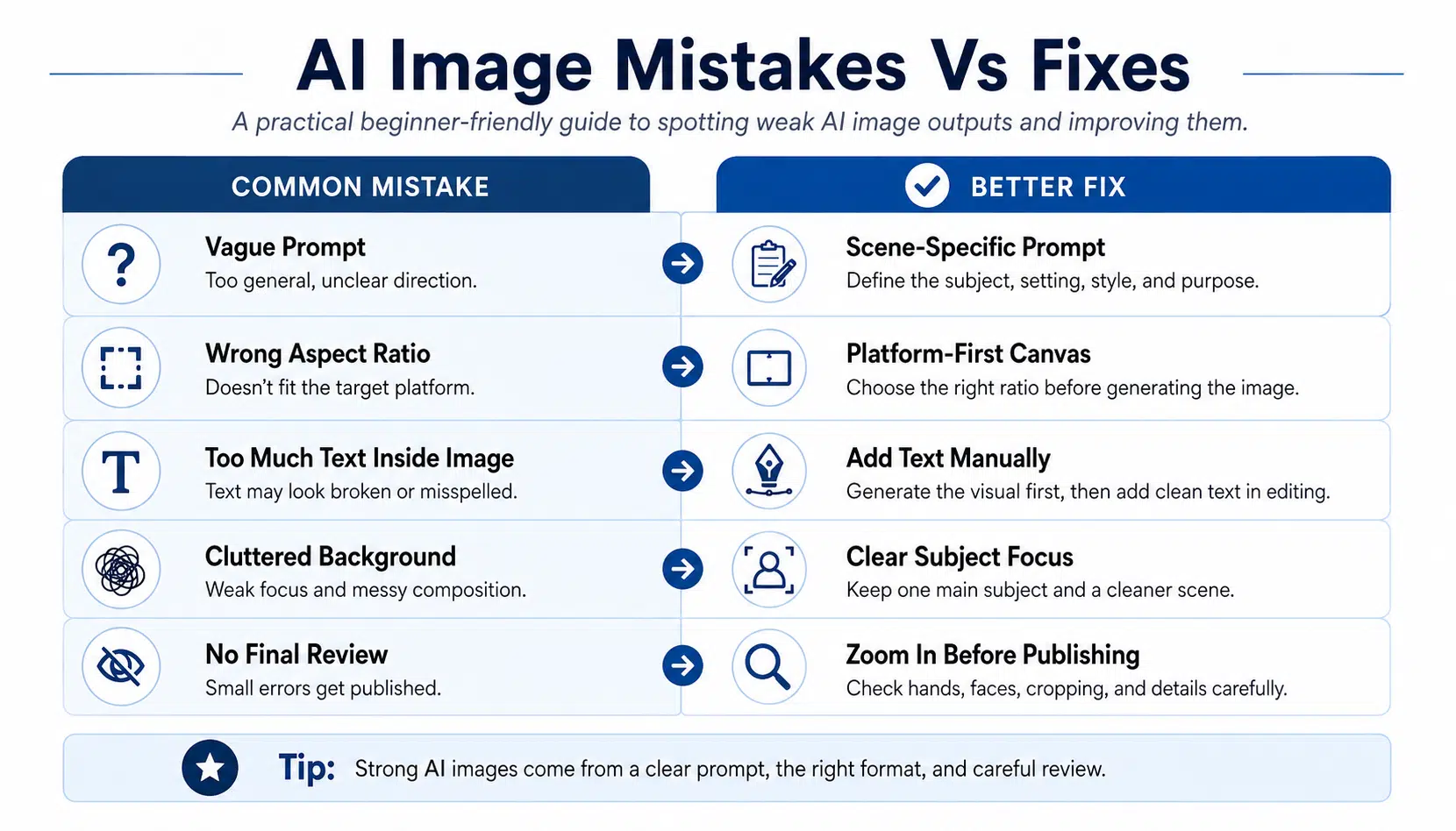
Mistake 2: Writing Vague Prompts
A vague prompt creates vague results. I have discussed it in my text-to-video AI guide, where prompts and visual direction play a major role.
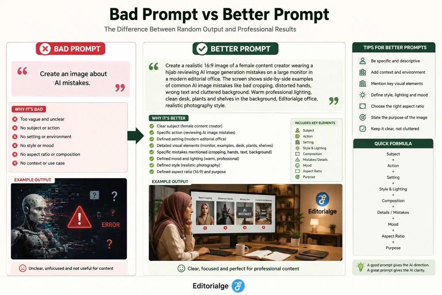
Bad prompt:
Make an AI image for content creation.
Better prompt:
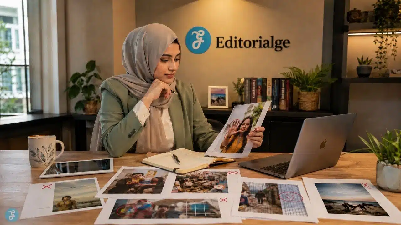
Create a realistic 16:9 image of a female content creator working in a modern Bangladeshi-style editorial office, reviewing AI-generated image layouts on a large monitor, with warm professional lighting, a clean desk, a realistic photography style, trustworthy media environment.
The second prompt gives the model a clear direction.
A strong prompt usually includes:
| Prompt Element | Example |
| Subject | Female content creator |
| Action | Reviewing AI image layouts |
| Setting | Bangladeshi-style editorial office |
| Style | Realistic photography |
| Lighting | Warm professional lighting |
| Composition | Wide 16:9 workspace scene |
| Mood | Trustworthy and focused |
| Restrictions | No distorted text, no extra people, no clutter |
My rule is simple: do not prompt like a search query. Prompt like an art director.
In my own workflow, I do not approve an AI image just because it looks attractive at thumbnail size. I zoom in, check the hands, inspect the screen area, review the crop, and only then decide whether it is publish-ready.
Mistake 3: Ignoring Aspect Ratio Before Generation
Aspect ratio is not something to fix at the end. It should be decided before the image is generated. A 16:9 image may work beautifully for a blog featured image, but it may fail badly as an Instagram Reel cover. A 9:16 vertical image may work for TikTok or Reels, but it may feel awkward as a website hero image.
| Use Case | Better Ratio |
| Blog featured image | 16:9 |
| YouTube thumbnail | 16:9 |
| Instagram feed | 4:5 |
| TikTok / Reels / Shorts | 9:16 |
| Pinterest pin | 2:3 |
| Square social post | 1:1 |
| Link preview | 1.91:1 |
This is one of the most common AI image generation mistakes because beginners often generate one image and try to crop it for everything. That rarely works well.
If the image is part of an image-to-video workflow, aspect ratio becomes even more important. A vertical video should start with a vertical-friendly image. A blog hero video should start with a wide image. Otherwise, you lose important parts of the subject during animation or cropping.
Mistake 4: Putting Important Details Too Close To The Edges
Even when the aspect ratio is correct, the composition can still fail. The subject’s face, hands, product, logo, or main visual point should not sit too close to the edge. Social platforms crop previews differently. Mobile interfaces also cover top and bottom areas with captions, buttons, usernames, or controls.
My safe-zone rule:
Keep the most important subject inside the center 70% of the canvas.
This matters for:
- Faces
- Products
- Logos
- Text overlays
- Hands
- CTA space
- Mobile video covers
- Social preview crops
If an image is going to become a video later, I leave even more breathing room. AI video generation may zoom, pan, or slightly shift the frame.
Mistake 5: Using Too Much Text Inside AI Images
AI image tools have improved, but text inside generated images can still become messy, misspelled, or visually inconsistent.
This is a big issue for:
- Posters
- Social images
- Infographics
- Product labels
- Screenshots
- Signs
- UI mockups
- Brand graphics
My practical rule is this: generate the image without important text, then add the text manually in a design tool.
AI-generated text can work in some cases, but for professional publishing, I do not rely on it. A single misspelled word can make the entire visual look untrustworthy. This is especially important for Editorialge or brand visuals. If the brand name is wrong, the image loses credibility immediately.
Mistake 6: Overloading The Prompt With Too Many Ideas
A beginner may think that more details always create better images. Not always.
This kind of prompt can confuse the model:
Create a futuristic editorial office with AI tools, a creator, robots, holograms, social media icons, video editing panels, newspaper background, startup team, Bengali calendar, laptop, camera, plants, logo, books, neon lighting, cinematic mood, infographic style, realistic photo, and 3D render.
That is not a prompt. That is a crowded shopping list.
A better prompt focuses on one main idea:
Create a realistic editorial office scene with one female creator working on AI image layouts on a large monitor. Warm lighting, clean desk, professional media workspace, subtle Editorialge branding in the background.
The model performs better when the visual priority is clear.
Mistake 7: Not Using Reference Images When Consistency Matters
If you need consistency across a pillar and cluster series, reference images matter.
For example, if the same creator appears across multiple images, or if the same office setup needs to appear in different visuals, prompts alone may not be enough. A reference image can help maintain the visual style, creator identity, outfit direction, office mood, and brand environment.
For article visuals, I use reference thinking in three ways:
| Reference Type | Why It Helps |
| Subject reference | Keeps the creator or character consistent |
| Style reference | Keeps color, lighting, and mood aligned |
| Layout reference | Keeps composition similar across assets |
Without this, every image may look like it belongs to a different website. When I work on a cluster series, I prefer creating a controlled visual base first through ImagineLab, then adapting that direction into featured images, infographics, social visuals, and video-ready frames. This keeps the full content hub visually connected instead of looking like random one-off AI generations.
Mistake 8: Ignoring Hands, Faces, And Small Details
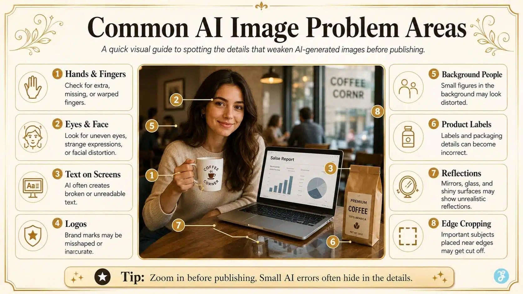
AI images can look great at thumbnail size and still fail at full size.
The most common problem areas are:
- Hands
- Fingers
- Eyes
- Teeth
- Ears
- Jewelry
- Eyeglasses
- Keyboard keys
- Screens
- Logos
- Books
- Product labels
- Reflections
- Background people
This is why I always zoom in before approving an image. For professional publishing, do not only judge the overall look. Inspect the details. A distorted hand, strange eye, broken keyboard, or messy screen can distract readers and reduce trust.
Mistake 9: Choosing Style Over Usefulness
Some AI images look impressive, but do not help the article. For example, a dramatic cyberpunk AI image might look beautiful, but if the article is about beginner image aspect ratios, a practical workspace or clean ratio guide is more useful.
The visual should match search intent.
| Article Type | Better Image Style |
| Beginner guide | Clean, instructional, realistic |
| SaaS tutorial | Modern UI/workflow style |
| Ethics article | Trustworthy, serious, professional |
| Social media guide | Mobile-first, colorful, clear |
| Image-to-video workflow | Creator workspace + motion interface |
| Mistakes article | Comparison, checklist, practical examples |
A good image should not only impress readers. It should help them understand the article faster.
Mistake 10: Using A Different Style For Every Image In The Same Article
This is a common content production problem. One image looks cinematic. The next looks cartoonish. The next looks like a corporate stock photo. The next looks like an anime poster. The article starts to feel visually disconnected.
For a serious cluster article, I prefer visual consistency:
- Similar color palette
- Similar lighting
- Similar typography in infographics
- Similar icon style
- Similar creator or workspace style
- Similar background texture
- Similar image dimensions
This makes the article feel more professional and trustworthy. Consistency is especially important across a pillar-cluster strategy. If the pillar and clusters all share a connected visual identity, the whole topic hub feels more authoritative.
Mistake 11: Forgetting The Image May Later Become A Video
For this AI video pillar, this is a major point. Many AI images are not just article images anymore. They may later become:
- Reel covers
- TikTok visuals
- YouTube Shorts scenes
- Image-to-video clips
- Social teasers
- Course thumbnails
- Motion graphics
- Blog hero videos
So I generate images with possible motion in mind.
A good image-to-video base image should have:
| Feature | Why It Helps |
| Clear subject | Easier for AI to preserve |
| Clean background | Reduces warping |
| Good lighting | Looks better during motion |
| No critical text | Avoids text distortion |
| Space around the subject | Allows camera movement |
| Stable composition | Easier to animate |
| Simple visual hierarchy | Keeps motion controlled |
If the base image is chaotic, the animated video will likely become chaotic too. In a real workflow, I would first create or refine the base visual using ImagineLab, then review the image for composition, aspect ratio, subject clarity, and possible video use before publishing or animating it.
Mistake 12: Not Editing The Final Image
AI output should not always go directly to publishing.
I usually review and adjust:
- Cropping
- Brightness
- Contrast
- Sharpness
- Color balance
- Compression
- Text overlays
- Brand elements
- Logo placement
- File size
- Alt text
- Filename
This is where the image becomes publish-ready. AI creates the raw visual. Human editing makes it usable.
Mistake 13: Forgetting Copyright And Commercial Use
This is one of the biggest trust issues. AI image generation does not automatically mean the image is free from copyright, trademark, likeness, or platform policy concerns. The safer approach is to treat every commercial AI image as something that needs review before publishing.
For creators and publishers, the practical checklist is:
- Check tool terms before commercial use.
- Avoid copyrighted characters.
- Avoid recognizable brand logos unless you have permission.
- Do not use real people’s likenesses without consent.
- Avoid mimicking living artists too closely for commercial content.
- Keep prompts, edits, references, and project files.
- Add meaningful human editing and arrangement.
- Use licensed or owned source images.
This is not legal advice, but it is a responsible workflow.
Mistake 14: Not Thinking About AI Labeling And Transparency
AI image transparency is becoming more important. For normal blog illustrations, disclosure may depend on your editorial policy and platform. But for realistic images involving people, sensitive topics, news-like visuals, or public confusion risk, transparency matters much more.
My practical rule: If the image could make readers believe something real happened, be transparent.
That protects trust. If an AI image is clearly illustrative, it may not need the same treatment as a realistic news-like image. But if it looks like a real event, real person, real office moment, or real product claim, I would rather be transparent than create confusion.
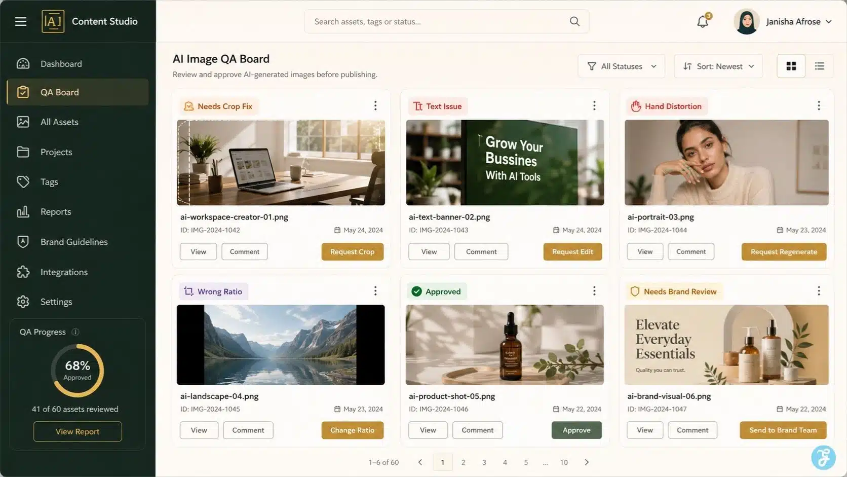
Mistake 15: Using AI Images As Decoration Instead Of Information
Images should add value. A common mistake is adding AI visuals just to make the article look busy. That does not help readers. It may even slow the page or distract from the content.
Better image types include:
- Workflow diagrams
- Comparison graphics
- Checklists
- Screenshot-style boards
- Platform ratio guides
- Before-and-after examples
- Safe zone diagrams
- Practical production visuals
- Realistic creator workflow scenes
For a cluster article like this one, I would not only use a beautiful featured image. I would also use practical visuals that show mistakes and fixes.
Mistake 16: Ignoring File Names And Alt Text
AI images should still follow basic SEO image practices.
A file named:
image123-final-v3.webpIt
It is not helpful.
A better filename:
common-ai-image-generation-mistakes.webp
Good alt text should describe the image naturally.
Example:
AI image generation mistakes shown with a creator reviewing visual errors on a design screen
Do not stuff keywords. Use clear descriptions. For SEO, image optimization supports accessibility, relevance, and content experience. It also makes your media library easier to manage.
Mistake 17: Making Images Too Heavy For The Page
Large images can slow down a page.
Before publishing, I usually:
- Resize to the required dimensions
- Use WebP when possible
- Compress without ruining quality
- Avoid uploading oversized originals
- Use descriptive filenames
- Keep visual quality high enough for retina screens
- Test the image in the actual article layout
A beautiful 6 MB image is not ideal for a fast-loading blog post. For Editorialge-style content, a 1280 × 720 featured image in WebP is often a practical balance between quality and performance.
Mistake 18: Trusting The First Output Too Quickly
The first output is rarely the best output.
AI image generation works better with iteration:
- Generate the first version.
- Identify what is wrong.
- Improve the prompt.
- Adjust the aspect ratio or composition.
- Generate variations.
- Pick the strongest one.
- Edit manually.
- Check details.
- Publish only after review.
Beginners often stop too early. Professionals refine.
Mistake 19: Not Creating A Reusable Visual System
If you are writing a full pillar-cluster series, every image should not be invented from scratch.
Create a visual system:
| Visual Element | Recommendation |
| Main style | Realistic editorial workspace + clean infographics |
| Color palette | Warm neutral, dark green, gold, and blue accents |
| Creator style | Consistent but varied outfit and hijab |
| Brand environment | Editorialge office background where relevant |
| Infographic style | Cream background, clean cards, readable labels |
| Image sizes | 1280 × 720 for article visuals |
| File naming | Keyword-based and descriptive |
| Image purpose | Featured, infographic, checklist, screenshot, social |
For this kind of repeatable system, ImagineLab can fit naturally as the starting point for base image creation before the visuals are refined, resized, animated, or adapted for different platforms.
Mistake 20: Forgetting Human Taste
This is the final and most important mistake. AI can generate images, but it cannot fully understand your audience, brand, article tone, editorial trust, or business goal.
Human taste decides:
- What feels believable
- What looks professional
- What supports the article
- What should be removed
- What needs editing
- What feels too artificial
- What may confuse readers
- What fits the brand
The tool creates options. The creator makes decisions. That is the difference between AI output and professional content.
My AI Image Generation Mistakes Checklist
Before publishing an AI image, I use a simple checklist.
| Question | Check |
| Does the image match the article topic? | ☐ |
| Is the aspect ratio correct? | ☐ |
| Is the main subject clear? | ☐ |
| Are faces and hands clean? | ☐ |
| Is there any broken text? | ☐ |
| Are important elements away from the edges? | ☐ |
| Does the style match other article images? | ☐ |
| Is the image useful, not just decorative? | ☐ |
| Are copyright and usage risks checked? | ☐ |
| Is the image compressed and named properly? | ☐ |
| Is alt text ready? | ☐ |
| Can this image become a video later if needed? | ☐ |
This checklist may look simple, but it prevents most beginner-level mistakes.
A Practical Example: Fixing A Weak AI Image Prompt
Weak prompt:
Create an image about AI image mistakes.
Better prompt:
Create a realistic 16:9 editorial office scene where a female content creator wearing a hijab reviews AI image generation errors on a large monitor. The screen shows side-by-side image previews with visible issues like bad cropping, distorted hands, and wrong aspect ratio. Warm Bangladeshi-style office setup, clean desk, Editorialge branding in the background, professional media workspace, realistic photography style.
Why the better prompt works:
| Prompt Detail | Purpose |
| Realistic 16:9 | Fits the article’s featured image |
| Female creator wearing hijab | Keeps creator identity consistent |
| Reviews AI image errors | Matches the article topic |
| Side-by-side previews | Shows mistake comparison |
| Bad cropping/hands/ratio | Makes the topic visual |
| Editorialge branding | Adds trust |
| Bangladeshi-style office | Makes it feel firsthand and local |
| Realistic photography | Avoids generic AI-art look |
That is the difference between a random AI image and a content asset.
Final Thoughts: Better AI Images Come From Better Direction
The most important lesson from these AI image generation mistakes is simple: do not let the tool make every decision. Choose the platform first. Choose the aspect ratio early. Write a clear prompt. Keep the subject clean. Avoid messy text. Check hands and faces. Use reference images when consistency matters. Edit before publishing. Think about copyright, transparency, and audience trust.
AI image generation is powerful, but it still needs human direction. The best images are not the ones that look the most dramatic. They are the ones that fit the article, help the reader, support the brand, and survive real publishing conditions.
That is how AI visuals become trustworthy content assets instead of random, pretty pictures.
Frequently Asked Questions About AI Image Generation Mistakes
1. What Is The Most Common AI Image Generation Mistake?
The most common mistake is writing vague prompts without a clear purpose. If the prompt does not define subject, setting, style, ratio, and use case, the AI has to guess.
2. Why Do AI Images Often Look Wrong After Cropping?
AI images often look wrong after cropping because they were generated in the wrong aspect ratio. Always choose the platform and canvas size before generating the image.
3. Should I Add Text Inside AI-Generated Images?
Avoid adding important text inside AI-generated images. AI can misspell or distort text, so it is usually better to add headlines, labels, and branding manually during editing.
4. Can I Use AI-Generated Images Commercially?
It depends on the tool’s terms, source material, and legal context. Always check usage rights, avoid copyrighted characters or logos, and keep records of prompts, edits, and references.
5. How Can I Make AI Images Look More Professional?
Use specific prompts, correct aspect ratios, clean composition, consistent style, manual editing, and detailed review. Professional AI images come from workflow, not one-click generation.