

Learning how to optimize product pages requires balancing search engine visibility with seamless user experience. To rank and convert, an e-commerce product page must provide search crawlers with structured data, clean canonical URLs, crawlable technical specs, and clear product information.
Simultaneously, it must eliminate shopper friction by delivering precise product details, available inventory variants, transparent pricing, and genuine customer reviews.
Instead of cluttering pages with excessive copy, pop-ups, or aggressive call-to-action buttons, effective product page optimization removes buyer uncertainty. By structuring accurate technical metadata for search algorithms and presenting friction-free, believable evidence to human shoppers, store owners can successfully drive both organic traffic and higher conversion rates.
Product Pages Have to Support the Whole Decision
A product page has three jobs: help the right customer find the item, judge whether it fits, and complete the purchase.
SEO and conversion work often split those jobs. The result may be a keyword-heavy page that buries dimensions, or a visually clean redesign that removes useful headings and crawlable information.
Start with the questions a qualified buyer is likely to ask:
- Is this the correct product or model?
- Will it fit, connect, or work with what I own?
- Which option is selected?
- What is included?
- What will delivery cost, and when will it arrive?
- Can I return it?
The page should answer these in roughly the order they affect the decision.
Match the Page to Real Product Searches
Product pages are usually best suited to searches for a specific product, model, configuration, or tightly defined item. Useful language may include the brand, product type, model, size, material, capacity, compatibility, intended use, and a defining feature.
A page for a 40-litre waterproof hiking backpack should not revolve around “outdoor bag.” Buyers are more likely to compare capacity, empty weight, fit, materials, pocket layout, and rain protection.
Use only terms the product can support. Describing a water-resistant jacket as waterproof may bring more clicks, but it also attracts poorly matched shoppers and creates return risk.
Google recommends using the words people use to find a page in prominent places such as the title, main heading, alt text, and internal links. That is a case for accurate identification, not repeated keyword insertion.
Handle Variants Without Creating URL Chaos
Colour, size, storage, material, and other options need a deliberate URL structure.
Google expects each selectable variant to be reachable through a distinct URL. On a single-page implementation, those URLs can preselect the variant while pointing to one canonical URL for the overall product group. A multi-page setup can give variants separate pages, but each page needs complete markup for the product information it displays.
Separate indexable pages make sense when a variant has meaningful search demand, unique images or specifications, and stable availability. Creating hundreds of thin pages for every size-and-colour combination usually adds crawl and maintenance problems without helping shoppers.
Whichever structure is used, selecting a variant should update the image, price, availability, SKU, delivery information, and cart item consistently.
Write a Title That Identifies the Product
A useful title lets someone recognize the item before reading the description. A practical order is:
Brand + product name or type + defining attribute + model
Examples include “Acme K84 Wireless Mechanical Keyboard” and “Alder Oak Dining Table, 180 cm.” Not every product needs every field. A replacement part may depend on its model number; a dining table is more likely to need material and dimensions.
Avoid titles packed with synonyms. “Waterproof Hiking Jacket Outdoor Rain Coat Women’s Waterproof Jacket” is harder to scan and does not identify one clear product.
Keep the HTML title and visible H1 closely aligned. Google can draw title links from both, along with prominent page text and incoming links, so conflicting labels create unnecessary ambiguity.
How to Optimize Product Pages With Useful Content
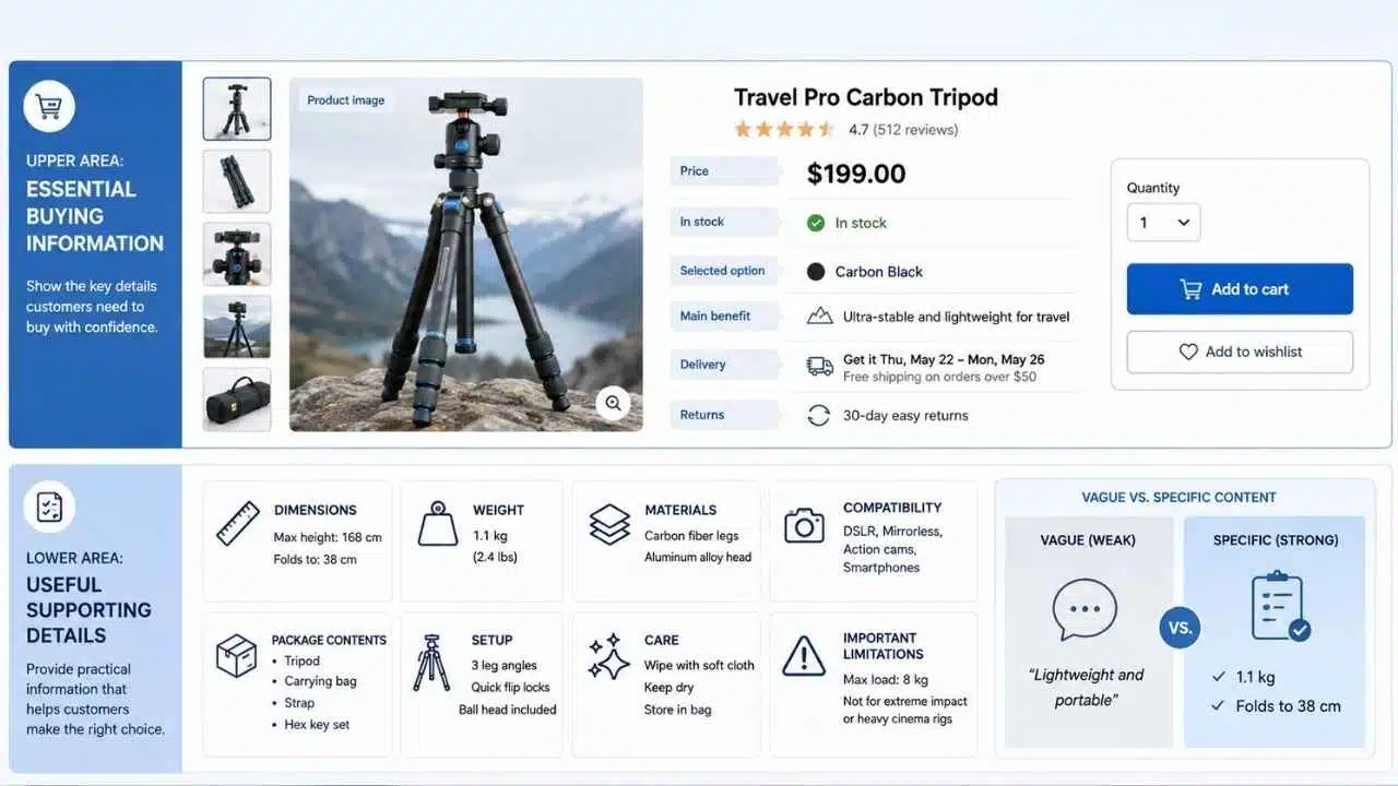
Manufacturer copy often lists features without explaining what they mean for the buyer. Rewriting it with different adjectives is not enough.
Useful product content covers:
- What the item is and who it suits
- Its main differentiator
- Dimensions, weight, materials, or capacity
- Compatibility requirements
- Package contents
- Setup, care, or maintenance
- Important limitations
Specific details are stronger than praise. “Weighs 1.1 kg and folds to 38 cm” helps a traveller judge a tripod. “Lightweight and portable” does not.
Place the buying summary near the top: product name, price, stock, selected option, main benefit, delivery estimate, return summary, and purchase control. Longer specifications can sit lower on the page, preferably under clear labels rather than several vague “More information” accordions.
Use Images to Resolve Doubt
A gallery should not contain six nearly identical studio shots. Each image should answer a different question: scale, texture, fit, controls, included parts, colour, installation, or use in context.
For a lamp, handbag, appliance, or piece of furniture, an in-scale image may matter more than another close-up. Baymard’s product-page research repeatedly identifies missing scale cues and hidden size options as sources of hesitation.
Large catalogues do not need the same photography budget for every SKU. Prioritize high-traffic products, high-margin items, frequent returns, and products that generate repeated support questions.
Serve responsive, compressed images and reserve their dimensions to reduce layout movement. Alt text should describe useful visual information, such as “Black hiking jacket showing the adjustable hood and zipped front pockets,” not repeat a sales keyword string.
Make Cost, Delivery, and Returns Visible
Customers should not have to begin checkout to learn the real cost of an order.
Near the purchase area, show the current price, genuine discount details, stock status, delivery estimate, shipping charge or threshold, return period, return-shipping responsibility, and relevant warranty terms.
“Easy returns” is too vague. “Returns accepted within 30 days; return shipping is deducted from the refund” gives the shopper information that can change the decision.
Baymard’s testing has found that shoppers actively look for shipping information on product pages. Treat this as a usability finding rather than a universal conversion formula: the exact placement and detail still need testing for the store and market.
Remove Friction From Variant Selection
Variant controls cause expensive errors when the interface and cart disagree.
The shopper should always know which option is selected, which options are unavailable, whether price or delivery changes, and what will enter the cart. For a short apparel size range, visible buttons usually reveal availability more clearly than a closed dropdown. A complex computer configurator, by contrast, may need staged selectors rather than dozens of buttons.
Do not rely on colour swatches alone. Show the colour name, especially for similar shades such as navy, black, and charcoal. Put size or compatibility guidance beside the selector, not in the footer.
Let Reviews Explain the Rating
An average score cannot show whether buyers are broadly satisfied or sharply divided.
A useful review area includes the average, review count, rating distribution, filters, relevant sorting, verified-purchase labels where available, and clear disclosure of incentives. Critical reviews should remain visible; shoppers often use them to decide whether a limitation applies to their situation.
Reviews are most useful when they reveal what polished copy cannot: long-term durability, fit on different body types, difficult installation, colour accuracy, or recurring faults.
Any review markup must represent reviews visible on the page. Structured data should never be used to manufacture credibility.
Keep Structured Data, Feed Data, and the Page Aligned
Product structured data can describe names, images, identifiers, price, currency, availability, condition, ratings, shipping, returns, and variant relationships. It can make a page eligible for enhanced search appearances, but eligibility does not guarantee display.
Common failures include stale prices, an unavailable item marked in stock, one default price attached to every variant, or ratings marked up when no reviews are visible.
Larger stores should usually treat on-page structured data and Merchant Center data as complementary. Custom integrations should follow the Merchant API, which Google now positions as the primary programmatic interface for Merchant Center.
Validate templates rather than repairing isolated URLs. One template error can affect thousands of products.
Keep Canonical and Internal-Link Signals Consistent
Tracking parameters, filters, session values, alternate category paths, and variant states can create several URLs for similar content.
Use self-referencing canonicals on preferred pages, include those URLs in the XML sitemap, and link internally to the same versions. Google treats redirects and rel=”canonical” as stronger canonical signals than sitemap inclusion, but consistent signals work better than conflicting ones.
Products also need crawlable paths from categories, subcategories, brand pages, buying guides, comparisons, and relevant editorial content. Do not rely on an internal search box as the only route to inventory.
Useful Features Can Become Performance Problems
Product pages accumulate image galleries, reviews, recommendations, personalization, chat, analytics, payment tools, and pop-ups. Each may be useful; together they can delay the main image or make the purchase area move during loading.
The current “good” Core Web Vitals thresholds are LCP at 2.5 seconds or less, INP at 200 milliseconds or less, and CLS at 0.1 or less, assessed at the 75th percentile separately for mobile and desktop.
Check the product template itself. A fast homepage says little about an image-heavy product page. Load the main image early, lazy-load media below the fold, reserve image space, and review third-party scripts before removing useful buying information.
Measure Search and Sales Together
Rankings and conversion rate can both mislead when viewed alone.
Track search visibility through indexed URLs, impressions, clicks, query groups, and structured-data errors. Pair that with product views, variant interactions, add-to-cart rate, purchases, revenue per session, returns, cancellations, and out-of-stock exits.
Segment by device, category, traffic source, stock condition, and new versus returning visitors. A conversion increase may come from better content, but it may also follow a promotion or a drop in low-intent traffic.
Record pricing, promotions, stock changes, and seasonality before judging an experiment.
Fix Problems in the Right Order
For most stores, the priority should be:
- Indexing, rendering, canonicals, and crawlable links
- Product titles, prices, stock, variants, images, and specifications
- Delivery, returns, sizing, compatibility, and package contents
- Structured data and Merchant Center accuracy
- Mobile usability and performance
- Content depth and internal linking
- Layout and messaging experiments
Testing button colours while prices or shipping terms are unreliable is misplaced effort. Technical access and product accuracy come first.
Final Thoughts
The practical answer to how to optimize product pages is to make each page easier to find, evaluate, and trust. Start with a small group of commercially important products. Check how search engines reach them, which queries bring visitors, where shoppers hesitate, and which questions appear repeatedly in support tickets or returns. Then repair the fundamentals before commissioning a full redesign.
A strong product page does not pressure every visitor into buying. It gives the right shopper enough accurate information to make a decision without unpleasant surprises. That is what supports durable search visibility and sales.