Staring at bright screens late at night often leads to eye strain and discomfort, making web browsing less enjoyable. This issue is common for users trying to relax while reading online in low-light environments.
Dark Mode Web Design solves this by replacing bright white backgrounds with darker tones and light text, reducing glare and improving visual comfort. Popularized by platforms like Apple and Android, it not only eases eye fatigue but also helps conserve battery life on OLED screens.
As a result, dark mode is becoming a standard in modern web design. Its benefits extend across UI/UX, enhancing usability while maintaining strong color contrast and readability.
What Is Dark Mode?
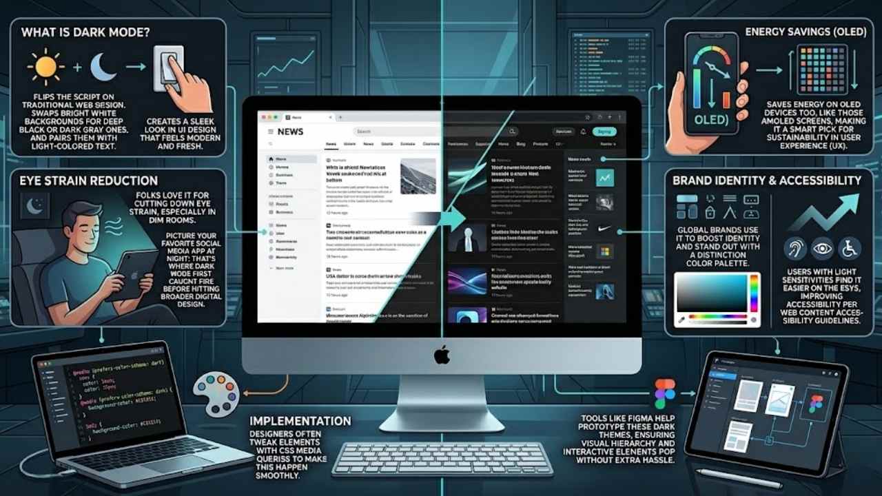
Dark mode flips the script on traditional web design. It swaps out those bright white backgrounds for deep black or dark gray ones, and pairs them with light-colored text. This shift creates a sleek look in UI design that feels modern and fresh.
Picture your favorite social media app at night; that’s where dark mode first caught fire before hitting broader digital design. Folks love it for cutting down eye strain, especially in dim rooms.
Brands like Nike and Microsoft use it to boost their brand identity and stand out with a cool color palette.
Dark mode adds a modern touch to websites and has become the default for many digital platforms.
Designers often tweak elements with CSS media queries to make this happen smoothly. It saves energy on OLED devices too, like those AMOLED screens, making it a smart pick for sustainability in user experience (UX).
Users with light sensitivities find it easier on the eyes, improving accessibility per web content accessibility guidelines. Tools like Figma help prototype these dark themes, ensuring visual hierarchy and interactive elements pop without extra hassle.
The Rise of Dark Mode in Web Design
Social media apps kicked off the dark mode craze, folks. They swapped bright screens for those sleek, shadowy looks, and users loved it right away. Think about scrolling through your feed at night, no more squinting at harsh lights.
This shift spread fast to broader web design trends, turning into a staple for digital products everywhere. Developers noticed how it boosts ux/ui design, making user interfaces feel fresh and modern.
Apps like Twitter and Instagram led the charge, proving dark mode design adds that cool, modern touch to websites. Users crave it for better viewing comfort, especially in dim rooms, where it cuts eye strain like a pro.
Energy efficiency plays a big role too, saving battery on devices with OLED screens, almost like giving your phone a little break. Imagine you’re chilling in bed, and the screen doesn’t blast your eyes; that’s the magic pulling everyone in.
Platforms now make dark mode the default, driven by what folks expect in their daily browses. It enhances the total user experience, fitting right into design systems that prioritize comfort.
Social apps popularized it first, but now it’s mainstream, weaving into app development and even tools like Drupal for smoother sites. Users keep similar habits without it, sure, but why settle when it feels so essential for modern vibes? This rise ties into design psychology, like Jakob’s law, where folks want familiar, comfy setups across the web.
It saves energy on gadgets, a smart, green choice that brands love to tout. Imagine your site standing out with bold typography against a dark backdrop, drawing eyes without the glare.
Developers build it into prototypes with tools like FigJam, testing how it flows in low-light spots.
Why Dark Mode Is Becoming Standard
4. Why Dark Mode Is Becoming Standard: Hey, imagine flipping on dark mode to cut eye strain during late-night scrolls, boost battery life on your smartphone’s OLED screen, tap into that aesthetic-usability effect for standout brand vibes like IKEA’s sleek site, and make pages friendlier for folks with light issues—curious for the full scoop?
Enhanced Visual Comfort
Dark mode boosts your viewing ease, folks. It cuts down eye strain, especially when you browse in dim rooms. Users love this setup for better comfort during late-night scrolls. Think of it like slipping on sunglasses indoors, it just feels right.
Dark mode swaps bright whites for deep grays, making text pop without the glare. This user-focused perk goes beyond trends, drawing in folks who crave smooth sessions. Webfolks often prototype sites with this in mind, tapping the aesthetic-usability effect to keep eyes happy.
Pair dark mode with vibrant color palettes, and you amp up that comfort level. It shines in low-light spots, improving focus without harsh lights tiring you out. Imagine flipping a switch for instant relief, that’s the magic here.
Developers use tools like WebGL to craft these themes, ensuring they fit various screens. IKEA even nods to such designs in their apps, proving how dark mode enhances daily digital life for everyone.
Energy Efficiency on OLED Devices
OLED screens power pixels individually. They shut off for black areas in dark mode. This cuts energy use a lot on smartphones and tablets. Designers add motion design to smooth theme switches, like fading elements gently.
You save battery life during long sessions, and it’s kind to the planet too. Picture your phone lasting longer on a dim flight; that’s the magic here. Teams use prototyping tools to test these features early.
Dark mode isn’t just stylish; it slashes power draw on OLED devices, extending battery by up to 30% in some cases, says a web design expert.
Experimental navigation in dark themes keeps users engaged without draining juice fast. Avoid bright flashes that spike energy. Your site feels modern and efficient this way.
Aesthetic Appeal and Brand Differentiation
Dark mode adds a modern touch to websites, folks. Imagine your favorite site flipping to sleek black backgrounds with crisp light text, it stands out like a sharp suit in a crowd of jeans.
Social media apps kicked this off, you know, platforms like Twitter and Instagram made it pop first. Now, brands use it to differentiate, they craft that cool, edgy vibe users crave in low-light scrolls.
It enhances the general user experience, turns a plain page into something fresh and inviting.
Users expect this now, driven by their preferences for that modern edge. Think about how it sets a brand apart, like a secret handshake in the digital world. Dark mode has become the default for many platforms, it signals you’re in tune with trends.
Designers love it too, they weave in subtle shades to make sites feel alive and user-focused, beyond just a passing fad.
Improved Accessibility for Users with Sensitivities
Many people deal with light sensitivity, and bright screens can feel like a punch in the eyes. Imagine squinting at your phone late at night; that discomfort hits folks with photophobia hard.
Developers now swap those glaring white backgrounds for softer dark grays, easing the strain. Users with visual impairments, like those facing migraines, find relief in this switch.
They read text more easily against light colors on dark canvases. Talk about a game-changer; it turns web browsing into a kinder experience. One reader shared, “Dark mode saved my evenings from headache hell.” This feature boosts comfort for everyone, especially in dim rooms.
Designers focus on folks with conditions such as astigmatism or dyslexia too. Light themes often blur letters, but dark modes sharpen focus with better contrast. Think of it as turning down the lights at a party to chat without shouting.
Websites adapt, offering toggles for personal needs. People with epilepsy appreciate fewer flashes from stark whites. It feels empathetic, like the site whispers, “We’ve got you.” Energy savings tie in, yet accessibility steals the show here.
Modern platforms lead the way, making dark mode a must-have for inclusive design.
Proven Benefits of Dark Mode
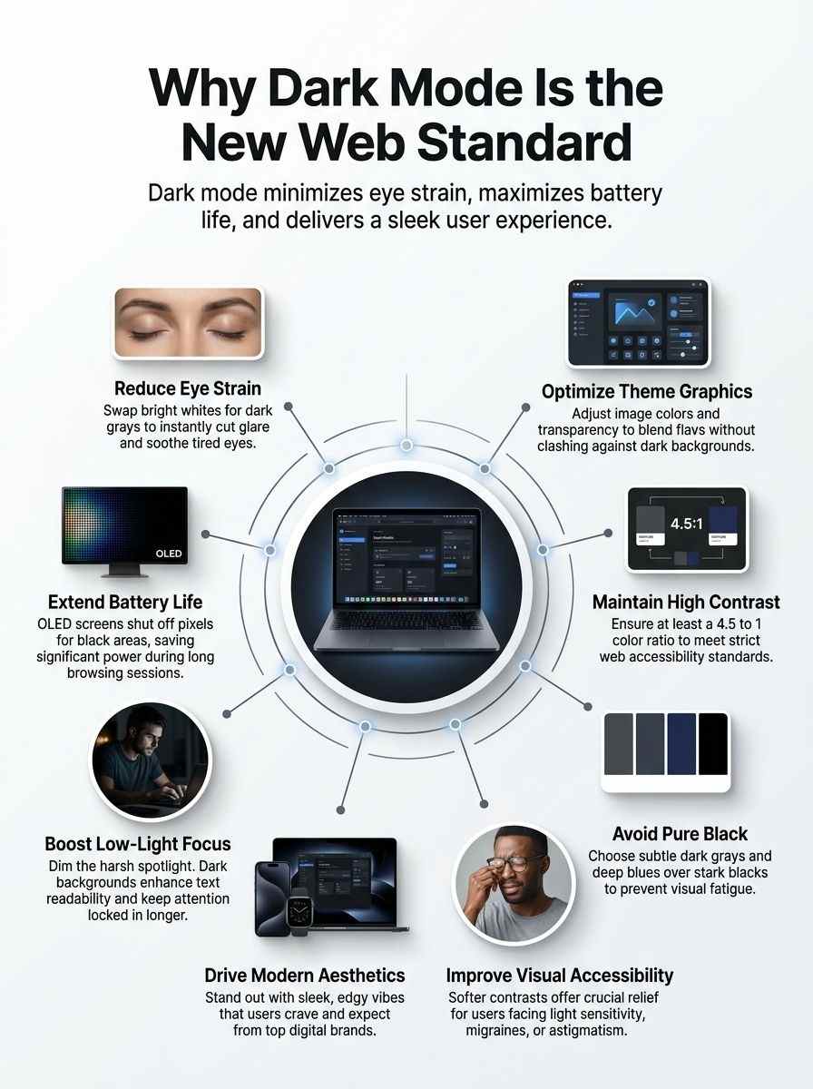
Imagine switching on dark mode after a long day, and your eyes thank you right away. It cuts down glare like a soft blanket over harsh lights, plus it saves power on those fancy screens we all love.
Reduced Eye Strain
Dark mode cuts down on eye strain, folks. You know that glare from bright screens late at night? It tires your eyes fast. Switch to dark mode, and light text on a dark background eases the load.
Users love this setup for better comfort in dim rooms. Think about scrolling through social media apps in bed; your eyes thank you. This feature boosts readability too, making text pop without the harsh light.
No more squinting or headaches after long sessions.
Eyes get a break with dark mode’s gentle approach. In low-light spots, like a cozy evening on the couch, it feels like a soft blanket for your vision. People pick it over light themes for that reason alone.
Social media started this trend, and now web designs follow suit. Your browsing stays smooth, even in the dark. Comfort rules here, plain and simple.
Extended Battery Life
You know, dark mode does more than look cool on your screen. It saves battery life on devices with OLED displays. These screens light up pixels only when needed. In dark mode, many pixels stay off.
That cuts power use a lot. Fact is, this choice helps the environment too. Devices run longer without charging. Imagine scrolling through your favorite site late at night. Your phone lasts hours more.
Developers love this perk. They add it to apps and sites. Users notice the difference right away.
Picture your tablet in a dim room. Dark mode kicks in and sips less energy. On platforms like social media, it’s now the go-to setting. This shift started with apps, then hit web design hard.
Energy savings add up over time. Think about all those devices worldwide. Less charging means a greener planet. Folks with sensitivities appreciate it even more. They get comfort plus efficiency.
Web teams test this on various gadgets. It boosts focus without draining power fast.
Improved Focus in Low-Light Environments
Dark mode shines, quite literally, when lights dim around you. Picture scrolling through a site late at night, with that harsh white glow blasting your eyes like a spotlight. Ouch, right? Switch to dark mode, and everything changes.
It cuts down on glare, letting you zero in on content without squinting. Users love this setup for better comfort in dim rooms, as studies show. Dark mode swaps bright backgrounds for deep grays or blacks, with light text popping out clearly.
This tweak boosts readability, so you stay locked in longer.
Think about those evening browsing sessions on your phone or laptop. Dark mode helps you focus, plain and simple, by easing eye strain in low-light spots. Folks pick it often for that cozy feel, making web time more enjoyable.
It even fits into modern design, where platforms set it as default. No wonder it spreads fast across apps and sites. Your eyes thank you, and so does your attention span.
Challenges of Implementing Dark Mode
Think you’re tweaking your site’s CSS to flip colors for those sleek dark themes, but suddenly text blends into the background like a ninja in the night, images lose their punch on OLED screens, and extra testing eats up hours across browsers like Chrome and Firefox—want the fixes that make it all worthwhile? Keep scrolling!
Ensuring Proper Contrast and Readability
Dark mode flips light backgrounds to dark ones, but contrast can make or break readability. Designers tackle this by checking color ratios, keeping text clear and eyes happy.
- Swap pure black for softer grays to cut glare, as dark mode reduces eye strain and boosts readability in low-light spots, much like dimming lights for a cozy movie night.
- Check contrast levels with tools like the WebAIM Contrast Checker to meet WCAG standards, since users prefer dark mode for better viewing comfort, especially on social media apps that started this trend.
- Adjust text colors to light shades on dark backdrops, improving focus in dim environments and saving battery on OLED screens, an eco-friendly perk that makes dark mode a smart choice for modern sites.
- Test designs on various devices to spot issues, because dark mode enhances user experience in general, yet demands tweaks for images to avoid washed-out looks in this user-focused feature.
- Balance aesthetics with function, as dark mode adds a sleek touch to platforms, driven by preferences for less strain, though it’s not essential since behaviors stay similar without it.
Reworking Images and Graphics for Dark Themes
Images often clash with dark backgrounds, making your site feel mismatched. Designers fix this by tweaking graphics to blend seamlessly, keeping users hooked.
- Adjust color schemes on images to match dark themes, like lightening edges or adding subtle glows, so they pop without overwhelming the eye, and dark mode reduces eye strain in low-light spots as users prefer for comfort.
- Invert colors on graphics carefully, flipping dark areas to light ones, which helps maintain that modern touch websites gain from dark mode, a feature popularized first by social media apps before hitting broader designs.
- Optimize file formats for faster loads in dark mode, swapping heavy files for lighter versions, since dark mode saves energy on devices and acts as an environmentally conscious choice that boosts battery life.
- Test transparency levels in illustrations, ensuring no weird halos appear on black backgrounds, tying into how dark mode enhances readability and becomes essential for user experience in today’s digital landscape.
- Redesign icons with higher contrast, using white outlines on gray fills, to support accessibility for sensitive users, and hey, it’s like giving your site a sleek makeover that aligns with dark mode’s rise as a standard driven by what folks expect.
- Scale down brightness in photos, applying filters to mute harsh lights, which improves focus in dim rooms, much like how dark mode swaps light backgrounds for dark grays with pale text for better viewing.
- Layer effects on visuals sparingly, avoiding pure blacks that swallow details, because dark mode adds aesthetic appeal while being user-focused beyond just trends, even if folks behave similarly without it.
- Collaborate with tools like design software to preview changes, making tweaks quick and fun, as dark mode spreads from apps to web platforms, turning into a mainstream feature for general browsing joy.
Increased Development and Testing Efforts
Developers face more work when they add dark mode to websites. They swap light backgrounds for dark gray or black ones, as dark mode involves that key change. This setup demands extra coding time, since teams must handle user preferences that drive the feature’s rise.
Social media apps popularized it first, spreading to broader web design now. Users love the modern touch it adds, making sites feel fresh and differentiated. Yet, teams rework elements to keep everything readable, which increases total effort.
Testing jumps up too, with checks across devices like OLED screens that save energy in dark mode. Teams verify reduced eye strain and better focus in low-light spots, ensuring the environmentally conscious choice pays off.
They confirm improved accessibility for sensitive users, as dark mode enhances viewing comfort. Extra rounds catch issues in varied lighting, upholding the user-focused feature’s benefits.
Brands differentiate through this, but the process requires careful steps to maintain quality.
Best Practices for Dark Mode Design
Picture your website as a cozy night owl, adapting smoothly to dim lights with CSS media queries that switch themes on the fly. You can tweak color palettes in tools like Figma to dodge harsh glare, making sure folks with light sensitivity keep scrolling without a hitch, so why not try these tips on your next project?
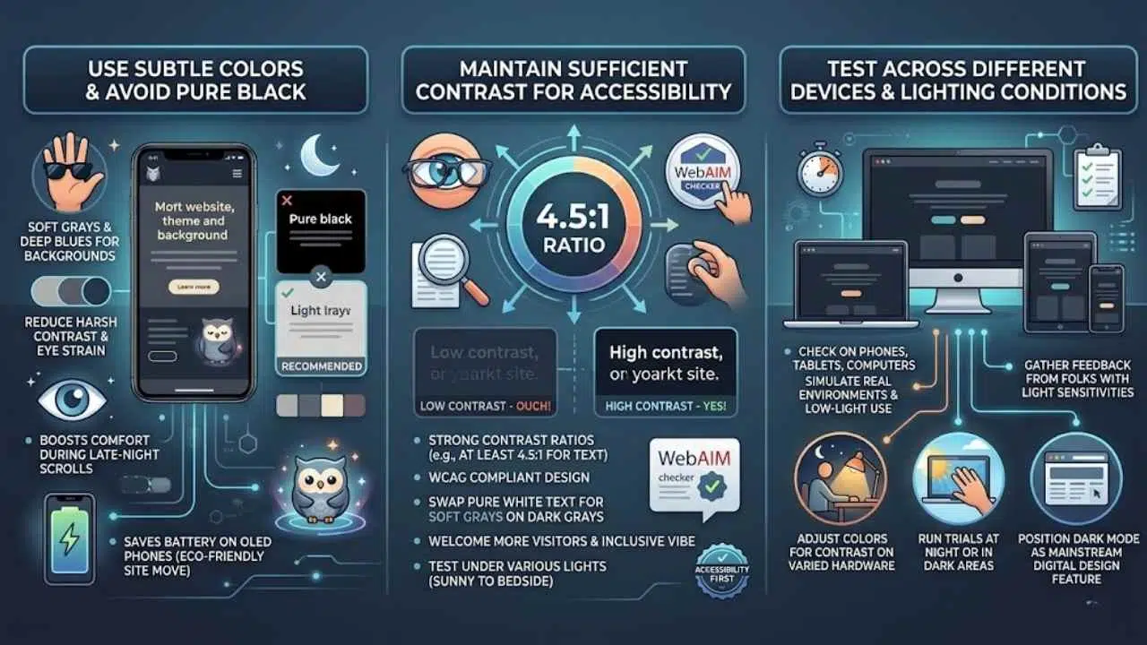
Use Subtle Colors and Avoid Pure Black
Designers pick soft grays and deep blues for dark mode backgrounds. They skip pure black to cut down on harsh contrasts that tire eyes out. Dark mode swaps those bright white screens for dark gray ones with light text, easing strain in dim rooms.
Users love this switch; it boosts comfort during late-night scrolls. Think of it like wearing sunglasses indoors, you avoid the glare but keep things clear. This choice also saves battery on OLED phones, a smart move for eco-friendly sites.
Go for muted tones that feel gentle, like a cozy blanket on a chilly evening. Test these colors on various screens to spot issues early. Brands stand out with this modern vibe, drawing folks who crave sleek looks.
Social media apps kicked off this trend, and now web pros follow suit for better user vibes. Keep text light and backgrounds subtle; that combo sharpens focus without the burn.
Maintain Sufficient Contrast for Accessibility
Imagine this, folks, you’re scrolling through a site at night, and the text blends right into that dark background like a shadow in the alley. Ouch, right? Dark mode boosts comfort and cuts eye strain, sure, but low contrast can trip up folks with visual sensitivities, making words hard to read.
Aim for strong contrast ratios, think at least 4.5 to 1 for regular text, following WCAG standards. Tools like the WebAIM checker help spot issues fast. Users love dark mode for better viewing in dim spots, yet it shines brightest when everyone can access it without squinting.
Swap out pure white text for softer grays on dark grays, and watch readability soar. This tweak saves battery on OLED screens and keeps sites modern and inclusive. Imagine a brand standing out with sleek vibes, all while welcoming more visitors.
Test those colors under various lights, from sunny rooms to cozy bedsides, and you’ll nail that essential user experience boost. Dark mode feels like a cozy blanket for your eyes, but solid contrast makes it a true friend to all.
Test Across Different Devices and Lighting Conditions
Designers test dark mode on various screens to catch issues early. This step keeps websites looking sharp, no matter the setup.
- Check dark mode on phones, tablets, and computers, since users browse in low-light conditions and prefer it for comfort, like how social media apps first made it popular before it spread to broader web design.
- Use real devices or tools like browser emulators to simulate different screens, focusing on energy savings for OLED devices, which makes dark mode an environmentally conscious choice that extends battery life.
- Test in bright rooms and dim spaces to spot readability problems, as dark mode reduces eye strain and improves focus in low-light environments, enhancing the user experience.
- Adjust colors for contrast on varied hardware, noting that dark mode swaps light backgrounds for dark gray with light text, adding a modern touch that’s now default on many platforms.
- Gather feedback from folks with light sensitivities, because dark mode boosts accessibility and is driven by user preferences, even though it’s not essential since behaviors stay similar without it.
- Run trials at night or in dark areas to mimic real use, tying into how dark mode saves energy and cuts eye strain, making it a user-focused feature beyond just a trend.
- Verify images and text pop on all setups, as this ensures viewing comfort, particularly in low light, and positions dark mode as a mainstream feature for modern digital design.
The Future of Dark Mode in Web Design
Dark mode keeps growing as a key player in web design, folks. Users now expect it on sites, much like they do on apps from social media giants. Consider this: you flip on your phone at night, and the screen glows softly, easy on the eyes.
That comfort drives the trend forward. Developers add it to boost user experience, making sites feel modern and fresh. Social media apps started the wave, and now broader web spots follow suit.
Energy savings on devices add to the appeal, like a smart choice for the planet. Think of it as the cool kid in class that everyone wants to hang with. Preferences shift, and dark mode meets them head-on.
It stands out as essential for today’s digital world, drawing in folks who crave that sleek look.
Expect dark mode to stick around and evolve, readers. It enhances browsing in dim spots, cutting eye strain like a trusty pair of shades. Platforms set it as default, from big names like Twitter to everyday sites.
You know, users stick to habits even without it, but with dark mode, focus sharpens in low light. Accessibility improves for sensitive eyes, creating a win-win. Brands use it to stand out, adding that modern vibe.
Imagine tweaking CSS with media queries to switch themes automatically, based on user settings in browsers like Chrome or Firefox. Tools such as system preferences in iOS and Android push this forward.
Dark mode saves battery on OLED screens, proving its practical side. Conversations buzz about it becoming the norm, driven by what users love and need.
Final thoughts
We’ve covered how dark mode flips light backgrounds to deep grays, boosts comfort, saves battery on smartphones, and tackles challenges like contrast checks. These tips make adding it simple and quick, with big payoffs in user happiness.
Ready to tweak your site’s theme? It cuts eye strain and draws more visitors, turning your web page into a cozy spot for night owls. Check out tools like CSS prefers-color-scheme for easy starts, and join forums for more ideas.
Flip the switch today, your audience will thank you with longer stays.
Frequently Asked Questions (FAQs) on Dark Mode Web Design
1. What makes dark mode a rising star in web design?
Dark mode flips the script on bright screens, using deep shades to cut eye strain. Think of it like switching from a sunny day to a cozy night, it saves battery on gadgets too. Websites now add this feature to keep users comfy and hooked longer.
2. Why do folks love dark mode on sites?
It eases the glare that tires your eyes after hours online. Plus, on phones, it stretches battery life like a smart saver.
3. How does dark mode boost site access for everyone?
It helps people with light-sensitive eyes browse without headaches, like a gentle filter on harsh lights. Designers weave it in as a toggle, making the web friendlier for night owls and day workers alike. This shift turns sites into welcoming spots, no matter the hour.
4. Can any website jump on the dark mode bandwagon?
Yes, coders tweak styles with simple switches for light and dark views. It fits right into modern web tools, keeping things fresh and user-focused.