
The best A/B test ideas for underperforming landing pages begin with finding the point where visitors hesitate. An ad promises a free guide, but the page opens with a vague slogan. A mobile visitor wants to book a demo, but the button is hidden in a menu. Someone begins a form and gives up halfway through.
Each of those problems suggests a different experiment. Test one plausible fix against the current page, then judge it by completed signups, qualified leads, or sales. A better-looking page or a higher button click rate may still fail to improve the outcome that matters.
Find the problem before choosing a test
When a landing page underperforms, I would first look at the visitor’s path: arrival, engagement with the offer, call-to-action (CTA) click, form start, submission, and any later sale. The point of greatest drop-off tells you where to investigate.
| What you see | A useful place to start |
| Visitors leave soon after arriving | Ad-to-page match, headline, image, or load speed |
| Visitors read the offer but rarely act | CTA wording, missing proof, or unclear cost and commitment |
| People start a form but do not finish | Field count, labels, errors, or mobile form layout |
| Mobile visitors convert far less often | CTA visibility, layout, or mobile performance |
Compare traffic sources and devices separately. A specific search query and a broad social ad can bring people with different questions to the same page. Make sure your analytics records successful submissions and purchases; a button click alone does not confirm either one.
These 12 tests cover common points of friction. Choose the one that matches what your own data and visitor feedback reveal.
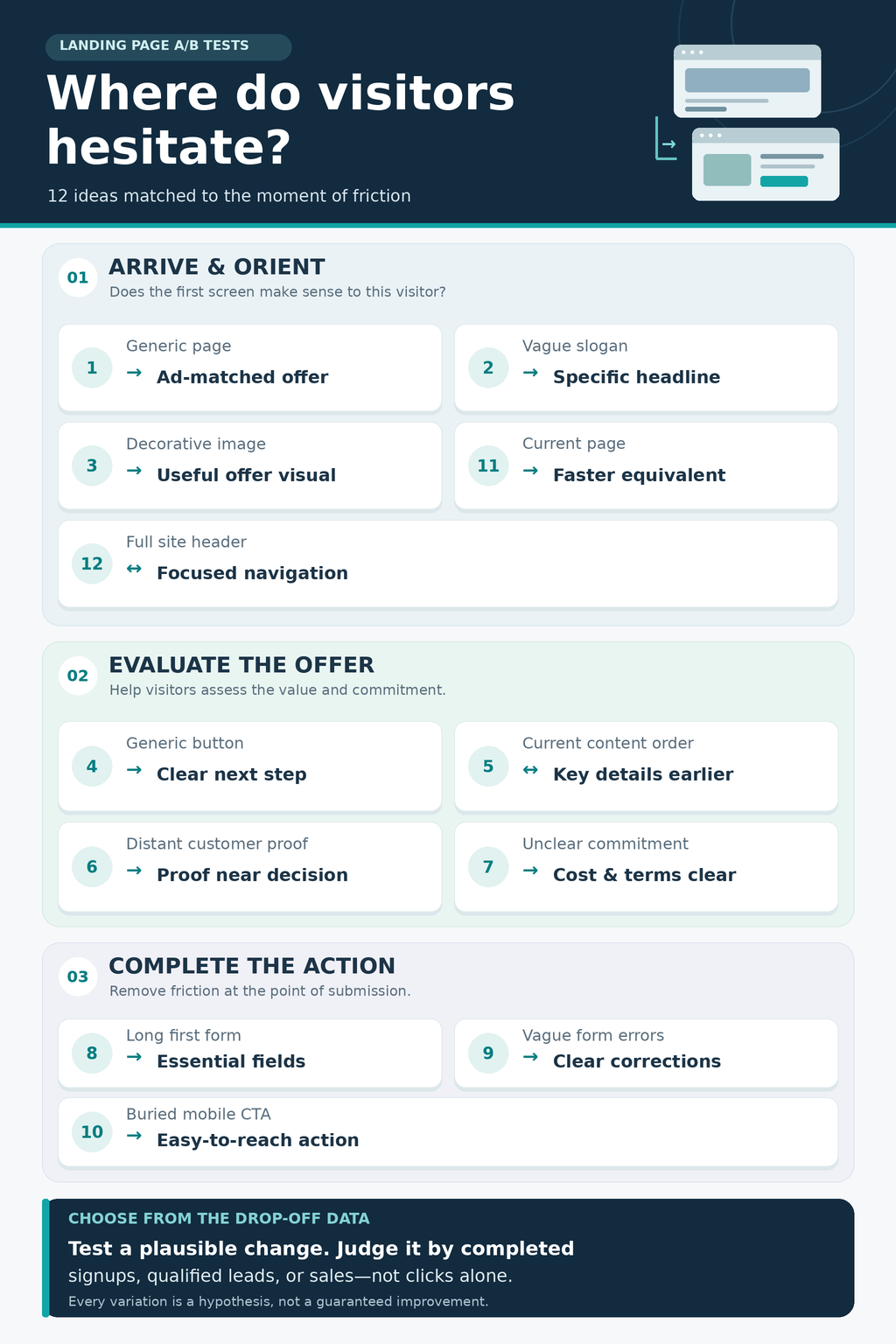
1. Match the page to the ad’s promise
Control: A generic page used for several campaigns.
Variation: A headline and first offer section that reflect the particular ad or search intent.
If an ad offers a free webinar checklist, the checklist should be apparent as soon as someone lands. A headline about “transforming your marketing” makes that visitor work to confirm they reached the right place. Google Ads also advises advertisers to keep landing-page content and calls to action aligned with the clicked ad.
Run this test for the relevant traffic source, and measure completed downloads, purchases, or qualified enquiries. Keep both versions honest: the variation must not introduce a discount or promise the business cannot deliver.
2. Make the headline specific enough to evaluate
Compare a broad brand slogan with a headline that says what the offer does and who it helps. “Build a Better Future” could describe almost anything. “See every new lead and its next follow-up in one dashboard” gives a sales team something concrete to assess, provided the product actually does that.
The supporting line can explain what is included and how to get it. Avoid invented savings, deadlines, or guaranteed results. The question is whether visitors understand the value sooner and complete the intended action, not whether the new headline sounds more exciting in a meeting.
3. Replace a decorative hero image with useful evidence
Test a generic stock photo against a real product screenshot, a product shown in use, or a photograph of the service being delivered. The image should answer a question: What does the software look like? How large is the product? Who will do the work?
In a reported event-page test, replacing a laptop image with a photograph of the live conference increased clicks toward registration. The original image had suggested a different kind of event. That case demonstrates why the picture must support the offer, but its measured result was clicks toward registration, not completed registrations. Follow visitors through to your actual goal.
4. Tell visitors what the CTA will do
Put “Submit” or “Get Started” against a label that names the immediate next step: “Download the checklist,” “See available plans,” or “Book a demo.” Keep the button’s position and design consistent so the wording is the main difference.
A label must also be accurate. “Get instant access” sets the wrong expectation if the next page asks for a sales call. Measure completed downloads, bookings, or signups. A variation can receive fewer casual clicks and still bring in more worthwhile conversions.
5. Change the order or amount of supporting content
If visitors face a long explanation before they can assess the offer, test bringing the central benefit and CTA forward. Move screenshots or frequently asked questions below the first decision point while keeping essential details available.
Shorter is not automatically better. In an AssessmentDay landing-page test reported by its experimentation provider, removing the FAQ improved sales; removing screenshots separately also helped. Removing both reduced sales. I would treat that as a reminder to test which information visitors need and when they need it. Judge the change by sales or qualified leads, not scroll depth alone.
6. Put credible proof beside the decision
Compare a page that keeps customer evidence elsewhere with one that places a relevant review or case result near the offer or form. Proof is most useful when it answers a real hesitation: Has this worked for someone like me? What was delivered? What happened after they signed up?
Use genuine, attributed comments with permission or a verifiable result. A row of unexplained logos or an anonymous “Amazing service!” quote offers little reassurance. One reported education landing-page test increased brochure requests after placing a testimonial above its form. The result is a reason to test placement, not a promise that every testimonial will increase conversions.
7. Clarify price and commitment before the click
Test whether showing the applicable price or price range, extra charges, trial conditions, or next steps near the CTA changes completed conversions. For a consultation, explain whether it costs anything and what happens after the request. For software, make any card requirement or trial limit clear. For a product, help buyers understand delivery costs before checkout.
Baymard’s product-page research found that many shoppers looked for shipping costs before adding an item to the cart. That finding comes from ecommerce, so do not treat it as proof that publishing a service price will always raise leads. It does support testing whether uncertainty about the commitment is holding your visitors back.
8. Ask for fewer details on the first form
Compare the current lead form with one that requests only the information needed for the immediate next step. If a visitor wants an emailed guide, do you need a phone number and annual budget before sending it? Those questions may belong in a later conversation.
Keep fields needed to fulfil an order, contact the person as promised, or meet applicable requirements. More importantly, measure qualified leads per visitor alongside form submissions. A shorter form can attract more responses while leaving the sales team with fewer useful enquiries.
9. Help people correct form errors without starting over
If form starts are healthy but completions are low, test clearer labels, visible required-field indicators, timely error messages, and preservation of answers after an error. Check whether the mobile form follows a natural single-column path.
A visitor should not submit a form, receive “Something went wrong,” and have to guess what to fix. A reported Micro Focus A/B test improved form completions after clarifying which fields were required. If you change several form details together, describe the result as a win or loss for the complete form variation. The test cannot isolate which detail made the difference.
10. Make the primary action easy to reach on mobile
A desktop CTA may be obvious while its mobile equivalent sits inside a menu or disappears after a long scroll. Compare that experience with a clearly visible action near the relevant offer. Depending on the page, a sticky button that leads to the form may be worth testing.
Check small screens and the on-screen keyboard before launch. A sticky bar should not cover content, form fields, or other controls. Measure completed mobile signups or purchases. Published tests of sticky product-page buttons have measured more cart clicks, but a cart click does not establish that more customers bought anything.
11. Compare the current page with a faster equivalent
If a large hero file, third-party scripts, or layout shifts slow the page, test an optimized version that keeps the same words, offer, and functions. This gives you a clearer view of whether performance itself affects conversions.
Rakuten 24 reported a month-long, evenly split landing-page test in which the optimized version was otherwise visually and functionally the same. It loaded faster in a mobile test and produced higher conversions and revenue per visitor. That result belongs to Rakuten’s page; your own test should use real visitor performance data and your own business outcome.
On a campaign page with one clear action, compare the full site header with a focused version that removes unrelated exits. Preserve access to policies and the information visitors need to assess the offer.
There is no universal rule to remove menus. Yuppiechef reported more wedding-registry signups after taking navigation off its landing page. RMIT Online reported more leads after making useful course categories easier to find on mobile. The question is whether each link helps your visitors make a decision or pulls them away from it. Track the final conversion as well as where people go next.
Run the experiment so the result means something
Start with a hypothesis tied to an observed problem. For example: “Mobile visitors cannot find the demo button. Showing it in the header may increase completed demo requests.” That gives the team a specific change and an outcome to check.
Choose one primary metric before launch. For a sales page, it might be purchases per visitor. For a lead page, it might be qualified leads. Watch related measures such as form completion, average order value, or lead quality to catch an apparent win that hurts the business further down the journey.
Split comparable visitors between versions at the same time. Estimate the sample required from the current conversion rate and the smallest improvement worth detecting. Run the test through a normal traffic cycle and until the chosen method’s requirements are met; a fixed number of calendar days is not enough if there are too few conversions. Verify that both pages work and that tracking counts the same action in both groups.
A test can change several elements if they form one coherent solution, such as redesigning a difficult form. It then tells you which whole version performed better, not which individual field or button caused the result. An inconclusive test is also a result. Avoid declaring a winner simply because the variation briefly pulls ahead.
Start With the Moment Visitors Hesitate
When a landing page misses its goal, I would look for the moment visitors hesitate: a promise they cannot recognize, a cost they cannot find, or a form asking for more than the next step needs. That observation gives the test a reason to exist. Change the part that may be causing friction, decide what success means before launch, and follow people through to qualified leads or sales. Some tests will improve the page. Others will show that the suspected problem lies elsewhere. Both are useful when they lead to a clearer next decision.
Frequently Asked Questions about A/B test ideas for underperforming landing pages
1. What should I test first?
Start where the largest meaningful drop-off occurs. Early exits point toward relevance, clarity, or speed. Low CTA engagement suggests examining the offer and next step. High form starts with low completions suggest form friction.
2. How many visitors does a landing page A/B test need?
There is no universal number. The existing conversion rate, the smallest change worth detecting, the test method, and the number of variants all affect the required sample. Estimate it before starting. For a low-traffic page, user interviews or a larger, more meaningful variation may be more useful than repeatedly running underpowered tests.
3. How long should I run the test?
Run it until it meets the preplanned sample or the requirements of the statistical method you use, while covering the usual weekly pattern in traffic. Do not stop a conventional fixed-sample test just because one version leads after a few days.
4. Should I change only one element at a time?
A single-element test is easier to interpret. A broader variation is reasonable when several connected changes solve one problem. If that version wins, credit the complete change; test its parts separately only if you need to know which one mattered.
5. What if clicks rise but sales fall?
The variation has not met a sales goal. Check whether the CTA attracts people who are not ready to buy, the next page breaks the promise, or order value has changed. Clicks can explain a result, but they should not replace the business outcome.