The Nordic region is an absolute goldmine for digital brands right now. You cannot just copy and paste a US or UK strategy here and expect to win. People in Sweden, Norway, Denmark, and Finland boast some of the highest digital literacy rates on the entire planet. They expect websites to be blazing fast, incredibly clean, and deeply connected to their everyday lives.
If your online store feels like a generic, templated site, shoppers will bounce before your hero image even finishes loading. When we talk about Nordic e-commerce design, we look at a massive market where nearly everyone shops online monthly. By 2026, consumer expectations hit an all-time high across the board. Shoppers demand to see their local currency, exact language nuances, and payment methods that do not force them to pull a plastic card out of a physical wallet. To succeed here, you truly need to understand the cultural DNA of the North and adapt your entire layout to match their strict preferences.
| Market Insight | Current Data & Trends |
| Digital Literacy Rate | Over 95 percent of the total population |
| Online Shopping Frequency | 86 percent of consumers shop monthly |
| Preferred Browsing Device | Mobile devices drive 70 percent of traffic |
| Core Consumer Values | Unshakable trust, sustainability, and sheer efficiency |
Why Treating the Nordics as a Single Market is a Mistake?
Differences in Local Regulations
One of the biggest blunders international brands make is lumping all Northern countries into one neat little bucket. While they absolutely share a love for modern minimalism, their underlying infrastructures remain vastly different. Sweden acts as the massive tech hub with a booming start-up scene, while Norway sits firmly outside the European Union. This creates a highly unique set of customs and tax hurdles that you must tackle head-on. Your Nordic e-commerce design needs to stay flexible enough to handle these major differences without breaking the user experience.
For instance, a Norwegian shopper remains incredibly sensitive to hidden import duties and surprise fees at checkout. If your checkout page does not clearly show that VAT is fully handled, they will immediately abandon the cart and never return. Meanwhile, a shopper in Finland might hunt for specific bank-direct payment links that a typical Swede would never even consider using. You need a modular, intelligent design that seamlessly adapts to these hyper-local regulatory realities.
| Country | Regulatory & Market Focus |
| Sweden | High competition, mobile-first design priority |
| Norway | Strict customs, non-EU tax transparency |
| Denmark | Demands rapid urban logistics and home delivery |
| Finland | Unique language syntax requiring flexible UI layouts |
Cultural Nuances in User Behavior
Danes are often described as the most continental group in the region, showing a bit more openness to broad international retail trends. Finns are remarkably direct and value high-quality technical specifications way more than emotional marketing fluff. Swedes and Norwegians are incredibly brand-loyal but will ditch your store in a heartbeat if your mobile app feels even slightly clunky. Designing for these specific nuances means your user interface should feel like it was built locally in Stockholm or Helsinki.
You cannot just run your English site through a basic translation tool and call it a day. The cultural tone must reflect local expectations, favoring honesty and clarity over aggressive sales pitches. When a shopper lands on your page, they should instantly feel that you understand their daily habits and preferences. Crafting this exact localized experience heavily boosts your overall conversion rates and builds solid, long-term brand equity.
| Target Country | Core Behavioral Trait |
| Swedish Shoppers | Appreciate balance and modern, clean aesthetics |
| Norwegian Shoppers | Prioritize durability and outdoor lifestyle compatibility |
| Danish Shoppers | Seek convenience and friendly, cozy brand messaging |
| Finnish Shoppers | Demand factual accuracy and high technical detail |
1. Embrace Minimalist, Functional Aesthetics
The Concept of Lagom in User Experience
Nordic design is famous globally for a very specific reason. It focuses heavily on pure beauty through sheer utility. When building a digital storefront, you must avoid the loud, flashy style of web design commonly seen in other markets. There should be zero blinking banners, no aggressive pop-ups blocking the screen, and definitely no blinding neon colors. The primary goal is to make your product the absolute hero of the visual story. In Sweden, the word lagom describes something that is just right, striking a perfect balance.
In web design, this translates to finding the exact sweet spot between a terrifyingly blank page and a chaotic, cluttered one. Your site navigation should feel highly intuitive, featuring clear categories that do not require endless clicks to reach the desired product. The user should feel a genuine sense of calm when browsing your catalog, which organically builds a deep, subconscious level of trust in your brand identity.
| Design Element | Nordic Preference |
| Site Navigation | Flat menus with highly simplified categories |
| Color Palette | Muted, earthy tones or clean monochrome themes |
| Pop-ups | Extremely limited or completely removed |
| Typography | Highly legible, clean, and modern sans-serif fonts |
Implementing White Space Strategically
White space is never just empty space on a webpage. It is an incredibly powerful tool that strategically directs the user’s eye right where you want it. By using very generous margins and padding, you tell the shopper exactly what to look at next without overwhelming them. This technique is especially useful on individual product pages where you want the add to cart button to pop visually. You can achieve this without relying on ugly, vibrating background colors that clash with your brand.
Use high-quality typography with plenty of line height to ensure that text remains readable. This is critically important because words in languages like Finnish can get incredibly long. If your text is cramped, it becomes completely unreadable on a smaller mobile screen. Proper white space ensures that your Nordic e-commerce design feels premium, modern, and perfectly aligned with local consumer expectations.
| White Space Strategy | User Benefit |
| Generous Padding | Reduces cognitive overload for the shopper |
| Spaced Typography | Improves reading speed for longer local words |
| Isolated Call to Action | Naturally draws the eye to the purchase button |
| Clean Image Borders | Makes product photography look high-end and premium |
2. Integrate Hyper-Local Payment Methods
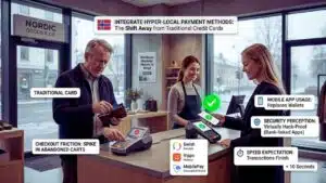
The Shift Away from Traditional Credit Cards
If you only offer standard credit card options, you are actively leaving massive amounts of money on the table. In the Northern markets, local mobile payment applications are absolute kings. These secure apps connect directly to the user’s bank account and digital identity. This makes them much safer, faster, and more reliable than typing out credit card details. By 2026, many younger shoppers across the region have never even held a physical credit card for an online purchase.
Nordic shoppers heavily value checkout speed above almost anything else. They want to click a single button, see a quick notification on their mobile phone, and be done with the entire transaction. Using a traditional card requires finding a physical wallet, entering a long number, adding an expiry date, and typing a security code. This clumsy process feels like ancient history and creates unnecessary friction that leads to dropped sales.
| Payment Reality | Market Impact |
| Checkout Friction | Leads to a massive spike in abandoned shopping carts |
| Mobile App Usage | Replaces physical wallets for daily digital transactions |
| Security Perception | Bank-linked apps are viewed as virtually hack-proof |
| Speed Expectation | Transactions must finish in under ten seconds |
Key Payment Gateways by Country
You simply must integrate the right payment gateways if you want to survive. In Sweden, you absolutely must have Swish integrated flawlessly into your system. In Norway, the entire digital economy revolves around an app called Vipps. Denmark relies heavily on MobilePay for almost every online and offline purchase. If these specific logos are not highly visible on your product page or footer, many shoppers will assume your site is a scam.
They immediately think you are not a trusted local seller and will leave without buying a thing. Furthermore, buy now pay later services like Klarna set the standard expectation across the entire region. Shoppers absolutely love having the option to receive and try products at home before their bank account ever gets debited. Your Nordic e-commerce design must place these exact local payment options at the very front and center of the checkout flow.
| Country Market | Essential Payment Gateway |
| Sweden | Swish |
| Norway | Vipps |
| Denmark | MobilePay |
| Finland | Verkkopankki |
3. Prioritize Sustainability and the Circular Economy
Designing for Eco-Conscious Shoppers
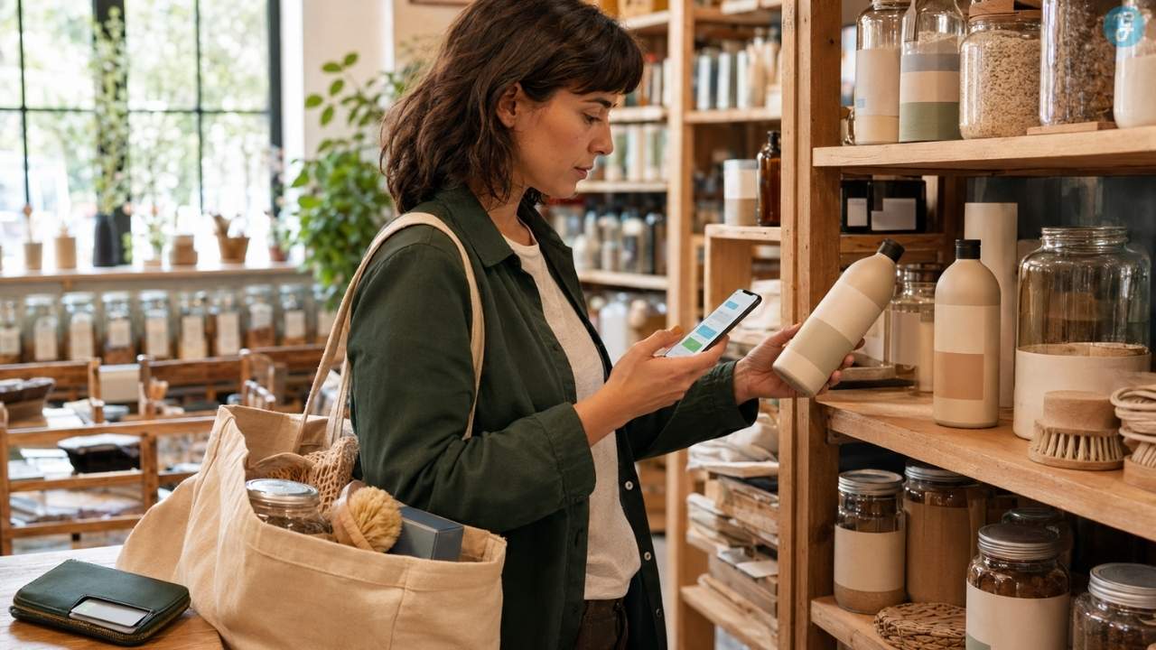
Sustainability is definitely not just a cheap marketing gimmick in the Nordics. It is a fundamental way of life for the vast majority of consumers. Shoppers here are highly educated on personal carbon footprints, global supply chains, and ocean plastic waste. If your digital store hides its environmental impact, people will instantly get suspicious and leave. You need to be incredibly loud and totally clear about exactly how your company helps the planet.
However, you must remain strictly honest about your claims to avoid getting called out for greenwashing. Your product pages should feature clean icons that proudly highlight eco-friendly materials and manufacturing processes. Use very simple, direct labels for terms like organic or recycled or carbon-neutral shipping. It is also an incredibly smart move to include a small section detailing how the customer can recycle the product at the end of its natural life.
| Eco-Friendly Strategy | User Trust Impact |
| Clear Material Badging | Instantly boosts confidence in product quality |
| Carbon Tracking Data | Appeals strongly to younger, climate-aware buyers |
| Transparent Packaging Details | Removes the guilt associated with online shipping |
| Honest Supply Chain Info | Builds long-term loyalty and repeat brand purchases |
Integrating Second-Hand and Resale Marketplaces
One of the absolute hottest trends hitting the digital market right now is the integrated circular shop. Massive Nordic retailers are currently building dedicated resale sections right into their primary websites. This smart design choice allows returning customers to buy gently used items or easily trade in their old gear for instant store credit. Designing a smooth, seamless interface for this exact process can massively boost your brand reputation.
Users need to easily see the exact condition of a used item through high-quality photography and detailed text descriptions. If you sell both brand new and refurbished items, your search filters must clearly distinguish between the two categories. This allows eco-conscious shoppers to actively navigate straight toward the sustainable choices without getting frustrated. Offering a seamless take-back program shows that you actually care about the product long after the initial sale is completed.
| Circular Economy Feature | Implementation Strategy |
| Dedicated Resale Portal | Build a specific tab for pre-loved inventory |
| Condition Rating System | Use clear visual stars or grades for used items |
| Trade-In Interface | Offer instant digital store credit for old products |
| Smart Search Filters | Allow users to filter exclusively for recycled goods |
4. Build a Flawless Mobile-First Experience
Designing for the Commuter
If you visit cities like Stockholm or Oslo, you will quickly notice almost everyone staring at their phones on the train. A massive chunk of all regional e-commerce happens right during these daily transit commutes. This reality means your mobile website cannot just be a lazily shrunk down version of your desktop layout. It needs to be built specifically for one-handed use with a thumb. Buttons must remain well within easy reach, and page load times need to stay lightning-fast, even when moving between cellular towers.
Commuters naturally have very short attention spans and face constant physical distractions. Your interface needs to allow for interrupted shopping sessions without losing any data. This means your shopping cart must save items automatically and instantly. The checkout flow should be so streamlined that a user can easily complete a purchase between two quick subway stops.
| Mobile Design Element | Purpose for the Commuter |
| Thumb-Zone Layout | Keeps core buttons reachable with one hand |
| Auto-Save Cart Memory | Prevents lost sales if a connection drops |
| Streamlined Checkout | Allows lightning-fast purchases on the go |
| High-Contrast UI | Keeps text readable under bright sunlight |
Speed and Accessibility Standards
The Nordic nations boast some of the absolutely fastest internet infrastructure in the entire world. However, that fact does not give you permission to write lazy, bloated website code. Users here possess zero patience for a webpage that takes longer than two or three seconds to fully render. You absolutely must compress your high-resolution product images and minimize heavy scripts. Furthermore, social inclusivity acts as a core, foundational Nordic value that you cannot ignore.
Your website must remain fully accessible to people navigating with visual impairments or physical limitations. You need to follow the latest digital accessibility standards to ensure screen readers can easily parse your menus and product descriptions. Providing high contrast text ratios and clear alternative image tags is not just a nice bonus. It is a strict requirement if you want to earn respect and capture the full market potential.
| Performance Metric | Implementation Standard |
| Page Load Speed | Must fully render in under three seconds |
| Image Optimization | Use modern web formats to reduce total file size |
| Screen Reader Support | Ensure all menus and buttons have proper text tags |
| Visual Contrast | Maintain high contrast ratios for poor eyesight accessibility |
5. Cultivate High Trust with Transparent Signals
Leveraging Digital Identification
Brand trust forms the absolute foundation of any successful sale in the Northern markets. While local citizens generally hold deep trust for their governments and neighbors, they stay highly wary of unfamiliar foreign websites. You must provide immediate, visual proof that you operate a totally legitimate and secure business. This effort goes far beyond simply installing a standard security certificate on your server. It involves showing the customer that your digital infrastructure deeply connects with their familiar, local ecosystem.
One of the absolute best ways to establish instant trust is by seamlessly integrating digital identification systems. In places like Sweden and Norway, secure digital IDs handle everything from filing taxes to booking healthcare appointments. If a shopper can log into your store using their national digital ID, they instantly know their personal data remains incredibly safe. It also makes filling out shipping forms effortless since their details pull automatically from verified government profiles.
| Trust Building Tool | Consumer Perception |
| Bank-Linked Login | Maximum security and ultimate convenience |
| Verified SSL Certificates | Baseline expectation for any digital transaction |
| Local Contact Details | Proves you have a real presence in the region |
| Data Privacy Badges | Reassures users that their information is never sold |
The Power of Verified Customer Reviews
Shoppers in this region inherently trust the honest opinions of other ordinary shoppers much more than clever marketing copy. You need to display your customer reviews highly prominently right near the top of the product page. Make absolutely sure that these reviews are fully verified to prevent any suspicion of fake manipulation. Utilizing a well-known, localized third-party platform that has deep roots in Denmark or Sweden is an incredibly smart strategic move.
You should actively show both the highly positive and slightly negative reviews to maintain total transparency. A digital storefront showing only perfect five-star reviews looks totally fake to a highly skeptical Norwegian or Finnish consumer. Beyond product reviews, clearly display your full return policies, exact shipping costs, and direct customer service contact numbers. If a shopper has to dig through your website footer to find return information, they will simply close the tab.
| Review Strategy | Direct Impact on Sales |
| Third-Party Verification | Stops users from thinking you fake your own feedback |
| Showing Mixed Reviews | Adds immense credibility to your overall product catalog |
| Clear Return Policies | Drastically lowers anxiety right before clicking buy |
| Prominent Display | Keeps users on the page instead of searching for external reviews |
6. Localize Language and Cultural Nuances
Translating Beyond Simple Text
Relying exclusively on automated translation tools for your main website serves as a guaranteed recipe for failure. The specific languages spoken in the North are highly distinct and carry their own unique grammatical rhythms. Even though almost everyone speaks totally fluent English, they feel far more comfortable spending hard cash on a site native to their local tongue. Properly translating your site proves you actually care about their specific market experience.
True localization always pushes far beyond merely swapping out English words for local vocabulary. For example, Finnish words are notoriously long and can easily shatter your beautifully designed navigation menus. You need a highly flexible user interface that automatically scales to handle significantly varying text lengths. You must also guarantee that your specific date formats and metric measurements align flawlessly with what local shoppers use every single day.
| Localization Task | Technical Requirement |
| Fluid Menu Design | Must expand to fit very long Finnish word structures |
| Metric System Check | Ensure all weights and sizes avoid imperial units completely |
| Local Date Formats | Utilize the standard day-month-year formatting |
| Currency Displays | Format numbers with local comma and decimal placement |
Adapting Tone and Messaging
The overall tone of your written website copy must remain incredibly humble, highly factual, and wonderfully direct. You must strictly avoid hyper-marketing phrasing where you claim every item is a life-changing miracle product. Nordic people heavily appreciate raw honesty and will instantly spot fake enthusiasm from a mile away. If a winter jacket holds a specific waterproof rating, simply tell them the exact technical number without adding unnecessary fluff.
Shoppers here want facts, not fiction, is a common saying among regional retail experts. Being entirely straightforward and genuinely helpful stands as the absolute fastest way to win their loyalty. Craft your product descriptions to clearly explain exactly how the item works and why it lasts a long time. Drop the aggressive countdown timers and flashing red text that screams about limited stock because it just creates annoying, negative pressure.
| Copywriting Style | Cultural Reception |
| Factual Product Specs | Builds immense respect and limits return rates |
| Humble Tone | Aligns perfectly with local cultural values of modesty |
| Absence of Fluff | Keeps the reading experience smooth and highly efficient |
| Honest Urgency | Only use stock alerts if an item is genuinely selling out |
7. Offer Flexible, Transparent Delivery Options
Designing the Checkout Logistics Experience
In the Northern markets, the specific where and how of product delivery matter just as much as the product itself. Shoppers maintain very strict daily routines and demand total control over how packages arrive. Some users absolutely prefer a box left directly at their front door, while others demand to pick it up from a nearby grocery store locker. Your Nordic e-commerce design absolutely must present these distinct choices clearly before the user even begins typing their payment details.
The checkout screen should essentially function like a highly optimized logistics dashboard. Shoppers expect to see an interactive digital map of nearby pick-up points or a simple list of popular local carrier options. Providing a highly accurate estimated delivery date works significantly better than giving a vague delivery window. Total transparency right here prevents stressful delivery anxiety and drastically cuts down on angry customer service emails.
| Logistics Feature | User Checkout Experience |
| Interactive Map | Allows easy selection of the nearest neighborhood parcel locker |
| Exact Delivery Dates | Removes all guesswork about when the package will arrive |
| Multiple Carriers | Gives the user the power to pick their favorite local delivery company |
| Upfront Pricing | Stops cart abandonment caused by hidden, last-minute shipping fees |
Promoting Eco-Friendly Shipping
Because personal sustainability holds such massive importance, you should always highlight a completely green shipping method. This might look like a dedicated bicycle courier navigating the streets of Copenhagen or a fully electric truck delivering goods across Stockholm. Visually highlighting these clean options with a tiny green leaf icon makes the shopper feel incredibly good about finalizing their purchase. Many regional consumers will happily agree to wait an extra day or two if it guarantees their delivery produces zero carbon emissions.
You must ensure that these specific eco-friendly options are not hidden at the bottom of a drop-down menu. Place them right at the top of the shipping list so they act as the default, preferred choice. Taking this step proves your brand genuinely commits to lowering pollution rather than just writing a nice paragraph about it on an about page.
| Shipping Option | Environmental Impact |
| Fossil-Free Transport | Drastically cuts carbon emissions for urban home deliveries |
| Consolidated Shipping | Groups multiple items together to reduce total packaging waste |
| Bicycle Couriers | Provides completely emission-free delivery in major city centers |
| Pick-Up Lockers | Lowers the number of failed delivery attempts by big trucks |
8. Master Cross-Border Usability

Currency Switching and Dynamic Pricing
Absolutely nothing murders an online sale faster than a user seeing their total cost displayed in foreign dollars or euros. Your website infrastructure must automatically detect the exact geographic location of the shopper and instantly swap the currency display. This sounds like an incredibly simple task, yet an alarming number of major international websites still completely fail at executing it properly. You also need to guarantee that your displayed price includes all mandatory local taxes right from the very first click.
In the Nordics, the exact price you view on the product screen is the final price you fully expect to pay. Slapping on hidden digital taxes or random processing fees at the absolute last step guarantees instant cart abandonment. Giving the user a clean, highly accurate price prevents frustrating mental math and builds a totally frictionless cross-border shopping journey.
| Pricing Feature | Cross-Border Benefit |
| IP Location Detection | Automatically serves the correct local language and currency |
| Transparent Tax Display | Prevents massive sticker shock when reaching the final checkout step |
| No Hidden Fees | Builds total trust and drastically increases the overall conversion rate |
| Live Exchange Rates | Ensures your profit margins remain safe while offering fair local pricing |
Handling International Shipping Policies
If you ship inventory straight into Norway from outside their borders, you must clearly address their specific customs rules head-on. Cross-border shopping happens daily, but confusing import taxes remain the absolute highest source of customer complaints. Your web design should function as a helpful guide, navigating the user safely through complex international shipping rules. Use a highly visible banner to explicitly state that you ship to their specific country without any hidden border fees.
Clearly label your items as having all duties pre-paid so Norwegian shoppers can breathe a massive sigh of relief. You can even design a small, helpful tooltip popup right next to the buy button that simply explains how local shipping works. Providing all this crucial information right up front ensures the shopper never gets cold feet right before completing the final purchase.
| Policy Transparency | Customer Experience Improvement |
| Duties Pre-Paid Tag | Removes the massive fear of surprise bills from the local post office |
| International Banners | Welcomes the foreign user and confirms you service their exact area |
| Clear Tooltips | Explains complex shipping timelines without forcing users off the page |
| Border Delay Info | Manages expectations if customs processing takes an extra day |
9. Utilize High-Quality, Authentic Visuals
Moving Away from Generic Stock Photography
The deeply ingrained visual aesthetic of the North firmly roots itself in raw nature and total, unpolished reality. People living here possess a remarkably low tolerance for incredibly fake, heavily airbrushed, and totally overly processed marketing imagery. They desperately want to see exactly how a product actually looks under totally natural, outdoor lighting conditions. They absolutely hate seeing items placed in sterile, white-box photo studios featuring highly artificial drop shadows.
Your specific Nordic e-commerce design must feel incredibly grounded, totally authentic, and deeply connected to real life. Stop buying generic stock photos featuring overly perfect models smiling aggressively in completely unidentifiable locations. Instead, hire diverse, totally natural-looking people who look exactly like they might be your actual neighbors in Copenhagen or Helsinki. Show your heavy winter coats getting soaked in actual rain or your boots trekking through real, muddy snow.
| Visual Content Strategy | Customer Reaction |
| Natural Lighting Use | Makes the product colors look highly accurate and totally realistic |
| Diverse, Real Models | Helps normal shoppers easily visualize themselves using the item |
| Authentic Backgrounds | Grounds the product firmly in a relatable, everyday physical environment |
| Zero Text on Images | Keeps the UI totally clean and prevents messy visual overlap |
Adapting to Seasonal Realities
The natural seasons operating in the Northern hemisphere remain incredibly extreme and dictate massive shifts in daily consumer behavior. During the harsh winter months, it stays dark, wet, and freezing, while summer brings endless, incredibly bright sunshine. Your digital storefront visuals must dynamically adapt to perfectly match these massive seasonal shifts. Swapping out your main homepage hero images to reflect the exact current weather makes your brand feel highly present and totally relevant.
Running a targeted winter campaign heavily featuring cozy, indoor scenes heavily resonates with the famous local concept of indoor comfort. Conversely, your bright summer imagery should loudly celebrate outdoor nature hikes and the incredibly popular midsummer culture. Ignoring these massive seasonal shifts makes your digital brand look totally disconnected from the actual reality your local customers experience every single day.
| Seasonal Adaptation | Marketing Focus |
| Winter Visuals | Highlight pure warmth, indoor coziness, and heavy weather protection |
| Summer Visuals | Celebrate outdoor freedom, bright sunlight, and active lifestyle gear |
| Transition Periods | Focus heavily on unpredictable rain gear and versatile layering options |
| Lighting Adjustments | Match the brightness of your photos to the general mood of the season |
10. Implement Smart Search and Rich Product Data
Local digital shoppers remain incredibly detail-oriented and will absolutely take the time to read the tiny fine print. If they specifically hunt for a certain type of recycled polyester jacket, your search bar needs to locate it instantly. Basic, old-school keyword search functions simply do not cut it anymore for this highly advanced digital market. You must integrate a highly intelligent system that deeply understands complex user intent and perfectly catches accidental spelling mistakes.
The immediate future of digital retail entirely involves incredibly smart, discovery-based shopping experiences. This specific setup means your site proactively suggests products based on functional daily needs rather than just exact brand names. ~If someone searches for a rainy commute, your system should show waterproof boots and umbrellas,~ is exactly how a modern search should function. Leveraging advanced digital algorithms guarantees your shoppers quickly find exactly what they desire.
| Smart Search Feature | End-User Benefit |
| Semantic Intent parsing | Understands the context of a search instead of just matching exact words |
| Typo Forgiveness | Prevents empty result pages when a user types incredibly fast on mobile |
| Visual Photo Search | Allows users to simply upload a picture to find a totally similar product |
| Predictive Auto-Fill | Saves massive amounts of time by guessing the rest of the search query |
Structuring Product Pages for Detail
Because smart digital algorithms totally rely on clean data to make accurate recommendations, your product pages must stay rigorously detailed. You absolutely must design your entire backend database to seamlessly display highly rich product attributes to the end user. Always include exact metric dimensions, highly detailed material compositions, and incredibly specific washing or care instructions. For heavy tech items or outdoor gear, you need to present all technical specifications clearly inside a highly readable table.
Providing this massive level of detailed data does not just deeply help the human shopper make a fast choice. It critically helps powerful digital search engines properly index your pages and recommend your specific items to new buyers. The more heavily structured data you provide up front, the easier it becomes for everyone to understand exactly what you sell.
| Product Data Element | Value to the Shopper |
| Metric Size Guides | Totally eliminates the fear of buying clothes that absolutely do not fit |
| Material Breakdown | Confirms sustainability claims and highlights high product quality |
| Care Instructions | Shows the user exactly how to make the item last for many years |
| Compatibility Specs | Prevents massive frustration when buying technical parts or accessories |
Final Thoughts
Building a highly successful online retail presence in Northern Europe requires mastering a very delicate balance between high-tech functionality and raw human simplicity. Your Nordic e-commerce design should absolutely function as a pure reflection of the core values held by local citizens. They totally demand unshakable trust, complete transparency, and a deeply profound respect for both their time and the environment. If you strictly focus on thoroughly localizing your specific payment gateways and remaining totally honest about your carbon footprint, you will win.
Keeping your overall user interface totally clean, fast, and mobile-friendly easily helps you stand out from a massive sea of generic global competitors. This sophisticated market heavily rewards any digital brand that takes the extra time to get the tiny details exactly right. Stick closely to the beautiful principles of lagom, stay totally authentic, and always put the localized user experience first.
Frequently Asked Questions (FAQs) About Nordic E-commerce Design
1. Does a store need a local domain ending to succeed?
While not strictly mandatory, securing a local domain ending heavily boosts consumer trust and your local search optimization. It clearly signals to both everyday users and large search engines that you remain deeply dedicated to supporting that exact local market.
2. How do seasonal light changes affect digital marketing?
Extreme seasonal lighting drastically alters local consumer moods and specific product needs. During the extremely dark winters, marketing heavily shifts to indoor comfort and warmth. When bright summer arrives, the entire focus shifts outdoors, and your design should visually reflect these massive environmental changes.
3. Are digital payment apps fully safe for my brand reputation?
In these markets, local digital payment applications function as the absolute gold standard for financial safety. Shoppers view them as a massive security upgrade over credit cards because they connect directly to secure government identification networks. Utilizing them heavily boosts your overall brand trustworthiness.
Finnish vocabulary regularly spans thirty to fifty percent longer than standard English equivalents. You must utilize intelligent CSS rules that allow text to hyphenate naturally or build flexible buttons that easily expand without shattering your website layout.
5. Why are parcel lockers so incredibly popular here?
Parcel lockers give busy consumers total control over their personal schedules. Shoppers highly prefer grabbing their packages from a secure locker at the local grocery store rather than waiting all day at home for a delivery truck to finally arrive.