
What is a Forex Chart?
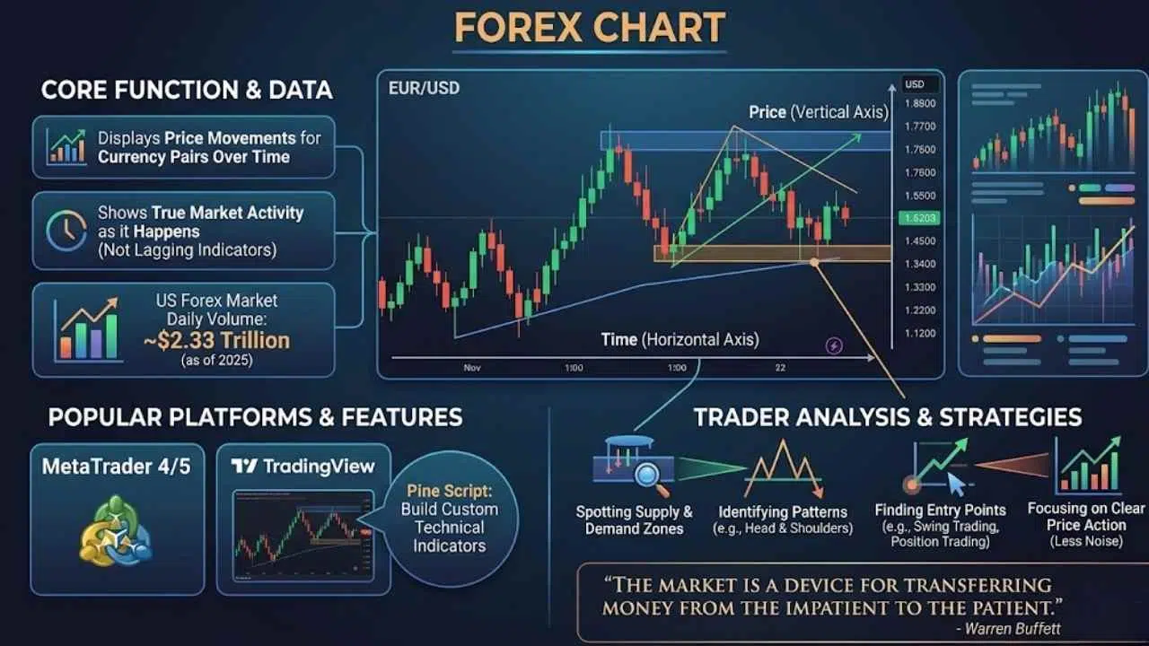
A forex chart displays price movements for currency pairs over time. It shows the real market activity that traders actually see. These charts track how currencies move against each other, such as EUR/USD or other major pairs.
The price chart acts as your window into market data. It reveals what buyers and sellers are doing right now. Unlike lagging indicators that play catch-up, forex charts show true price action as it happens.
Did you know the US forex market handles about $2.33 trillion in daily trading volume as of 2025? That is a massive amount of money changing hands. You need a reliable platform to make sense of all that data.
Platforms like MetaTrader 4, MetaTrader 5, and TradingView display this information beautifully. TradingView is especially popular because it offers a feature called Pine Script. This lets you build custom technical indicators with just a few lines of code.
The chart itself is simple. It plots prices on a graph with time on the bottom and price on the side.
Market psychology stays consistent across all assets. The patterns you see on a currency pair chart match patterns on commodity charts or crypto charts. Your brain reacts the same way whether you trade EUR/USD or Bitcoin.
Traders use these charts to spot supply and demand zones. They identify head and shoulders patterns and find entry points for swing trading or position trading.
The visual representation cuts through the noise. A good forex chart shows price movement clearly. This is why professional traders focus on price action instead of overloading their screens with too many trading indicators.
The market is a device for transferring money from the impatient to the patient. – Warren Buffett
Types of Forex Charts
Different chart types show price movement in different ways. Each one tells its own story about what the market is doing. You pick the chart that matches your trading style and how much detail you want to see.
Line Chart
Line charts connect closing prices over time. They are one of the simplest tools in technical analysis. You plot each closing price as a single point and draw a line connecting them all together.
This approach strips away the noise that clutters a candlestick chart or bar chart. You see the pure price movement without extra details. Traders use line charts to spot trends fast.
The simplicity works in your favor. You focus on what matters most, which is the price itself.
Professional traders often pull up line charts first to understand the general trend. They then switch to candlestick patterns for more detailed entry points. You get the big picture without drowning in data.
Here is a quick look at why traders love line charts:
- They cut out intraday volatility.
- They make support and resistance levels visually obvious.
- They help beginners focus on the closing price.
- They prevent information overload.
Bar Chart (HLOC Chart)
Bar charts show you four key prices for each trading period. These are the high, low, open, and close prices. These charts pack more information into every bar than line charts do.
Each bar displays a vertical line stretching from the lowest price to the highest price. Small horizontal marks stick out from the left side to show the open. Marks on the right side show the close.
This setup reveals volatility and price range within each trading session. You see exactly how much the market moved around before settling on a final price.
A tall bar signals big price swings. A short bar shows the market stayed calm. Traders using momentum indicators often pair bar charts with tools like RSI, MACD, or stochastic oscillators.
The HLOC format works great for margin trading and derivatives. You catch price action details that shape your entry points and exit plans.
Many trading academies teach bar charts as a foundation. They work across shares, commodities, and forex trading.
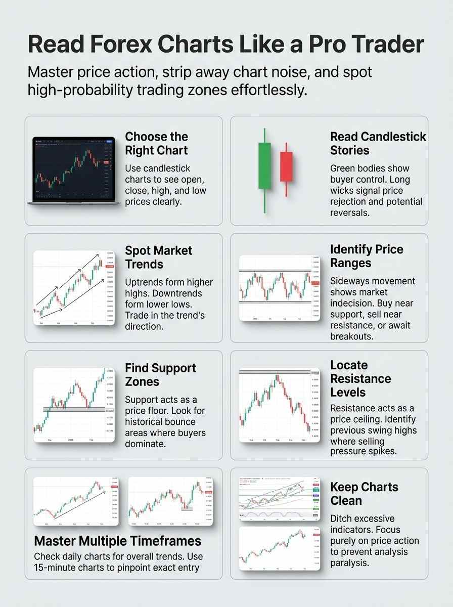
Candlestick Chart
Candlestick charts show you exactly what happened to price during each time period. Professional traders at trading academies and platforms like forex.com rely heavily on them.
Each candlestick displays four crucial data points:
- Open: Where the trading period began.
- High: The absolute peak price reached.
- Low: The absolute bottom price touched.
- Close: Where the trading period ended.
You see the full story in one simple shape. Spotting trends and patterns is much easier than with other chart types.
The body of each candlestick tells you whether buyers or sellers won that round. A green or white body means buyers were in control. A red or black body means sellers took charge.
The thin lines sticking up and down from the body are called wicks or shadows. These show how far price traveled beyond the open and close levels.
Patterns like pin bars, engulfing bars, and inside bars form from these shapes. A 2025 study on forex patterns showed that a well-placed pin bar can have a success rate of 60% to 90%. That accuracy depends heavily on the timeframe and currency pair.
School of pipsology courses teach traders to read these patterns to predict future moves. Master candlestick reading, and you master price action itself.
Mountain Chart
Mountain charts shade the area below a line chart. This creates a bold visual picture of price movement. It makes spotting the general direction of price very simple.
Traders use mountain charts when they want a clean, basic view of the market. This approach works great for seeing if prices are moving up or sitting flat. Your trading academy instructor might show you mountain charts as a starting point.
Retail brokerages often use mountain charts as their default view because they look friendly to beginners.
If you trade on lower timeframes, mountain charts will not give you the detail you need. They cannot show you the real body, wicks, or exact opening and closing prices.
Most professional traders skip mountain charts. They jump straight to a candlestick chart or bar chart instead. You get better results when you focus on precise price data.
Understanding Candlestick Anatomy
Candlesticks pack a lot of information into a small space. Each one tells a story about the battle between buyers and sellers. Learning to read them separates the pros from the amateurs.
Real Body
The real body shows you the gap between the open and close prices. Think of it as the heart of the candlestick. It tells the story of who won the battle.
A long body means strong momentum pushed the price in one direction. A small body signals indecision in the market. Professional traders at Bloomberg and other platforms watch these body sizes closely.
For US traders, the closing price at 5:00 PM Eastern Standard Time is incredibly important. This marks the end of the New York trading session. The real body formed at this exact hour carries massive weight for predicting the next day’s movement.
Color matters just as much as size. A filled red or black body shows strong selling pressure. A green or white body tells the opposite story.
Traders using tools like the CCI or studying Dow Theory understand these colors paint a clear picture. You will spot trading opportunities faster once you train your eye to read the real body.
Upper and Lower Wick
Candlesticks show you where buyers and sellers fought over price. The upper wick stretches from the real body to the highest price traders pushed the currency pair. The lower wick extends down to the lowest price.
These wicks tell stories that professionals read like a trading journal entry. A long upper wick means sellers rejected the higher price. A long lower wick shows buyers defended a lower level.
A long wick is the market’s way of shouting that a price level was firmly rejected.
Imagine a long top wick like a failed invasion. Buyers tried to push higher but got stopped cold.
Many successful traders use a specific trick for the pin bar pattern. They do not enter right away. They wait for the price to retrace 50% of that long wick to get a much safer entry point.
Traders using Heikin Ashi charts spot these rejections even faster because that style smooths out noise. These price rejections matter because they show you where the market found support or resistance.
Color Interpretation
Green or white candles tell you buyers are winning. Red or black candles show sellers are taking control. These colors work like traffic lights on your chart.
Professional traders at IG Academy and BabyPips Premium teach this first because color interpretation saves you time. You do not need to study every detail when the color already speaks volumes.
Long red candles scream strong selling pressure. Short green candles suggest buyers fought back but lacked power. This color system lets you spot bullish and bearish momentum instantly.
Your eyes catch color faster than numbers. Successful traders use color to distinguish between upward and downward moves in seconds. A string of green candles shows strength. A series of red candles signals weakness.
Mix these colors with price action patterns, and you have a solid foundation for your trading strategies.
Identifying Trends and Market Structure
Markets move in clear patterns. You must learn to spot them fast. Technical analysis tells the whole story if you pay close attention to the structure.
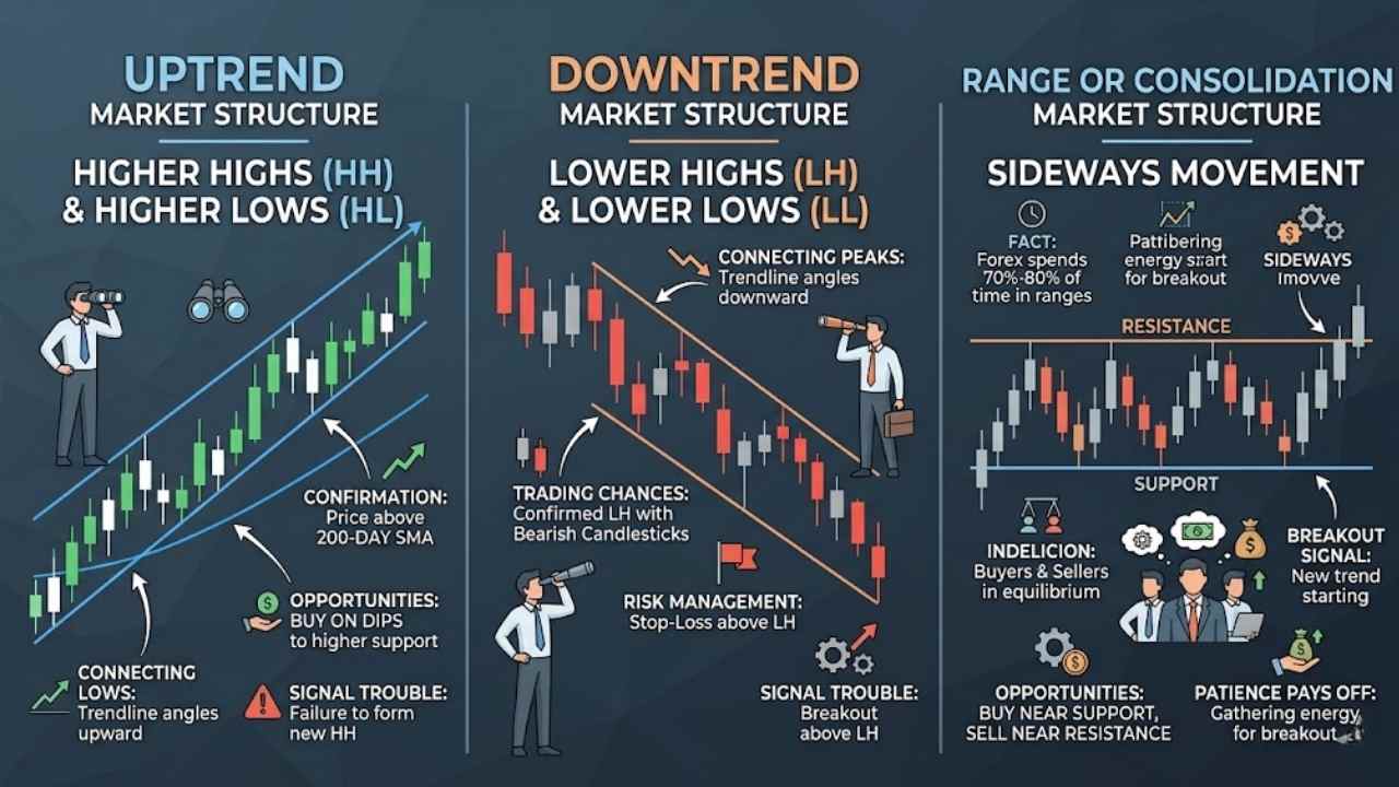
Uptrend: Higher Highs and Higher Lows
Buyers take control when prices form a series of higher highs and higher lows. This pattern tells you that demand keeps pushing prices up. Each pullback stops at a higher level than before.
You spot an uptrend by drawing a line connecting the low points. This line angles upward. The high points also climb higher as time passes.
Traders use this pattern to make smart decisions about buying at the right time. They often pair this structure with the 200-day Simple Moving Average. If the price is making higher highs above that 200-day line, the uptrend is officially confirmed.
Professional traders look for entries in the direction of the uptrend. They buy dips to lower support levels. You catch these dips when price pulls back but fails to break below the previous low.
A failure to form higher highs signals trouble. It may mean the trend is about to reverse. Successful traders ride the uptrend and stay aligned with the strongest market force.
Downtrend: Lower Highs and Lower Lows
A downtrend shows up when prices make lower highs and lower lows. Sellers take control of the market and push prices down. Each time the price bounces up, it fails to reach the previous high point.
Each time it drops, it falls below the last low point. This pattern tells you that bears are winning the battle. You spot this structure by connecting the peaks and valleys on your chart.
The peaks get shorter, and the valleys sink deeper. This is the exact opposite of an uptrend.
Smart traders hunt for selling opportunities during downtrends. They look for three specific things:
- A confirmed lower high.
- A bearish candlestick pattern at that high.
- A break below the previous support level.
Smart traders use those “lower highs” as the perfect place to put their risk management stop-loss orders. If the price breaks above that lower high, the downtrend is broken, and it is time to exit.
Breaks in trend structure signal that a downtrend might be ending. Price action reveals the story on your chart. The downtrend gives you a roadmap to follow.
Range or Consolidation
Price moves sideways when traders cannot agree on a direction. This sideways movement creates a range. The price bounces between support and resistance without forming new highs or lows.
The market sits still, showing indecision among buyers and sellers. You spot ranges by watching price hit the same ceiling, bounce down, then climb back up.
Did you know that the forex market spends roughly 70% to 80% of its time in consolidation? Trends are actually quite rare. Learning how to trade in a range is a required survival skill.
Ranges give you clear trading chances. You can buy near support and sell near resistance. Other traders wait for a breakout.
That breakout signals the range is over and a new trend is starting. Sideways price movement means the market is gathering energy. Patience pays off here.
Using Support and Resistance Levels
Support and resistance levels act as invisible floors and ceilings. Price bounces back from these areas. Read on to master how traders spot these game-changing zones.
How to Spot Support Levels
Finding support levels takes practice, but you can master this skill quickly. Price action tells the story, and support zones reveal where buyers step in.
- Look at where price bounced up multiple times in the past.
- Draw horizontal lines at prices where the market reversed upward.
- Identify clusters of price touches to find stronger zones.
- Watch psychological round numbers, like 1.1000 on the EUR/USD, where big banks place massive buy orders.
- View support as a zone rather than a single exact line.
- Track volume patterns to confirm real buying pressure exists.
How to Identify Resistance Levels
Resistance levels show you where the price stops going up. These levels help you make smarter trades because you know where sellers will fight back.
To find the best resistance zones, look for these specific clues:
| Resistance Indicator | Why It Works |
|---|---|
| Recent Swing Highs | These mark the exact price point where the market recently turned around and fell. |
| Flipped Support | Former support floors often become new resistance ceilings once the price breaks below them. |
| Volume Profile Nodes | This advanced tool shows exactly where the heaviest volume of selling occurred in the past. |
| Round Numbers | Prices ending in .00 or .50 act as magnets for institutional sell orders. |
Watch for price bounces off these levels. Each bounce proves that the resistance level works. Track multiple timeframes to spot resistance levels that show up on daily, weekly, and monthly charts.
Identify price clusters where the market spent lots of time moving sideways. These congestion areas attract sellers. Observe how price reacts near resistance zones by watching candlestick patterns. Strong rejection candles with long upper wicks show you that sellers dominated at that level.
Timeframe Analysis for Professional Trading
Professional traders switch between daily charts and 15-minute charts. They spot the big picture first, then find the perfect moment to jump in.
Higher Timeframes for Overall Trend
Daily and weekly charts show you the big picture. These timeframes cut through the noise that confuses new traders. You see the real trend, not the tiny price jumps that happen every few minutes.
Start your analysis on these higher timeframes first. Professionals call this the “Top-Down Analysis” method. You figure out the daily trend, and then you only take trades in that same direction on the smaller charts.
Lower timeframes create confusion if you use them alone. They show too many small moves. Think of it like watching individual raindrops instead of the storm.
Higher timeframes let you spot significant support and resistance levels. Traders who skip this step often get caught in false moves. The professionals always start big and zoom in later.
Lower Timeframes for Entry Points
Shorter timeframes like 1-hour or 15-minute charts help you spot the exact moment to jump into a trade. Price moves faster on these lower timeframes, giving you more trading chances.
These charts show you specific price action patterns right at key support and resistance levels. You can time your entry with incredible precision.
For US traders, the best time to drop down to a 15-minute chart is between 8:00 AM and 11:00 AM Eastern Standard Time. This window is the London and New York session overlap. It provides the highest liquidity and the cleanest chart patterns of the day.
Lower timeframes give you the power to refine your entry. Start by checking a higher timeframe, then drop down to a 15-minute chart to nail your entry point. This two-step approach keeps you from getting fooled by small price wiggles.
Simplifying Your Charts
You cut through the noise when you strip your charts down to what matters most. Keep reading to learn which tools actually move the needle for your trading decisions.
Avoid Overloading Indicators
Too many indicators on your chart will trip you up. Traders often load their screens with ten or fifteen different tools. They think more data means better trades. This approach backfires hard.
Recent 2025 data from the CFTC shows that only about 27% of US retail forex traders are actually profitable. A major reason for that high failure rate is analysis paralysis from messy charts.
Analysis paralysis happens when your chart has so many colors and lines that you cannot even see the price anymore.
Your brain gets flooded with conflicting signals. One tool says buy. Another says sell. You sit there confused and unable to act.
Professional traders keep things simple. Limit yourself to two or three technical indicators, such as moving averages or RSI. Use them only to confirm what the price is already telling you.
The price chart itself is your main teacher. Support and resistance levels speak louder than any complex formula. Strip away the noise. A clean chart lets you spot trends faster.
Focus on Price Action with Minimal Tools
Professional traders focus on price action instead of piling on indicators. You read the market directly from what prices do. You do not rely on lagging tools that tell you what already happened.
Candlestick patterns, breakouts, retests, and rejections serve as your primary trading signals. You spot them by watching how buyers and sellers battle it out.
A clean chart lets you see price structure clearly. Your eyes catch support and resistance levels faster.
Many successful price action traders use a highly specific, minimal setup:
- A clean candlestick chart for pure price action.
- One 20-period Exponential Moving Average to see the short-term trend.
- One MACD indicator at the bottom to check momentum.
Breakouts happen when price punches through a level with force. Retests occur when price returns to that same level to confirm it holds. Rejections show you when price bounces back hard.
Markets move fast, and you need speed. Minimal tools give you that speed. You react quicker and process less information, keeping your decisions sharp.
Final Thoughts
You have learned how to read forex charts like a pro. We covered everything from candlestick anatomy to trend identification using technical analysis. Support and resistance zones act as your trading roadmap. Timeframe analysis helps you spot both the big picture and the best entry opportunities. Keeping your charts clean prevents the paralysis that comes from too many indicators.
The strategy of identifying direction, finding high-probability zones, and waiting for price signals separates successful traders from the rest. Patience and discipline matter more than constant trading activity. Focus on quality setups over quantity. Start applying these methods today, and watch how your trading clarity improves. The best traders earn money by sitting still and waiting for the right moment to act.