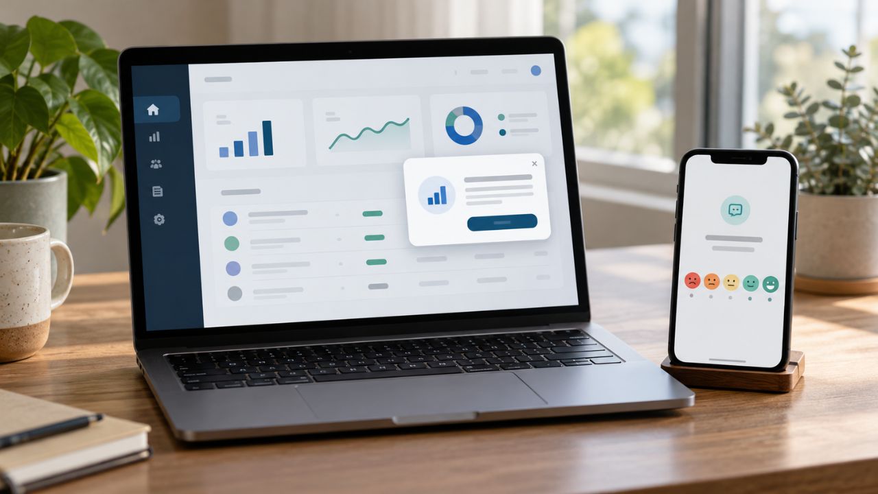
A user finishes a simple task in an app. The screen fills with confetti, a jingle plays, and the phone vibrates. For one person, that feels rewarding. For another, it is an unpleasant surprise, especially if the same effects play every time.
Sensory-friendly app design gives people more control over experiences like these. It considers the sound, movement, color, touch feedback, and interruptions an app produces. It also asks whether someone can reduce those effects and still do what they opened the app to do.
That last part matters. A quiet setting is of little use if it also removes the instructions.
What does sensory-friendly app design mean?
A sensory-friendly app accounts for differences in how people experience input from a screen or device. It might let users reduce animation, control sounds separately, change the appearance of a screen, or limit notifications. Its layout should also make the next step clear instead of constantly drawing attention in several directions.
There is no single combination of colors, sounds, and settings that suits everyone. A person may dislike sudden alerts but welcome spoken instructions. Someone else may enjoy animated rewards and need a simpler menu. Preferences can also change with fatigue, stress, and the environment in which the app is being used.
This is why a good design offers meaningful choices. The user should not have to choose between tolerating an effect and losing access to a feature.
“Sensory-friendly” is a descriptive label, not a certification. An app may advertise a calm appearance while still playing unexpected audio or making its controls difficult to find. Its behavior is more revealing than its description.
Why it matters beyond a calmer screen
Sensory differences are common among autistic people, though they vary widely from person to person. Some people are particularly sensitive to sound or light; others seek certain kinds of stimulation. It is possible to welcome one sound and find another overwhelming.
Other users encounter different barriers. Spinning or zooming transitions may cause discomfort for someone with motion sensitivity. Repeated alerts can disrupt a person who is trying to concentrate. A flashing visual effect can present a more serious concern for someone susceptible to visually provoked seizures. A user who cannot hear an app’s chime needs another way to know whether an action worked.
The effect is often practical. Someone loses their place while reading. A child stops an activity before getting to the lesson. A user misses a confirmation because the only feedback was a sound. Addressing those problems makes the best app for autistic children easier to use; it does not justify claims that the app treats a condition or guarantees better learning.
Where an app can create unnecessary sensory load
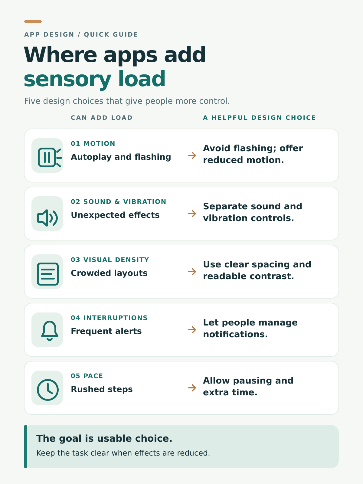
Sensory load often builds through small interruptions. A banner moves while someone reads, a button plays a sharp sound, and a notification covers the next step. When those effects arrive without warning or a way to control them, a simple task can become difficult to finish.
Motion and flashing
Animation has a place in app design. It can show that a button worked, explain a change on screen, or demonstrate an action. Problems arise when decorative movement repeats, starts without warning, or follows the user across the screen.
A reduced-motion option can replace a spinning reward with a still image or a dramatic transition with a simpler change. Developers should check how the app responds to the device’s reduced-motion setting as well as any control inside the app.
The information must survive the change. If a moving demonstration shows how to complete a task, users who reduce motion still need clear steps or another usable explanation.
Flashing requires separate attention. It should not be a routine way to signal success, an error, or a new offer. A control that lets users stop a flash after it begins does little to prevent the initial exposure.
Sound and vibration
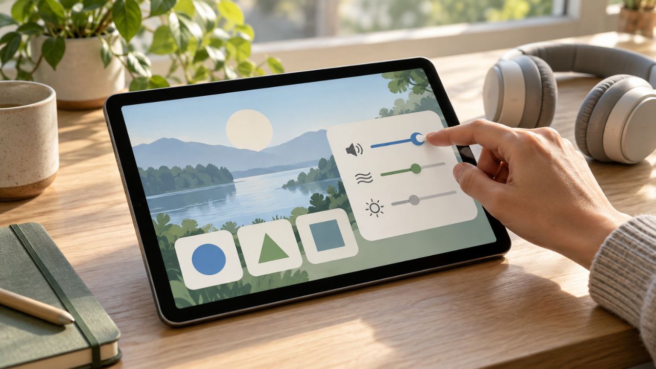
An app may contain narration, background music, button sounds, alerts, and reward effects. They serve different purposes, so one all-or-nothing sound switch can be frustrating.
Consider a phonics app. The learner needs to hear the letter sound, perhaps more than once. They do not necessarily need music behind it or applause after each attempt. Separate controls would keep the lesson available while letting the learner choose how much else to hear.
Essential feedback should have another form, too. A visible “Saved” message can confirm an action when a device is muted. Captions can convey meaningful speech and sounds in a video. A vibration may help some users notice a response, but it should not become another unexpected effect that cannot be controlled.
Busy screens and hard-to-read themes
Strong colors are not automatically bad, and muted colors are not automatically accessible. Pale text can disappear against a soft background. Gray text on black may be difficult for some people to read, even though the app offers dark mode.
The more useful questions are whether the main action is easy to find, the text and controls are readable, and the screen gives users enough space to tell one choice from another. Instructions should identify a button by its label or purpose, rather than saying only “tap the red one” or “choose the icon on the right.”
A simpler view can help when a screen contains several competing panels. It still needs to show the information required to finish the task. Hiding everything behind additional menus can create a different difficulty.
Interruptions and pace
Pop-ups, autoplay media, promotional prompts, and repeated rewards can break a person’s concentration even when each one lasts only a few seconds. Letting users control notifications and dismiss nonessential content makes the app more predictable.
Timing also deserves thought. A countdown may be the point of a game. In a reading, learning, or routine task, it can prevent someone from working at a comfortable pace. Where the activity allows it, pause, replay, and resume options give users room to continue.
These controls need to be easy to find. An app that offers a quiet mode only after several noisy screens has left users to manage the very experience the setting was meant to address.
What this looks like in a learning app
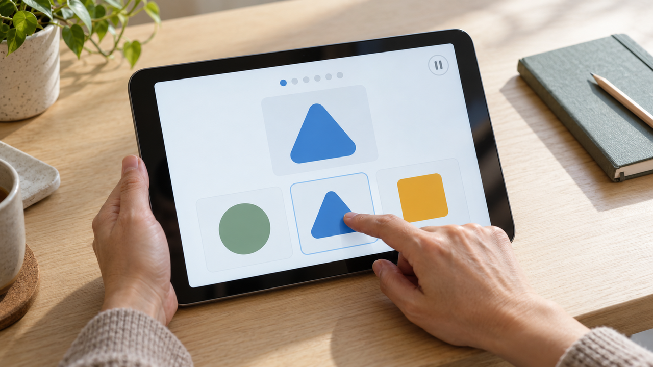
Imagine a child matching a pictured object to a number. A correct answer brings falling stars, music, spoken praise, and a vibrating tablet. One child may want to repeat the activity partly for that celebration. Another may want to move straight to the next number.
The app could offer shorter rewards, a quiet checkmark, or an option to skip decorative effects. If hearing the number is part of the lesson, the child should still be able to play it on request. The matching task remains the same.
This is a hypothetical example, not a description of a tested app. It points to a useful design question: when someone changes a sensory setting, can they still complete the activity and understand the result?
That question applies to more than children’s apps. In a travel app, turning off animated map effects should not hide directions. In a finance app, muting alerts should not make a completed payment impossible to verify. Each product has to work out which input is essential and which is decoration.
How to judge an app in everyday use
My test for an app described as sensory-friendly would start with its main task. Settings matter, but their value becomes clear only when someone uses them.
- Notice what happens on opening: Does sound or video begin before the user asks for it? Are several parts of the screen moving at once?
- Find the controls: Can the user adjust music, narration, effects, motion, vibration, and notifications without searching through unrelated menus?
- Try a quieter version of the task: Do instructions, progress, errors, and success messages still make sense when decorative sound or motion is reduced?
- Watch the interruptions: Do ads, requests for ratings, or rewards repeatedly cover the work?
- Return to the app later: Are preferences remembered, and can a paused activity be resumed when that makes sense?
For a child’s app, the child’s response matters more than an adult’s guess about which colors or rewards should feel calming. Ask what they like when they can tell you. Notice whether they avoid a sound, repeatedly replay it, or want an effect turned off. Revisit the settings as their preferences change.
This is a practical way to assess an experience, not a medical assessment or a formal accessibility audit.
What accessibility standards can, and cannot, tell you
The Web Content Accessibility Guidelines, known as WCAG, address several issues relevant to sensory-friendly design. They include criteria concerning contrast, certain automatically playing audio and moving content, flashing, and instructions that rely only on a sensory cue such as shape, color, location, or sound.
One easily misunderstood criterion is called “Sensory Characteristics.” It concerns how instructions identify controls and content. Its name does not mean that WCAG certifies an entire app as sensory-friendly.
WCAG was developed for the web. W3C also provides guidance on applying its criteria to non-web software, including native mobile apps. Those references help teams check important accessibility requirements. They do not replace watching how people use the product with different settings and needs.
A soothing interface can still have unreadable text or unlabeled buttons. Likewise, meeting a technical criterion does not tell a developer whether a reward sound feels intrusive after the fiftieth repetition. Standards checks and user feedback answer different questions, and both are needed.
When a “calm mode” falls short
A calm mode should make the app more usable. It fails when muting decorative sounds also mutes a lesson, or when removing an animation leaves the user unable to understand what happened. A softer theme can fail if the text becomes difficult to read.
It can also fail by assuming that everyone wants the least stimulation possible. Some users value spoken guidance, lively feedback, or strong visual cues. They may want one effect turned down while keeping another.
Developers can learn more by testing complete tasks with people who have varied preferences, including the users the app is intended to serve. They should check what happens with device accessibility settings enabled, with audio off, and with text enlarged. Feedback from one person is useful, but it cannot represent everyone with the same diagnosis or sensory preference.
Giving people a workable choice
An app feels considerate when users can change its sensory effects without fighting the interface. The settings are available before discomfort builds. The task stays clear. A person can hear an instruction again, quiet a reward, or reduce movement and carry on.
That is a stronger measure of sensory-friendly app design than a pastel palette or a “calm” label. The app gives people a real choice about how to use it, and follows through when they make one.