Listen to the Podcast:
For Nokia, today has been fairly hectic. The formerly renowned phone manufacturer appears to be implementing the long-needed reforms. One of them involves the company’s brand. Nokia, at last, came up with a globally recognizable logo. The specifics are as follows.
Nokia Changes Iconic Logo
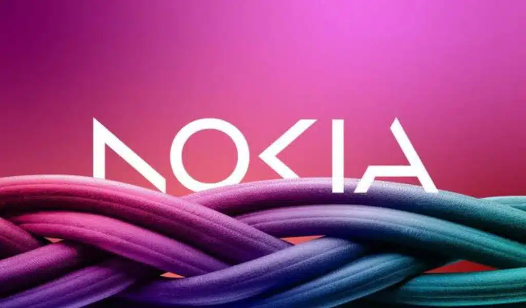
As part of its efforts to accelerate expansion in the market, Nokia has launched a new corporate identity, which includes an updated version of its logo. This change was made public. It has been nearly sixty years since the last time Nokia altered its emblem, making this occasion particularly momentous. The new Nokia logo comprises five distinct forms that spell out “NOKIA.” The former colour scheme, which was blue, has been replaced with a new logo that incorporates a variety of hues depending on the context in which it will be used.
The adjustment in branding that Nokia has implemented reflects the company’s increased concentration on the enterprise technology market. Pekka Lundmark, the company’s CEO, highlighted that the past link with cell phones is no longer the primary objective of the business. During an interview with Reuters, he stated that the company has transitioned into a business technology role. We can conclude that the corporation will not enter the smartphone market again.
Although some may think that Nokia still produces Mobile phones, this is untrue. HMD Global is the company that makes the phones that are sold under the Nokia brand, while Nokia is merely a brand name.


