
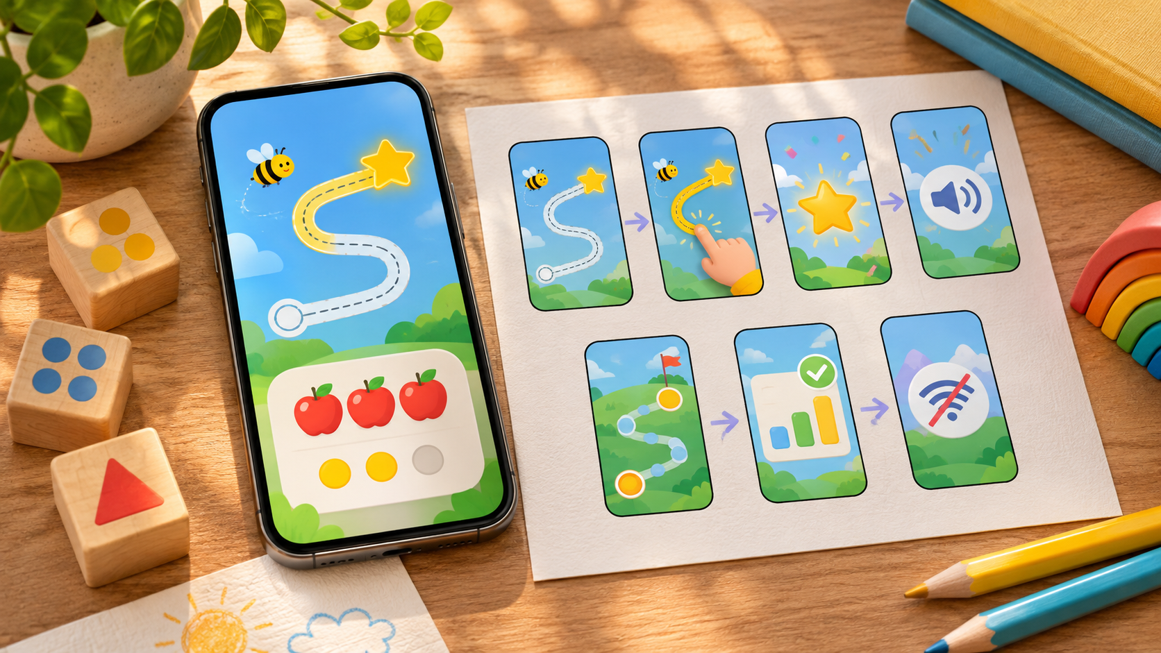
Seven screenshot storyboards for a learning app store page can help a family see the learning task before they install. A useful sequence shows what the learner is asked to do, how the app responds, and what happens next. The seven learning app store screenshots below are alternative ways to organize real captures from a release build. They are not a request to upload 21 screenshots or a claim that every app includes every feature.
Start with the action that distinguishes the app: tracing a letter, sorting sounds, solving a problem, or practicing a phrase. Then choose the supporting storyboards that match features people can actually use. Each example caption below is sample copy for a hypothetical app and needs a check against the product before use.
How to build a screenshot story that fits the store
Apple allows up to 10 screenshots per supported device size and says the first one to three may appear in search when there is no app preview. It asks developers to show the app in use in the majority of screenshots for each device type. Google Play likewise asks for captured in-app experience and recommends keeping the interface prominent in the first three images. Its preview-asset guidance also calls for restrained taglines and separate alt text. Apple’s screenshot review guidance permits explanatory overlays as long as they do not crowd out the real interface.
That makes the opening three images a useful place for a single short arc: task, learner action, and feedback. Later images can explain progression, family controls, or access conditions. If a preview video appears ahead of the stills, check the combined order rather than assuming the first screenshot is the first thing every visitor sees. Capture the actual phone and tablet layouts you plan to submit, and inspect the exported set at the size of a store listing.
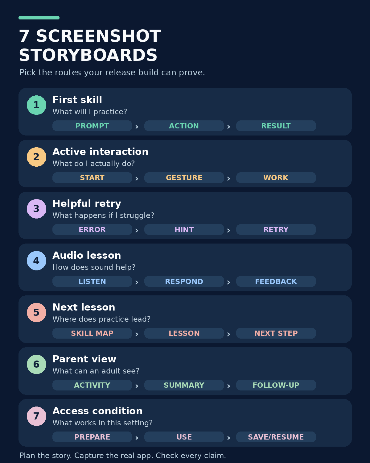
The table is a planning menu. One app might use storyboard 1 with 3 and 6; a language app might lead with 4. Choose the shortest sequence that answers the buyer’s most important questions.
| Storyboard | Three capture beats | Question it answers |
|---|---|---|
| 1. First skill | Prompt → action → result | What will I practice? |
| 2. Active interaction | Starting state → gesture → completed work | What do I actually do? |
| 3. Helpful retry | Wrong answer → specific hint → retry | How does the app help when I struggle? |
| 4. Audio lesson | Listen → respond → visible response | How does sound support the task? |
| 5. Next lesson | Skill map → lesson → next step | Where does practice lead? |
| 6. Parent view | Learner activity → adult summary → follow-up | What can an adult see and do? |
| 7. Access condition | Prepare → use → save or resume | What works under this condition? |
1. Start with one specific learning skill
For the opening storyboard, take the shopper straight into a real activity. In a counting app, frame one might show five objects and the prompt to count them. Frame two shows the learner selecting five. Frame three shows the app’s actual response and the next question. A language app could substitute a word-matching task. The point is to make the subject and the expected action legible without requiring someone to read a long caption.
Use this route when the home screen looks pleasant but says little about the lesson. An opening card headed “Count objects up to 10” is more informative than “Learn with fun,” provided the actual lesson supports that range. Keep the prompt and working area large enough to read at thumbnail size. If the third frame merely displays confetti, choose an earlier state that shows the correct answer or a meaningful explanation.
Record the build and lesson used for the capture. If that exercise is locked behind a subscription, the sequence and adjacent listing copy must make access clear. Do not place a premium exercise in a sequence that implies it is part of the initial free experience.
2. Show the learner’s action, not just a colorful screen
A tracing, drawing, coding, or puzzle app needs a storyboard that explains its interaction. Capture the blank task, a partly completed action, and the submitted work. For a letter-tracing lesson, the visible path, the learner’s trace, and the resulting letter can tell the story. If the input is a drag gesture, a small overlay may point to where the drag begins, while the real interface remains the main subject.
This sequence fits an app whose differentiator is how the learner participates. It helps a parent distinguish active practice from watching an animation. Avoid a staged hand covering the UI or an invented “perfect” result that a normal user cannot produce. Capture an ordinary successful attempt in the release build and preserve the raw image as the source for any crop or overlay.
Before approval, let someone unfamiliar with the app look at the three images without explanatory narration. Ask them what the learner does. If they describe the wrong action, change the frame selection or the short caption, not the product claim.
3. Show a mistake and the help that follows
Many learning pages show only a correct answer. A more revealing storyboard starts with a plausible wrong answer, then shows a targeted hint and the learner’s second attempt. For example, a phonics activity could distinguish two similar sounds, highlight the sound to replay, and let the learner try again. The frame should reveal the nature of the help, not just a generic “Try again” screen.
This route is especially useful if the app claims to guide practice or adapt to errors. A score, reward, or streak does not by itself prove that the app diagnoses a misconception. Our guide to formative assessment in learning apps explains why the next action after an answer matters more than the presence of a quiz. Show the actual response rule you can reproduce with a clean account.
Do not call a fixed hint “personalized” unless the app genuinely changes it based on the learner’s answer. If the app merely repeats the same prompt, depict that honestly or choose a different storyboard. A mistake scene can be calm and clear without portraying a child as failing.
4. Make an audio-led lesson understandable with the sound off
An audio feature is hard to evaluate from silent stills. Build the three beats around visible states: the instruction and play control, the response task, and the feedback the app displays. A vocabulary app might show a word being played, two pictured choices, and the selected choice with an explanation. A pronunciation app could show a record control and actual response screen, if it has one.
Use this route when listening or speaking is central to the app. The screenshot text can say “Listen, then choose the word” if that is the real task. It should not promise accurate pronunciation scoring merely because a microphone icon appears. If feedback relies on a speech service, test the supported language, device permission, connection, and account conditions before making a stronger claim.
For an app aimed at emerging readers, avoid making the whole explanation depend on tiny written instructions. The visual distinction among play, respond, and review should survive a small preview. When localizing the listing, check both the overlay and the in-app words for consistency.
5. Connect a lesson to the next achievable step
A path or dashboard can answer a buyer’s question about scope, but it should follow a real learning moment rather than replace it. Capture a skill map with the current lesson visible, a task from that lesson, and the next available activity or review step. A reading app might move from matching letter sounds to blending a simple word. A math app might move from counting objects to comparing groups.
This storyboard works when the app has a coherent sequence of lessons. Show a genuine progression that a new user can reach, or label a later level accurately. A locked row of lessons may suggest depth while giving no information about what the learner practices. Use one screenshot to explain the structure and the others to show the substance.
Avoid presenting completion badges as evidence of mastery. If the progress indicator records attempted activities, say “completed activities” rather than “skills mastered.” When the curriculum differs by age, locale, or subscription tier, use the corresponding build and account for the market receiving the screenshots.
6. Pair the child’s activity with a useful parent view
If adults can inspect learning activity, give them a sequence they can act on. Begin with a learner task, move to the actual adult summary, and end with the next recommended practice or conversation prompt. For example, a parent view that reports repeated difficulty with a sound could be paired with the relevant replay activity. This shows why the report matters rather than filling the screenshot with charts.
This route fits a product with a real parent area or teacher dashboard. Check what the view actually measures. “Practiced three activities” is a different claim from “improved reading ability.” Use fictional profile information in every capture and avoid real child names, photos, school details, or identifiable work. Parents evaluating an educational app often want to know what the learner did, not simply how long they stayed inside it.
If the parent view requires a separate login or a paid plan, state that condition where the feature is shown. A privacy badge or a broad “safe for kids” overlay should go through a separate evidence check. Our app store creative claim checklist can help review access, privacy, and plan wording before export.
7. Prove one access promise with a complete task
The last storyboard can answer a practical condition that often decides whether a family can use the app: offline lessons, multiple profiles, accessibility controls, or low-bandwidth practice. Choose one that truly matters to this app. An offline example might show a lesson downloaded while connected, the same lesson running without a connection, and the completion state after reconnecting. Those are different capabilities; a downloadable video does not establish that feedback or progress syncing works offline.
This route is useful when the condition is a real buying concern, but it should not take the opening slot unless it is the product’s main value. Test with a clean account and record any setup required before the feature works. The offline learning app test
Keep the caption narrow. “Play this downloaded lesson offline” is supportable after the specific flow has been checked; “Learn anywhere without internet” may imply that every lesson, report, and sync feature works without a connection.
Learning app store screenshots: Turn the storyboards into a publishable sequence
Write one sentence for each chosen card: what the user sees, what claim it makes, and what build state proves the claim. Capture the originals from the relevant release build, then add minimal overlays that describe a visible action. Put the strongest skill arc first, inspect the order with any preview video, and remove duplicate screens. Seven useful screenshot storyboards may yield a five-image listing; the number of plans is not the number of final uploads.
Finally, review each device and language version as a separate experience. Check whether a screenshot shows a paid lesson, whether a parent area contains fictional data, whether a claimed outcome is measured, and whether the exported text remains readable. The best learning app store screenshots make the actual task easy to understand and leave a clear, accurate expectation for the first session.