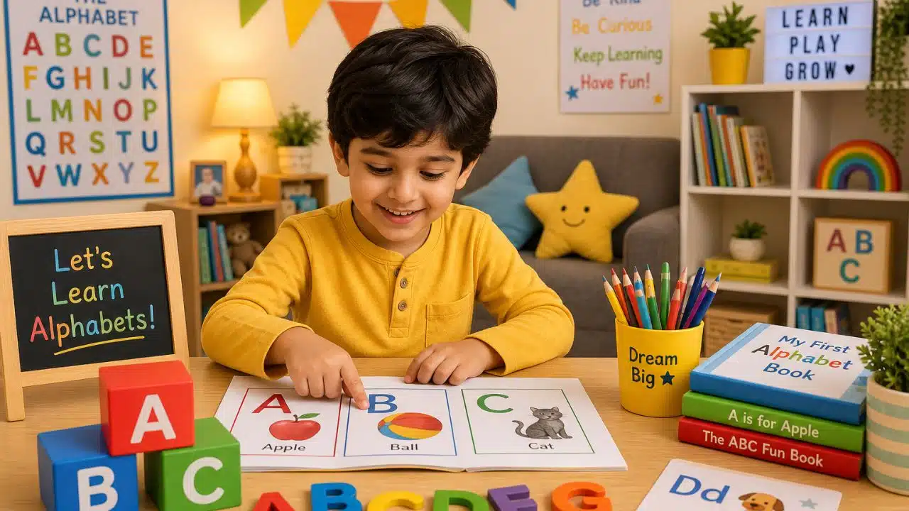
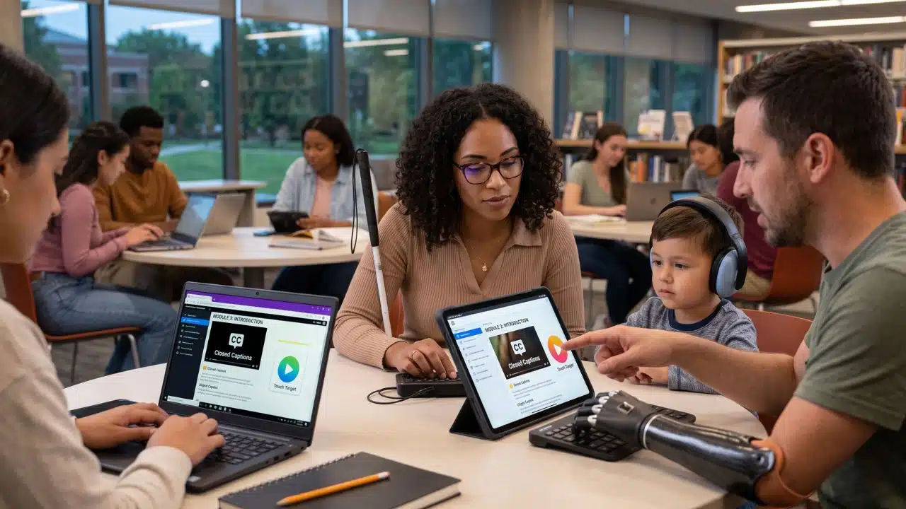
Designing an inclusive learning app isn’t just about checking technical compliance boxes. It is about ensuring every single student, regardless of their physical, cognitive, or sensory abilities, has a fair shot at success.
When you build with accessibility features in mind from day one, you align with the Universal Design for Learning (UDL) framework. UDL isn’t just about code; it’s about cognitive engagement. It champions “Multiple Means of Representation,” meaning students aren’t forced to learn through a single medium. If a learner cannot process audio, a transcript provides the exact same educational value. By building these features, you aren’t just helping users with disabilities, you are creating a cleaner, more intuitive product that benefits everyone.
Whether you are aiming for UDL principles or strict baseline compliance with the latest Web Content Accessibility Guidelines (WCAG) 2.2, here are the nine non-negotiable features your educational app needs.
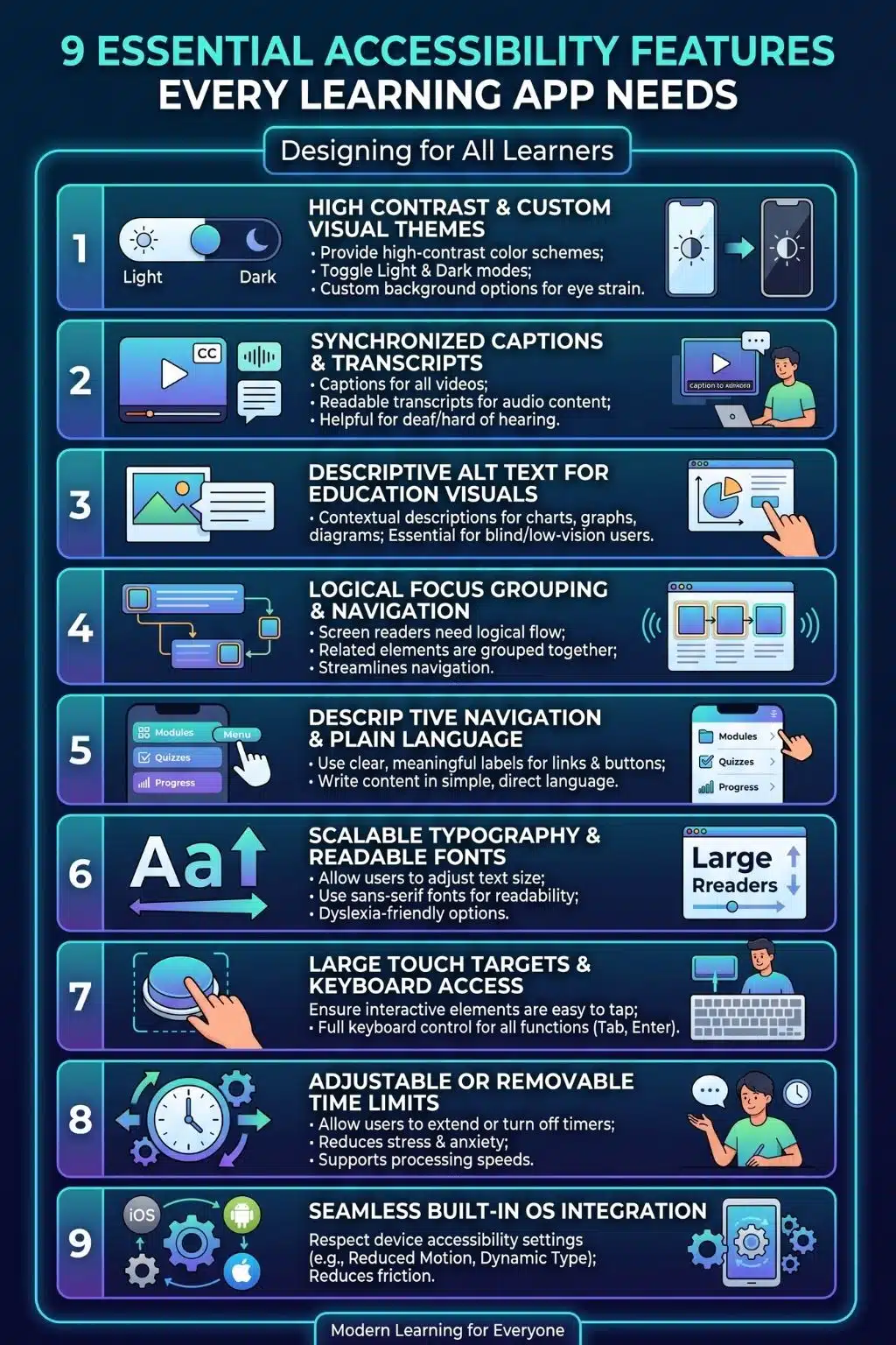
1. High Color Contrast & Custom Visual Themes
Visual clarity is the bedrock of accessible digital learning. Grey text on a white background or low-contrast user interface elements creates massive barriers for users with low vision, color blindness, or even just a student studying outside in bright sunlight.
- The Standard: Modern accessibility guidelines require a contrast ratio of at least 4.5:1 for standard text and 3:1 for large text and interactive components.
- The Upgrade: Go beyond the bare minimum by offering customizable visual themes. Allow learners to toggle Dark Mode, High Contrast Mode, or even adjust background colors (like a sepia tone) to reduce eye strain and support neurodivergent learners.
2. Captions, Transcripts, and Audio Descriptions
Video and audio are staples of modern EdTech, but without adaptations, they exclude deaf, hard-of-hearing, and blind users.
- The Standard: Every single video must include synchronized closed captions. Audio snippets and educational podcasts need readable, easily accessible transcripts.
- The Upgrade: Don’t forget about your blind users. For videos where vital educational information is presented visually (for example, a silent animation of a cell dividing), you must include audio descriptions that actively narrate what is happening on the screen.
3. Descriptive Alt Text for Educational Visuals
To a screen reader, an image without alternative text is just a frustrating, silent blank space. Every image, icon, chart, and non-text element requires a descriptive text alternative.
- The Standard: Context is everything. If an app displays a shopping cart icon with a number, the alt text shouldn’t just say “icon”, it should read “Shopping cart contains 3 items.”
- The Upgrade: In an educational context, complex visuals like graphs, historical maps, or math formulas need thorough text explanations. Use MathML for equations so screen readers can parse them logically, rather than reading them aloud as a confusing jumble of symbols.
4. Logical Focus Grouping & Eliminating Keyboard Traps
When users rely on screen readers or keyboard navigation, the app must feed them information in a cohesive, logical order.
- The Standard: Developers must group related information. If a quiz question is worth 10 points, the screen reader shouldn’t read the question, wait for a user to swipe, and then randomly say “10 points” without context.
- The Warning: You must actively test for and eliminate the keyboard trap. A keyboard trap occurs when a user navigating with the “Tab” key gets stuck inside an interactive course module (like a pop-up quiz or video player) and cannot tab their way back out to the main menu.
Vague links and complex jargon create cognitive overload and navigation hurdles, particularly for users with cognitive disabilities, ADHD, or those using voice-command software.
- The Standard: Never use ambiguous link text like “Click Here” or “Read More.” Instead, use descriptive, action-oriented phrases like “View course syllabus” or “Submit assignment.”
- The WCAG 2.2 Update: Pay attention to the new “Accessible Authentication” rule. Learning apps should not force users to solve complex cognitive puzzles (like visual CAPTCHAs) or memorize long passwords just to log in to their digital classroom. Support password managers, biometric logins, or magic links.
6. Scalable, Responsive Typography
Users with visual impairments or dyslexia often need larger text or specific font styles to read comfortably without losing their place.
- The Standard: Your app must allow users to increase the font size (up to 200%) without “breaking” the layout, meaning text shouldn’t bleed off the screen, truncate, or overlap with essential buttons.
- The Upgrade: Integrate options for dyslexia-friendly fonts and adjustable line spacing. Coupling this with a built-in Text-to-Speech (TTS) feature that highlights words sequentially as they are read aloud can massively boost reading comprehension.
7. Large Touch Targets & Alternatives to Drag-and-Drop
Interactive learning apps rely heavily on drag-and-drop exercises (like matching vocabulary words). However, this is a massive barrier for users with motor tremors or limited dexterity.
- The Standard: Ensure all clickable elements (buttons, dropdowns, checkboxes) have a minimum target size of 24×24 CSS pixels, though aiming for 44×44 pixels is highly recommended.
- The WCAG 2.2 Update: Under the new “Dragging Movements” criterion, your app must offer a simple “tap-to-select, tap-to-drop” alternative for every drag-and-drop exercise. Users should never be forced to hold and swipe precisely across a screen if they lack the fine motor control to do so.
8. Adjustable or Removable Time Limits
Timed quizzes, countdowns, and automatic security logouts are standard in educational platforms, but they can be disastrous for users who need more time to read, process information, or input their answers.
- The Standard: Always provide a way to turn off, adjust, or extend time limits for tasks. Unless the strict timing is absolutely essential to the core competency being tested (like a typing speed test), allow users to bypass the clock so they aren’t unfairly penalized.
9. Seamless OS-Level Accessibility & Global Legal Compliance
Your app shouldn’t force users to manually re-configure their accessibility needs if they have already set them up meticulously on their device’s operating system.
- The Standard: Design the app to “listen” to and respect system-wide settings automatically. If a user has “Reduce Motion” toggled on in their phone settings, your app’s flashy, celebratory animations upon completing a lesson should automatically disable to prevent sensory overload.
- The Business Reality: Adhering to these standards isn’t just about empathy; it ensures compliance with strict global mandates like the European Accessibility Act (EAA) and U.S. Section 508. For EdTech companies, meeting these legal benchmarks is often a mandatory requirement for securing school district or corporate contracts.
Designing for Every Mind
Building an accessible learning app is an ongoing journey of empathy and technical refinement. By integrating high-contrast themes, logical screen-reader grouping, scalable typography, and inclusive interactive elements, you are doing much more than writing good code or satisfying legal requirements. You are actively removing the friction that stands between a student and their potential. When you design for the margins, you inevitably build a better, more robust educational experience for everyone.
Frequently Asked Questions About Accessibility Features for Learning App
1. Why is accessibility so important in EdTech?
Accessibility ensures that education remains a universal right, not a privilege. Beyond supporting students with recognized disabilities, accessible features like captions, offline modes, and clear typography help all learners, such as those studying in noisy environments, dealing with temporary injuries, or learning in a second language.
2. What is the difference between WCAG 2.1 and WCAG 2.2 for EdTech?
WCAG 2.2 builds upon previous versions by adding 9 new success criteria heavily focused on cognitive disabilities, low vision, and motor accessibility. For learning apps, the biggest shifts involve providing alternatives to drag-and-drop interactions, ensuring focus indicators are highly visible, and simplifying login screens so users don’t have to memorize passwords or solve complex puzzles.
At a strict minimum, interactive targets should be 24×24 CSS pixels to meet baseline accessibility standards. However, best practices dictate aiming for at least 44×44 pixels (roughly the size of an adult fingertip) with ample spacing between buttons to prevent accidental taps, especially for younger students or users with motor tremors.
4. Do we really need audio descriptions if we already have captions?
Yes! Captions only translate spoken words and sounds into text for users who cannot hear. Audio descriptions translate vital visual information (like on-screen text, character actions, or scientific diagrams) into spoken words for users who cannot see. They serve two completely different needs.
5. How can I test if my learning app is truly accessible?
Start with automated testing tools to catch obvious contrast and code errors, but don’t stop there. The gold standard is manual testing. Navigate your app entirely with a keyboard to ensure there are no “keyboard traps,” turn on a screen reader and close your eyes, and most importantly, invite users with disabilities to beta-test your app and provide direct feedback.