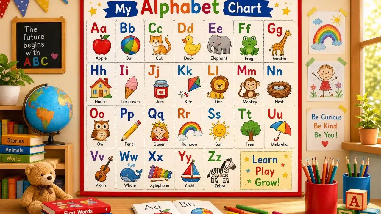
My niece could sing the ABC song at three. She still couldn’t point to the letter R. The chart above her bed had all 26 letters, a rainbow border, and a cartoon animal in every square. It looked like learning was happening. Two years later I was staring at that same style of chart pinned to a design board, choosing images for our own app, and I finally understood why it did so little. Most alphabet charts are decorations that happen to contain letters.
I spent about six weeks pulling apart classroom posters, printable PDFs, board books, and competitor apps while our team built Alphabet Magic trace & phonics. The same five problems showed up almost everywhere. Here’s what I check now and why it matters more than the art style.
Why the Chart on the Wall is Worth Arguing About
Letter knowledge is one of the strongest early signals we have. Knowing letter names before school has predicted later reading for about a century, with a typical correlation around .50, which works out to roughly a quarter of the variation in later reading scores.
There’s even a rough target. Research on preschool benchmarks suggests a child who can name about 18 uppercase and 15 lowercase letters by the end of preschool is unlikely to land in the at-risk group later, and the Head Start framework uses those same numbers.
So a chart isn’t wallpaper. It’s often the one piece of print a three-year-old sees a hundred times a week. It should be right.
What Makes an Alphabet Chart Actually Useful
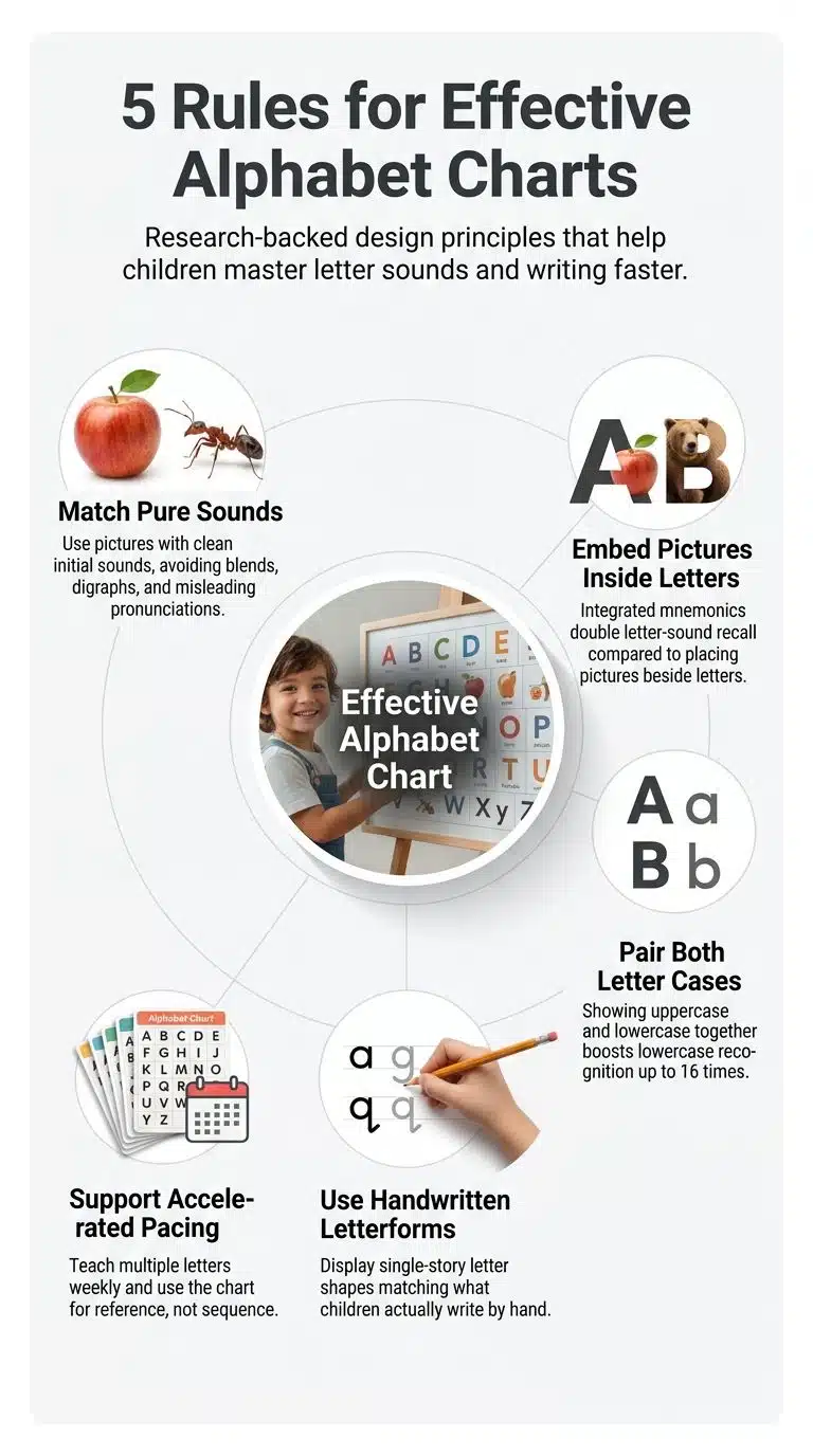
Five things. None of them are about colors.
1. The picture has to make the letter’s sound
This is the one that broke my trust in pretty charts.
Take X. “Xylophone” starts with a /z/ sound. X-ray starts with a short /e/. A child in kindergarten will almost always meet “x” at the end of a word, standing for /ks/, as in “fox” and “box.” So the two most common X pictures in the world teach the wrong thing.
Vowels are worse. Umbrella is the standard picture for U, but the /m/ swallows the vowel almost instantly, so the child hears “um” instead of /u/. “Up” is cleaner and every toddler already knows the word. Elephant has the same problem with E.
Consonants get sloppy too. Giraffe for G makes a /j/ sound. Chicken and sheep hide their first letters inside digraphs. Star, train, and dragon bury the target sound in a blend, so the child hears /st/, /tr/, /dr/ instead of /s/, /t/, /d/. Sun, Taco, and Doll do the job without the interference.
My working rule while we recorded audio: say only the sound, then say the picture name. If the sound doesn’t fall out of the front of the word cleanly, the picture gets cut. We rejected a lot of nice illustrations that way.
2. The picture belongs inside the letter, not beside it
Almost every wall chart parks an apple next to the A. The two things sit in the same square and the child is expected to connect them.
Building the picture into the letter shape works better. This is called an embedded or integrated mnemonic, and the evidence goes back to Ehri and colleagues in 1984, with a later replication in Hebrew. In a 2019 study by Roberts and Sadler, preschoolers taught with embedded mnemonics learned about twice as many letter sounds as the comparison group and identified around 1.5 times as many beginning sounds.
Think of a snake curled into the shape of an S, not a snake standing next to one. The letter and the cue become a single thing to remember instead of two.
3. Both cases sit together
Charts that show only capitals are common because capitals are easier. That’s exactly why it’s a mistake to stop there.
One study found children were 16 times more likely to know a lowercase letter if they already recognized the matching uppercase shape. The uppercase form is a hook the lowercase form hangs on. Print them as a pair, with the same square and same size relationship, so the connection is free.
4. The letterforms match what your child will actually write
Pull up a chart and look at the lowercase a. If it has the little hood on top, it’s a printed letter, not a handwritten letter. Same with g. Kids write the single-story versions, and the shape on the wall should be the shape they’re being asked to draw.
While designing the tracing games, this turned into a real fight over b, d, p, and q. Those four are the same shape in four orientations. A chart that runs them in alphabetical order puts b and d two squares apart, which is about the least helpful arrangement possible. We split uppercase and lowercase tracing into separate activities partly so those letters get practiced through movement instead of just being looked at.
5. It supports a faster pace than a letter a week
The letter-of-the-week routine is still everywhere, and it’s too slow. At that speed you finish the alphabet in half a school year, which leaves no room to review the hard ones. Research points toward roughly three to four letters a week, and one Norwegian study found benefits at a letter a day, with the extra time spent on review rather than on introductions.
A full A-to-Z chart is fine here, as long as nobody treats it as the running order. The chart is a reference the child returns to. The teaching sequence should follow letter difficulty and the child’s own name, not the alphabet song.
What a Chart Can’t Do on Its Own
A chart is passive. It only works when someone points at it.
Letter names and sounds taught together beat letter names alone, and explicit adult-led instruction beats hoping the print soaks in. There’s an interesting wrinkle here: one 2020 study found preschoolers taught letters inside a storybook learned fewer letter sounds than children taught the same letters in isolation. Context helps motivation. It doesn’t automatically help the mapping.
The cheapest upgrade I know costs nothing. Tape your child’s name next to the chart. Kids learn the letters in their own name first, and they learn the sounds of those letters faster too, so the name gives you a bridge to the rest of the board.
If you want a broader picture of where the standard advice goes wrong, we covered a few of these in common alphabet teaching myths.
What All this Changed in Our Own App
I’d like to say we got this right from the start. We didn’t. Our first image set had a giraffe for G and an x-ray for X, because that’s what everyone else had.
What survived the rebuild: sound-first keyword choices; uppercase and lowercase tracing as separate practices; and a matching game where the child pairs the capital with the small letter instead of just naming it. Eight small activities, no ads, works offline, because a five-second interstitial in the middle of a phonics drill undoes the whole point.
It’s also worth saying what an app can’t fix. One parent review of ours puts it well: it leans more toward fun than deep learning, and parents still need to sit with their kids. That’s fair, and it’s true of every alphabet product I’ve tested, including the paper ones. The chart and the app are practice surfaces. The adult is the teacher.
The same principle applies further up the ladder, whether you’re looking at STEM activities for young kids or educational games for math and coding. The tool doesn’t teach. It gives you something to teach with.
A Two-Minute Audit of the Chart You Already Own
Stand in front of it and run through this:
- Say only the sound of each letter, then name the picture. Do they match? Check X, U, E, G, C, S, T, and D first.
- Is the picture inside the letter shape or parked next to it?
- Are uppercase and lowercase shown as a pair?
- Does the lowercase a have a hood? Does the ‘g’ have a loop? Both should look like handwriting.
- Can your child reach it? A chart above eye level is a poster. One at hand height gets touched.
If it fails on the pictures, you don’t need a new chart. Cover the worst offenders with a sticky note and draw better ones. Mine has a hand-drawn arrow pointing up over the umbrella.
Frequently Asked Questions (FAQs)
1. At what age should I put up an alphabet chart?
Around two to three is fine, but treat it as exposure, not instruction. Real letter teaching usually clicks between three and five when the child can hear individual sounds in words. Before that, the chart is mostly something to point at while you talk.
2. Should the chart show uppercase or lowercase letters?
Both are paired in the same square. Children pick up capitals first because the shapes are more distinct, then transfer that knowledge to the lowercase forms. Showing only capitals wastes the transfer.
3. Is a sound wall better than an alphabet chart?
A sound wall starts from sounds and shows the spellings for each, which matches how reading actually works. It’s a stronger classroom tool. For a home wall with a three-year-old, a well-built alphabet chart is simpler and does enough.
4. Do children need to learn letters in A-to-Z order?
No. Letters early in the alphabet do tend to be learned sooner, but that’s mostly because they get more attention, not because they’re easier. Start with the letters in your child’s name and the ones whose names contain their sound, like B, F, and M.
Final Words
If you only change one thing, change the pictures. Letterform, layout, and pace all matter, but a chart that teaches the wrong sound for eight letters is actively working against you, and it does it silently for months.
Go look at your X right now. I’ll wait.