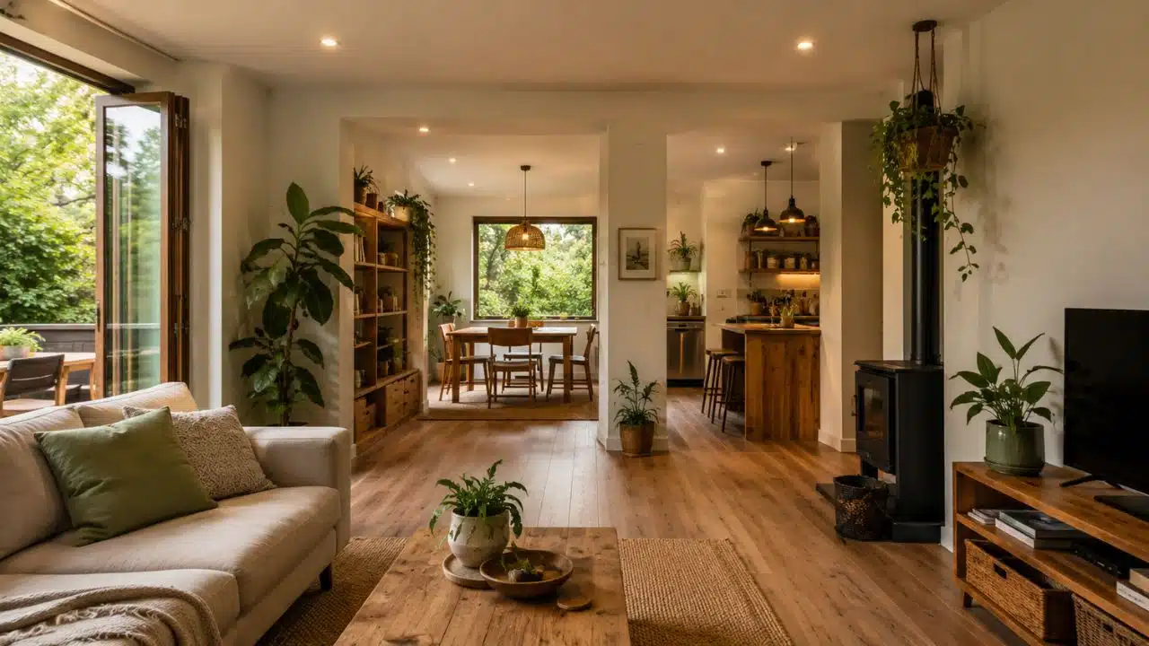
Selecting among the best modern living room color schemes 2026 has to offer is the most impactful step in completely transforming the atmosphere of your home. Whether you are actively planning a sustainable home staging project for the real estate market or simply curating a fresh, eco-friendly lifestyle space for your family, color dictates the foundational energy of the room. This year, interior design is moving away from the sterile, cold grays of the previous decade. Instead, the focus has shifted entirely toward grounded, biophilic palettes, warm organic neutrals, and rich jewel tones that perfectly highlight natural materials like restored hardwood floors and sustainable textiles.
How We Curated the Top Palettes
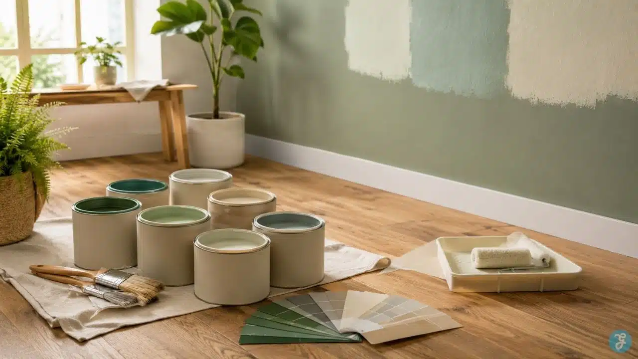
To curate this list for 2026, we looked beyond basic paint swatches. A successful color scheme must account for natural light, spatial perception, and how the tones interact with modern furniture and eco-conscious materials. Below are the key metrics used to evaluate and rank these interior design trends.
| Criteria | Evaluation Metric | Why It Matters |
| Versatility | Adaptability to different lighting conditions | Colors can shift drastically between morning sunlight and artificial evening lighting. |
| Material Pairing | Synergy with natural woods, stone, and sustainable fabrics | A great palette should enhance, not clash with, the natural grain of freshly refinished hardwood floors. |
| Emotional Impact | Psychological color theory (calming vs. energizing) | Living rooms are multi-purpose spaces; the color must support both relaxation and social gathering. |
| Longevity | Resistance to becoming a fast-fading micro-trend | Painting is labor-intensive; the chosen scheme should remain modern and relevant for years. |
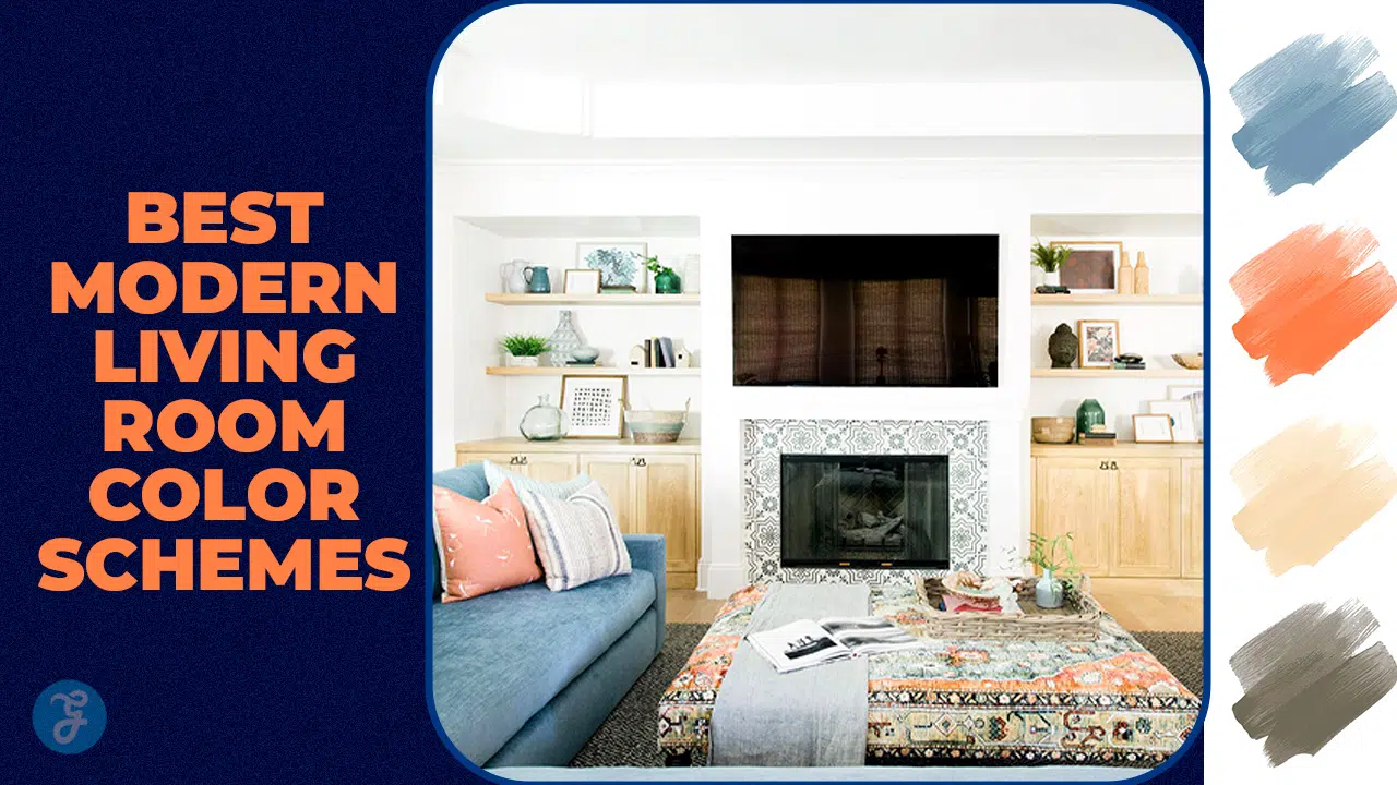
The 15 Best Modern Living Room Color Schemes 2026
From warm, grounding earth tones to sophisticated, moody contrasts, these 15 color palettes represent the pinnacle of modern interior design this year.
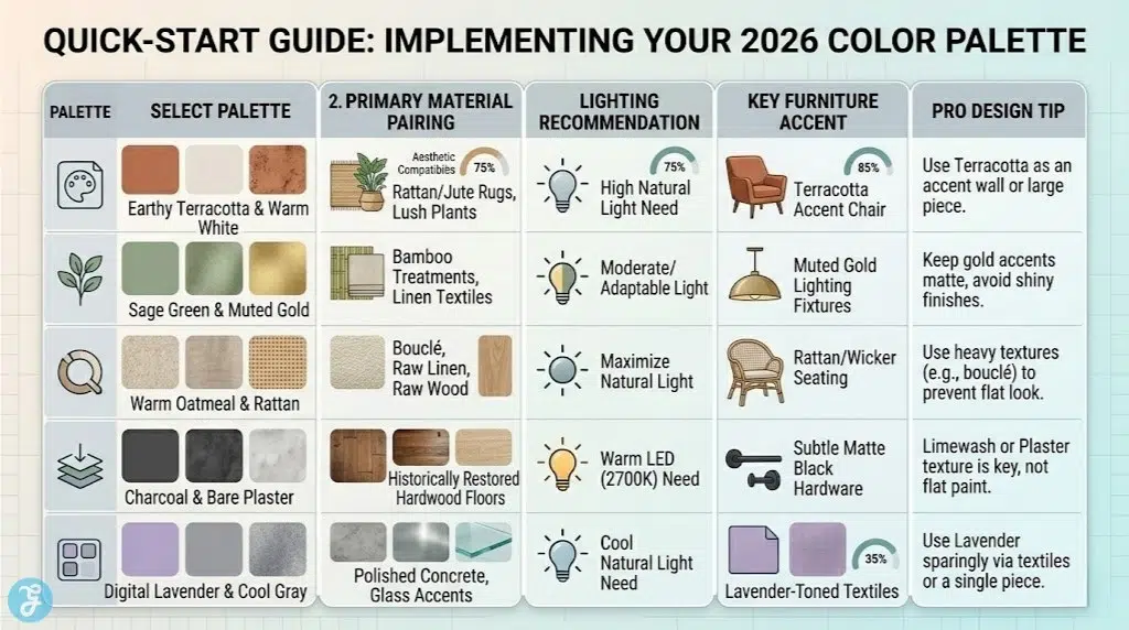
1. Earthy Terracotta and Warm White
Terracotta brings a baked-earth warmth that instantly makes a room feel inviting and grounded. When paired with a creamy, warm white, it strikes the perfect balance between vibrant energy and clean modernism. This scheme is particularly effective in rooms with abundant natural light and provides a stunning contrast against lush, green indoor plants, making it a staple for sustainable, biophilic design.
-
Best features: Highly warming; creates a Mediterranean or desert-modern aesthetic.
-
Pro tip: Use terracotta as an accent wall or on large furniture pieces rather than painting the entire room.
2. Sage Green and Muted Gold
Sage green acts almost as a neutral in 2026, offering a calming, restorative backdrop that brings the tranquility of nature indoors. Paired with subtle accents of muted or brushed gold in lighting fixtures or picture frames, this scheme feels both organic and highly sophisticated. It pairs flawlessly with natural jute rugs and eco-friendly bamboo window treatments.
-
Best features: Extremely calming; blurs the line between indoor and outdoor spaces.
-
Pro tip: Keep the gold accents matte to avoid a flashy, outdated look.
3. Warm Oatmeal and Rattan
Moving away from stark white, “oatmeal” is the ultimate warm neutral for a highly textured, minimalist space. This scheme relies heavily on layering different shades of beige, cream, and soft taupe, accented by the natural textures of rattan, wicker, and raw linen. It is the definitive color palette for a sustainable, slow-living aesthetic.
-
Best features: Maximizes the feeling of space and light; incredibly soothing.
-
Pro tip: You must use heavy physical textures (bouclé, linen, raw wood) to prevent this monochromatic scheme from looking flat.
For a living room that demands elegance and a touch of traditional grounding, deep navy blue paired with rich camel leather is a timeless combination upgraded for 2026. The cool depth of the navy walls pushes the boundaries of the room outward, while a camel-colored sofa or armchair injects vital warmth.
-
Best features: Sophisticated and cozy; excellent for evening entertaining.
-
Pro tip: Ensure your living room has adequate artificial lighting to prevent the navy from feeling too cave-like at night.
5. Charcoal and Bare Plaster
Industrial design has softened. Instead of harsh concrete and black steel, 2026 favors the powdery, organic texture of bare plaster (or limewash paint) paired with soft charcoal gray. This creates a moody, architectural atmosphere that beautifully highlights the rich, warm tones of historically restored hardwood flooring.
-
Best features: Highly textural; creates a bespoke, artisanal atmosphere.
-
Pro tip: Use warm-toned LED lighting (2700K) to bring out the subtle warmth in the plaster.
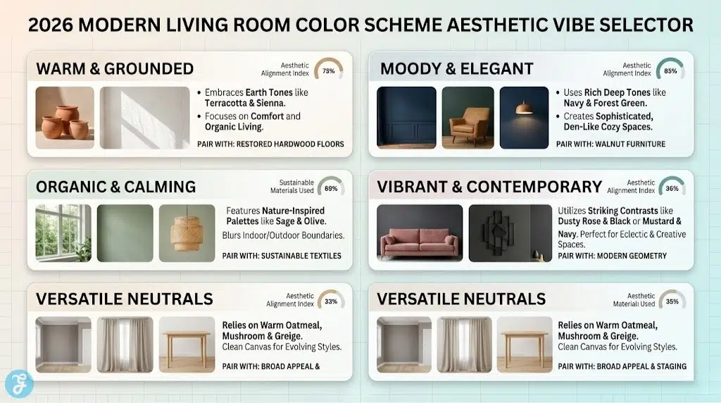
6. Forest Green and Walnut
This rich, moody palette is designed for deep comfort. Forest green walls absorb light to create a cozy, den-like atmosphere, while the dark, luxurious grain of walnut furniture provides structural elegance. This scheme is perfect for showcasing vintage finds or high-quality, sustainable wood craftsmanship.
-
Best features: Creates a strong sense of enclosure and comfort; highly elegant.
-
Pro tip: Add touches of brass or amber glass to reflect light around the darker space.
7. Dusty Rose and Matte Black
Dusty rose has shed its purely feminine associations and emerged as a highly sophisticated, grounding neutral when anchored by stark matte black accents. The pink tones offer warmth and softness, while black window frames, side tables, or light fixtures provide necessary modern contrast and edge.
-
Best features: Unexpected and contemporary; balances softness with architectural geometry.
-
Pro tip: Keep the dusty rose muted and earthy, leaning closer to clay than bubblegum.
8. Mushroom and Crisp White
Mushroom—a complex blend of gray and brown—is the workhorse neutral of 2026. It has more depth than standard beige and more warmth than traditional gray. Paired with crisp, clean white trim and ceilings, it creates a tailored, pristine environment that serves as the perfect blank canvas for rotating seasonal decor.
-
Best features: The most versatile neutral; works with almost any furniture style.
-
Pro tip: Paint the baseboards and doors the same mushroom color as the walls for a seamless, modern look.
9. Digital Lavender and Cool Gray
For a more tech-forward, futuristic aesthetic, digital lavender offers a soothing, almost ethereal vibe. It is a highly sensory color that promotes mental clarity. When anchored by cool, architectural grays, it creates a living room that feels clean, forward-thinking, and deeply serene.
-
Best features: Unique and mentally stimulating; excellent for modern, minimalist furniture.
-
Pro tip: Use lavender sparingly through textiles or a single accent piece if you are hesitant to paint the walls.
10. Burnt Sienna and Cream
Taking inspiration from 1970s design revivals, burnt sienna is a deep, rusty orange-red that brings massive energy to a space. By pairing it with expansive areas of soft cream, the intensity is balanced, resulting in a room that feels both vibrant and incredibly welcoming.
-
Best features: High energy and warmth; fantastic for spaces designed for socializing.
-
Pro tip: Incorporate velvet textures to maximize the luxurious feel of the sienna tones.
11. Olive and Warm Taupe
A darker, more serious cousin to sage, olive green paired with warm taupe creates a deeply organic, woodland-inspired palette. This is an excellent choice for homes surrounded by nature or for those wanting to create a strong, grounded retreat away from digital screens.
-
Best features: Deeply organic and grounding; hides everyday wear and tear well.
-
Pro tip: Pair with natural stone accents, like a slate fireplace surround or a marble coffee table.
12. Plum and Charcoal
For maximum drama and luxury, deep plum paired with charcoal is the ultimate bold choice. This scheme thrives in secondary living spaces, media rooms, or evening lounges. It creates an enveloping, velvet-like atmosphere that is incredibly chic.
-
Best features: Dramatic, luxurious, and highly distinctive.
-
Pro tip: This scheme requires excellent lighting design—use multiple lamps and sconces to create pools of warm light.
13. Soft Peach and Greige
Soft peach brings a gentle, optimistic warmth to a living room, acting as a softer alternative to terracotta. When balanced with “greige” (gray-beige), the look remains sophisticated and adult, avoiding any nursery-like connotations. It is a highly flattering color palette for both natural light and human skin tones.
-
Best features: Optimistic, soft, and highly flattering.
-
Pro tip: Incorporate natural, blonde woods like ash or birch to maintain the airy feel.
14. Warm Slate and Blond Wood
A nod to modern Scandinavian design, warm slate (a blue-gray with brown undertones) provides a calming, structural backdrop for the pale, clean lines of blond wood furniture. It is a crisp, highly organized aesthetic that promotes a clutter-free, mindful lifestyle.
-
Best features: Clean, organized, and highly functional aesthetic.
-
Pro tip: Keep window treatments minimal to allow maximum natural light to hit the slate walls.
15. Mustard Yellow and Midnight Blue
For those who love high-contrast, eclectic design, mustard yellow and midnight blue offer a vibrant, intellectual energy. The deep blue provides a stable foundation, allowing the mustard yellow to pop brilliantly as an accent chair, throw blanket, or piece of oversized modern art.
-
Best features: Highly energetic, creative, and bold.
-
Pro tip: Balance the high contrast with plenty of white space or neutral flooring so the room doesn’t feel overwhelming.
Quick Overview
The following table summarizes these top color schemes to help you match a palette to your specific home aesthetic and lifestyle goals.
Comparison Table
| Color Scheme | Primary Vibe | Best Paired With | Lighting Need |
| Terracotta & White | Earthy / Desert | Indoor Plants & Rattan | High Natural Light |
| Sage Green & Gold | Biophilic / Calm | Bamboo & Jute | Moderate |
| Oatmeal & Rattan | Warm Minimalist | Linen & Raw Wood | High Natural Light |
| Navy & Camel | Classic / Sophisticated | Leather & Brass | Strong Artificial |
| Charcoal & Plaster | Organic Industrial | Restored Hardwood | Warm LED (2700K) |
| Forest Green & Walnut | Moody / Elegant | Dark Woods & Amber Glass | Moderate |
| Dusty Rose & Black | Soft / Architectural | Matte Metals | Moderate |
| Mushroom & White | Versatile Neutral | Any Wood Tone | Highly Adaptable |
| Lavender & Gray | Tech-Forward / Serene | Chrome & Glass | Cool Natural Light |
| Burnt Sienna & Cream | Vibrant / Retro | Velvet & Ceramics | Moderate |
| Olive & Taupe | Grounded / Organic | Natural Stone | Moderate |
| Plum & Charcoal | Dramatic / Luxe | Velvet & Brass | Strong Artificial |
| Soft Peach & Greige | Optimistic / Gentle | Blonde Woods | High Natural Light |
| Warm Slate & Blond Wood | Scandi / Clean | Ash or Birch Wood | High Natural Light |
| Mustard & Midnight Blue | Eclectic / Bold | White Space / Canvas | Moderate |
Quick Picks
If you are looking for an immediate recommendation based on your specific project goals:
-
Best for Sustainable Home Staging: Oatmeal & Rattan (Maximizes broad appeal and light).
-
Best for Showcasing Restored Hardwood Floors: Charcoal & Bare Plaster.
-
Best for a Moody, Evening Lounge: Forest Green & Walnut.
-
Best for High-Energy, Creative Spaces: Burnt Sienna & Cream.
Final Thoughts
Choosing the best modern living room color schemes 2026 has to offer is about much more than following a passing trend; it is about establishing the emotional baseline of your home. Whether you are prepping a property for the market with universally appealing warm neutrals or creating a deeply personal, eco-friendly sanctuary anchored by biophilic greens, your color palette sets the stage. By thoughtfully pairing these modern tones with sustainable materials and quality flooring, you create a living space that is not only visually stunning but fundamentally designed for modern, mindful living.