
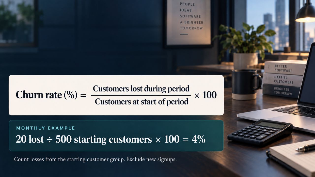
Our billing dashboard said monthly churn was 4%. My own SQL query, run against the same tables in the same month, said 9%. Nothing was broken. The two numbers were counting different things, and neither of us had written down which.
That gap is the whole problem. The formula takes ten seconds to apply. The four decisions sitting behind it take longer, and that’s where most teams lose the plot. So here’s how to calculate churn for your SaaS in a way that survives a board question, an investor’s diligence request, or your own Monday morning.
What Churn Actually Means
Churn is the share of customers, or of recurring revenue, that you lose over a set period.
There are two kinds, and you need both. Customer churn (also called logo churn) counts accounts that left. Revenue churn counts the money that left. Customer churn measures the number of accounts lost over a given period, while revenue churn measures recurring revenue lost regardless of how many customers it represents.
They can point in opposite directions. Lose ten small accounts and one large one, and your logo churn looks mild while your revenue churn looks awful. I’ve seen teams celebrate the first number and miss the second for two quarters.
How to Calculate Churn for Your SaaS Step By Step
The base formula is this:
Customer churn rate = (customers lost during the period ÷ customers at the start of the period) × 100
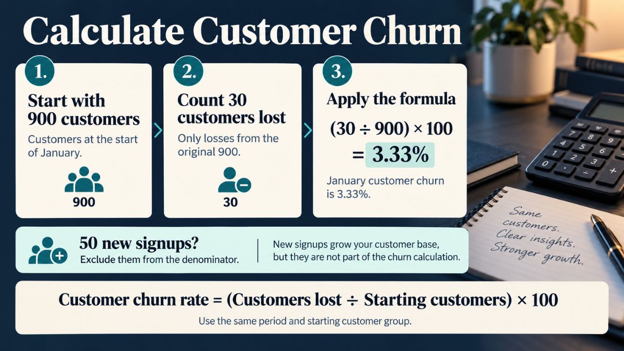
A worked example. You enter January with 900 existing customers and acquire 50 new ones during the month. You lose 30 of those original 900. Your January churn rate is 3.33%. Note what happened to the 50 new signups: they stayed out of the denominator entirely.
Revenue churn uses the same shape, with money in place of accounts:
Gross revenue churn = (MRR lost from cancellations and downgrades ÷ MRR at the start of the period) × 100
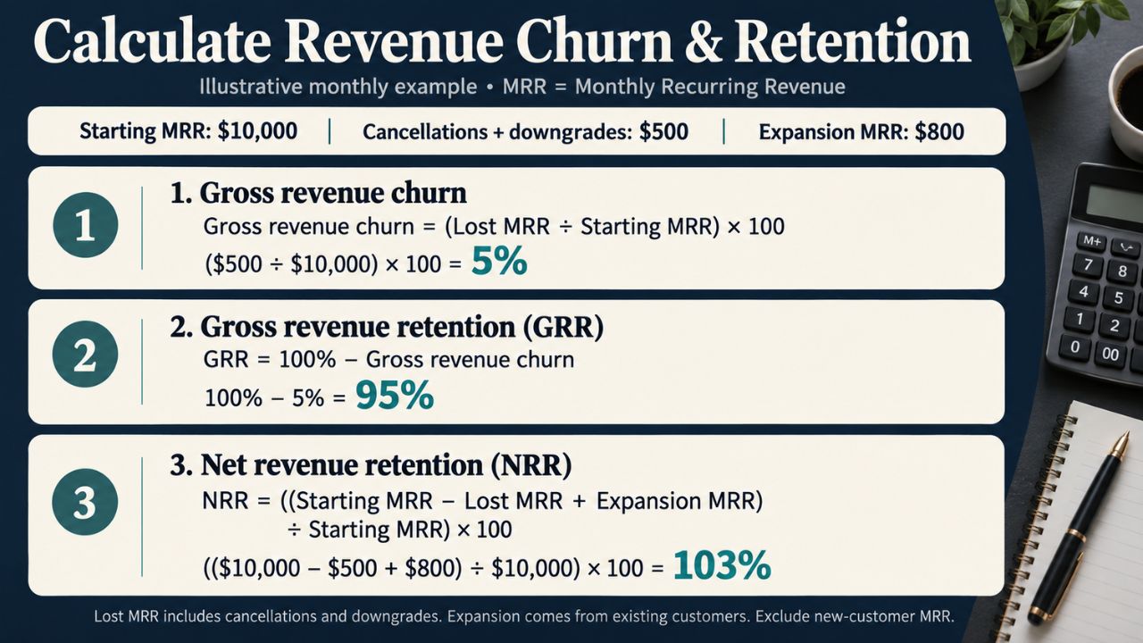
Subtract gross revenue churn from 100% and you get gross revenue retention (GRR). Add expansion revenue back in and you get net revenue retention (NRR), which is the number investors actually ask for. More on what those should look like in our SaaS churn rate guide.
Four Decisions that Change the Answer
The formula is easy. These aren’t.
1. Pick a period and write it on the number: This is the single biggest source of confusion in published churn data. Most benchmark figures float around with no period attached, which makes them useless for comparison. Stripe’s widely quoted 38% figure is annual churn on monthly-billed subscriptions only, roughly 3.9% a month, while Recurly’s 2.5% voluntary rate states no period at all. If your number doesn’t carry “monthly” or “annual” next to it, someone will misread it. Probably you in six months.
2. Pick a denominator and don’t change it: Starting customers is the standard. It breaks during fast growth, because a big new-signup month inflates your base and pushes the rate down even as more people leave. Taking the midpoint of the customer count for the period, rather than the count on day one, gives a clearer metric for companies growing quickly. Either choice is defensible. Switching between them quarter to quarter is not.
3. Decide what to do with customers who joined and left inside the same window: Some customers may have joined and churned, or churned and reactivated, within the same period, and you need to make sure they don’t skew the calculation. My rule: exclude same-period signups from the churn calculation and track them separately as an activation problem. Mixing them in tells you your product is failing when your onboarding is.
4. Split voluntary from involuntary: A customer who clicked cancel and a customer whose card expired are two different failures with two different fixes. Paddle and ProfitWell, research puts failed payments at roughly 20% to 40% of total churn, with about 10% of recurring payments failing on the first attempt. If you report one blended number, you’ll spend engineering time on a product problem that is actually a dunning problem. We cover the payments side in involuntary churn.
Measuring Churn When There is No Cancel Button
This is the part the standard guides skip, and it’s the part I deal with daily.
ImagineLab Art runs on token-based billing. People buy credits and spend them. There’s no subscription to cancel, so there’s no cancellation event to count. If you wait for a churn signal, you wait forever.
What we do instead is define churn ourselves in the query. A customer is churned if they bought credits in a prior window and have gone a defined number of days past their own typical repurchase gap without buying again. For us that gap is roughly 60 days, because our median repurchase interval sits near 30. Your number will differ, and you should derive it from your own repurchase data rather than borrowing ours.
Two rules make this honest. Write the definition down in a comment at the top of the query. And never change the threshold in a quarter where you’re also reporting improvement. The temptation is real.
I’m applying the same discipline to RankPilot.ai, which is still in development. Building the churn definition before launch is much cheaper than retrofitting it onto a year of messy billing rows.
Cohorts Beat the Monthly Average
A single blended churn rate averages away the thing you need to see.
When I broke our ImagineLab numbers out by acquisition channel, the blended rate was unremarkable. The cohort view was not. Paid-search cohorts were mostly gone by month two. Referral cohorts from the exact same months held. Same product, same pricing, same onboarding, completely different retention. That finding drove a pricing change and shaped what we built next.
The broader data says the same thing. ChartMogul’s analysis of more than 3,500 software businesses found AI-native median GRR at 40% against 63% for traditional B2B SaaS, with the main driver being “AI tourist” users who signed up out of curiosity and churned when the novelty wore off. A monthly average would bury that. A cohort table shows it in one glance. Pair the cohort read with the account-level work in our SaaS customer success strategies guide.
I run ours as SQL against our own billing tables. You don’t need a product analytics platform to start.
What a Good Churn Rate Looks Like in 2026
Context first, number second. Price point and segment matter more than the headline median.
AI products under $50 a month show 23% gross retention and 32% net. At $50 to $249, they show 45% gross and 61% net. Above $250 a month, they show 70% gross and 85% net, which is close to healthy B2B SaaS. For traditional B2B software, the 2025 Recurly Churn Report puts median annual B2B SaaS churn at 3.5%, split into 2.6% voluntary and 0.8% involuntary.
Watch that 3.5% figure. It’s annual, and several sites have republished it as monthly. A monthly 3.5% is a completely different business. Full segment breakdowns are in our SaaS churn benchmarks roundup.
FAQs on How to Calculate Churn for Your SaaS
1. What is a good churn rate for SaaS?
For B2B SaaS, under 5% annual logo churn is healthy and under 3% is strong. Self-serve and consumer products run far higher. Compare against your own price tier, not the blended median.
2. Should I measure churn monthly or annually?
Measure monthly for operations and annually for reporting. Don’t convert one to the other by multiplying by twelve. Compounding makes that wrong.
3. Does churn include downgrades?
Customer churn doesn’t. Revenue churn does. That’s precisely why you track both.
4. How do I calculate churn with no subscriptions?
Define a churn threshold from your own repurchase interval, apply it consistently, and document it in the query.
5. Start with the definition, not the dashboard
The number your billing tool shows you is the answer to a question someone else wrote. Write your own. Pick the period, pick the denominator, decide what counts as a loss, and put all three in a comment at the top of the query.
Once the number is trustworthy, the work shifts to moving it. That’s a separate job, and we’ve mapped it in reducing SaaS churn strategies.