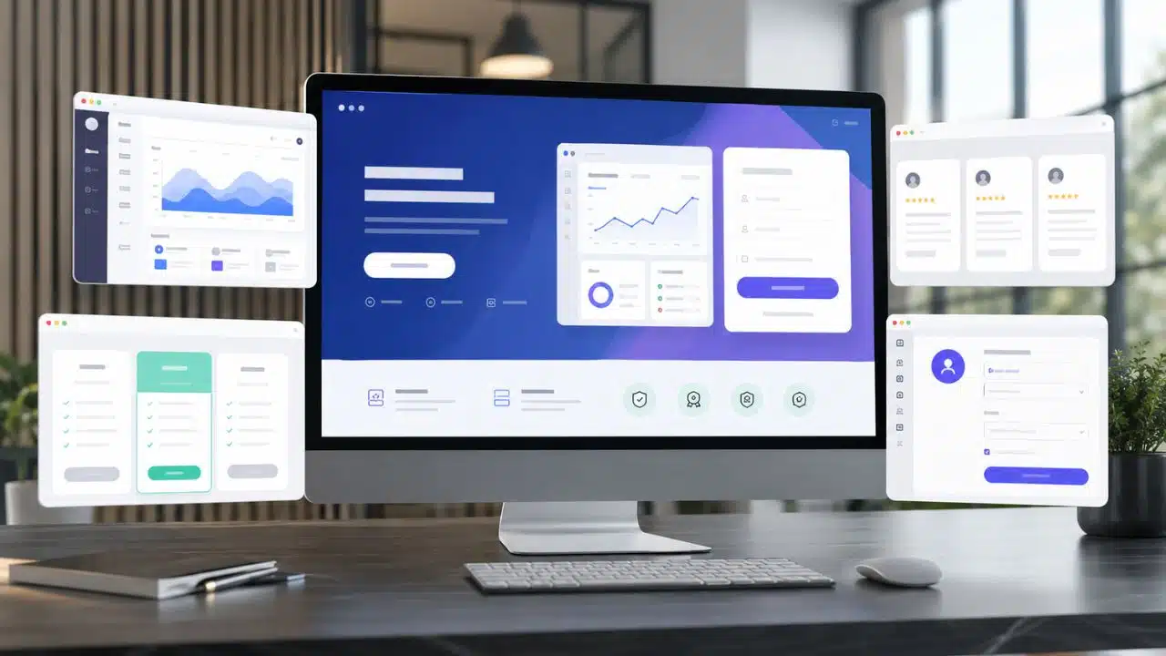
A good SaaS landing page has two jobs: make the product understandable and make the next step feel reasonable. Attractive design helps, but it cannot rescue a vague offer, an unreadable interface, or a signup process that asks for too much too soon.
When I review SaaS landing page examples, I look beyond animations and color choices. I want to see whether the page matches a real customer need, shows the product clearly, answers practical objections, and guides visitors toward one appropriate action.
One caveat matters here. These companies do not publish page-level conversion rates. The pages below are worth studying because they use sound conversion principles, not because outsiders can prove exactly how well each one performs.
1. HubSpot Free CRM Defines What “Free” Means
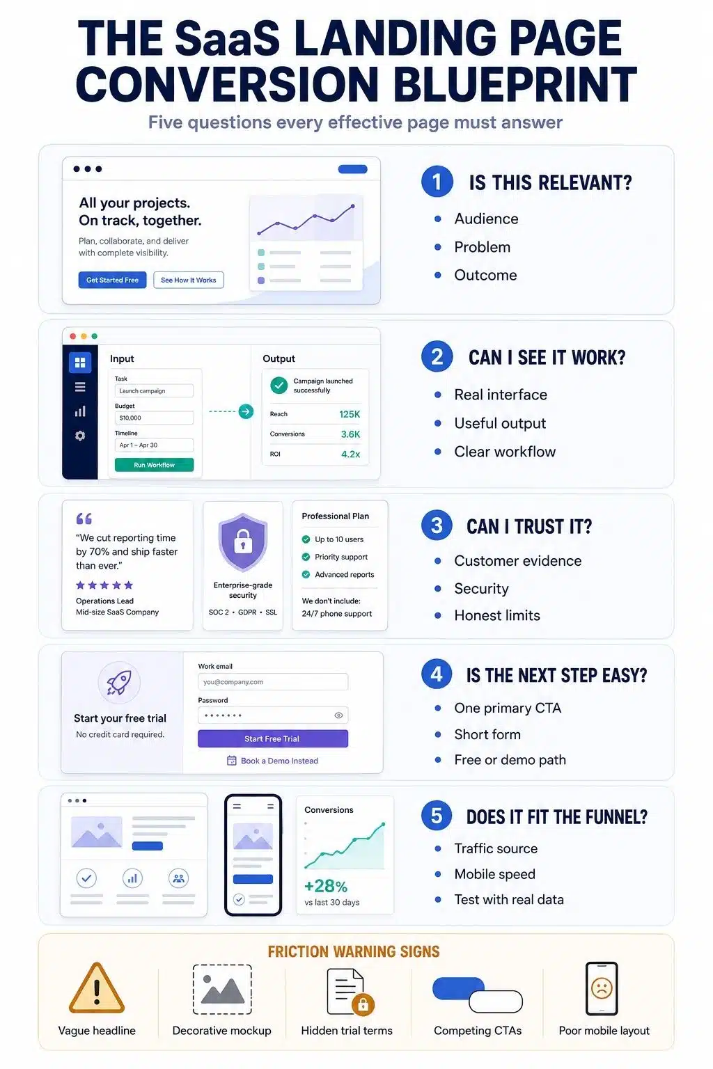
HubSpot’s Free CRM page does not make visitors hunt for the conditions behind its offer. It identifies startups and small businesses as its audience, presents spreadsheets as the frustrating alternative, and places “Get free CRM” at the center of the page.
The supporting details do much of the conversion work. HubSpot states that the free version does not expire and requires no credit card. At the time of writing, it supports up to two users and 1,000 contacts. The page also names useful features, including contact management, email tracking, meeting scheduling, task management, live chat, and sales quotes.
That level of detail helps visitors answer three questions quickly:
- Is this meant for a business like mine?
- Can I try it without entering payment information?
- Is the free version useful enough to justify setting it up?
The page is longer than a smaller SaaS business would probably need. Its offer of clarity is the part worth borrowing. If “free” comes with a time limit, usage cap, required credit card, or restricted feature set, say so before visitors commit.
2. Grammarly Provides Value Before Asking for an Account
Someone visiting Grammarly’s Free Grammar Checker usually has text that needs checking now. The page respects that intent by letting visitors begin the task instead of opening with a lengthy product pitch.
Users can enter text, see how issues are identified, and understand the suggestion process. The account prompt appears as a way to continue and access more guidance, including feedback on tone, clarity, engagement, and word choice.
This is product-led conversion in a practical form. The visitor does not need to imagine what the software might do; the page demonstrates a controlled version of the experience.
Not every SaaS product can offer a usable tool before signup, but many can provide a smaller proof point:
- A sample audit
- A limited calculator
- A document scan
- A short assessment
- A preview generated from user input
- A partially completed workflow
The conversion event needs to be defined carefully. Using a free checker, creating an account, installing an extension, and paying for a plan are separate actions. Combining them into one headline conversion rate would hide where people actually leave the funnel.
3. Webflow Turns the Hero Into a Product Demonstration
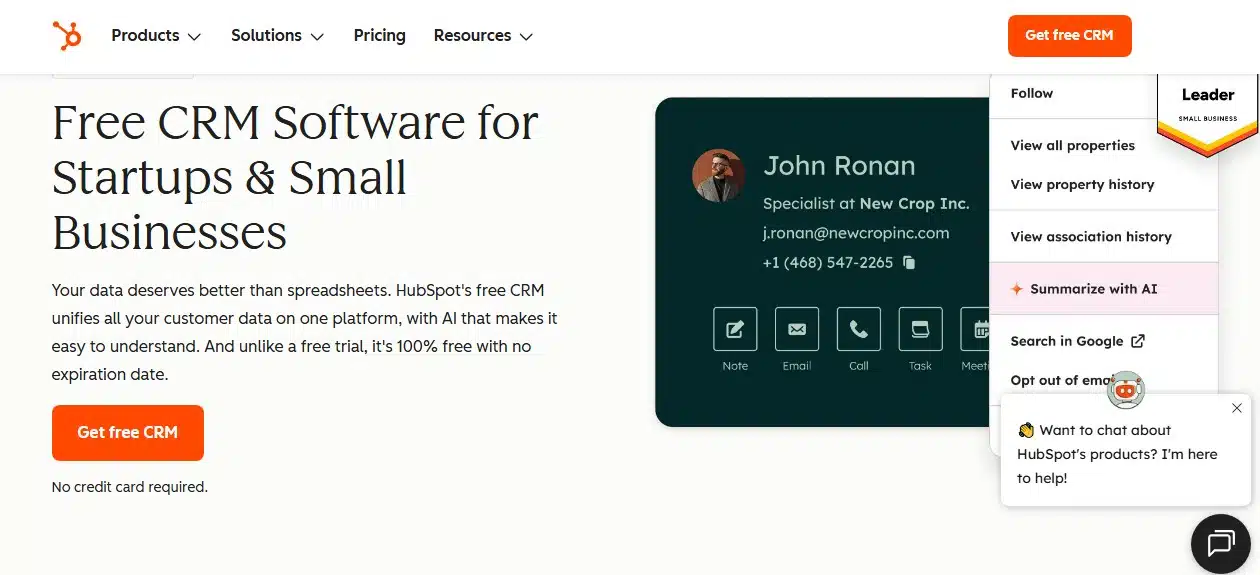
Webflow’s AI Site Builder page brings the product interaction into the hero. Visitors see a prompt field, sample categories, and a Generate button, the same basic action they would take when using the tool.
The short headline, “Start fast. Build right,” is broad, but the supporting copy provides the necessary detail: Webflow can turn a prompt into a customizable, production-ready website.
Further down, the page shows how users can arrange sections, change styles, adjust typography, and continue editing the generated site. That helps answer a reasonable concern about AI website builders: will the result be a disposable template or a site that can grow beyond the first prompt?
Webflow also explains that connecting a custom domain requires a paid Site plan. That limitation is not buried until checkout.
An interactive hero is useful when it teaches visitors something important about the product. It is less useful when it exists mainly to look impressive. Any live demonstration must still load quickly, work on mobile devices, and remain understandable to visitors who choose not to interact.
4. Canva Gives Visitors Somewhere to Start
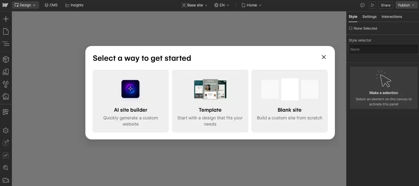
Canva’s Website Builder page uses a direct action, “Create a website”, rather than making the CTA about registration. It then presents templates for portfolios, bio links, businesses, nonprofits, weddings, and other common needs.
Those templates reduce the pressure of starting with an empty canvas. Instead of considering a generic website builder, visitors can picture a recognizable project they might create.
This approach works particularly well for creative software, but the principle applies more widely. Accounting platforms can offer invoice templates. Automation tools can provide ready-made workflows. Analytics products can open with sample dashboards. Project-management tools can supply launch plans or editorial calendars.
The strongest starting point is not always a blank workspace. Sometimes conversion improves when the product helps people avoid making every early decision themselves.
5. Calendly Shows the Whole Scheduling Journey
Calendly’s meeting-scheduling page opens with a straightforward outcome and names situations visitors recognize: sales demonstrations, client calls, and candidate interviews.
It then explains the experience in a natural order. Users connect a calendar, set their availability, choose a meeting type, share a link, and automate reminders or follow-ups. The page also covers website embeds, browser tools, mobile access, routing, and meeting polls.
That sequence makes the product easier to evaluate. A visitor can see how Calendly fits into existing work rather than trying to assemble the process from an unrelated feature list.
The page offers a free signup and a demo request. Here, two actions make sense because they serve different buyers. An individual may want to start immediately, while a larger organization may need to discuss security, administration, integrations, or rollout.
A secondary CTA should have that kind of purpose. Adding “Book a demo” beside “Start free” without a clear audience distinction can create another decision instead of helping visitors make one.
6. Loom Matches One Page to One Clear Need
Loom’s Free Screen Recorder page targets visitors who already know what they want. The headline names the tool directly, the free signup appears near the top, and the page explains screen, webcam, and audio capture without detouring into a broad story about workplace productivity.
The information follows the product workflow: record, edit, annotate, and share. It also covers device support, captions, links, comments, embedded videos, and feedback.
At the time of writing, Loom states that its free version records at up to 720p, with higher-resolution options available through an upgrade. That detail may affect a visitor’s decision, so including it strengthens the offer rather than weakening it.
The page later adds company-reported adoption figures, customer logos, and testimonials. Those elements provide reassurance, but visitors do not need them to understand the product.
Some sections become repetitive, so the page is not a model of perfect restraint. Its message match is the better lesson: a person searching for a free screen recorder should land on a page about recording screens, not a general corporate homepage.
7. Notion Simplifies a Product That Does Almost Everything
Notion can function as a document editor, project manager, wiki, database, calendar companion, and team workspace. Listing every capability in the opening section would make the product harder to understand.
Its team page narrows the offer to three familiar jobs: projects, wikis, and documents. It also identifies the intended range, from small teams to larger organizations.
Visitors can start for free or request a demo. Product screens and customer examples then show how teams might coordinate projects, centralize knowledge, and keep decisions visible.
This is a useful way to market an expanding SaaS platform. The first screen does not need to explain the entire product. It needs to provide enough structure for the right visitor to recognize a relevant problem.
Notion says its free starting option has no time limit or credit-card requirement. However, free team use still carries collaboration and feature restrictions. “Start free” should not be interpreted as unlimited access to every team capability.
8. Slack Connect Sells an Alternative to Email
Slack Connect focuses on a narrow problem: working with customers, suppliers, agencies, and partners outside an organization.
Its headline offers a better way to work with people outside the company, while the supporting message contrasts shared Slack conversations with siloed email threads. That gives the page a clear audience, problem, and alternative.
The page then deals with the questions external collaboration naturally raises. It explains the invitation process, what partners can access, how teams begin working together, and how security is handled. A four-step setup section makes adoption feel manageable.
Slack also presents results achieved by particular customer teams and states that outcomes can vary. That qualification matters. A successful customer result is evidence that something can happen, not a promise that every new customer will achieve it.
The pricing side is less simple. Access for external partners can depend on the host organization’s subscription and eligibility conditions. Slack Connect remains a strong messaging example, but it should not be described as universally free.
9. Linear Uses Product Screens That Carry Meaning
Many SaaS pages place an unreadable dashboard inside a laptop frame and treat it as proof. Linear’s planning page uses product visuals more deliberately.
The screens contain recognizable project states, milestones, dependencies, dates, risks, documents, issue references, updates, and conversations. Together, they show how work moves from an idea toward a launch.
The language is equally specific. Product teams will recognize concepts such as initiatives, project health, roadmaps, dependencies, and resource allocation. Linear does not spend much time teaching the category because its page is written for visitors who already understand the work.
That makes the page useful for qualified, product-aware traffic. The same level of terminology could confuse people encountering an unfamiliar category for the first time.
The lesson is not simply to add more screenshots. Each visual should explain a task, decision, or sequence. A realistic product scenario carries more meaning than a polished interface shown without context.
10. Zapier Uses Specific Details to Explain a Broad Platform
Zapier now covers automated workflows, agents, forms, tables, chatbots, functions, integrations, and other connected tools. That breadth could easily turn its landing page into a catalogue.
The page keeps the platform grounded through concrete details. It highlights connections with more than 9,000 apps, offers signup through email or Google, and places security and privacy references near the beginning. Templates help visitors see what they could automate without designing an entire system from scratch.
Customer stories connect the software to recognizable jobs such as processing leads, handling support requests, and moving information between business systems. This makes “automation” feel less abstract.
Zapier also organizes its suite into selectable product areas instead of forcing visitors through one uninterrupted inventory.
Its newer positioning includes technical terms related to agents and AI infrastructure. Those phrases may resonate with developers and AI-focused teams, but they could confuse a traditional small-business visitor. Zapier has enough category recognition to carry some complexity. A lesser-known product would usually need to explain the basic outcome more plainly.
What These SaaS Landing Page Examples Have in Common
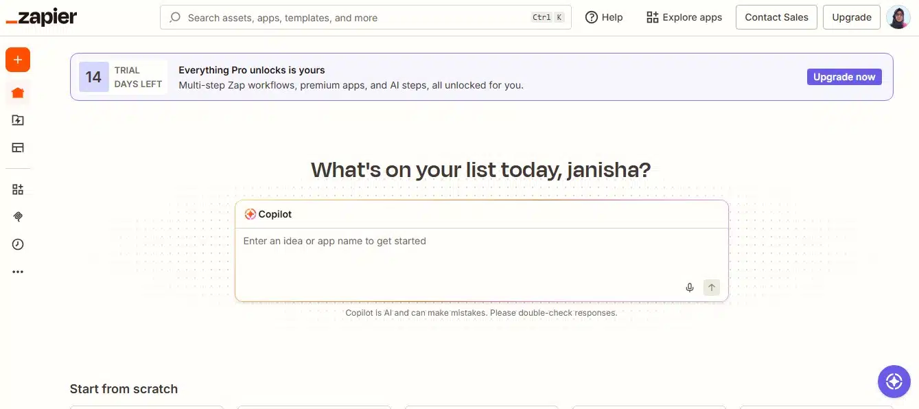
The pages do not share one visual formula. Some are restrained, while others use dense product demonstrations. Their stronger similarities are practical:
- Visitors can identify the product or use case quickly.
- The primary action appears early and returns at useful points.
- Product screens, outputs, templates, or tools provide evidence.
- Free offers include enough detail to set realistic expectations.
- Testimonials support specific outcomes rather than offering generic praise.
- Security appears where trust could block a decision.
- Broad products reveal their complexity gradually.
- Self-serve and sales-assisted buyers receive different paths when needed.
These are patterns to adapt, not a template to reproduce.
The Messy Reality Behind “High-Converting” Pages
A landing page does not convert on design alone. Traffic source, audience awareness, price, brand reputation, sales cycle, and the promise made before the click all influence what happens next.
A homepage receiving branded searches can succeed with an abstract headline because visitors already know the company. Put the same headline in front of cold paid-social traffic and it may explain too little.
The conversion itself also matters. Creating a free account is easier than requesting an enterprise demo. Installing an extension is different from entering payment details. Comparing those actions without context produces an impressive-looking but largely useless benchmark.
This is why copying a successful company’s button color, animation, or page length rarely solves a conversion problem. The better approach is to understand the decision behind the page, adapt it to the visitor’s intent, and test it with real traffic.
Final Thoughts
The strongest SaaS landing page is not necessarily the most minimal, animated, or visually fashionable. It is the one that helps the right visitor understand the offer, see credible evidence, resolve important doubts, and take the next step without avoidable friction.
These SaaS landing page examples succeed in different ways. HubSpot defines its free offer, Grammarly demonstrates value before signup, Webflow makes the product interactive, and Slack Connect deals directly with the risks of external collaboration. The useful move is to borrow that judgment, not another company’s surface design.
Frequently Asked Questions on SaaS Landing Page Examples
1. What is a SaaS landing page?
A SaaS landing page is designed to move visitors toward a software-related action, such as creating an account, starting a trial, installing a tool, selecting a plan, or requesting a demo. Unlike a general homepage, a campaign landing page normally focuses on one audience, problem, or offer.
2. What is a good SaaS landing page conversion rate?
One widely used benchmark based on 2024 data placed the median SaaS landing-page conversion rate at about 3.8%. Treat that as background information, not a universal target. Conversion rates vary considerably depending on the product, traffic source, price, and action being measured.
3. Should a SaaS landing page display pricing?
Self-serve products should normally provide enough pricing information for visitors to judge affordability without contacting sales. Enterprise products may need custom pricing, but the page should still explain what affects the cost and what buyers receive.
4. How many CTAs should a SaaS landing page have?
A focused page should have one primary conversion goal, although the same CTA can appear in several relevant places. A secondary action can work when it serves a genuinely different buyer, such as an enterprise visitor who needs a demo instead of a free account.
5. Is a SaaS homepage the same as a landing page?
Not always. A homepage usually serves several audiences and provides broad navigation. A dedicated landing page is more focused and often matches a particular advertisement, search query, product feature, or customer group.