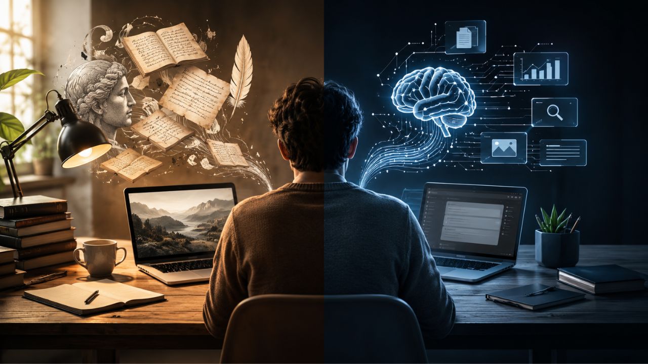
Do you ever feel stuck at your desk, staring at a blank screen while the clock keeps ticking? You are certainly not alone. Many of us struggle with staying focused or creative in our US workplaces. We often overlook the easiest fix right under our noses, like the actual colors painted on our walls. I have a surprising secret to share with you. Scientists have found that color has a real, measurable effect on our mood and how well we work. Picking the right shades for your workspace might just be the easiest way to boost your productivity.
It can completely change how you feel and help reduce your daily stress. In this article about the Psychology of Color in Productivity, we are going to explore how certain colors keep you sharp. Grab a cup of coffee, and let us go through it together. I will show you exactly why blue helps you focus and yellow sparks those big ideas!
The Science Behind Color and Productivity
Understanding the Psychology of Color in Productivity shapes how we work much faster than a cup of coffee wakes us up. Even small changes in shade or tint can flip our brains into focus mode or leave us daydreaming at our desks.
How colors influence mood and behavior
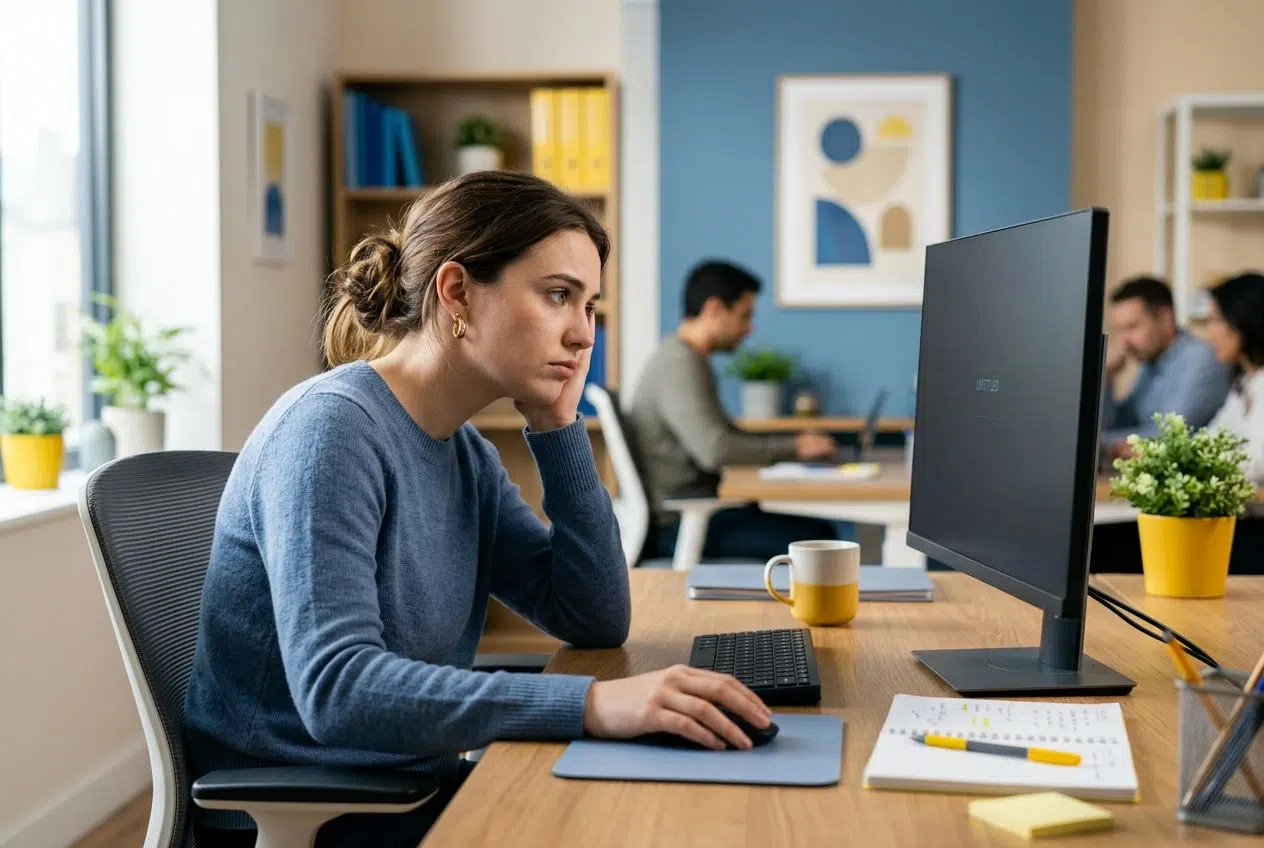
A bright yellow wall can lift your spirits and make a room feel sunny on the cloudiest days. Blue tones usually help people stay calm and focused. This is why many tech companies use blue for tasks that demand deep thought.
Red grabs your attention fast, boosts your heart rate, and heightens your energy levels. People sit in green rooms to relax because green mimics nature and eases stress.
A landmark study by Dr. Nancy Kwallek at the University of Texas revealed a fascinating truth about plain spaces. Her team found that workers in stark white or gray offices actually made more errors and felt sadder than those in colored environments.
“Colors are the smiles of nature.” (Leigh Hunt)
The connection between color and cognitive performance
Color directly affects how your brain processes information. Bright shades like red make you more alert and help you focus on tasks that need fast action.
Dr. Kwallek’s University of Texas research also discovered that a person’s individual sensitivity matters. She found two distinct reactions based on personality types.
- High Screeners: These individuals easily block out distractions and perform highly in bright red rooms.
- Low Screeners: These easily distracted workers felt overwhelmed by red but thrived in soothing blue-green environments.
Green is linked with memory and reading speed. Students consistently recall facts better in green classrooms. Yellow may enhance creativity, but it can feel tiring over long hours if used too much in a workspace.
The Basics of Color Psychology
Color speaks to our minds in silent, vivid ways. Simple tones can boost your energy or calm your nerves on a stressful Monday morning.
Warm colors vs. cool colors
Warm colors like red, orange, and yellow feel like a sudden burst of sunlight in the office. They boost your motivation, raise your energy levels, and spark creativity.
Bright reds signal urgency. Yellows give off cheer and optimism, while oranges bring out friendliness during group tasks.
Cool colors like blue and green act like a calming breeze. These tones help you relax your mind, making focus much easier in places where deep thought is needed.
Color does not add a pleasant quality to design, it reinforces it. (Pierre Bonnard)
The role of saturation and brightness in productivity
Saturation means how pure or intense a color looks, while brightness tells us if the color feels light or dark. High-saturation colors like bright red grab attention fast, but too much can tire your eyes.
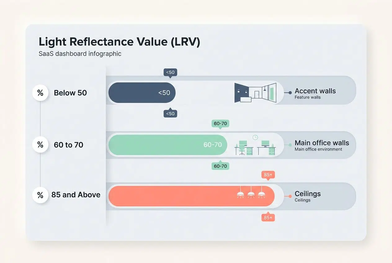
Lighting and brightness play a massive role in office productivity. Paint experts at Sherwin-Williams often recommend looking at a color’s Light Reflectance Value (LRV).
| LRV Range | Best Office Application | Expected Result |
|---|---|---|
| Below 50 | Accent walls, cozy corners | Absorbs light, creates a moody or intimate feeling. |
| 60 to 70 | Main office walls, large open spaces | Bounces natural light beautifully, reduces eye strain. |
| 85 and Above | Ceilings, poorly lit corridors | Maximizes all available light to brighten dark areas. |
Colors with an LRV of 60 or higher bounce natural daylight back into the room. This simple design choice reduces your reliance on harsh artificial lighting and keeps your team energized.
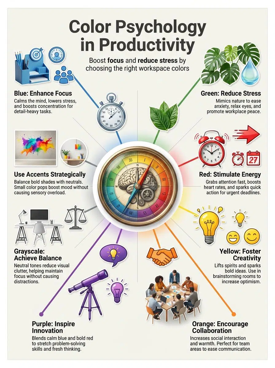
Impact of Specific Colors on Productivity
Colors do more than decorate your workspace. Every shade has its own secret superpower waiting to help you get the job done.
Blue: Enhancing focus and stability
Blue calms the mind and helps people think clearly. A national survey by the Pantone Color Institute found that blue is the preferred hue for focused office workers.
If you want to add steady energy to your day, try these simple blue additions:
- Paint a single accent wall in a soft, cool blue.
- Use blue folders or desk organizers for high-priority projects.
- Add a light blue bulletin board to rest your eyes between screen sessions.
These choices make a massive difference. In fact, a 2009 study at the University of British Columbia showed that people solve twice as many puzzles in a blue room compared to a neutral one.
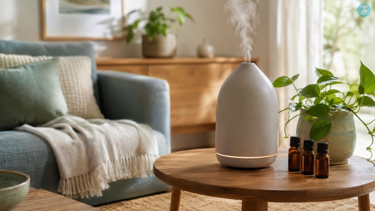
Green: Promoting calmness and reducing stress
Green steps in as the ultimate color of calm. People often find that green helps lower stress and quiets a busy mind. In a 2016 study by Harvard, workers surrounded by natural elements like green plants reported 15% less anxiety than those in plain rooms.
Paint colors like Benjamin Moore’s Sage Green tell your eyes to relax. This gives your brain permission to pause for just a moment before jumping back into work mode.
Red: Stimulating energy and urgency
Red snaps people to attention. It jumps out, grabs your eyes fast, and signals absolute urgency. Offices use red on signs or buttons that need quick action. Huge fast-food brands love red because it speeds up decision-making and makes you feel hungry.
A pop of red in your workplace can kick-start your motivation for short tasks. Just keep it balanced, as a single bright chair gives enough spark without turning your workspace into an alarm bell zone.
Yellow: Fostering creativity and optimism
Yellow gives a strong creative boost, acting like pure sunlight for your mind. Studies show that yellow can increase your energy and attention.
There is a reason classic Post-it notes are bright yellow. The color forces your eye to stop and read, making it the perfect tool for brainstorming.
Try adding soft yellow shades to project corners to push your team to think outside the box. Small pops go a long way toward optimism and creativity enhancement.
Orange: Encouraging friendliness and collaboration
Orange fills a workplace with warmth, making people feel much more open and ready to talk. Rooms painted orange can increase social interaction by up to 20 percent, according to research from the Color Association of the United States in 2022.
Retailers like The Home Depot use orange aprons because the color physically stimulates activity and signals extreme approachability. Add orange chairs near break areas for a quick mood boost.
Purple: Inspiring imagination and innovation
Purple sparks fresh ideas and big dreams in the workplace. This color blends calm blue with bold red, making it a smart choice for creative thinking.
You can easily sprinkle purple into a creative space by:
- Adding a rich lilac chair cushion for comfort and style.
- Displaying artwork with deep violet tones in brainstorming rooms.
- Using purple notebook covers for your most imaginative projects.
Tech companies originally chose purple branding to stand out and inspire constant innovation among their teams.
Grayscale: Achieving balance and neutrality
Grayscale colors like white, black, and gray create a sense of calm in any workplace environment. These shades offer neutrality and balance that help reduce visual stimuli.
Tech giants like Apple use grayscale in their stores to reduce visual clutter. This blank canvas lets your mind focus entirely on the products or tasks at hand.
Use neutral backgrounds carefully. As Dr. Kwallek’s University of Texas study proved, an entirely sterile white office can actually increase worker errors over time.
Designing Workspaces with Color Psychology
Color can shape a workspace perfectly, making it smart for tasks and easy on your eyes. Keep reading to see how you can brighten up your office space.
Choosing colors based on tasks and goals
Color choices completely change how people work and feel at their desks. Picking the right shades helps boost your mood, focus, and creativity.
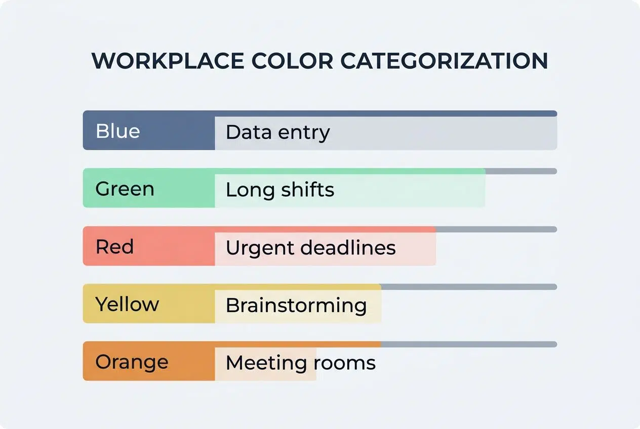
| Color Choice | Best Office Task | Psychological Benefit |
|---|---|---|
| Blue | Data entry, writing, focused work | Calms the mind and slows the heart rate. |
| Green | Long shifts, call centers | Eases eye strain and reduces workplace stress. |
| Red | Urgent deadlines, active zones | Sparks immediate action and high energy. |
| Yellow | Brainstorming, graphic design | Lifts spirits and promotes creativity enhancement. |
| Orange | Meeting rooms, team spaces | Improves collaboration and feels welcoming. |
Matching colors with natural light keeps everyone alert during the day. Sunlight makes blue pop and turns green soothing instead of dull.
Balancing bold and neutral tones
Too much color can distract workers and make spaces feel chaotic. You need a reliable system to keep your office design grounded.
Professional interior designers frequently use the 60-30-10 rule to perfectly balance bold and neutral tones. Here is exactly how it works:
- 60% Dominant Color: This is your neutral base, like soft gray or warm beige, used on the main walls.
- 30% Secondary Color: This is a supporting tone, like a navy blue sofa or a painted accent wall.
- 10% Accent Color: This is your bold pop of energy, like a bright red chair or vibrant yellow artwork.
This blend makes a workspace look neat but keeps things extremely lively. Natural light bouncing off pale walls also improves your mood and protects your eyes.
Incorporating natural light and reflective surfaces
After striking a balance with your colors, you should turn your eyes to the lighting. Sunlight acts like a quick refresh button for your tired brain.
Paint experts recommend choosing wall colors with an LRV of 60 or higher to maximize natural rays. This simple trick supports better focus and lessens workplace anxiety.
Reflective surfaces, like glass tables or glossy painted walls, bounce light around a room. This makes even small, cramped spaces feel bigger and brighter.
Psychological and Emotional Benefits of Color
Color can lift your mood and help you feel much more relaxed at work. With the right shades, you will notice lighter spirits and less tension in your day.
Improving employee well-being and morale
Blue walls often help people feel calm and steady, cutting down on stress during busy workdays. Splashes of green in meeting spaces make workers feel less anxious.
Choosing the right color tones in office design helps employees enjoy their day more. Workers surrounded by colors that lift their spirits often experience:
- Better daily focus and engagement.
- Fewer days are called in sick.
- A stronger sense of being valued at work.
Even yellow touches can spark genuine smiles, spreading hope and brightening moods across your entire team.
Reducing workplace stress and anxiety
Focusing on employee well-being lifts the spirit, but using smart color choices directly eases physical tension. Calming shades like soft green or beige become critical for anxiety reduction in the workplace.
According to the 2024 Stress in America survey by the American Psychological Association, 77% of adults report the future of the nation as a significant source of stress.
With baseline anxiety running that high, you need environments where brains can take a breather. Doctors agree that blue-green tones lower pulse rates and promote a sense of peace.
Employees surrounded by stress-reducing hues miss fewer days due to burnout. They also perform much better during busy periods, according to several studies tracked by the Harvard Business Review last year.
Practical Tips for Using Color in Office Design
A splash of the right hue can lift your mood or sharpen your focus in an instant. Let us look at how to turn a plain office into a productivity powerhouse.
Avoiding overstimulation with too many bright colors
Too many bright colors in one workspace can make your eyes incredibly tired. People may start feeling restless or anxious after long exposure to strong, lively hues.
Bright reds and yellows give you energy, but using too much turns a room into a circus rather than a place for calm focus. A smart mix of color choices helps keep cognitive performance high.
To avoid overloading your senses, try using light grays or soft blues as your main colors. Save your sharp pops of red or orange for smaller areas.
Using accent colors strategically
Accent colors work exactly like a spotlight. They pull your eyes to where you want attention, such as an important notice or a vital tool. A red lamp can signal urgency without making the whole area feel stressful. Stick with small pops of color in places that matter most.
- Place green plant pots on your desk to rest your eyes.
- Use blue desk organizers to keep your mind calm during tough tasks.
- Hang yellow artwork in group spaces to spark creativity.
The right accent supports your focus without stealing the show from your actual work.
Adapting colors for individual preferences and team dynamics
Splashes of color, used as accents, can beautifully brighten any workspace. In shared offices, you will find that color preferences often vary widely. Some folks feel perfectly calm around cool blues or soft greens. Others find their creative sparks in bright yellow or orange tones.
Mixing different colors across specific zones supports productivity for everyone on your team. Letting employees choose their desk accessories gives them a comforting sense of control.
Wrapping Up
Color choices can absolutely work wonders in any workplace. A dash of blue helps boost your focus, while green cools your mind and reduces stress. People light up with yellow and orange, as these colors spark creativity and cheer.
Red wakes everyone up, pushing energy levels higher for those urgent tasks. Careful color selection shapes how you and your employees feel each day. Even small shifts, like a bold accent wall or fresh green plants, change how teams think and connect.
Understanding the Psychology of Color in Productivity is the secret to making every workspace more pleasant and efficient for everyone.