Picking the right colors for your home can seem like a tough puzzle. You want your space to feel just right, reflecting your style and making you happy every time you walk in. One fact stands out: colors have a big job.
They set the mood of a room and affect how we feel in it. Our guide offers 9 expert tips for choosing the perfect color palette that will transform your space.
We’ll help you understand color theory, pick a dominant shade, and use light to make colors pop. By following these steps, you’ll create rooms that look balanced and inviting. This journey into colors is exciting! Keep reading to find out more.
Understand the Basics of Color Theory
Color theory might initially seem mundane; indeed, it’s not. In reality, it’s a key strategy for crafting spaces that look fantastic. We rely on the color wheel as our trusty helper in this.
See it as your guide for understanding color schemes. Equipped with it, you can discover harmonious combinations that delight your visual senses. Complementary colors act as perfect rivals—they’re contrasting yet phenomenal when paired, much like blue and orange.
Analogous colors reside side by side on the wheel, their proximity generating a calm ambiance.
Warm colors infuse a room with dynamism quicker than your morning cup of coffee. Comprising reds, oranges, and yellows, they demand attention. Conversely, cool colors such as blues, greens, and purples infuse a calming effect, calling for relaxation.
Triadic color schemes are comparable to the three musketeers – positioned evenly apart on the wheel they introduce balance and harmony to any space effortlessly. So, take the color wheel and experiment; working with it is simpler than assembling IKEA furniture!
Define the Mood You Want to Create
Defining the mood starts with understanding color psychology. Warm colors like reds, oranges, and yellows bring energy to a room. They welcome people in. Think of using these hues where you gather, eat, or play.
On the other hand, cool colors such as blues, greens, and purples offer calmness. These shades best suit places meant for rest or focus like bedrooms and offices.
Choosing right can transform your space. Soft blues or greens create tranquility in sleeping areas; bright yellows energize kitchens. It’s all about matching color psychology with the function of each room to get the desired feel.
Choose a Dominant Color
Selecting a dominant color plays a key role in shaping the mood of your space. This prominent hue should stand out as the main attraction, creating harmony throughout common areas.
For example, soft beige can serve as a neutral choice that sets an inviting ambiance. Such colors influence perceptions and emotional impact.
Your dominant color runs through all rooms for balance and unity. Reflect on how it interacts with light; natural light can enhance warm colors while cool shades may feel more tranquil.
Consider what emotions you want to evoke when making this choice. A well-chosen dominant color impacts brand recognition in spaces too, making them memorable and cohesive.
Use the 60-30-10 Rule for Balance
The 60-30-10 rule helps you create an inviting space. Start by choosing your dominant color for about 60% of the room. This often includes walls and larger furniture pieces. For balance, pick a secondary color that covers about 30% of your area.
Think window treatments or accent chairs to enhance your main hue.
Add some fun with accent colors, which should make up the final 10%. Use these in decorative items like throw pillows or artwork. This formula keeps things visually appealing and creates harmony in your color palette.
Consider the Role of Natural and Artificial Light
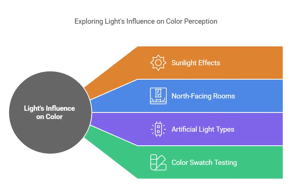
Light plays a big role in how colors look. Sunlight brightens darker hues, making them pop. In contrast, north-facing rooms often make colors appear cooler or darker. Before you paint, capture how your chosen palette looks at different times of the day.
Artificial light can also influence your color choices. Warm bulbs create cozy vibes with warm colors, while cool LEDs might bring out the freshness in cool tones and neutrals. Use color swatches to test these effects within your space before finalizing your design.
This way, you get a true sense of how each hue interacts with light throughout the day!
Incorporate Textures to Enhance Your Palette
Textures play a crucial role in enhancing your color palette. They add depth and character to any space. Consider using wood for warmth, metal for a modern touch, or fabric for softness.
Each material brings its own vibe.
Patterns also make a difference. Stripes can elongate areas, while florals inject playful energy. Geometric designs give that contemporary feel you might want in your interior design project.
Mixing textures and patterns helps achieve perfect color harmony while creating an engaging user experience in your surroundings.
Experiment with Complementary and Analogous Colors
Complementary and analogous colors can transform your space. Understanding how they work will elevate your color palette choices.
- Complementary colors sit opposite each other on the color wheel. Blue and orange create a vibrant contrast that energizes a room.
- Analogous colors are next to each other on the wheel. A mix of blue, blue-green, and green creates harmony and flow in spaces.
- Use complementary colors for bold statements. Pairing warm colors with cool tones adds excitement and depth to any design.
- Try using analogous shades for a calming effect. This strategy creates a serene atmosphere, perfect for relaxation areas like bedrooms or reading nooks.
- Test different shades within these groups. Tints, tones, and shades allow for variety without overwhelming the viewer.
- Balance is key when using complementary combinations. Too much of one color can tire the eyes quickly; moderation keeps it fresh.
- Consider the psychology of color no matter what you choose. Colors influence emotions; warm tones often convey cheerfulness while cool colors promote tranquility.
- Experimentation can lead to surprising outcomes. Don’t shy away from mixing styles or adding unique accents to define your personal style and enhance user experience.
Test Your Palette with Swatches and Samples
Testing your color palette with swatches and samples helps you make informed choices. You need to see how colors look in different lighting and spaces.
- Purchase large paint samples. Small chips can mislead you about the undertones of a color.
- Apply swatches on the walls. Paint both large sections and small areas for better comparisons.
- Observe colors at various times of the day. Natural light can change how your chosen shades appear.
- Compare swatches with furniture and decor. Make sure your dominant color complements your existing items.
- Use neutral colors as a base. They can help accentuate brighter, bolder hues in your palette.
- Test colors with fabrics or textures nearby. This will help you understand how different materials interact with the palette.
- Consider using nature-inspired colors, like greens and browns, for a calming feel.
- Take your time making adjustments based on what you see and feel around you.
- Document your findings by taking photos of each combination in different lights.
This testing phase is crucial for crafting a lovely atmosphere in your space!
Create a Mood Board for Visualization
Creating a mood board helps you visualize your color palette. Use tools like Pinterest or Photoshop for an engaging experience.
- Gather at least 50 inspiration images that resonate with your vision. Look for colors that excite you and fit your desired atmosphere.
- Narrow down your collection to 8-10 favorites. This step focuses on quality, helping to refine your choice of colors.
- Arrange images to ensure visual cohesion and clarity. The placement of each image matters in forming a harmonious look.
- Extract brand colors organically from chosen images using tools like Photoshop. This process allows you to connect the visuals directly to specific hues.
- Experiment with various arrangements on the board until it feels right. Shuffling the images can spark new ideas and insights about your color palette.
- Include swatches of dominant colors alongside images for reference. These swatches reinforce color associations and maintain consistency in your design.
- Incorporate textures into your mood board to enhance its appeal. Mixing materials like fabric samples gives depth to your visual presentation.
- Share your mood board with friends or family for feedback. Fresh perspectives can highlight details you might miss.
- Adjust based on their input while staying true to what inspires you most. Balancing personal taste with external opinions creates a richer palette.
- Keep refining the mood board as you develop your project further; it’s a living tool in selecting the perfect color scheme.
Utilizing a well-crafted mood board transforms abstract ideas into tangible designs, guiding you toward the perfect color palette for any space or brand!
Refine and Adjust Based on Your Space and Style
Refining and adjusting your color palette is key for a perfect fit. Your space and style can totally change how colors feel.
- Assess the room size. Large rooms can handle bold colors, while smaller spaces benefit from lighter shades.
- Observe natural light. The amount of sunlight will shift how colors appear throughout the day.
- Evaluate artificial lighting. Different bulbs can warm up or cool down your palette’s vibe.
- Consider existing decor. Colors should complement furniture and other elements, not clash with them.
- Test paint samples. Apply swatches on walls to see how they interact with light at different times.
- Adjust based on mood preferences. Warm colors like red and yellow create cozy feelings; cool hues like blue promote calmness.
- Blend textures in the space. Softer fabrics or rugged finishes can enhance your chosen color scheme greatly.
- Embrace neutral tones as a base. Neutral backgrounds allow for flexibility when introducing accent colors later.
- Experiment with accent colors wisely. These should pop against dominant shades but still flow well in your design story.
- Seek inspiration from nature-inspired colors, which often evoke pleasant emotions through their associations.
- Trust your instincts about personal style choices; they play a huge role in curating a space that feels right for you.
Fine-tuning these elements will lead to a balanced color arrangement that truly reflects who you are!
Takeaways
Choosing the perfect color palette brings joy and creativity to your space. Explore color theory and play with hues that reflect your style. Test combinations with swatches for the best results.
Craft a mood board to visualize your ideas. With these tips, you can create a home that feels distinctly yours!
FAQs on Choosing The Perfect Color Palette
1. What is a color palette and how does it relate to interior design?
A color palette is a selection of colors used in various forms of visual communication, including interior design. It can include primary colors like red, blue, and yellow; secondary colors created by mixing primary ones; as well as tertiary colors that are combinations of primary and secondary hues.
2. How do I choose the perfect color palette for my brand or painting?
Start with understanding the psychology of colors—how different shades evoke certain emotions. For instance, warm colors like vermilion might convey lightheartedness while cool tones could create a calming effect. Use this knowledge along with your branding goals to select a dominant color and accent colors that complement it.
3. Can you explain monochromatic color schemes?
Sure! A monochromatic scheme uses different tints or shades of one single hue from the RGB (red, green, blue) or CMYK (cyan, magenta, yellow, black) color models. This approach creates harmony and cohesion but also requires careful use of texture to avoid monotony.
4. Why should I consider nature-inspired colors for my palette?
Nature-inspired palettes offer an array of harmonious options from soft neutral greys to vibrant greens and blues—all capable of enhancing user experience, whether in photo editing or room decor!
5. What role does ‘color theory’ play when choosing the right palette?
Color theory helps us understand how different hues interact on the color wheel—which includes primary, secondary & tertiary colors—helping us identify complementary pairs or pleasing triads for balanced designs.