
An infographic has to earn its place beside an article. When I turn written material into a visual, I want readers to grasp it quickly, and I need enough control to make the result fit the page. That was the standard I brought to my ImagineLab Art Infographic Lab vs Napkin AI test.
I entered the same text into both tools. Both generated an infographic, but the results took different directions. Napkin AI gave me a more shape-based visual that I could rearrange and customize. ImagineLab Art gave me something closer to the infographic I wanted to publish. I chose its result for the article.
That choice made me look more closely at the experience around each output: what I could change, how easily I could move toward the design I wanted, and where each tool might fit in my work. I’ll show both results as screenshots so you can judge the visuals alongside my account of using them.
Disclosure: ImagineLab Art is our in-house built product at Editorialge. I tested both tools before writing this comparison.
The brief was more than a list of apps
The source text grouped the apps by what a child might want to make: play with color, draw their own ideas, or turn pictures into stories. It also included short descriptions, a personal note about using an app with my nephew, and a simple activity parents could try with their child.
I wanted an infographic that would help a reader follow those three paths at a glance. I used the same text brief in both tools so I could judge what each made of that material.
What Napkin AI gave me
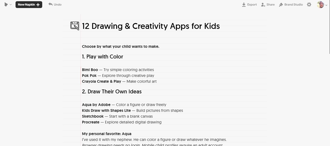
Napkin AI generated a visual, but the result leaned toward the chart and shapechart-d style I associate with its editor. I could see how to work on it: Napkin let me adjust elements such as the layout, colors, size, and effects. Its editing tools also support changes to individual shapes, text, and other components.
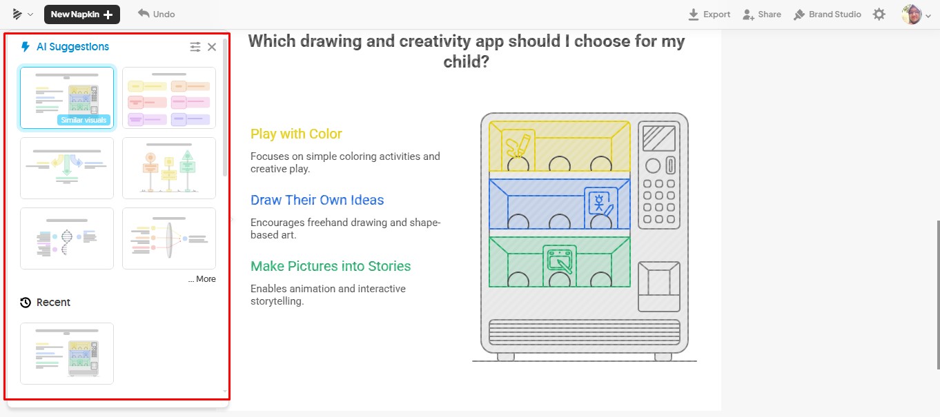
That flexibility matters. If I had wanted a structured diagram or a more geometric way to organize the information, I might have taken the result further. For this article, though, the first result did not feel like the illustrated, reader-friendly infographic I had in mind.
That is a judgment about this brief and this result. Napkin also lets users describe the type of visual they want during generation, so a different instruction or another round of editing could lead to a different outcome.
Why ImagineLab Art Infographic Lab worked for this article
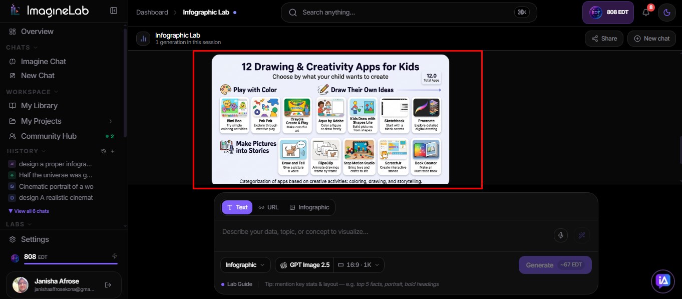
ImagineLab Art’s Infographic Lab gave me a stronger starting point. The result felt closer to the infographic I had pictured when I prepared the brief, and it was the version I chose to publish.
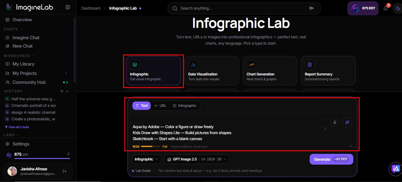
The choices available before and after generation helped me get there. In the interface I used, I could choose from eight visual directions: Infographic, Data Visualization, Report Summary, Chart Generation, Comparison, Process Flow, Timeline, and Mindmap. For this assignment, I wanted an infographic rather than a process flow or a chart. I could also choose a model and use options to enhance the prompt and adjust the visual treatment, including color and background.
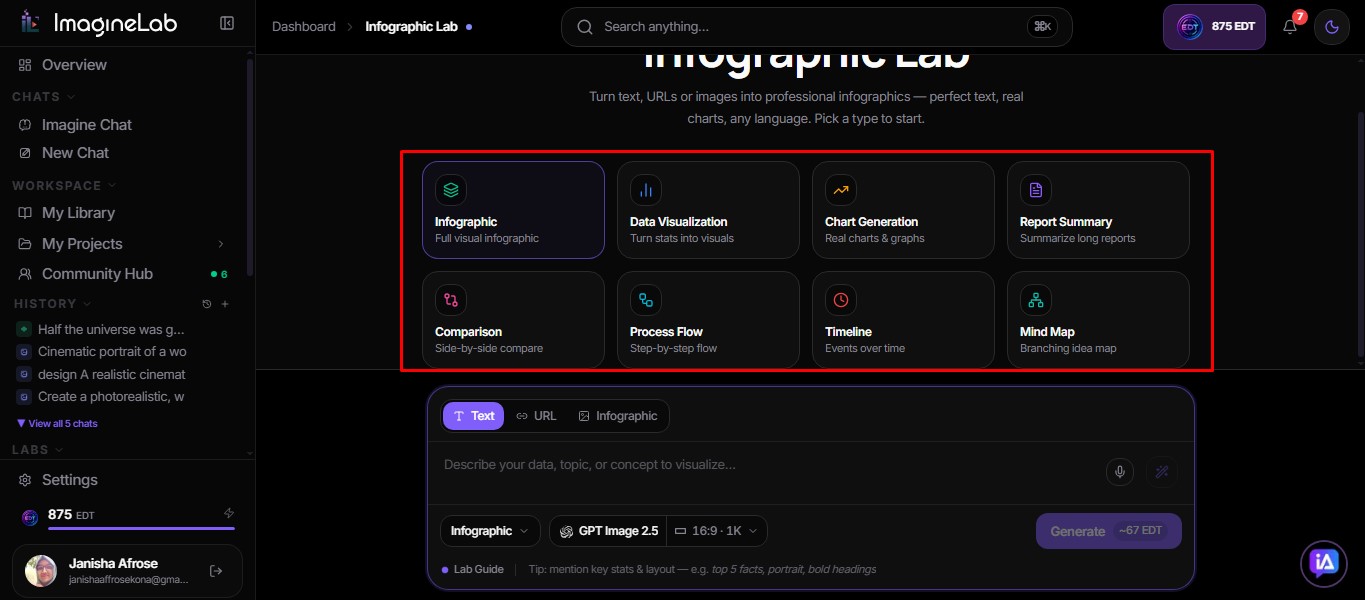
ImagineLab Art describes Infographic Lab as part of its wider seven-lab workspace and says it supports several kinds of structured visual content. Those broader product capabilities provide context, but my preference here comes from the output I made for this article.
What the editing experience changed for me
The difference was partly about where I wanted to spend my effort. Napkin offered hands-on control over the parts of its visual. I could visualise and reorganize elements, but I would have needed to do more work to move that initial result toward the style I wanted.
With ImagineLab Art, the generated infographic was already closer to my goal. I had options to refine it, and I exported the version I used as a JPG. One ImagineLab generation in this test cost me 67 EDT. That figure describes this generation; it is not a fixed price for every infographic or setting.
I did not use this test to benchmark generation speed, compare every export option, or test both tools with a numerical data brief.
Which one would I use again?
For a visual like this, an editorial infographic built from grouped recommendations and short explanations, I would start with ImagineLab Art Infographic Lab. It gave me the result I wanted to publish and useful choices for shaping that result.
I would still consider Napkin AI when I want to build or adjust a diagram, chart-like visual, or layout made from editable components. I have not tested that as a separate head-to-head test, so I would not call either tool the overall winner. In this test, with this brief, ImagineLab Art was the better fit for my work.
Frequently Asked Questions on ImagineLab Art Infographic Lab vs Napkin AI
1. What is ImagineLab Art Infographic Lab?
Infographic Lab is one of ImagineLab Art’s seven creative labs. It turns a written brief into a visual and lets you choose the kind of information design you want to make. ImagineLab Art places it in the same workspace as its image, video, voice, music, writing, and chat tools.
2. What kinds of visuals can I make with Infographic Lab?
In the interface I tested, I saw eight choices: Infographic, Data Visualization, Report Summary, Chart Generation, Comparison, Process Flow, Timeline, and Mindmap. I chose Infographic for my article because I wanted readers to follow three groups of app recommendations, rather than read the information as a chart.
3. How should I write a brief for Infographic Lab?
Start with the point the visual needs to make. Then group the information under clear headings and identify any names, numbers, or short notes that must appear. My brief worked from three categories of children’s activities; that structure gave the tool more to work with than a single ungrouped list.
4. Can I choose a model and refine the result?
Yes. ImagineLab Art offers model selection, and I could choose a model during my Infographic Lab test. I also used the lab’s options to shape the result, including prompt enhancement and visual controls for color and background. Available models and settings can change, so check the choices shown in the lab when you create yours.
5. Will the infographic lab reproduce every word in my brief correctly?
Check it before publishing. A good-looking visual still needs a close read for names, counts, headings, and small but meaningful details. For my 12-app brief, I would compare the finished image with the source text, especially where several app names and descriptions share one section.
6. How much does one ImagineLab infographic cost?
One generation in my test cost 67 EDT. That is the cost of that generation, not a standard price for every infographic. ImagineLab’s wallet guide says to use the amount displayed in the lab for the settings you select; it does not publish a fixed Infographic Lab price in that guide.
7. Can Napkin AI also make infographics?
Yes. Napkin AI can turn text into infographics and other visuals, and it offers controls for visual type and layout. Its result for my particular brief was more shape- and chart-oriented than I wanted, but that does not mean it cannot make an infographic. Napkin also offers direct editing of individual visual elements, which may suit someone who wants to rearrange the output by hand.