

Your churn rate reads 3.8%. It read 3.8% last month and the month before. Nothing on the dashboard looks broken. Then growth flattens two quarters later and nobody on the team can name the month it started going wrong.
That blind spot is not a reporting failure. It is arithmetic. A blended churn rate averages customers who signed up eighteen months ago with customers who signed up last Tuesday, and the long-tenured group props up the number long after new signups have stopped sticking.
Cohort analysis is what separates them. That separation is why SaaS founders need cohort analysis once acquisition is big enough to have a mix in it.
Group every customer by the month they signed up. January signups are one cohort, February signups another. Then track each group forward on its own timeline: how many were still paying at month one, month two, and month six.
You end up with a table where every row is a signup month and every column is a month of age. Reading down a column tells you whether newer customers behave better or worse than older ones at the same point in their life. Reading across a row tells you when a specific group quit. Our fuller walkthrough of the mechanics is in our guide to cohort analysis, so this piece stays on the decisions it drives.
Cohorts do not have to be time-based. You can cut by acquisition channel, pricing plan, company size, or whether a user finished onboarding. The signup-month version is the default because it needs no event tracking you don’t already have.
The Blended Number is an Average of Things that Shouldn’t Be Averaged
Take two groups in the same reporting month. An older cohort retains 90%; a newer one retains 62%. Blended together, you report 78% and nobody panics.
| Cohort | Month 1 | Month 3 | Month 6 |
|---|---|---|---|
| Older cohort | 94% | 91% | 90% |
| Newer cohort | 71% | 64% | 62% |
| Blended view | 84% | 78% | 78% |
Those figures are illustrative, but the shape is common. The blended row is stable and useless. It hides a newer cohort that is failing, and it keeps hiding it for as long as the older group is large enough to carry the average. By the time the blended number finally drops, the decisions that caused it are six to nine months in the past.
The benchmarks give this some urgency. Bootstrapped SaaS companies between $3M and $20M ARR reported a median net revenue retention of 103% in SaaS Capital’s 2026 survey, with the 90th percentile at 117.9%. Across Benchmarkit’s 2026 panel of 342 companies, working from full-year 2025 data, the median sits at 102%.
Retention on the gross side has been drifting down: top-quartile gross revenue retention fell to 91% in 2025, where 95% had been the long-standing rule of thumb for elite performance. A blended figure near the median tells you nothing about which parts of your base are holding and which are leaking.
Why SaaS Founders Need Cohort Analysis Once Paid Traffic Enters the Mix
At ImagineLab.art, our blended retention looked acceptable. Split by acquisition channel, it wasn’t one number at all. Paid-search cohorts were largely gone by month two. Referral cohorts from the same signup months kept going. Same product, same pricing, same onboarding, completely different outcomes.
The underlying effect is documented well outside software. A 2011 study in the Journal of Marketing tracked around 10,000 customers of a German bank for nearly three years and found that referred customers held a higher retention rate that persisted over time and were worth at least 16% more than comparable non-referred customers. That is banking data, not SaaS, so treat it as directional rather than a benchmark. The mechanism travels, though: a referrer filters for fit before sending anyone, while a paid click buys whoever happened to be searching.
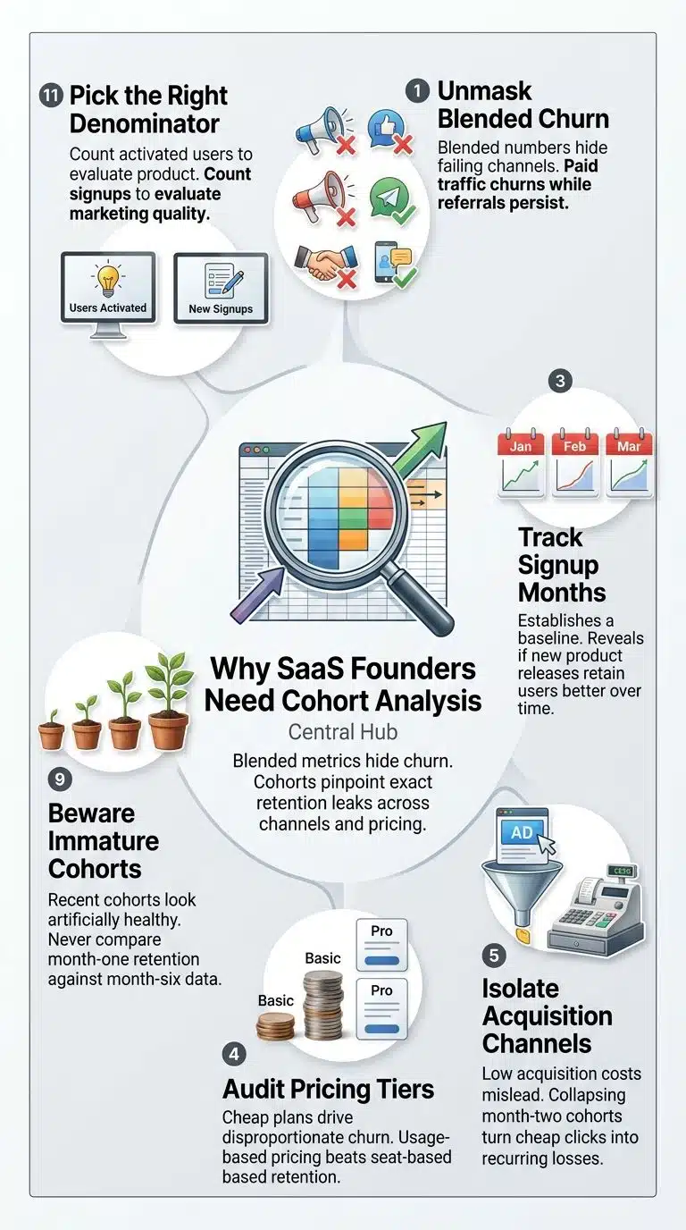
Two decisions came out of that split for us. We changed pricing because the plan structure was letting people in at a price point that never gave them a reason to come back. And we put development into products that gave existing users somewhere to go next, which is where Imagine Chat and Long Video Lab came from. Neither call was visible in a blended churn figure. Both were obvious within ten minutes of looking at the channel view.
That is the practical version of why SaaS founders need cohort analysis: it turns “retention is a bit weak” into a named channel, a named plan, and a named month.
Three Cuts Worth Running Before Anything Else
Signup month. The baseline. It tells you whether the product you shipped this quarter retains better than the one you shipped last quarter.
Acquisition channel. The one most likely to move the budget. If a channel’s cohorts collapse by month two, a low cost per acquisition is not a bargain. It is a subsidy you pay every month.
Pricing tier. Cheap plans often churn hardest, which sounds obvious until you see how much of your churn number they generate. The pricing model itself is a retention variable: usage-based companies posted a 108% median net revenue retention in the 2026 benchmark data, while seat-based companies sat below the 100% break-even line, with the exact seat-based figure varying by report.
Start with one cut. A channel-by-month table built in an afternoon will change more decisions than a dashboard project that takes a quarter.
Where Cohort Tables Mislead You
Immature cohorts are the most common trap. Last month’s cohort has one data point and looks excellent, because everyone who signed up three weeks ago is still technically a customer. Never read a month-1 cell against a month-6 cell, and be careful with any cohort younger than your billing cycle.
The denominator matters just as much. If you count signups, a spike in low-intent traffic wrecks the table even though your paying customers are fine. Counting activated users gives you a table about the product. Counting signups gives you a table about marketing. Both are worth having; mixing them gives you neither.
Seasonality distorts things too. A December cohort and a March cohort may be different kinds of buyer, not evidence that something changed. And cohorts tell you what happened, not why. They point to the month and the segment. The conversation with five churned customers is what tells you the reason.
Running This in SQL When You Have a Data Team
We build these against our own tables rather than through a product analytics tool across ImagineLab.art and RankPilot.ai. For a team with a warehouse, the query is short:
select
date_trunc(‘month’, u.created_at) as cohort_month,
date_diff(‘month’, u.created_at, a.active_at) as month_index,
count(distinct a.user_id) as active_users
from users u
join subscription_activity a on a.user_id = u.id
group by 1, 2
order by 1, 2;
active_at is where the real argument happens. Logged in, performed a core action, or paid an invoice are three different tables and three different stories. Agree on it once, write it down, and keep it stable, because quietly changing the definition makes every historical comparison worthless.Cohorts Feed Your Other Numbers
A cohort table is an input, not a standalone report. It shows which customer groups reach the activation event that actually predicts staying, which is the work behind choosing a north star metric for subscription apps. It also makes LTV, CAC payback and net revenue retention mean something, since those figures calculated on a blended base carry the same averaging problem. If the team needs the definitions lined up first, our breakdown of SaaS metrics covers them.
Final Thoughts
Build one table this week: signup month down the side, months since signup across the top, split by acquisition channel. Do not build a dashboard yet. Look at the first version, find the one cohort behaving differently from the rest, and go find out why.
Why SaaS founders need cohort analysis comes down to timing. A blended metric tells you something is wrong roughly two quarters after you could have fixed it. A cohort table tells you which month it started, which group it hit, and usually what you changed to cause it. At growth stage, with a data team already sitting on the raw tables, there is no good reason to be working from the blended number.