

There’s a question I couldn’t answer in July, and it bothered me for about a week. Someone on the ImagineLab.art team asked how many beta users had actually turned into paying users. Simple question. It took me most of a day to give a number I trusted, and even then I hedged. That’s the whole reason I ended up building out subscription analytics for a SaaS business that, at the time, had no real analytics at all.
This guide is what I wish someone had handed me on day one. It’s written for founders who can read SQL and want the actual tables and formulas, not a list of tool recommendations.
One thing to say up front: ImagineLab Art is a sister concern of Editorialge. It runs custom billing with Stripe, Wise, Bkash, Visa, Mastercard, and UPI. If you’re in the same boat, the second half of this guide is the part you want.
Why Subscription Analytics for a SaaS Business Gets Messy Fast
Most SaaS metric guides assume one thing: all your money flows through one processor, and that processor already knows what a subscription is.
Break that assumption and everything gets harder. Our money arrives in three shapes. A Wise transfer shows up in a bank feed two or three days later, in whatever currency the customer sent. A Payoneer payment is similar. None of those rails understand the idea of “a monthly plan that renews.” They only understand “money moved.”
So the first thing to accept is this: your payment tools are not your source of truth. They’re evidence. Your own database has to hold the truth about who is subscribed to what.
Once I accepted that, the rest of the work got a lot clearer.
Step 1: Write the Questions Down Before You Write Any Code
I skipped this at first and wasted two days building a dashboard nobody looked at.
Sit down and write the questions you actually need answered. Mine ended up being seven:
- How much money do we make every month that we can count on?
- How much do we make that we can’t count on?
- Of the people who sign up free, how many pay us, and how long does that take?
- Who leaves, and when?
- What does each paying user cost us to serve?
- Which of our creative labs makes money and which one bleeds?
- If we do nothing, what does next month look like?
Every table I built after that traced back to one of these. If a metric doesn’t answer a question on your list, don’t track it yet. You’ll add it later when someone asks.
Step 2: Agree on Definitions Before You Argue About Numbers
This sounds boring. It’s the single highest-value hour I spent. Two people on a team can pull “churn” and get different answers because one counts people and the other counts money. Write these down somewhere permanent:
Active subscriber. Someone with a paid plan whose period hasn’t ended, including people who cancelled but still have paid time left. We count them as active until their period actually ends.
Churn. The day their paid period ends without a renewal. Not the day they clicked cancel. Those are usually different dates, and mixing them up will make your churn look worse than it is.
Trial. We don’t run a card-on-file trial. Free users get a small monthly allowance of EDT tokens. So “trial” for us means “the first 30 days after signup,” and that’s a decision, not a fact. Write down that it’s a decision.
Recurring revenue. Only the plan fee. Token top-ups are not recurring revenue. More on that below, because it’s the mistake I see most often in AI products.
Step 3: One Events Table, Not Five Dashboards
The core of subscription analytics for a SaaS business is an append-only log of money events. Never update rows. Never delete. If something is wrong, write a correcting event.
Here’s roughly what we landed on, trimmed down:
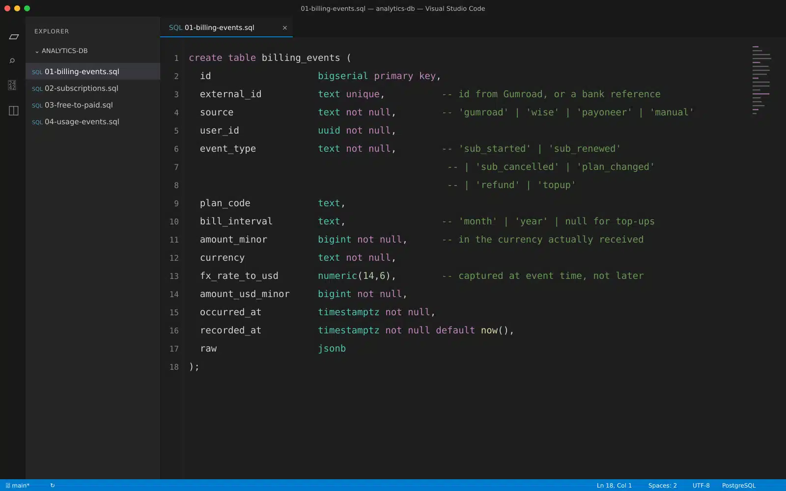
external_id with a unique constraint saves you from double-counting. Webhooks retry. Bank feeds get re-imported. You will replay data at some point.
occurred_at and recorded_at are separate columns for a reason. A Wise payment happens on Monday and lands in your feed on Thursday. If you only store one timestamp, your Monday revenue quietly moves to Thursday, and your month-end numbers stop matching your bank.
fx_rate_to_usd gets stored at the moment of the event. If you convert later using today’s rate, last quarter’s revenue changes every time you refresh the dashboard. Ask me how I know.
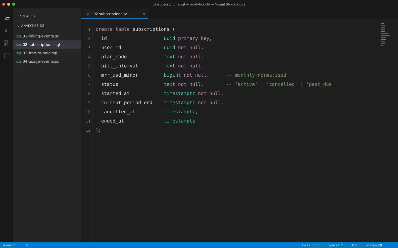
Then a separate table holds the actual subscription state, because reconstructing “who is subscribed right now” from an event log on every query is painful:
Step 4: Map Every Money Source into the Same Shape
This is the part with no Stripe, so here’s how we handle it.
Gumroad tells us when a sale happens. We take that webhook, write a billing_events row, then update or create the matching subscriptions row. Straightforward.
Wise and Payoneer don’t do that. They just move money. For those, the subscription is created by us at the point the customer agrees to a plan, and the incoming payment simply confirms it. Payment confirms the subscription; the subscription does not depend on the payment existing first.
That means we need a small reconciliation job. Once a day it asks, “Which active subscriptions had a period end in the last 48 hours with no matching payment?” Those go into a list someone looks at. It’s not automated and it doesn’t need to be at our size. Two hundred subscribers is a five-minute review. Twenty thousand would need a different answer.
Also, annual plans that arrive as one big Wise transfer will wreck your monthly chart if you count the whole thing in one month. Divide by twelve for MRR, and keep the actual cash received in a separate column. Cash and MRR are two different stories and both matter.
Step 5: The Formulas, in Plain Terms
Only calculate these from your own tables, never from a payment dashboard.
MRR is the sum mrr_usd_minor across active subscriptions. Monthly plans count at face value. Annual plans count at one twelfth. Token top-ups count at zero, because a top-up is not a promise to pay again.
That last rule is the one I’d underline for anyone building an AI product with credits. It’s tempting to fold top-up money into MRR because it makes the number bigger. Don’t. MRR is supposed to mean “money we can reasonably expect next month.” Top-ups don’t qualify. Track them as a second line called “consumption revenue” and report both.
ARPU is MRR divided by active paying users. Useful mostly as a sanity check on pricing changes.
Customer churn rate for a month is customers lost divided by customers at the start of that month.
Revenue churn rate is MRR lost divided by MRR at the start. Watch both. If one small customer leaves, customer churn moves and revenue churn barely does. If your biggest account leaves, the opposite. The gap between the two numbers tells you something.
Net revenue retention is:
NRR = (starting MRR + expansion - contraction - churned MRR) / starting MRRExpansion is an upgrade. Contraction is a downgrade. If NRR is above 100%, your existing customers are growing your revenue on their own.
LTV, and here’s where AI products differ from normal SaaS:
LTV = ARPU × gross margin % ÷ monthly customer churn rateMost guides drop the gross margin part. For a normal software product that’s forgivable because serving one more user costs almost nothing. For us, every image, song, or video a user generates costs real money at Vertex AI or Fal.ai. Calculating LTV for Imaginelab Art without margin would tell us a heavy user is our most valuable customer when a heavy user on a flat monthly plan might be losing us money. That’s not a small error. It’s the wrong sign.
Step 6: Free to Paid Conversion, the number I Got Wrong First
I’ll be honest about this one because it’s the thing I most want someone else to avoid.
My first version divided this month’s new paying users by this month’s new signups. That number is meaningless. Someone who signs up on the 29th has one day to convert. Someone who signed up in May and paid in July doesn’t appear at all.
The fix is to group people by when they signed up and follow that group forward. Pick a window and stick to it. We use 30 days.
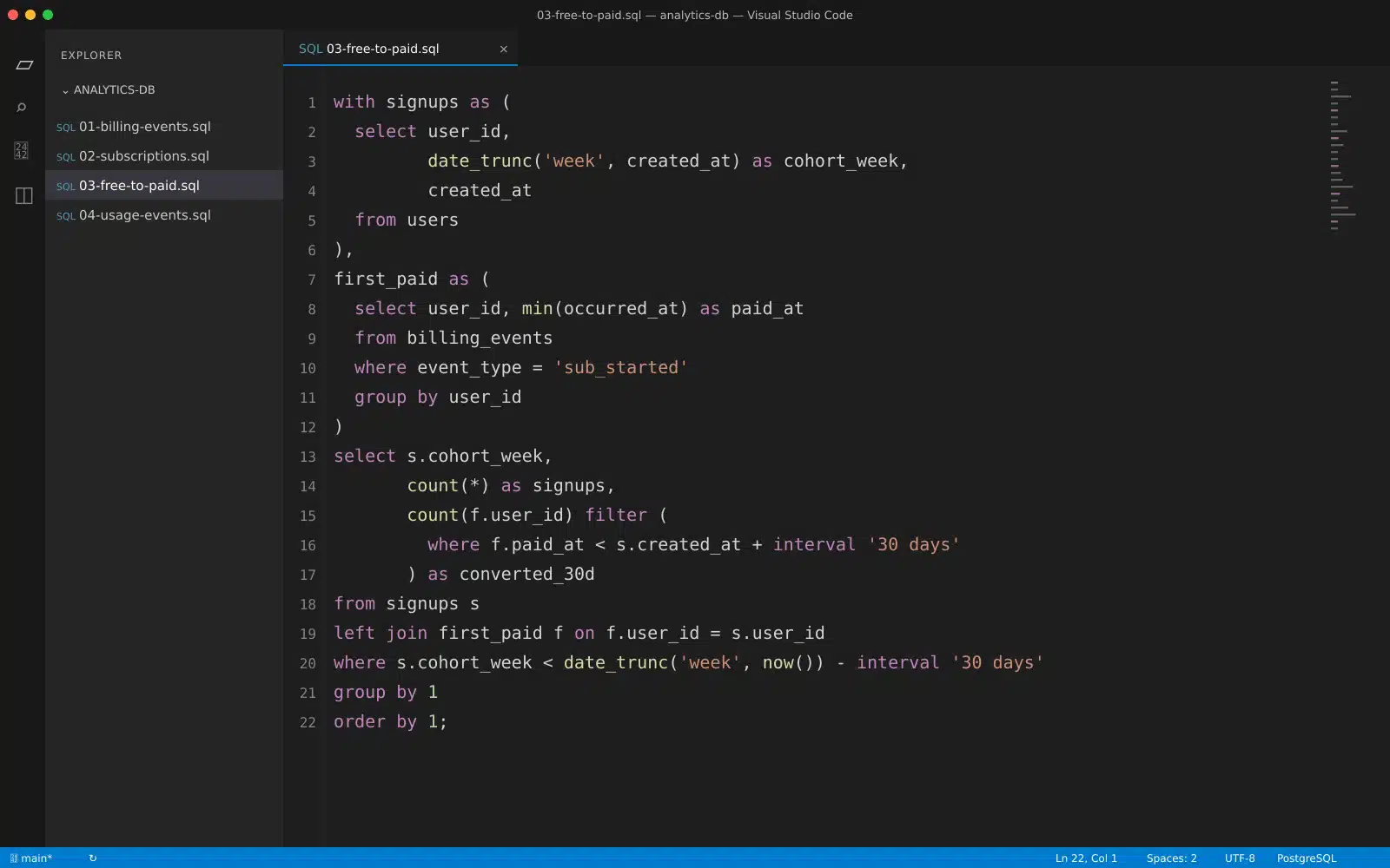
where clause at the bottom matters. It hides any week that hasn’t had a full 30 days to mature. Without it, your most recent week always looks terrible and people panic in meetings about nothing.Step 7: Tie Token Burn to Revenue, Per Lab
This was the other hard one, and the reason is structural. Subscription revenue arrives per user. Cost arrives per generation, per lab, and per provider. They don’t line up on their own.
The fix is small and you have to do it early: record the provider cost at the moment of the call in the same row as the usage.
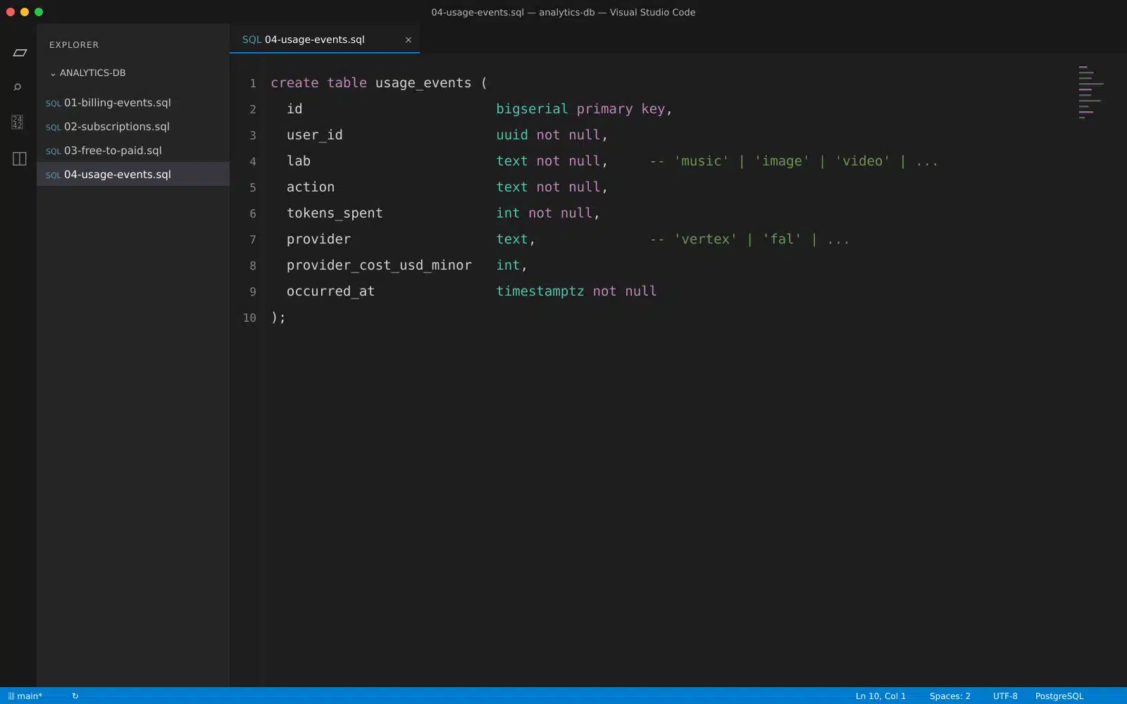
provider_cost_usd_minor and plan to work costs out later from a provider invoice, you’ll be guessing. Provider bills are monthly totals. They can’t tell you that Music Lab is the expensive one.With that column in place, two queries become easy. Cost per paying user for the month, which feeds the LTV formula above. And gross margin per lab, which tells you where your pricing is wrong. In our case one lab was clearly heavier than the others per generation, and knowing that changed how we thought about token pricing before launch instead of after.
Group your unit costs by lab, not just overall. An average across seven labs hides the one that’s losing money.
Step 8: Pick Tools Last, not First
I know this goes against the usual advice. Here’s my reasoning.
If your data model is right, swapping tools is a weekend. If your data model is wrong, no tool saves you. We started with Postgres plus scheduled SQL plus Metabase, and for a beta, that’s genuinely enough. Products like ChartMogul or Baremetrics are excellent, but most of them expect Stripe. With Gumroad, Wise, and Payoneer in the mix, you’re feeding them from your own tables anyway, so you may as well have the tables right first.
Whatever you choose, keep one rule: the dashboard reads from your database, never directly from a payment provider’s API. One source of truth.
What I’d do differently
Snapshot daily from day one. I added it late and lost history I can’t get back to. Store the FX rate at event time. Already said it; saying it again, it caused the most rework.
Write definitions in a shared doc and date them. When a definition changes, note the date. Otherwise a chart shifts one day and nobody remembers why. Don’t build a dashboard until three people have asked for the same number twice.
Final Thoughts: Where I’d Start If I Were You
Pick the one question your team keeps asking and can’t answer. Build only the tables that answer it. Ship that; look at it for two weeks, then add the next thing.
For us that question was the free-to-paid one, and getting it right meant rebuilding how we stored events before we could even attempt the answer. That order surprised me. The metric was the easy part. The plumbing was the work.
If you’re running billing outside Stripe too, I’d like to hear how you handle the reconciliation gap. That’s still the least elegant part of our setup.
Frequently Asked Questions (FAQs) on Subscription Analysis for a SaaS Business
1. How many metrics should I track when I’m just starting?
Five is plenty: MRR, active paying users, monthly customer churn, 30-day free-to-paid conversion, and gross margin per user. Everything else can wait until someone asks for it.
2. Can I do subscription analytics without a proper data warehouse?
Yes. Below a few thousand subscribers, a Postgres read replica with scheduled queries handles it fine. Warehouses become worth it when your queries slow down the app or when you need to join several systems together.
3. Should token or credit purchases count as recurring revenue?
No. Report them separately as consumption revenue. Folding them into MRR makes your growth look steadier than it is, and it will burn you the first month people don’t top up.
4. How often should I look at these numbers?
Weekly for conversion and signups, monthly for MRR, churn, and margin. Checking churn daily just produces noise and anxiety.