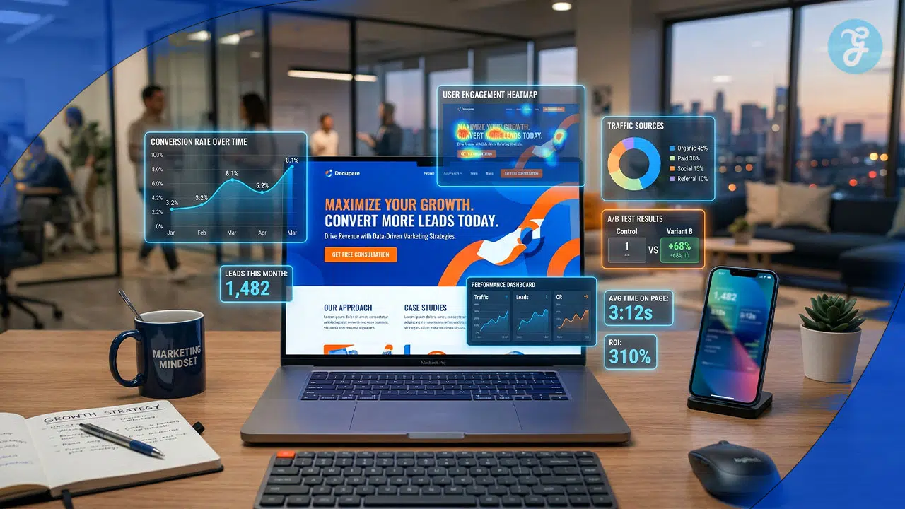
Running an online business often means spending heavily on ads—yet traffic alone doesn’t guarantee sales. Visitors arrive but leave quickly. The problem? A cluttered homepage filled with distractions. When ads promise one thing and the page delivers another, confusion kills conversions.
That’s where High-Converting Landing Page Design makes the difference. Unlike general web pages, focused landing pages are built to match user intent and guide visitors toward a single action. Industry data from Statista and NeilPatel.com shows that optimized landing pages consistently outperform standard pages in conversion rates.
This guide breaks down the essentials of effective High-Converting Landing Page Design—from writing compelling headlines and adding trust-building social proof to creating strong calls-to-action that drive results. It also highlights tools like Unbounce and HubSpot for easy page creation, along with A/B testing strategies to improve performance.
A well-designed landing page turns traffic into measurable growth by aligning design, messaging, and user experience.
What is a High-Converting Landing Page?
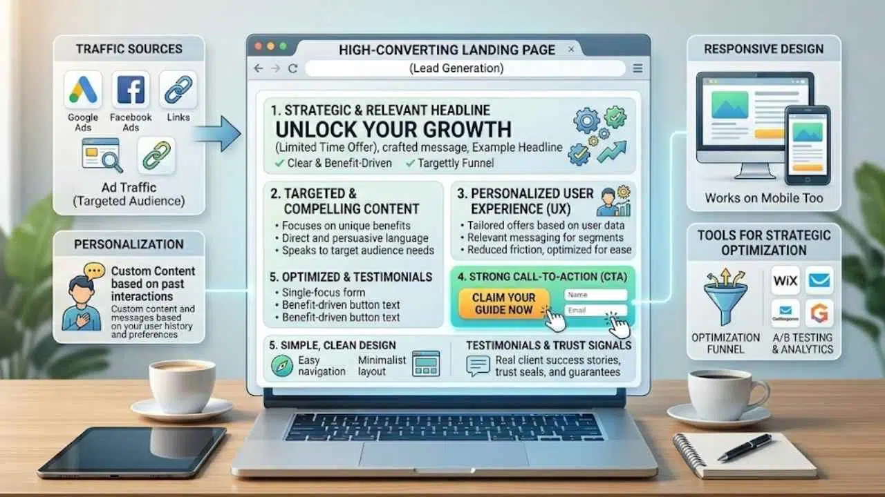
A high-converting landing page grabs visitors and turns them into leads or customers, folks. It boasts a higher-than-average conversion rate over standard web pages, thanks to its sharp focus on lead generation.
Imagine, like a well-oiled machine, it directs ad traffic straight to itself, not your homepage, to boost user experience (UX). Clarity and relevance drive its success, with short, concise content that holds attention tight.
High performers shine through clear, benefit-driven headlines that match the ad or link that got folks there in the first place.
Design stays simple and clear, so anyone can zip through navigation and submit info without a hitch. Think of it as a friendly guide, highlighting your value proposition with strong call-to-actions (CTAs) that nudge action.
Personalization amps up engagement, making visitors feel seen and boosting conversion potential. Tools like landing page builders, from Wix to GetResponse, help craft these responsive designs that work on mobile too.
No page hits 100% conversions, but aim high with audience targeting and trust signals for real results.
Key Elements of a High-Converting Landing Page
Picture your landing page as a friendly handshake that grabs attention right away, pulling visitors in with a bold hero image and crisp copy that speaks their language. Dive deeper, and you’ll see how a smart mix of trust signals, like glowing reviews, teams up with punchy buttons to turn casual browsers into eager buyers, sparking that “aha” moment every time.
Clear and Compelling Headlines
Headlines act as the front door to your landing page. They grab attention right away. High-performing landing pages feature clear, benefit-driven headlines that align with the ad or link that brought users there.
Clear headlines that grab attention and get to the point quickly are essential for high-converting landing pages. Think of them like a firm handshake, welcoming visitors and setting the tone.
For example, Spotify uses headlines with engaging visuals to draw people in fast. Curology highlights clear benefits in their headlines, making visitors feel understood. Keep yours short and punchy, like a quick chat over coffee.
Tie them to your hero image for extra impact. Match the headline to your target audience’s needs, just as Airbnb does with personalized content. This boosts engagement metrics and helps with customer acquisition.
Your headline is the promise of value that convinces visitors to stay, says a top expert from CXL.
Craft headlines that spark curiosity, maybe with a dash of FOMO. Use words that promise real gains, avoiding vague fluff. Test variations through split tests to see what clicks best.
Tools like Crazy Egg help track how headlines perform. Integrate them with strong CTAs for a seamless flow. Netflix nails this by keeping headlines simple yet compelling. Clarity drives conversions, turning browsers into buyers.
Strong and Irresistible Call-to-Actions (CTAs)
Strong call-to-actions, or CTAs, drive visitors to take your most-wanted action on a landing page. You define this action first, like signing up for an email list or starting a free trial with tools such as Mailchimp or Salesforce.
Make CTA text clear and benefit-driven, so it grabs attention fast and aligns with ad campaigns from Google or YouTube. For example, Spotify uses simplified CTAs with engaging visuals to boost conversions, while Curology highlights clear benefits that create FOMO, or fear of missing out.
Keep things concise; visitors need to act without confusion, and personalization amps up engagement for better results.
Craft irresistible CTAs with active language that pushes urgency, like “Get Started Now” instead of vague prompts. Integrate video content or mobile optimization to make them pop on any device, drawing from benchmarks in conversion reports.
Airbnb builds user trust with personalized CTAs tied to their content strategy, leading to higher rates than average pages. Tools like Slack or Stripe show how strong CTAs remove distractions and focus on relevance, turning clicks into real actions.
Test these elements often with data from Statcounter or Wyzowl to refine and improve performance.
Visual Appeal and Design Consistency
Visual appeal grabs attention right away, like a bright billboard on a busy street. Keep your landing page design simple and clear, so visitors navigate with ease and submit info without hassle.
Use a landing page template that matches your brand, with clean layouts that load fast on any device. Think of it as a tidy room, where everything sits in the right spot, making folks feel at home.
Add colors and images that pop, but skip the clutter to hold focus.
Design consistency builds trust, much like a familiar handshake. Match your page to the ad that sent folks there, boosting relevance and cutting confusion. Short and concise pages maintain visitor engagement, steering clear of overload.
Toss in subtle FOMO with eye-catching visuals, like those on Spotify pages, to nudge quick actions. Tools like Microsoft 365 help craft these consistent looks, turning casual browsers into loyal fans.
Social Proof and Testimonials
People trust what others say about your product. Social proof acts like a friend’s recommendation at a party. It boosts credibility on your landing page. Add testimonials from real users to show success stories.
These words make visitors feel confident. High-performing landing pages feature this element to align with ads. Think of Airbnb, they use user trust to personalize content. That increases engagement.
FOMO kicks in when folks see others benefiting. Keep testimonials short and genuine. They drive conversions higher than average.
Brands like Spotify engage with visuals, but testimonials add that human touch. Place them near your call to action for impact. A strong CTA paired with proof turns browsers into buyers.
Use data from conversion benchmark reports to pick the best ones. Email marketing often includes these gems. Lyft and DoorDash showcase rider stories for relatability. Zillow highlights buyer wins.
This approach keeps pages concise. Visitors navigate easily. Personalization here amps up potential. Monday and Fiverr use them to build quick connections. Gartner reports back this strategy.
Orca and Muck Rack swear by it for PPC success. Express VPN adds secure vibes with user quotes. Banner ads lead here for relevance. Clarity seals the deal.
5-Step Process to Design a High-Converting Landing Page
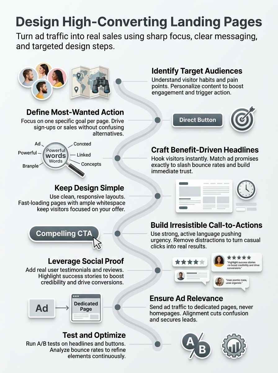
Ready to turn visitors into customers, like a magnet pulling in leads? Follow this simple guide, packed with tips on audience insights and A/B testing tools like Optimizely, to build pages that boost conversions and spark that fear of missing out with strong calls to action.
Identify Your Target Audience
Start by figuring out who visits your site. Understanding and knowing your audience forms the base for effective landing pages. Think about their needs, like busy parents seeking quick skincare fixes from Curology.
Personalization of landing page content boosts customer engagement and conversion potential. Imagine a user feeling that rush of fomo when your message speaks straight to them. You spot pain points, such as time constraints or budget worries, through simple surveys or data checks.
Dig deeper into habits and likes. Ask what drives their choices, maybe a strong call to action that taps into daily struggles. Airbnb nails this with customized spots that build trust fast.
Spot patterns in age groups or locations to craft messages that hit home. Keep it real; talk like you’re chatting over coffee about what matters most to them. This step sets up headlines and visuals that pull folks in without confusion.
Define Your Most-Wanted Action (MWA)
Figure out the one big thing you want visitors to do on your landing page. Call it your Most-Wanted Action, or MWA. This drives everything else. Maybe you want them to sign up for a newsletter, buy a product, or book a demo.
Pick that action wisely, folks. Tie it to a strong call to action (CTA) that grabs attention. Use words that spark fomo, like “Join now before spots fill up.” Visitors feel the pull, and conversions climb.
High-converting pages keep this focus sharp, leading to rates above the norm. Know your crowd first, then craft this MWA to match their needs. Personalization boosts engagement here, making folks more likely to act.
Keep the MWA clear and benefit-driven. Align it with ads that send traffic your way. Never dump folks on a homepage; send them straight to this dedicated spot. Short pages work best, holding attention tight.
Design stays simple, so anyone can navigate and complete the action fast. No distractions allowed. Clarity rules as the top factor for success. Set real goals, since no page hits 100% conversions.
Build trust with this step, and watch results soar.
Craft a Clear and Persuasive Message
Start with headlines that grab attention fast. Make them benefit-driven, and align them with the ad that sent folks your way. Clarity and relevance drive success here, so cut the fluff.
Keep pages short and concise to hold visitor focus. Know your audience well, it forms the base for everything. Personalize content to boost engagement and spark conversions. Toss in some FOMO to make offers feel urgent, like a limited-time deal that screams, “Grab it now or miss out!”.
Simple design lets anyone navigate and share info with ease. High-converting pages shine with clear messages that get to the point. Think of it as chatting with a friend over coffee, you want them hooked from the first word.
Use words that paint pictures of real gains, no vague promises. This approach turns browsers into buyers, step by step.
Design a User-Friendly and Responsive Layout
Keep your landing page design simple and clear. This lets visitors navigate with ease and submit info without hassle. Think of it like a smooth road trip, no bumps or detours to slow you down.
Use responsive layouts that adapt to phones, tablets, and desktops. Folks browse on the go these days, so make sure everything looks sharp on any screen. Add big buttons and easy forms to spark that fomo, pushing users to act fast before they miss out.
Picture a cluttered page like a messy room; nobody wants to stick around. Strip away extras to keep things short and concise. Focus on white space for breathing room, and pick colors that match your brand.
Test how it loads quick, because slow sites kill attention. Your audience feels the rush when it’s user-friendly, boosting those conversion rates higher than average.
Test and Optimize for Performance
You built your landing page, now put it to work. Run A/B tests to compare versions, like swapping headlines or buttons. Track metrics with tools such as Google Analytics to spot what boosts conversions.
No page hits 100% conversion rates, so set real goals and tweak based on data. Imagine visitors feeling that fomo kick in from a limited-time offer; test it out and see engagement soar.
Keep iterations simple, focus on user behavior, and watch your rates climb above average.
Data drives the wins here. Analyze bounce rates and click-throughs to refine elements. Personalize content for better engagement, as it ramps up conversion potential. Users love clarity, so optimize for quick loads and mobile views.
Spot patterns in testimonials or CTAs that pull people in. Stay persistent with tests; small changes often yield big results.
Examples of High-Converting Landing Pages
Ever wonder how big names turn visitors into loyal fans with just one page? Peek at these standout cases, like a music app that sparks that fear of missing out with bold images and easy buttons, and you’ll get ideas to amp up your own conversions.
Spotify: Engaging Visuals and Simplified CTAs
Spotify nails its landing page with bold images that pop right away. They draw you in, like a catchy tune that sticks in your head. Bright colors and album art create that visual hook, making you feel the vibe before you even click.
Plus, their CTAs stay simple, just “Get Spotify Free” or “Sign Up Now.” No clutter confuses things. This setup taps into fomo, you know, that fear of missing out on fresh playlists and hot tracks.
Readers, imagine scrolling and spotting your favorite artist front and center; it pulls you right in. High-performing pages like this feature clear, benefit-driven headlines that match the ad you clicked.
Spotify keeps everything short and concise to hold your attention tight.
They build trust with easy navigation, letting you submit info without hassle. Personalization shines here too; the page tweaks content based on what you like, boosting engagement.
Think of it as a friend recommending the perfect song. Clarity and relevance drive this success, far above average conversion rates. Spotify avoids distractions, focuses on that most-wanted action: signing up fast.
Data shows these elements work; understanding your audience makes all the difference. Short, punchy design lets any visitor glide through. Set realistic goals, though; no page hits 100% conversions.
Direct ad traffic straight here, not the homepage, for real wins.
Airbnb: Personalized Content and User Trust
Airbnb nails personalization on their landing pages. They tailor content to match what users search for, like cozy apartments in specific cities. This boosts engagement right away.
Users feel seen and valued, which sparks that fomo if they hesitate. Clear headlines highlight benefits, such as “Find your perfect stay in New York,” grabbing attention fast. They align these with ads that led visitors there, keeping everything relevant.
Trust builds through real user reviews and host verifications. Airbnb shows testimonials with photos and stories, making visitors nod in agreement. The design stays simple and easy to navigate on any device.
Short forms ask for just the basics, like dates and guests, to seal the deal. This setup drives higher conversion rates than average pages. You see how knowing your audience pays off in real bookings.
Curology: Clear Benefits and Strong Call-to-Actions
Curology nails its landing page by spotlighting clear benefits right away. Visitors see personalized skincare solutions that match their exact needs, sparking that fomo if they hesitate.
The page keeps things short and concise, with benefit-driven headlines that grab attention fast. Strong call-to-actions pop up, urging users to start their custom routine now. This setup builds trust and pushes conversions higher than average.
Design stays simple and clear, letting folks navigate with ease. Personalization amps up engagement, making each visitor feel seen. Curology aligns its message with ads, avoiding any confusion.
Testimonials add social proof, easing doubts. No distractions clutter the space, focusing eyes on the most-wanted action.
Best Practices for Landing Page Success
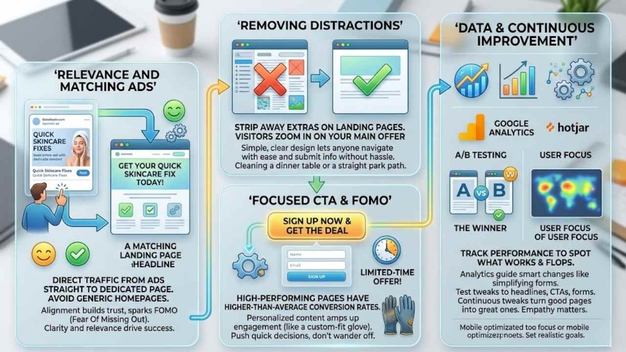
Match your ad promises to the page content, so visitors feel right at home and stick around longer. Cut out extra links and noise, then tap into fomo with urgent offers that push quick decisions, like limited-time deals on your signup form.
Ensure Relevance Between Ads and Landing Pages
Direct traffic from ads straight to a dedicated landing page. Skip the homepage, folks, it confuses visitors like a wild goose chase. Clarity and relevance drive success here, they make or break your page.
Imagine you click an ad promising quick skincare fixes, but land on a generic site. Boom, frustration hits, and poof, the visitor vanishes. High-performing pages use clear, benefit-driven headlines that match the ad’s promise.
This alignment builds trust, sparks that fomo feeling, fear of missing out on the deal.
Personalization amps up engagement and boosts conversion odds. Customize content to fit what the ad teased, like a custom-fit glove. Visitors feel seen, they stick around longer. Keep things simple, let them browse with ease and submit info without hassle.
Use data from tools like Google Analytics to spot mismatches and fix them fast. This approach turns casual clicks into real actions, no magic required.
Remove Distractions and Keep it Focused
Strip away extras on your landing page. You want visitors to zoom in on your main offer, right? Think of it like clearing clutter from a dinner table so guests focus on the feast. Landing pages should stay short and concise to hold attention and spark engagement.
Ditch side menus, extra links, or unrelated images that pull eyes away. This keeps folks locked in, boosting your shot at conversions.
Build a simple, clear design that lets anyone navigate with ease and submit info fast. Imagine a straight path through a park, no detours to confuse the stroll. Tie in fomo by highlighting limited-time deals without overwhelming the page.
Visitors feel the pull to act now, not wander off. Clarity rules here, making your page a conversion powerhouse compared to cluttered spots.
Use Data and Analytics to Continuously Improve
Track your landing page performance with tools like Google Analytics. Spot what works and what flops. Visitors click away fast if things feel off, right? Check metrics on bounce rates and user paths.
Clarity and relevance drive success or failure here. High-converting pages boast higher-than-average conversion rates over standard web pages. Test tweaks to headlines or calls-to-action.
A/B testing shows real winners. Data reveals how personalization boosts engagement and conversions. No page hits 100% conversions, so set realistic goals. Imagine the fomo if competitors outpace you without these insights.
Analytics guide smart changes, like simplifying forms for easy submits.
Keep an eye on user behavior through heatmaps. See where eyes linger or drop off. Short, concise pages hold attention better. Adjust layouts for mobile users. Data backs up every fix you make.
Empathy matters, folks hate confusing sites. Tools such as Hotjar uncover hidden issues. Aim for that sweet spot where visitors act fast. Continuous tweaks turn good pages into great ones.
Final Thoughts
You now know the basics, from crafting sharp headlines to adding social proof that builds trust. These steps feel simple, right, and you can apply them fast for real results without the hassle.
Picture your conversion rates soaring, turning visitors into loyal customers and solving those nagging drop-off issues. Check out tools like Google Analytics for deeper insights, or explore Unbounce for quick page builds.
Go ahead, build that page today, and watch the magic happen, just like it did for me when my first landing page doubled sign-ups overnight.
Frequently Asked Questions (FAQs) About Designing a High-Converting Landing Page
1. What’s FOMO, and how can it boost my landing page conversions?
FOMO (fear of missing out) taps into that nagging worry people feel when they might miss a great deal. Use it by adding countdown timers or limited-stock alerts on your page. That way, visitors act fast, like kids rushing for the last cookie.
2. How do I weave FOMO into my landing page design without overdoing it?
Think of FOMO (fear of missing out) as a gentle nudge, not a shove. Highlight exclusive offers or social proof, like “Join 500 others who grabbed this today.”
3. Can FOMO really make my landing page convert better, or is it just hype?
It’s no hype; FOMO (fear of missing out) works like a charm by creating urgency. Picture a shopper seeing “Sale ends in 2 hours” – they click buy quicker than you can say jackpot. Test it out, and watch those conversion rates climb.
4. What’s a simple way to add FOMO to my landing page right now?
Start with urgency phrases tied to FOMO (fear of missing out), such as “Limited spots left.” Pair it with real-time notifications.