
Which articles need attention? Where are website visits coming from? What is holding up the next publication? As a copy editor, these are the questions I want a dashboard to help me answer.
Free Looker Studio dashboards let me choose the figures that belong together for a particular decision. For this guide, I have selected seven practical builds using the standard reporting edition, native Google connectors, and Google Sheets.
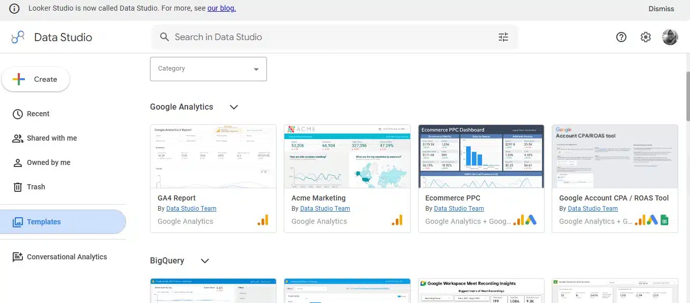
Google restored the Data Studio name in April 2026. The current interface uses that name, but it is the reporting tool readers know as Looker Studio. Its standard edition remains free.
What You Need Before Building
These seven dashboards do not require Data Studio Pro or a paid connector. They do require access to the relevant source records.
Google Ads reporting through the native connector has no additional connector fee; running advertisements has a separate cost. The social, sales, and editorial dashboards use records you supply in Google Sheets. Some community connectors charge separately, so check the connection required by any template you copy.
| Dashboard | Free connection route | Main purpose |
| Website traffic and engagement | Google Analytics connector for GA4 | Understand visits and on-site activity |
| Search visibility | Search Console connector | Investigate search performance |
| Google Ads performance | Google Ads connector | Compare campaign results |
| YouTube performance | YouTube Analytics connector | Review video views and watch time |
| Social media content | Google Sheets connector | Compare recorded post results |
| Sales and orders | Google Sheets connector | Track eligible orders and their value |
| Editorial workflow | Google Sheets connector | Follow article status and deadlines |
To begin a build, choose Create → Data Source, select the connector, authorize access if prompted, and select the dataset. After connecting, choose Create Report → Add to Report.
For Sheets, select the spreadsheet and worksheet. Use one header row, consistent column types, and genuine date values. Each data source connects to one worksheet.
7 Free Looker Studio Dashboards Worth Building
Start with the question you need answered regularly. Each recipe below identifies the source, the first charts to create, and the detail that matters when interpreting them.
1. Website Traffic and Reader Engagement
Connector: Google Analytics, using a Google Analytics 4 (GA4) property.
This is my starting choice for understanding where visits originate and which pages people arrive on.
Place four scorecards at the top: Total users, Sessions, Views, and Engagement rate. Add a sessions trend underneath, followed by a channel chart and a landing-page table. The complete walkthrough later in this guide shows the fields to select.
Use the Session default channel group with Sessions for the channel chart. Pair Landing page with Sessions and Engagement rate for the table. This keeps those charts focused on session acquisition.
If traffic changes, my next question is which channels and pages explain it. Engagement rate adds context, but an engaged session does not necessarily mean the visitor finished reading an article.
2. Search Visibility and Article Opportunities
Connector: Search Console.
For an editorial team, this dashboard helps identify stories worth investigating.
Select the property, choose Site Impression, and begin with web search. Build scorecards for clicks, impressions, CTR, and average position, then add a query table and a daily clicks trend.
For page-level reporting, create a second source using URL Impression. Add a page table using the clicks and CTR metrics available in that source. Site and URL reporting use different aggregation methods, so label them clearly.
Add country or device controls and check how they affect the intended charts. Discover and Google News can have separate report pages through the URL Impression source when the property has those records.
High impressions and low CTR would prompt me to review search intent, competing results, and the article’s presentation. Average position provides context across recorded appearances; it is not one fixed Google ranking.
3. Google Ads Campaign Performance
Connector: Google Ads.
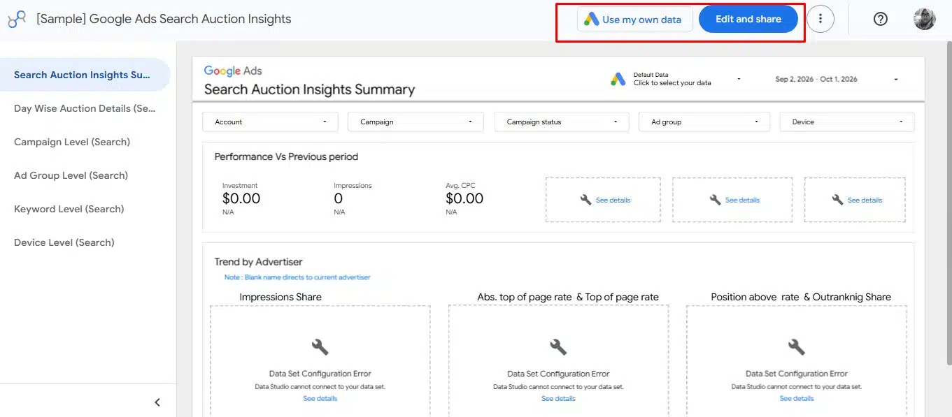
Connect the relevant account and select Overall Account Fields.
Build scorecards for spend, clicks, conversions, and cost per conversion. Add a daily spend trend and a campaign table containing spend, impressions, clicks, and conversions. A campaign drop-down lets readers focus the report.
My priority is the conversion definition. A purchase, enquiry, and newsletter signup serve different objectives.
Use conversions only after checking the measurement configured in Google Ads. The reporting connector does not establish conversion tracking. Claims about financial return also need suitable value and cost information.
4. YouTube Video Performance
Connector: YouTube Analytics.
Select a channel you have permission to access. Start with scorecards for Views, Total Watch Time, and Average Watch Time, using the corresponding fields in the source.
Add a views trend by date and a video table with views and watch time. Include the video identifier or title available in the source, and sort by the measure you want to investigate. Google’s connector supports channel reporting and total and average watch time metrics.
I prefer seeing views and viewing time together. Consider each video’s length and purpose before judging the comparison.
For Shorts, views have counted starts and replays without a minimum watch time requirement since March 31, 2025. That definition matters when comparing formats.
5. Social Media Content Performance
Connector: Google Sheets.
Use platform figures you can access through available exports or your own reports. Create one row per post, platform, and reporting period.
Include Reporting period, Platform, Post ID or URL, Format, Impressions, Link clicks, Comments, and Shares, where available. Record activity for the stated period; keep lifetime snapshots separate.
Build a post table and a bar chart with Format as the dimension and SUM of Link clicks as the metric. Add Platform and Reporting period drop-downs. Review one defined period before comparing posts.
For social content, I choose the main measure according to the post’s purpose. Website promotion calls for different questions from a discussion post.
Use each platform’s definitions when interpreting the figures. Summing reach across posts or networks does not establish a distinct audience.
6. Sales and Order Performance
Connector: Google Sheets.
Keep one row per order, with a unique Order ID. Include Order date, Sales channel, Status, Order value, Refund amount, and Currency. Enter zero for Refund amount when there is no refund.
Choose which order statuses qualify, and apply that rule consistently across the sales charts. Use one currency at a time.
Create these measures:
- Eligible orders: Count Distinct of Order ID.
- Net order value: A data-source calculated field, Order value minus Refund amount; use Sum in charts.
- Refund-adjusted order average: SUM(Net order value) divided by COUNT_DISTINCT(Order ID), for the same eligible records.
Calculated fields and distinct counting support these operations. Keep Order ID unique: distinct counting cannot prevent duplicated rows from inflating summed sales values.
Add scorecards, a monthly trend by Order date, and a Sales channel table. With this design, refunds are attached to the original order’s date; it is not a report of refund payments by refund date.
I want those definitions settled before reading the chart. Recorded sales alone do not establish profit.
7. Editorial Calendar and Production Workflow
Connector: Google Sheets.
This sits high on my list for a publishing team because it shows where work is waiting.
Use one row per article. Include Article ID, Title, Section, Assigned editor, Status, Deadline, and Publication date. Maintain an Overdue column marking active, unpublished articles whose deadlines have passed.
Build a bar chart with Status as the dimension and Count Distinct of Article ID as the metric. Add an overdue scorecard using the same count with an Overdue filter, plus separate tables for upcoming deadlines and overdue articles.
Use Section, Assigned editor, and Status drop-downs. Keep any upcoming-deadline date filter from affecting the overdue table, so older missed deadlines remain visible.
For me, the question is what needs action before publication. The report depends on editors keeping assignments, dates, and statuses current.
How to Build Your First Looker Studio Dashboard
The following walkthrough builds the website traffic dashboard from the first example.
You need a Google account with permission to access a GA4 property already collecting data. Connecting that property does not install website tracking. If you do not have GA4 records, begin with a Sheets-based dashboard instead.
Step 1: Connect the GA4 Property
Sign in to Data Studio. Choose Create → Data Source → Google Analytics.
Authorize access if prompted, select the account and property, and click Connect. Check that the fields panel belongs to the intended property.
Step 2: Create the Report
Click Create Report, then Add to Report.
Name it “Website Traffic and Engagement.” Use the freeform layout for this first desktop report, with space for the date control, scorecards, and charts.
Step 3: Set the Reporting Period
Choose Add a control → Date range control and place it near the title.
Set a default period, such as the last 28 days. Keep each chart’s default date range on Auto so it can follow the control. Charts with their own custom date ranges can behave differently.
Step 4: Add Four Scorecards
Choose Add a chart → Scorecard. In the Setup panel, select Total users as the metric.
Create three more cards for Sessions, Views, and Engagement rate. Check that the rate displays as a percentage.
Total users counts distinct users. Sessions represent periods of interaction, while views include repeated page views.
Step 5: Add a Sessions Trend
Choose a Time series chart.
Set Date as the dimension and Sessions as the metric. Place it below the scorecards and give it a descriptive title, such as “Sessions Over Time.”
A spike gives me a date to investigate. I still need the source reports and publishing context to explain it.
Step 6: Compare Traffic Channels
Add a bar chart using Session default channel group as the dimension and Sessions as the metric. Sort by Sessions in descending order. This compares the reported channels using the same session measure.
Step 7: Build the Landing-Page Table
Add a table with Landing page as the dimension and Sessions and Engagement rate as metrics.
Sort by Sessions in descending order. Your initial chart configuration should look like this:
| Component | Dimension | Metric |
| Four scorecards | None | Total users; Sessions; Views; Engagement rate |
| Traffic trend | Date | Sessions |
| Channel bar chart | Session default channel group | Sessions |
| Landing-page table | Landing page | Sessions; Engagement rate |
These session and landing-page fields are documented in the Analytics Data API.
Step 8: Add a Channel Control
Choose Add a control → Drop-down list. Set Session default channel group as the control field from the same GA4 source.
In view mode, select a channel and check that the intended charts respond. If one does not, inspect its source and any component grouping. Controls depend on the underlying fields, and filtering across different sources can require additional configuration.
Step 9: Verify the Figures
Compare the report with GA4 using the same property, dates, filters, dimensions, and metrics.
Total users and Active users are different measures. Check which one the GA4 report displays before comparing it with your scorecard.
Keep Search Console clicks separate from GA4 sessions. Their definitions differ, and differences in tracking, time zones, and other reporting conditions can affect comparisons. Investigate unexplained discrepancies before acting on the report.
Check the report in view mode. Use readable labels, consistent spacing, and clear chart titles. Confirm that the date and channel controls work as intended.
Review sharing permissions and data-source credentials. Owner’s credentials can let recipients view report data without their own access to the underlying dataset. Viewer’s credentials require that access.
Build Around the Decision You Need to Make
For editorial work, my priorities are search visibility and production workflow. Together, they cover how published stories appear in search and what needs attention before the next article goes live.
The GA4 walkthrough provides a manageable first build for anyone with website data. Once the charts are understandable and the figures checked, add detail when a new question requires it. A dashboard earns its place when you can use it to decide what to examine or do next.
Frequently Asked Questions on Free Looker Studio Dashboards
1. Is Looker Studio Still Free?
Yes. The standard edition, now called Data Studio, remains available at no charge for creators and viewers. Some connectors and underlying services have separate costs.
2. Do These Dashboards Require Pro?
No. These builds use the standard edition with native Google connectors or Google Sheets. You still need access to the source data.
3. Can I Build a Social Dashboard Without a Paid Connector?
Yes. Place accessible platform figures in Google Sheets and connect the worksheet. You must maintain those records; the Sheets connection does not collect new figures directly from each social platform.
4. How Often Will My Dashboard Update?
It depends on the connector, freshness settings, and when the source data becomes available. For spreadsheet builds, also check when the records were last updated.
5. Can the Free Version Email Reports Automatically?
Yes. Basic scheduled PDF email delivery is supported. Google currently permits one schedule per free report, with a maximum frequency of once per day. Additional delivery and scheduling capabilities require Pro.