AI image aspect ratios can quietly ruin an otherwise beautiful visual. I have seen this happen too many times: the image looks perfect in the generator, but once it goes to Instagram, LinkedIn, YouTube, Pinterest, or a blog hero section, the face gets cropped, the product is pushed too close to the edge, the text becomes unreadable, or the whole composition feels awkward.
That is why I do not treat aspect ratio as a final export setting anymore. I treat it as a creative decision before generating the image. When I create AI visuals for articles, social media, image-to-video workflows, or content campaigns, I start by asking one simple question: Where will this image live? A blog featured image, a Pinterest pin, a LinkedIn feed post, a YouTube thumbnail, an Instagram Reel cover, and a TikTok video frame should not all begin from the same canvas.
At Editorialge Media LLC, this matters even more because we are no longer only publishing articles. We are building across media, technology, SaaS, e-learning, and creative products. So every AI image has to work harder. It may support a blog post today, become a social visual tomorrow, and later become the base image for an AI video workflow.
That is why aspect ratio is not a small design detail. It is part of the production strategy.
What Are AI Image Aspect Ratios?
An aspect ratio is the relationship between an image’s width and height. It tells you the shape of the image, not the exact file size.
For example:
| Aspect Ratio | Common Pixel Size | Shape |
| 1:1 | 1080 × 1080 px | Square |
| 4:5 | 1080 × 1350 px | Portrait feed |
| 9:16 | 1080 × 1920 px | Full vertical |
| 16:9 | 1920 × 1080 px | Landscape |
| 2:3 | 1000 × 1500 px | Pinterest-style vertical |
| 3:4 | 1080 × 1440 px | Mobile photo-style portrait |
| 1.91:1 | 1200 × 628 px | Link preview / wide feed |
The aspect ratio controls how your AI image is framed. The pixel size controls resolution and quality.
For beginners, this distinction matters. A 9:16 image can be 1080 × 1920 px, 1440 × 2560 px, or another vertical size. The shape remains the same. The quality changes based on resolution.
Why Aspect Ratio Matters More With AI Images
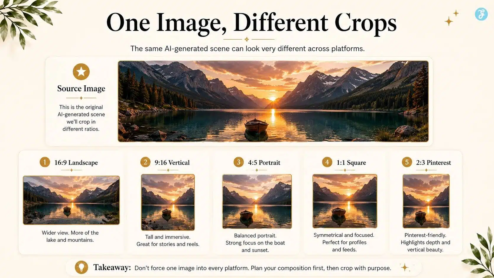
With normal photography, you can sometimes crop later because the original photo may have extra visual room. With AI images, the composition is usually generated around the selected canvas.
That means if you create a wide 16:9 AI image and later crop it into a 9:16 vertical video, you may lose the subject’s arms, desk, product, headline space, or background context. This is why beginners often feel their AI images “look good but do not fit anywhere.”
The problem is not always the prompt. Sometimes the problem is that the image was generated for the wrong platform shape. Text-to-video AI explained for better understanding.
My Rule: Platform First, Prompt Second
Before writing the prompt, I decide the destination.
| Destination | Best Starting Ratio |
| Blog featured image | 16:9 |
| YouTube thumbnail | 16:9 |
| Instagram feed portrait | 4:5 |
| Instagram Reels / Stories | 9:16 |
| TikTok | 9:16 |
| YouTube Shorts | 9:16 |
| LinkedIn feed image | 4:5 or 1:1 |
| Pinterest pin | 2:3 |
| X image post | 16:9, 1:1, or 4:5 |
| Facebook feed | 1:1 or 4:5 |
| Facebook Reels / Stories | 9:16 |
This approach saves time because I am not fighting the crop later. If I know the final asset is for a blog article, I generate it in 16:9. If I know it may become a Reel or Short, I either create a separate 9:16 version or design the main subject with enough room for vertical cropping.
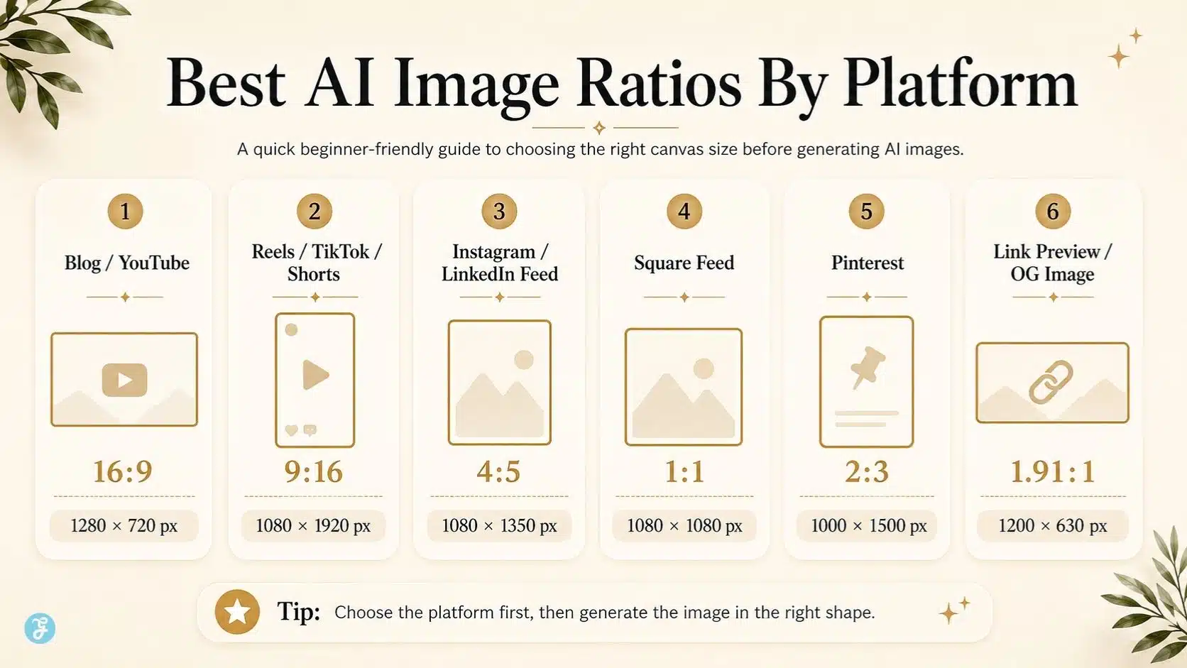
Best AI Image Aspect Ratios by Platform
Different platforms reward different shapes. Some formats technically work but do not always look native. That is why I separate “accepted” from “recommended.”
Instagram is no longer only a square-image platform. Current Instagram image guidance commonly supports square, portrait, and landscape feed posts, while Reels and Stories use vertical 9:16 formats. Buffer’s 2026 Instagram size guide lists feed posts as 1080 × 1080 px, 1080 × 1350 px, or 1080 × 566 px, with Stories and Reels at 1080 × 1920 px.
| Instagram Placement | Recommended Ratio | Recommended Size |
| Feed square | 1:1 | 1080 × 1080 px |
| Feed portrait | 4:5 | 1080 × 1350 px |
| Feed landscape | 1.91:1 | 1080 × 566 px |
| Reels | 9:16 | 1080 × 1920 px |
| Stories | 9:16 | 1080 × 1920 px |
My practical advice: for Instagram feed, I usually prefer 4:5 because it takes more vertical space on mobile. For Reels and Stories, I always design in 9:16 from the beginning.
TikTok
TikTok’s own ad specs recommend vertical 9:16 for In-Feed ads, with a minimum of 540 × 960 px, while also supporting 16:9 and 1:1 formats.
| TikTok Placement | Recommended Ratio | Beginner Size |
| Standard vertical content | 9:16 | 1080 × 1920 px |
| In-feed ad vertical | 9:16 | 1080 × 1920 px |
| Square fallback | 1:1 | 1080 × 1080 px |
| Horizontal fallback | 16:9 | 1920 × 1080 px |
For AI images that will become TikTok video frames, use 9:16. Do not create a wide cinematic image and expect it to feel native on TikTok.
YouTube
For YouTube long-form videos and thumbnails, 16:9 is still the practical standard. For Shorts, 9:16 is the mobile-first format. Current YouTube Shorts guidance from creator-focused resources identifies 9:16 as the official vertical format for Shorts, while YouTube itself continues to center long-form video around landscape viewing.
| YouTube Placement | Recommended Ratio | Recommended Size |
| YouTube thumbnail | 16:9 | 1280 × 720 px |
| Long-form video visual | 16:9 | 1920 × 1080 px |
| YouTube Shorts | 9:16 | 1080 × 1920 px |
| Community image | 1:1 or 4:5 | 1080 × 1080 / 1080 × 1350 px |
For article-to-video workflows, I usually create one 16:9 visual for YouTube and a separate 9:16 version for Shorts. Cropping one into the other often causes weak framing.
Facebook and Meta Placements
Meta recommends both 1:1 and 4:5 for Feed placements, with 4:5 recommended for single-image ads because it uses more vertical space. Stories and Reels usually need vertical 9:16 assets.
| Facebook / Meta Placement | Recommended Ratio | Recommended Size |
| Facebook feed | 1:1 or 4:5 | 1080 × 1080 / 1080 × 1350 px |
| Instagram feed via Meta | 1:1 or 4:5 | 1080 × 1080 / 1080 × 1350 px |
| Stories | 9:16 | 1080 × 1920 px |
| Reels | 9:16 | 1080 × 1920 px |
| Link preview style | 1.91:1 | 1200 × 628 px |
For AI visuals that may run across Meta placements, I do not rely on one image. I prepare at least two versions: 4:5 for feed and 9:16 for Stories/Reels.
LinkedIn supports several aspect ratios for ads and professional feed visuals. Its official single-image ad specs recommend vertical ratios for mobile performance, and LinkedIn notes that 4:5 helps avoid side borders in vertical image placements. LinkedIn’s video ad specs also list 4:5, 9:16, 16:9, and 1:1 dimensions.
| LinkedIn Placement | Recommended Ratio | Recommended Size |
| Feed image | 1:1 | 1200 × 1200 px |
| Mobile-first feed image | 4:5 | 1080 × 1350 px |
| Landscape creative | 16:9 | 1920 × 1080 px |
| Vertical video | 9:16 | 1080 × 1920 px |
| Carousel/document style | 4:5 or portrait | 1080 × 1350 px |
For LinkedIn, I like 4:5 when the post needs visibility in the feed. For professional reports, SaaS visuals, or thought-leadership graphics, 1:1 and 4:5 both work well.
Pinterest recommends a 2:3 aspect ratio, commonly 1000 × 1500 px, and warns that taller ratios may be cut off in feeds.
| Pinterest Placement | Recommended Ratio | Recommended Size |
| Standard pin | 2:3 | 1000 × 1500 px |
| Square pin | 1:1 | 1000 × 1000 px |
| Carousel pin | 2:3 or 1:1 | 1000 × 1500 / 1000 × 1000 px |
| Video pin | 2:3 or 9:16 | 1000 × 1500 / 1080 × 1920 px |
For Pinterest, I never start with 16:9. It wastes vertical feed space. If the content is from a blog, I create a dedicated 2:3 Pinterest version.
X / Twitter
X’s official ad specs recommend 1200 × 1200 px for 1:1 images and 1200 × 628 px for 1.91:1 images. X also supports expanded ratios such as 4:5 and 2:3 for image ads.
| X Placement | Recommended Ratio | Recommended Size |
| Standard image post | 16:9 or 1.91:1 | 1200 × 675 / 1200 × 628 px |
| Square post | 1:1 | 1200 × 1200 px |
| Vertical-style image | 4:5 | 1440 × 1800 px |
| Video | 16:9 or 1:1 | 1920 × 1080 / 1200 × 1200 px |
For X, I usually avoid overly tall images unless the creative is built for attention. A 16:9 or 1:1 image is safer for broad visibility.
Blog and Website Featured Images
For blog content, 16:9 is the safest starting point because it works well for featured images, thumbnails, previews, and embedded visuals.
| Website Use Case | Recommended Ratio | Recommended Size |
| Blog featured image | 16:9 | 1280 × 720 px |
| High-quality hero image | 16:9 | 1920 × 1080 px |
| Inline infographic | 16:9 or 4:5 | 1280 × 720 / 1080 × 1350 px |
| Author or profile image | 1:1 | 800 × 800 px |
| Open Graph preview | 1.91:1 | 1200 × 630 px |
For Editorialge-style articles, I usually prefer 1280 × 720 px for featured images because it is lightweight, wide, and suitable for web publishing.
Quick Reference: Best Ratios for AI Images
| Ratio | Best Use |
| 16:9 | Blog featured images, YouTube thumbnails, website hero visuals |
| 9:16 | TikTok, Reels, Shorts, Stories, vertical AI video |
| 4:5 | Instagram feed, LinkedIn feed, Facebook mobile feed |
| 1:1 | Square feed posts, profile-style visuals, simple social graphics |
| 2:3 | Pinterest pins, vertical blog promotion graphics |
| 1.91:1 | Link previews, wide social cards, Open Graph images |
| 3:4 | Mobile portrait-style images and some modern Instagram photos use |
The best ratio depends on the job. The wrong ratio can make a strong image feel amateur.
How I Choose Aspect Ratios Before Generating AI Images
My workflow is simple.
Step 1: Decide The Primary Platform
I choose the main destination first. If the image is mainly for the article, I use 16:9. If it is mainly for Instagram or LinkedIn feed, I use 4:5. If it is mainly for vertical video, I use 9:16.
Step 2: Decide Whether The Image Will Become a Video
If the image may become part of an image-to-video workflow, I leave space around the subject. AI video often adds motion, zoom, or panning, so tight framing can become a problem.
Step 3: Keep Important Elements Away From Edges
Faces, text, logos, products, and hands should not sit too close to the edge. This is especially important for 9:16 and 4:5 images.
Step 4: Generate Separate Versions Instead Of Cropping Everything
I do not like forcing one image into every format. A proper 16:9 featured image and a proper 9:16 Reel visual should be composed differently.
Step 5: Use The Same Visual Style Across Versions
Even when I create multiple ratios, I keep the subject, color palette, lighting, and mood consistent. This makes the content feel branded.
AI Image Prompting Tips for Different Aspect Ratios
The prompt should match the shape.
For 16:9 Landscape Images
Use this for blogs, YouTube, websites, and wide explainers.
Prompt direction:
Create a wide 16:9 realistic workspace scene with the subject placed slightly left, enough negative space on the right, warm lighting, a clean desk, modern creative workflow.
Best for:
- Featured images
- YouTube thumbnails
- Website hero images
- Explainer visuals
- Wide infographics
For 9:16 Vertical Images
Use this for Reels, TikTok, Shorts, and Stories.
Prompt direction:
Create a vertical 9:16 image with the main subject centered, enough safe space at the top and bottom, mobile-first composition, clean background, strong focal point.
Best for:
- AI video frames
- Social teasers
- Story visuals
- Mobile-first content
- Short-form video covers
For 4:5 Portrait Images
Use this for Instagram, LinkedIn, and Facebook feed posts.
Prompt direction:
Create a 4:5 portrait social media image with a clear subject, clean background, strong lighting, and space for a short caption overlay.
Best for:
- Feed posts
- Thought-leadership visuals
- Article promos
- Carousel covers
- Mobile feed graphics
For 2:3 Pinterest Images
Use this for Pinterest pins and visual discovery content.
Prompt direction:
Create a 2:3 vertical Pinterest-style visual with a clear subject, strong top-to-bottom composition, clean background, and space for a headline overlay.
Best for:
- Pinterest pins
- Blog promotion
- Evergreen content
- Listicle graphics
- Tutorial visuals
AI Image Aspect Ratios for Image-to-Video Workflows
Aspect ratio becomes even more important when the image is meant for AI video creation. If I start with a 16:9 image and later generate a 9:16 video, I may lose important details. If I start with a vertical image and later need a YouTube landscape video, the scene may feel too narrow.
For the image-to-video workflows, the safest rule is:
| Final Video Format | Start Image Ratio |
| YouTube video | 16:9 |
| Blog hero video | 16:9 |
| Instagram Reel | 9:16 |
| TikTok video | 9:16 |
| YouTube Short | 9:16 |
| LinkedIn feed video | 4:5 or 1:1 |
| Pinterest video pin | 2:3 or 9:16 |
Google’s Veo tools have added more support for vertical AI video generation, including 9:16 output in newer Veo updates, which shows how important native vertical formats have become for AI video creators.
That means beginners should stop treating vertical as an afterthought. Vertical is now a primary creation format.
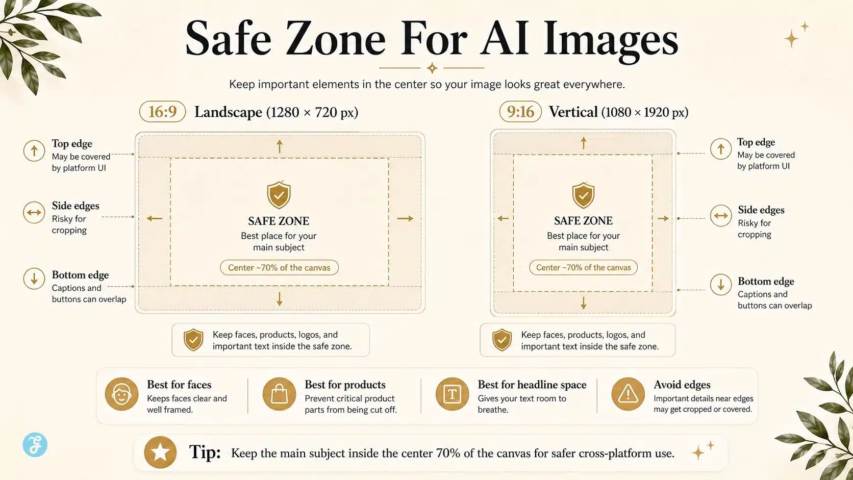
Safe Zones: The Hidden Part Beginners Forget
Even if the aspect ratio is correct, the image can still fail if important elements sit in unsafe areas.
This matters most for:
- Instagram Stories
- Instagram Reels
- TikTok videos
- YouTube Shorts
- Facebook Stories
- Pinterest pins with headline overlays
- LinkedIn mobile feed images
The danger areas are usually:
| Area | Why It Can Be Risky |
| Top edge | Platform icons, usernames, or crop previews may interfere |
| Bottom edge | Captions, buttons, descriptions, and controls may cover content |
| Side edges | Cropping or mobile UI may cut details |
| Corners | Logos and small text can be hidden or ignored |
My rule: keep the important subject in the central 70% of the canvas, especially for vertical images.
Common AI Image Aspect Ratio Mistakes
These are the mistakes I see most often.
Mistake 1: Creating Everything in Square Format
Square is safe, but it is not always best. A 1:1 post may look okay everywhere, but it rarely feels optimized for vertical-first platforms.
Mistake 2: Cropping a Landscape Image Into Vertical
This usually removes context. Faces get too close. Hands disappear. Products lose shape. The final result feels forced.
Mistake 3: Putting Text Too Close to the Edge
AI image text is already risky. Edge text makes the problem worse because platforms may crop or overlay it.
Mistake 4: Ignoring Platform Intent
Pinterest wants tall discovery visuals. YouTube wants wide thumbnails. TikTok wants vertical motion. LinkedIn rewards clean professional feed visuals. The same image cannot serve all of these equally.
Mistake 5: Using AI Images Without Export Planning
A strong AI image should be created with its final use in mind. Otherwise, resizing becomes damage control.
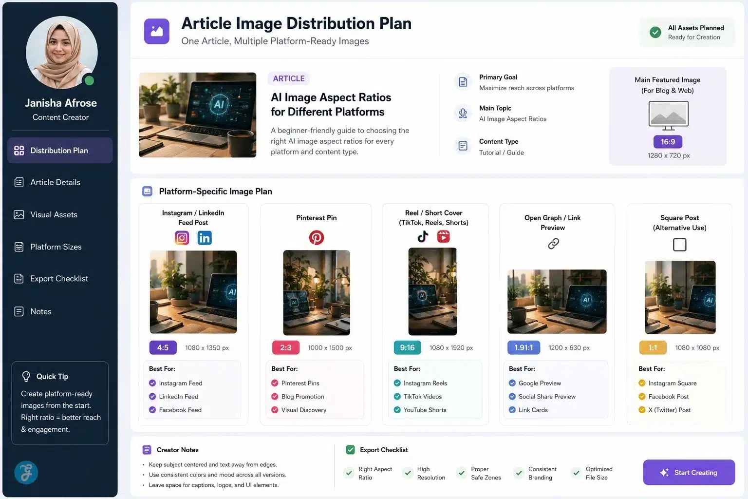
Best Aspect Ratio Strategy for One Article
For a serious blog article, I would create multiple image versions.
| Asset | Ratio | Purpose |
| Featured image | 16:9 | Main article visual |
| Inline infographic | 16:9 | Reader education |
| Instagram / LinkedIn promo | 4:5 | Feed visibility |
| Pinterest pin | 2:3 | Evergreen discovery |
| Reel / Short cover | 9:16 | Vertical video promotion |
| Open Graph image | 1.91:1 | Social link preview |
This is how one article becomes a full distribution package. For example, if I am creating visuals for an AI content article, I may use ImagineLab to generate the base image in 16:9 first, then create separate 4:5, 9:16, and 2:3 versions with the same visual identity. That gives me consistency without forcing one image to do every job.
Recommended AI Image Aspect Ratio Workflow
Here is the workflow I follow.
| Step | Action |
| 1 | Decide on the main platform |
| 2 | Choose the correct aspect ratio |
| 3 | Write the prompt around that shape |
| 4 | Keep the subject in the safe zone |
| 5 | Leave room for text or captions |
| 6 | Generate 2–4 variations |
| 7 | Check cropping in preview |
| 8 | Create secondary ratio versions |
| 9 | Optimize file size and format |
| 10 | Save reusable templates |
This process sounds simple, but it prevents most visual publishing problems.
Best Pixel Sizes for AI Image Creation
Here is my beginner-friendly pixel reference.
| Use Case | Ratio | Recommended Size |
| Blog featured image | 16:9 | 1280 × 720 px |
| High-quality web hero | 16:9 | 1920 × 1080 px |
| YouTube thumbnail | 16:9 | 1280 × 720 px |
| Instagram feed portrait | 4:5 | 1080 × 1350 px |
| Instagram square | 1:1 | 1080 × 1080 px |
| Instagram Stories/Reels | 9:16 | 1080 × 1920 px |
| TikTok vertical | 9:16 | 1080 × 1920 px |
| YouTube Shorts cover/frame | 9:16 | 1080 × 1920 px |
| LinkedIn square | 1:1 | 1200 × 1200 px |
| LinkedIn portrait | 4:5 | 1080 × 1350 px |
| Pinterest pin | 2:3 | 1000 × 1500 px |
| X image post | 16:9 | 1200 × 675 px |
| Open Graph image | 1.91:1 | 1200 × 630 px |
You do not need to memorize all of these. Save the ratios you use most often.
How Aspect Ratios Support SEO and Content Experience
Image aspect ratio is not a direct “magic SEO ranking factor” in the way beginners sometimes imagine. But it affects user experience, page presentation, visual engagement, social sharing, and content distribution. That matters for SEO because good content is not only text.
A strong article experience includes:
- Clear featured image
- Fast-loading visuals
- Helpful infographics
- Proper social previews
- Platform-ready promotional assets
- Visual consistency across channels
- Better engagement from social traffic
If your images are cropped badly, users notice. If your Pinterest image is too wide, it may get ignored. If your Instagram visual feels like a badly resized blog banner, it weakens the click. This is why image planning belongs inside SEO content strategy.
My Practical Recommendations for Beginners
If you are just starting, do not overcomplicate it. Use these four ratios first:
| Ratio | Why You Need It |
| 16:9 | Blog, YouTube, website, featured images |
| 9:16 | Reels, TikTok, Shorts, Stories, vertical AI video |
| 4:5 | Instagram, Facebook, LinkedIn feed |
| 2:3 | Pinterest and evergreen discovery |
Once you understand these four, you can handle most AI image publishing workflows.
Final Thoughts: Aspect Ratio Is Creative Direction, Not Just Resizing
The biggest lesson from this AI image aspect ratios guide is simple: do not wait until the end to think about size.
Aspect ratio shapes the entire image. It affects the subject, camera angle, background, negative space, caption room, platform fit, and future video use. If you choose it late, you are fixing problems. If you choose it early, you are directing the image properly.
For beginners, this one habit can make AI visuals look far more professional: decide where the image will be published before you generate it. A good AI image should not only look good in the tool. It should fit the platform, support the content, and survive the full workflow from article to social media to AI video.
That is how AI visuals become useful content assets instead of random pretty pictures.
Frequently Asked Questions About AI Image Aspect Ratios
1. What Is The Best Aspect Ratio For AI Images?
There is no single best aspect ratio for all AI images. Use 16:9 for blogs and YouTube, 9:16 for Reels and TikTok, 4:5 for social feeds, and 2:3 for Pinterest.
2. What Aspect Ratio Should I Use For Blog Featured Images?
For blog featured images, 16:9 is usually the safest choice. A 1280 × 720 px image works well for many article layouts, thumbnails, and web previews.
3. What Aspect Ratio Works Best For Instagram AI Images?
For Instagram feed posts, 4:5 is usually stronger because it takes more vertical space on mobile. For Instagram Reels and Stories, use 9:16.
4. Can I Use One AI Image For Every Platform?
You can, but it is not ideal. A better approach is to create separate versions for 16:9, 9:16, 4:5, and 2:3 so each platform gets a properly framed visual.
5. Why Do My AI Images Get Cropped On Social Media?
Your image may be using the wrong aspect ratio or placing important elements too close to the edges. Always design for the platform and keep faces, products, logos, and text inside the safe zone.