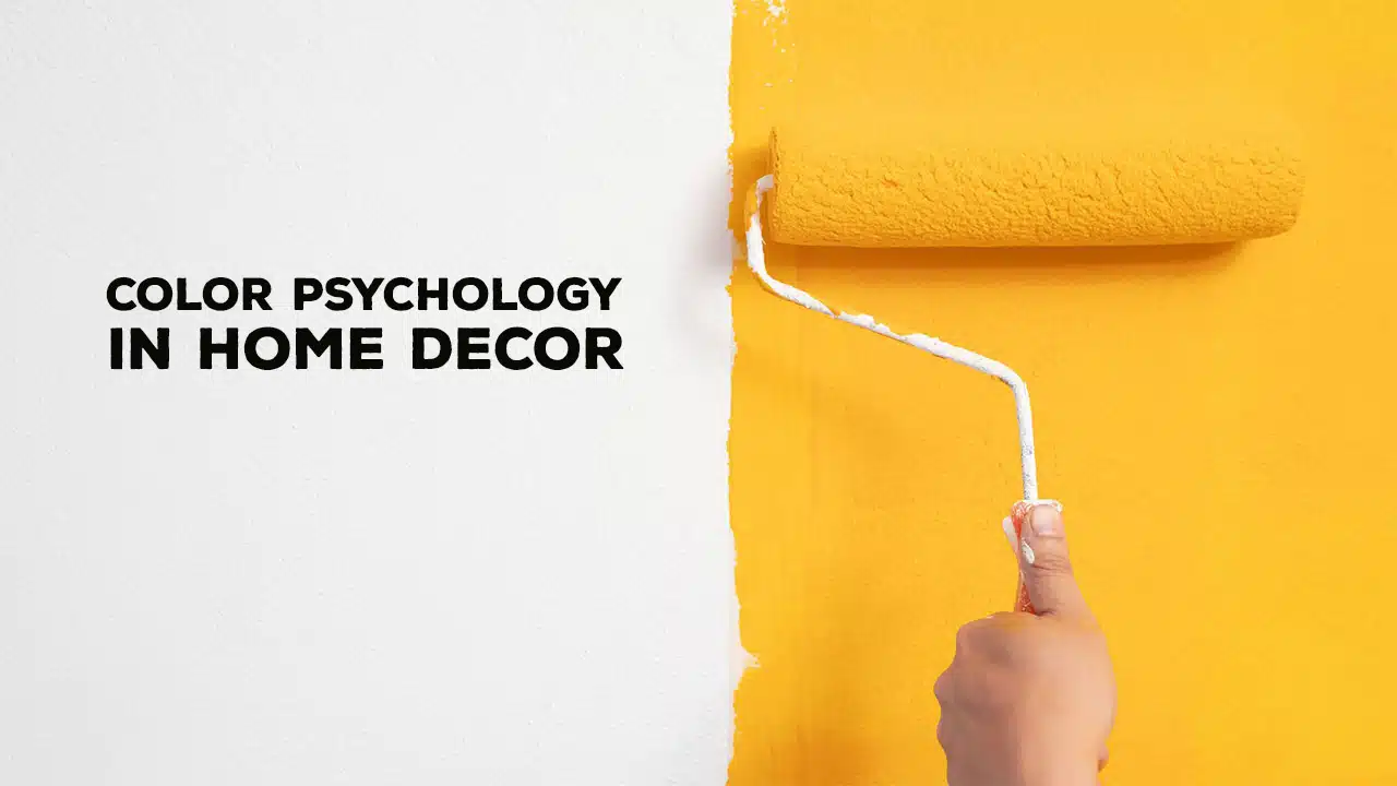
Colors are all around us. They affect how we feel and act. In our homes, colors play a significant role in creating the right mood. This is called color psychology. It’s the study of how colors impact our emotions and behaviors.
When we decorate our homes, we can use this knowledge to create spaces that make us feel good. This article will explore how to use color psychology in home decor. We’ll look at different colors and the moods they create.
We’ll also discuss choosing and combining colors for the best effect. Whether you want a calm bedroom or an energizing office, understanding color psychology can help. Let’s dive into the world of colors and learn how to use them to create the perfect atmosphere in your home.
Understanding Color Psychology:
Color psychology is not just a modern idea. People have been studying the effects of color for a long time. Ancient cultures used colors for healing.
They believed different colors had different powers. Today, scientists study how colors affect our brains and bodies. They’ve found that colors can change our mood, heart rate, and appetite.
In-home decor, color psychology is about using colors to create specific feelings. Some colors make us feel calm and relaxed. Others make us feel excited or happy. We can make our homes feel how we want them to by choosing the right colors.
It’s important to remember that color psychology isn’t exact. Different people might react differently to the same color. Culture, personal experiences, and preferences all play a role. However, there are some general effects that most people experience with specific colors.
The Basic Color Groups:
Before we dive into specific colors, let’s look at the main color groups:
- Warm Colors: These include red, orange, and yellow. They tend to feel energetic and cozy.
- Cool Colors: These are blues, greens, and purples. They often feel calm and relaxed.
- Neutral Colors: These include white, gray, and brown. They can help balance other colors.
Understanding these groups can help you start thinking about the overall feel you want in a room. Now, let’s look at specific colors and their effects.
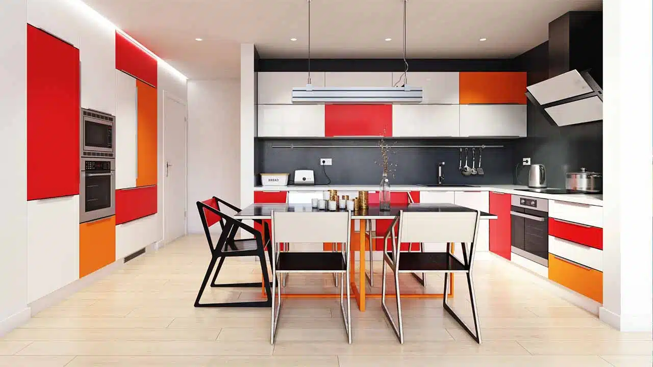
1. Red: The Color of Energy and Passion
Red is an intense color. It grabs attention and creates excitement. Red can make a bold statement for in-home decor. Here’s what you should know about using red:
Psychological Effects:
– Increases energy and enthusiasm
– Can raise heart rate and blood pressure
– Stimulates appetite (which is why it’s often used in dining rooms)
– Creates a sense of urgency or importance
Best Used In:
– Dining rooms to stimulate conversation and appetite
– Living rooms or entryways for a bold welcome
– Accents in any room for a pop of energy
How to Use Red:
– Use red sparingly as it can be overwhelming in large amounts
– Pair with neutral colors like white or gray to balance its intensity
– Consider using deeper shades like burgundy for a more sophisticated look
Things to Consider:
– Too much red can feel aggressive or create anxiety
– Red might not be the best choice for bedrooms as it can be stimulating
2. Orange: The Social and Creative Color
Orange is a friendly, warm color. It combines the energy of red with the cheerfulness of yellow. Here’s how to use orange in your home:
Psychological Effects:
– Promotes socialization and communication
– Encourages creativity and enthusiasm
– Creates a sense of comfort and warmth
Best Used In:
– Living rooms or family rooms to encourage conversation
– Home offices or craft rooms to boost creativity
– Kitchens for a welcoming, appetite-stimulating effect
How to Use Orange:
– Use lighter shades like peach for a soft, welcoming feel
– Darker oranges can create a cozy, autumn-like atmosphere
– Combine with blue (its complementary color) for a striking contrast
Things to Consider:
– Bright orange can be overwhelming in large amounts
– Some shades of orange might feel dated if not used carefully
3. Yellow: The Color of Happiness and Energy
Yellow is often associated with sunshine and happiness. It’s a cheerful color that can brighten up any space. Here’s what to know about yellow:
Psychological Effects:
– Promotes happiness and optimism
– Stimulates mental activity and memory
– Can increase energy levels
Best Used In:
– Kitchens and dining areas to promote happiness and stimulate appetite
– Home offices or study areas to enhance focus and creativity
– Entryways to create a welcoming first impression
How to Use Yellow:
– Soft, buttery yellows create a warm, welcoming feel
– Bright yellows can be used as accents to add energy to a room
– Pair with gray or white for a modern, balanced look
Things to Consider:
– Too much bright yellow can be overwhelming and cause eye strain
– Yellow might not be the best choice for bedrooms as it can be stimulating
4. Green: The Color of Nature and Balance
Green is associated with nature and growth. It’s a balancing color that can create a sense of calm and harmony. Here’s how to use green in your home:
Psychological Effects:
– Promotes feelings of calm and relaxation
– Encourages balance and harmony
– Can reduce anxiety and promote concentration
Best Used In:
– Bedrooms for a calming effect
– Home offices to reduce eye strain and increase focus
– Living rooms to create a balanced, harmonious atmosphere
How to Use Green:
– Light, sage greens create a soft, natural feel
– Deep forest greens can add richness and sophistication
– Use with wood tones for a natural, earthy look
Things to Consider:
– Some shades of green (like lime green) can be energizing rather than calming
– Avoid using muddy or yellowish greens in kitchens as they can be unappetizing
5. Blue: The Color of Calm and Serenity
Blue is often associated with the sky and water. It’s known for its calming effects. Here’s how to use blue in your home decor:
Psychological Effects:
– Promotes feelings of calm and relaxation
– Can lower heart rate and blood pressure
– Associated with trust and stability
Best Used In:
– Bedrooms for better sleep
– Bathrooms for a clean, fresh feel
– Home offices to reduce stress and increase focus
How to Use Blue:
– Light blues create an airy, open feeling
– Deep blues can add drama and sophistication
– Pair with white for a classic, clean look
Things to Consider:
– Too much blue can feel cold or uninviting
– Very dark blues might make a room feel smaller
6. Purple: The Color of Luxury and Creativity
Purple has long been associated with royalty and luxury. It can add a touch of elegance to any room. Here’s how to use purple in your home:
Psychological Effects:
– Promotes creativity and imagination
– Can create a sense of luxury and sophistication
– In lighter shades, it can be calming and relaxing
Best Used In:
– Bedrooms for a luxurious feel
– Home offices or craft rooms to boost creativity
– Living rooms or dining rooms for a touch of elegance
How to Use Purple:
– Light lavenders create a soft, romantic atmosphere
– Deep purples add richness and drama
– Use as an accent color with neutrals for a balanced look
Things to Consider:
– Too much purple can feel overwhelming
– Some shades of purple might feel childish if not used carefully
7. Pink: The Color of Love and Nurturing
Pink is often associated with femininity and love. It can create a soft, nurturing atmosphere. Here’s how to use pink in your home:
Psychological Effects:
– Promotes feelings of love and nurturing
– Can have a calming effect
– Associated with compassion and kindness
Best Used In:
– Bedrooms for a soft, romantic feel
– Nurseries or children’s rooms
– Bathrooms for a fresh, clean look
How to Use Pink:
– Soft, blush pinks create a delicate, romantic atmosphere
– Brighter pinks can add energy and playfulness
– Pair with gray or white for a modern, sophisticated look
Things to Consider:
– Too much pink can feel overwhelming or immature
– Consider using pink as an accent color in shared spaces
8. Brown: The Color of Earth and Stability
Brown is a natural, earthy color. It can create a sense of warmth and stability in a home. Here’s how to use brown in your decor:
Psychological Effects:
– Promotes feelings of stability and reliability
– Creates a sense of warmth and comfort
– Can make a space feel grounded and natural
Best Used In:
– Living rooms for a cozy, welcoming feel
– Home offices for a professional, stable atmosphere
– Kitchens for a warm, natural look
How to Use Brown:
– Light browns like tan or beige create a soft, neutral backdrop
– Dark browns add richness and depth
– Use with other natural colors like green for an earthy feel
Things to Consider:
– Too much brown can feel heavy or dull
– Balance brown with lighter colors to prevent a room from feeling dark
9. White: The Color of Cleanliness and Openness
White is associated with cleanliness and purity. It can make a space feel open and fresh. Here’s how to use white in your home:
Psychological Effects:
– Creates a sense of cleanliness and purity
– Can make a space feel larger and more open
– Provides a neutral backdrop for other colors
Best Used In:
– Kitchens and bathrooms for a clean, fresh look
– Small spaces to make them feel larger
– Any room as a neutral backdrop for colorful accents
How to Use White:
– Use different shades of white to add depth
– Combine with textures to prevent a sterile feel
– Use as a backdrop for colorful art or accessories
Things to Consider:
– Pure white can feel cold or sterile if not balanced with warm elements
– White shows dirt quickly, so it might require more cleaning
10. Gray: The Color of Balance and Sophistication
Gray is a neutral color that can create a sophisticated, balanced atmosphere. Here’s how to use gray in your home decor:
Psychological Effects:
– Promotes feelings of calm and balance
– Can create a sophisticated, modern atmosphere
– Provides a neutral backdrop for other colors
Best Used In:
– Living rooms for a modern, sophisticated look
– Bedrooms for a calming effect
– Home offices for a professional atmosphere
How to Use Gray:
– Light grays can make a room feel open and airy
– Dark grays add drama and sophistication
– Use with bright accent colors for a modern look
Things to Consider:
– Too much gray can feel dull or depressing
– Balance cool grays with warm elements to prevent a cold feeling
11. Black: The Color of Elegance and Power
Black is an intense color that can add elegance and drama to a space. Here’s how to use black in your home:
Psychological Effects:
– Creates a sense of elegance and sophistication
– Can make a space feel smaller and more intimate
– Provides strong contrast with lighter colors
Best Used In:
– Accents in any room for a touch of drama
– Dining rooms for an elegant, intimate atmosphere
– Home offices for a powerful, professional look
How to Use Black:
– Use sparingly as accents or focal points
– Combine with white for a classic, high-contrast look
– Use with metallic accents for a luxurious feel
Things to Consider:
– Too much black can make a space feel small and dark
– Black shows dust easily so it might require more cleaning
Combining Colors for the Perfect Mood:
Now that we’ve looked at individual colors, let’s discuss how to combine them. The right color combinations can create balanced, harmonious spaces. Here are some tips:
1. Use the 60-30-10 Rule:
– 60% of the room should be a dominant color (usually neutral)
– 30% should be a secondary color
– 10% should be an accent color
2. Consider Color Temperature:
– Combine warm colors with other warm colors
– Or mix warm and cool colors for contrast
3. Use the Color Wheel:
– Complementary colors (opposite on the wheel) create strong contrast
– Analogous colors (next to each other) create harmony
4. Think About Lighting:
– Natural light can change how colors look
– Consider how the room will look at different times of day
5. Start with a Inspiration Piece:
– Use a favorite painting or piece of furniture as a starting point
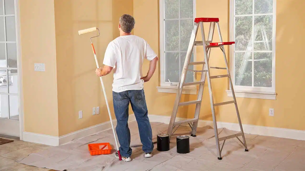
6. Test Before Committing:
– Use paint samples or fabric swatches to see how colors look in your space
Color Psychology in Different Rooms:
Different rooms in your home serve various purposes. The colors you choose should reflect this. Here’s a guide for using color psychology in specific rooms:
Living Room:
– Goal: Create a welcoming, social atmosphere
– Good colors: Warm neutrals, greens, blues
– Tips: Use a mix of colors to create interest and encourage conversation
Kitchen:
– Goal: Stimulate appetite and create energy
– Good colors: Warm colors like red, orange, or yellow
– Tips: Use these colors as accents if you don’t want to commit to a fully colorful kitchen
Dining Room:
– Goal: Encourage appetite and conversation
– Good colors: Reds, oranges, or rich, warm colors
– Tips: Consider using a bold color on one wall as a focal point
Bedroom:
– Goal: Promote relaxation and restful sleep
– Good colors: Cool colors like blue, green, or lavender
– Tips: Avoid very bright or stimulating colors
Bathroom:
– Goal: Create a clean, fresh atmosphere
– Good colors: Whites, light blues, or greens
– Tips: Use color to make small bathrooms feel larger
Home Office:
– Goal: Increase focus and productivity
– Good colors: Blues, greens, or energizing yellows
– Tips: Choose colors that help you feel alert and focused
Children’s Rooms:
– Goal: Encourage play and creativity while allowing for rest
– Good colors: Cheerful colors like yellow or green or calming blues
– Tips: Consider using colorful accents that can be easily changed as the child grows
Color Psychology and Home Value:
Color psychology can play a role if you’re considering selling your home. Some colors can make your home more appealing to buyers. Here are some tips:
– Neutral colors are generally safe and appealing to most buyers
– Avoid very bold or unusual color choices in main living areas
– Consider using color to highlight architectural features
– Remember that light colors can make spaces feel larger
Takeaways
Color psychology is a powerful tool in home decor. Understanding how different colors affect our moods and emotions allows us to create spaces that make us feel good. Remember, there’s no one “right” color for any space. The best colors are the ones that make you feel comfortable and happy in your home.
When choosing colors, consider the purpose of each room. Think about the mood you want to create. Don’t be afraid to experiment with different combinations. And remember, you can always start small with accent pieces or paint samples before making significant changes.
Color trends may come and go, but the psychological effects of colors remain consistent. Using this knowledge, you can create a home that looks beautiful and supports your well-being.
Whether you’re looking for a calm oasis, an energizing workspace, or a welcoming gathering place, color psychology can help you achieve your goals. Use this guide as a starting point, but trust your instincts. After all, your home should reflect you and what makes you feel good.
With the right colors, your home can be more than just a place to live. It can be a source of comfort, inspiration, and joy. So pick up that paintbrush, or choose that colorful throw pillow. Your perfect, mood-enhancing home is just a few colors away.