Visual content rules the digital landscape today. As someone deeply involved in digital marketing and content creation, I know that a wall of text rarely keeps a reader engaged. You need visuals that break down complex data into digestible pieces. However, creating these visuals from scratch eats up hours of valuable time.
That is why I started testing artificial intelligence tools to speed up my workflow. Finding the best AI models for accurate infographics completely changed how I approach content strategy.
Sitting in my usual coworking space in Dhaka with a fresh cup of coffee, I have spent the last few months rigorously testing the top platforms. I wanted to see which tools could actually handle real data, spell words correctly, and build a logical layout without requiring constant human intervention. In this comprehensive guide, I will share my first-hand experience with these platforms. I will break down their strengths, their weaknesses, and how you can integrate them into your daily operations to scale your visual content effortlessly.
Why I Value Data Precision in AI Visuals
When you manage digital media platforms, every single metric counts. I constantly monitor our Ahrefs Domain Rating (DR), Moz Domain Authority (DA), and organic search traffic. Through this monitoring, I noticed a clear trend: articles with high-quality, accurate infographics consistently earn more backlinks and retain readers longer. But the keyword here is accurate. If an AI tool hallucinates a statistic or places a chart upside down, it ruins your credibility instantly. When I search for the best AI models for accurate infographics, I demand precision above all else. A misspelled label or a skewed graph is completely unacceptable when presenting data to a professional audience.
| Visual Accuracy Metric | Impact on Content Performance | Why It Matters for SEO |
| Typographic Correctness | Eliminates reader confusion. | High-quality content signals increase dwell time. |
| Factual Data Placement | Builds trust with the audience. | Encourages authority backlinks from other sites. |
| Logical Grid Layout | Guides the eye naturally. | Reduces bounce rate on long-form articles. |
| Brand Consistency | Creates a professional aesthetic. | Boosts brand recognition across search results. |
The Shift from Art to Information Design
Historically, AI image generators focused on making beautiful, artistic pictures. They failed miserably at structured tasks. If you asked for a flowchart, you received a messy web of lines and unreadable alien text. Today, the technology has pivoted. We now have models specifically trained on data visualization, pedagogical structures, and typographic grids. This shift means we can finally rely on AI to help us explain complex topics, rather than just decorate our blog posts.
GPT Image-2: My Top Pick for Structured Layouts
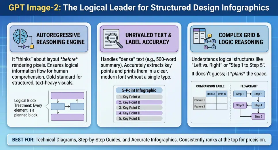
When I need a complex, text-heavy layout, OpenAI’s GPT Image-2 is the first tool I open. This model operates differently than standard diffusion models because it uses an autoregressive reasoning engine. It actually “thinks” about the spatial grid before it generates the image. I have used it to map out technical workflows, and it follows multi-step spatial instructions flawlessly. It places headers at the top, footnotes at the bottom, and keeps the central data aligned. For pure logical structure, it is undeniably one of the best AI models for accurate infographics available right now.
| GPT Image-2 Feature | My First-Hand Observation | Ideal Use Case |
| Reasoning Engine | Understands complex layout instructions. | Technical flowcharts and UI mockups. |
| Text Accuracy | Rarely misspells English or Bengali words. | Text-heavy lists and instructional graphics. |
| Generation Speed | Takes up to 30 seconds to render. | Deep, detailed work requiring precision. |
| Output Style | Clean, vector-like digital illustration. | Professional corporate reports. |
Unrivaled Text and Label Accuracy
The most impressive feature of GPT Image-2 is its typographic capability. I recently sat down with our Acting Editor, Barsha Nag Bhowmick, to test which tools could handle Bengali text alongside English without breaking the font scripts. GPT Image-2 performed exceptionally well. We generated tribute infographics featuring Bengali literature quotes, and the text rendered sharply and correctly. This eliminates the need to export a blank image and add the text manually later.
Canva Magic Media: The Daily Workhorse for Our Team
While GPT Image-2 is powerful for complex logic, you do not always need that level of heavy lifting. For day-to-day operations at Editorialge Media, Canva Magic Media is our absolute workhorse. Canva integrates AI directly into a massive library of human-designed templates. You type in your prompt, and the AI places your content into a pre-existing, balanced framework. It removes the anxiety of staring at a blank page. Because it allows for instant drag-and-drop editing after the AI does its job, it provides a safety net that pure generation tools lack.
| Canva Magic Feature | My First-Hand Observation | Ideal Use Case |
| Template Integration | Ensures layouts are always visually pleasing. | Quick social media graphics and listicles. |
| Post-Generation Editing | You can click and change any text or color. | Collaborative team design projects. |
| Ease of Use | Zero learning curve for new team members. | Scaling daily content output. |
| Export Options | Offers high-quality PNG, PDF, and SVG. | Multi-platform publishing. |
Template-Driven Generation
The real magic happens when you need to move fast. If I need a quick visual summarizing the top five SEO tools for an upcoming article, I just prompt Canva. It suggests a five-point vertical list layout automatically. The AI understands the context of the data and chooses a format that fits. If a generated icon looks slightly off, I can swap it out from Canva’s library in two seconds. It is a hybrid approach that perfectly blends AI speed with human editorial control.
Piktochart AI: Turning Raw SEO Data into Visual Gold
Dealing with spreadsheets is a huge part of my routine. Reviewing site speed metrics from Google PageSpeed Insights, GTmetrix, and Search Console generates massive amounts of raw data. Piktochart AI bridges the gap between boring spreadsheets and engaging content. You can upload a CSV file directly into the platform, and the AI analyzes the numbers to suggest the best type of chart. It takes the guesswork out of data visualization, making it an essential tool when hunting for the best AI models for accurate infographics for corporate reporting.
| Piktochart AI Feature | My First-Hand Observation | Ideal Use Case |
| Data Ingestion | Reads CSV and Excel files perfectly. | Traffic reports and financial summaries. |
| Chart Selection | Suggests the right chart for the data type. | Preventing misleading data visualization. |
| Brand Locking | Keeps company colors consistent. | Client presentations and pitch decks. |
| Precision | 100% accuracy on numerical data transfer. | High-stakes corporate reporting. |
The Excel to Infographic Pipeline
I once had a spreadsheet detailing a year-long growth trajectory for a client project. Instead of manually building a line graph, I fed the data into Piktochart AI. Within moments, it produced a clean, branded infographic that highlighted the exact traffic spikes we achieved. It automatically scaled the axes and labeled the data points correctly. For professionals who deal with hard numbers, this tool is an absolute lifesaver.
Midjourney v7: Crafting Hero Images for Campaigns
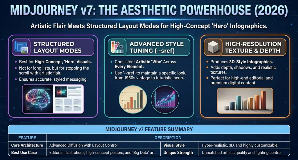
Sometimes, an infographic needs to be more than just a chart; it needs to be a piece of art that grabs attention immediately. When we secure a guest post or paid post placement for a client, the featured image must look premium. Midjourney v7, with its new Structured Layout Modes, is unmatched for aesthetic quality. While it might struggle with a 50-item list, it is perfect for high-concept, stylized infographics. It provides a level of depth, texture, and lighting that makes the visual pop off the screen.
| Midjourney v7 Feature | My First-Hand Observation | Ideal Use Case |
| Aesthetic Quality | Produces stunning, hyper-realistic visuals. | Hero images for premium articles. |
| Style Referencing | Keeps a consistent “vibe” across images. | High-end brand storytelling. |
| Texture and Depth | Creates 3D-looking charts and elements. | Magazine-style editorial layouts. |
| Learning Curve | Requires precise prompting via Discord/Web. | Advanced digital artistry. |
Advanced Style Control and Aesthetics
Using the –sref (style reference) parameter in Midjourney allows me to maintain a very specific look. If I want a corporate, modern 3D aesthetic with a specific blue and silver color palette, I can lock that style in. Every infographic element I generate will share that exact lighting and texture. It turns a standard data presentation into a highly engaging visual story that publishers love to feature.
Venngage AI: Perfecting the Educational Flow
When you are onboarding new staff or explaining a complex new company policy, clarity is everything. I have used Venngage AI extensively for creating internal training materials and step-by-step guides. Venngage focuses heavily on “information design,” meaning the AI is trained on how people actually learn and absorb information. It automatically spaces elements to reduce cognitive overload. If you need to build process diagrams or educational charts, Venngage is undoubtedly one of the best AI models for accurate infographics.
| Venngage AI Feature | My First-Hand Observation | Ideal Use Case |
| Smart Templates | Elements auto-resize when you add text. | Step-by-step process guides. |
| Educational Focus | Prioritizes readability and flow. | Employee onboarding and HR documents. |
| Accessibility Checks | Ensures color contrast is readable. | Public sector and educational content. |
| Icon Library | Massive selection of professional symbols. | Explaining abstract software concepts. |
Smart Tethering and Accessibility
The most frustrating part of manual design is moving one box and having to realign ten other arrows and text blocks. Venngage solves this with smart tethering. If I ask the AI to generate a four-step process, and later decide I only need three steps, I just delete one. The AI automatically reorganizes the remaining three steps to perfectly fill the space. Furthermore, its built-in accessibility checker ensures that our visuals meet compliance standards for visually impaired readers, which is a crucial step for modern web publishing.
ImagineLab.art: Exploring the Future of Unified AI
My interest in AI goes beyond just using third-party tools. Over the past year, I have been heavily involved in the development of ImagineLab.art, focusing on unifying different AI creative models into a single studio environment. While planning the backend architecture transition utilizing Python and Laravel, I have studied exactly how these generation models process data. The goal is to create a seamless environment where content automation meets high-fidelity multimedia generation without the friction of jumping between ten different apps.
| ImagineLab.art Vision | My First-Hand Observation | Ideal Use Case |
| Unified Workflows | Combining text, image, and data AI. | End-to-end content creation. |
| Backend Efficiency | Leveraging Python/Laravel for speed. | Fast, reliable generation at scale. |
| Model Integration | Pulling the best features of Gemini, Flux, etc. | Comprehensive creative suites. |
| User Experience | Removing the technical barriers of prompting. | Empowering marketers and writers. |
Bridging the Gap in Multimedia Content
Evaluating the current market of infographic tools has directly influenced how we approach feature development. The future is not just about generating an image; it is about memory, context, and workflow. An ideal system should remember your brand guidelines, understand your previous content, and generate relevant visuals automatically as you draft an article. Building these capabilities requires a deep understanding of both the creative process and the technical limitations of current AI models.
Final Thoughts
Navigating the world of automated design can feel overwhelming, but finding the right tools completely transforms your productivity. From my rigorous daily testing, it is clear that there is no single perfect tool for every job. If you demand flawless text and logical grids, GPT Image-2 is a powerhouse. If you need to move fast and edit easily, Canva is indispensable. And if you are dealing with raw spreadsheets, Piktochart is your best option. By integrating the best AI models for accurate infographics into your specific workflow, you can stop wasting time pushing pixels and start focusing on the data and stories that actually drive your business forward.
Frequently Asked Questions (FAQs) on Best AI Models for Accurate Infographics in 2026
How do I choose between a reasoning model like GPT Image-2 and a template model like Canva?
It comes down to your design experience and time constraints. If you want a unique, highly specific layout that follows complex instructions precisely, use GPT Image-2. If you need a guaranteed good-looking result in under a minute that you can easily edit later, choose Canva.
Can these AI models read and visualize data from a live website?
Most standard image generators cannot do this yet. However, specialized tools like Piktochart and Infogram allow you to link live Google Sheets or specific data URLs. The AI then uses that structured data to build and update the visual automatically.
Why does AI sometimes misspell words in my infographics?
Older AI models render text as pixels, essentially “drawing” what they think letters look like without understanding spelling. Modern models like GPT Image-2 use specific text-rendering engines that understand typography and language rules, drastically reducing spelling errors.
Are AI-generated infographics good for SEO?
Yes, highly beneficial. Unique, high-quality infographics keep users on your page longer, reducing bounce rates. Furthermore, if you provide accurate and valuable visual data, other websites are highly likely to link back to your image, boosting your domain authority.
Can I use these tools to generate infographics in Bengali?
Yes. Through my own testing, I have found that GPT Image-2 handles Bengali script exceptionally well, spacing the characters correctly. Canva also fully supports Bengali text input within its template editor.