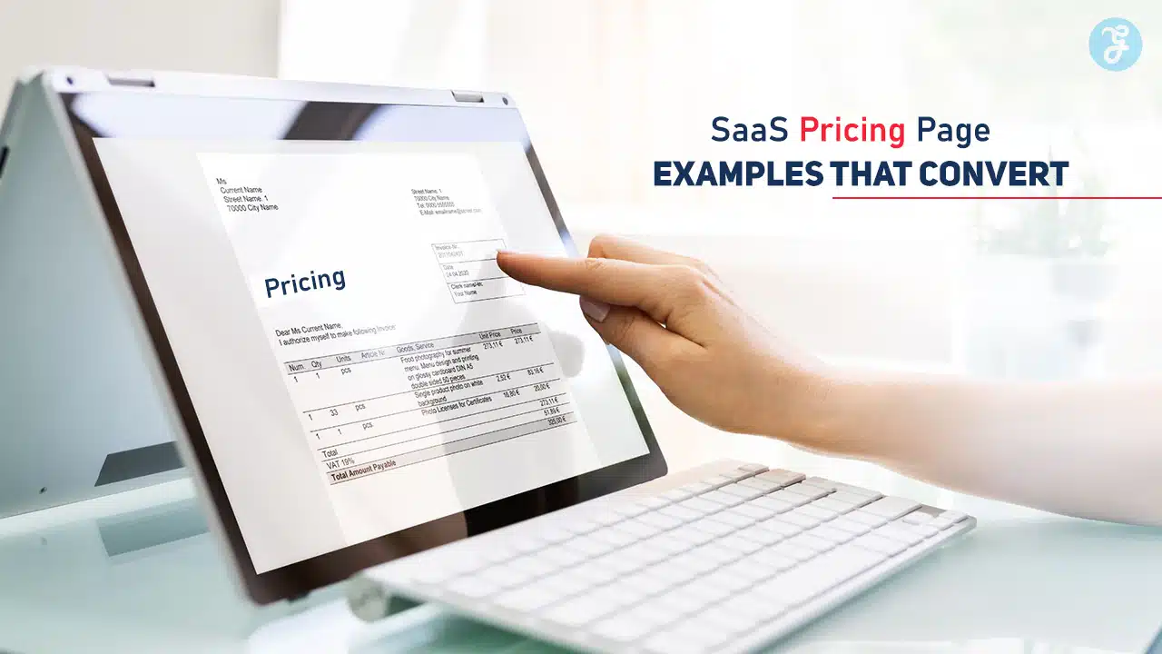
A well-designed pricing page is the cornerstone of any successful SaaS business. It’s the page where potential customers decide whether to invest in your product, making it a critical touchpoint in your conversion funnel.
Creating a pricing page that converts requires a mix of clear communication, compelling design, and strategic placement of key information.
By studying examples from top-performing SaaS companies, you can uncover actionable insights to optimize your pricing page and improve conversion rates.
In this article, we’ll explore 7 SaaS pricing page examples that convert, breaking down what makes each one effective. These examples demonstrate how to balance transparency, usability, and psychology to turn visitors into paying customers.
1. Slack
Slack’s pricing page is an excellent example of simplicity and clarity. The collaboration platform is designed for teams, and its pricing page reflects that by being easy to navigate and user-friendly.
Key Features of Slack’s Pricing Page:
- Straightforward Plans: Slack offers three main plans—Free, Pro, and Business+—with a concise description of each plan’s benefits.
- Side-by-Side Comparison: A feature comparison table helps users quickly identify the differences between plans.
- Call-to-Action (CTA) Placement: CTAs like “Get Started for Free” and “Contact Sales” are prominently displayed to guide users.
- Customer-Centric Messaging: Highlights how the paid plans enhance collaboration and efficiency.
Why It Converts:
Slack’s page focuses on the needs of its target audience, using clear headings and minimal distractions. The free plan hooks users, while the upsell benefits are compelling for businesses looking to scale.
2. HubSpot

HubSpot, a leading CRM platform, showcases one of the most comprehensive pricing pages in the SaaS space. The company’s multi-product ecosystem is reflected in its pricing layout.
Key Features of HubSpot’s Pricing Page:
- Product-Specific Pricing: Separate pricing pages for Marketing, Sales, and Service Hubs ensure clarity.
- Tiered Pricing: Each hub offers Starter, Professional, and Enterprise tiers with progressive features.
- Interactive Cost Calculator: Allows users to estimate costs based on the number of contacts or seats.
- Detailed FAQs: Addresses common questions to eliminate purchase hesitation.
Why It Converts:
HubSpot’s transparency and detailed breakdown of features build trust. The interactive calculator personalizes the experience, helping users understand how much they’ll pay based on their needs.
3. Dropbox
Dropbox’s pricing page epitomizes minimalism and clarity, aligning with its brand image as a simple, reliable file storage solution.
Key Features of Dropbox’s Pricing Page:
- Minimalistic Design: Uses plenty of white space and simple fonts to keep the focus on the pricing options.
- Plan Highlights: Emphasizes key features like storage size, device syncing, and advanced sharing options.
- Clear CTAs: Buttons like “Try Free” and “Buy Now” are strategically placed for easy access.
- Tailored for Individuals and Teams: Separate pricing sections cater to personal and business users.
Why It Converts:
The design’s simplicity ensures that visitors aren’t overwhelmed with information. The focus on Dropbox’s core value—file storage—helps users quickly see why the service is worth the investment.
4. Notion
Notion, a productivity tool, provides one of the most flexible and transparent pricing pages, catering to individual users, small teams, and enterprises.
Key Features of Notion’s Pricing Page:
- Customized for User Types: Offers pricing tiers for personal use, small teams, and businesses.
- Free Plan Highlight: The free plan is prominently displayed to attract new users.
- Feature Comparison: A concise table outlines key features like team collaboration, admin controls, and integrations.
- Visual Appeal: Uses subtle animations and icons to make the page engaging.
Why It Converts:
Notion emphasizes its free plan while showcasing the benefits of upgrading. The pricing page appeals to both casual users and businesses, ensuring a broad reach.
5. Canva
Canva, a graphic design platform, has a pricing page that reflects its brand’s creative and user-friendly approach.
Key Features of Canva’s Pricing Page:
- Visual Layout: Engaging visuals and icons illustrate key features for each plan.
- Clear Value Proposition: Highlights benefits like premium templates, unlimited folders, and collaboration tools.
- Free Trial Option: Encourages users to try the Pro plan risk-free for 30 days.
- Customer Testimonials: Social proof reinforces the platform’s credibility.
Why It Converts:
Canva’s design-centric approach ensures the page is visually appealing and easy to navigate. The free trial lowers barriers to entry, while the Pro plan offers irresistible value for creative professionals.
6. Shopify
Shopify, an e-commerce platform, excels in highlighting how its pricing plans drive business success.
Key Features of Shopify’s Pricing Page:
- Tiered Plans for Scalability: Basic, Shopify, and Advanced plans cater to businesses of all sizes.
- Feature Emphasis: Focuses on features like payment processing, shipping discounts, and analytics.
- Cost Calculator: Helps users understand the total cost, including transaction fees.
- Risk-Free Trial: A free 14-day trial encourages users to explore the platform.
Why It Converts:
Shopify’s focus on business growth resonates with entrepreneurs. The pricing page combines transparency with aspirational messaging, making it a compelling choice for e-commerce businesses.
7. Zoom
Zoom’s pricing page is an example of how simplicity can drive conversions. The video conferencing platform’s page ensures that users can quickly find the right plan.
Key Features of Zoom’s Pricing Page:
- Easy-to-Understand Plans: Free, Pro, Business, and Enterprise tiers cater to different user segments.
- Feature Highlights: Focuses on core benefits like participant limits, cloud storage, and integrations.
- Scalable Pricing: Allows users to add features like webinars or extra participants.
- Clear CTAs: Buttons like “Sign Up Free” and “Contact Sales” guide users effectively.
Why It Converts:
Zoom’s pricing page removes complexity, making it easy for users to understand their options. The free plan serves as a strong entry point, with upgrades available for advanced features.
Conclusion
A well-crafted pricing page can make or break your SaaS business. By studying these 7 SaaS pricing page examples that convert, you can identify the strategies that resonate most with your target audience.
From Slack’s simplicity to HubSpot’s detailed value presentation, each example demonstrates how clarity, transparency, and customer-centric design can boost conversions. Incorporate these insights into your own pricing page to create a user experience that drives results.
Remember, the key to a successful pricing page is testing and iteration. Use these examples as inspiration, but continuously analyze your audience’s behavior to refine your approach.
With the right strategy, your pricing page can become a powerful tool for converting visitors into loyal customers.