I’ve spent years watching incredibly talented teams water down their own impact. I’ve seen enthusiastic sales reps use neon green on a pitch deck for a luxury brand, and I’ve watched social media managers drop casual internet slang on an account for a corporate law firm. The problem in these situations is rarely a lack of talent; it’s a lack of alignment.
When your web developer, your graphic designer, and your copywriter are all speaking different languages, your audience gets confused. And in the business world, confusion kills trust. This is exactly where a brand style guide comes in. It’s the single most important document you can build to protect your company’s identity.
Let’s break down exactly what a brand style guide is, what goes into it, and how you can build one that your team will actually use.
What Exactly Is a Brand Style Guide?
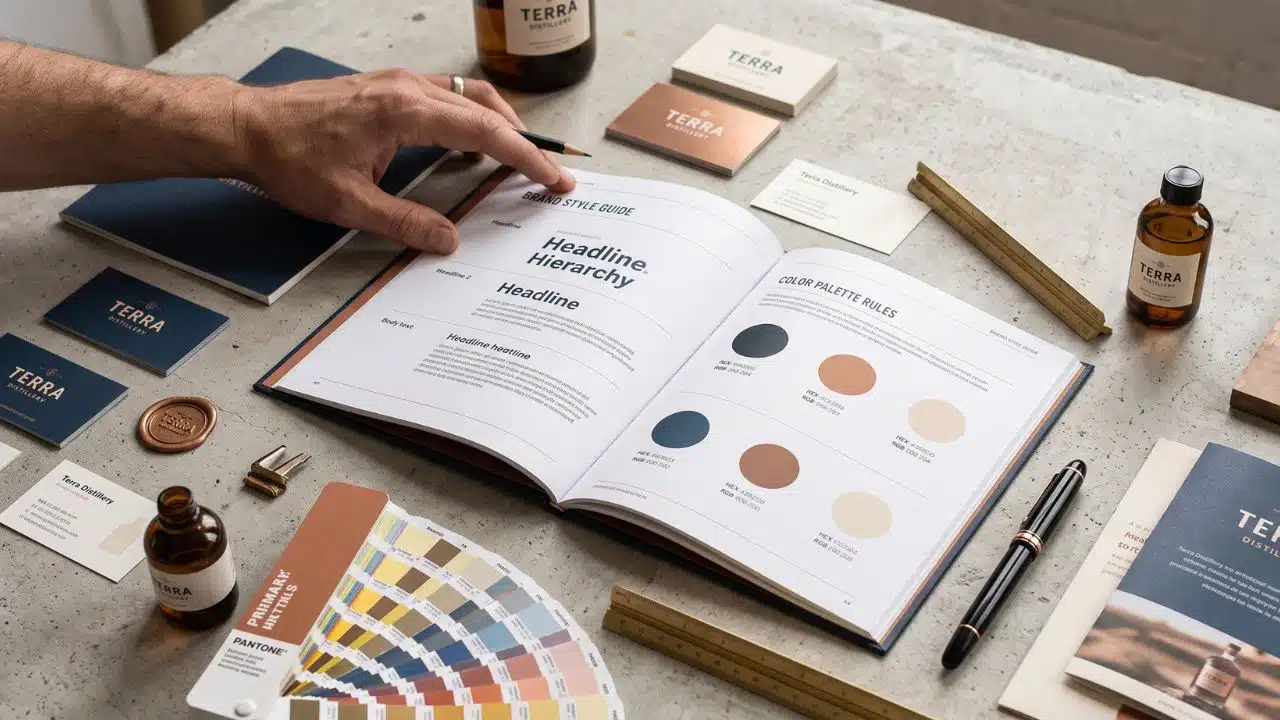
Think of a brand style guide as your company’s DNA documented on paper, or, more likely, a sleek PDF. It is a comprehensive rulebook that defines exactly how your brand looks, feels, and sounds across every single touchpoint.
It acts as the absolute source of truth. Whether you are onboarding a new freelance designer to create Instagram graphics or hiring an agency to rebuild your website, you hand them this guide. It ensures that no matter who is creating the content, the final result looks like it came from the exact same entity.
Consistent branding isn’t just an aesthetic choice, it’s a financial one. When people recognize your brand instantly, trust builds faster. And trust is what ultimately drives loyalty and revenue.
The Non-Negotiable Anatomy of a Style Guide
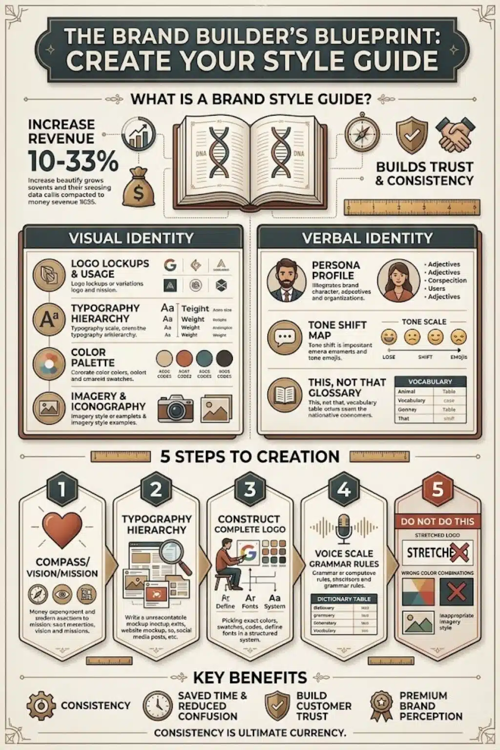
Over the years, I’ve found that the best style guides don’t just show people what to do; they explicitly explain how to do it. A comprehensive guide is split into two distinct halves: your visual identity and your verbal identity.
1. The Logo System [And How to Protect It]
Your logo is your signature, and it needs strict boundaries. A good guide doesn’t just slap the logo on a page. It must include:
- Primary and Secondary Lockups: The main logo, the vertically stacked version, and the icon-only version for tight spaces like app icons or browser favicons.
- Clear Space Rules: The exact amount of invisible “breathing room” required around the logo so it never looks cramped next to other elements.
- Minimum Size: The absolute smallest the logo can be printed or displayed on a screen before it loses legibility.
2. The Color Palette
You can’t just tell a designer, “Our brand is blue.” You have to give them the exact mathematical value of that blue.
I always break color palettes down into primary colors (your main brand colors) and secondary colors (accents used for buttons, backgrounds, or alerts). For every single color, you must provide the exact codes:
| Format | Where You Use It | Why It Matters |
| HEX | Websites, apps, digital UI | Ensures your website button is the exact right shade. |
| RGB | Digital screens (TV, monitors) | The standard for anything emitting light. |
| CMYK | Standard printing (flyers, merch) | Dictates what the ink will look like on paper. |
| Pantone | High-end or exact printing | When you need the color to match perfectly, regardless of the printer. |
3. Typography Hierarchy
Fonts carry personality. Your guide should specify your primary typeface (usually for headlines) and your secondary typeface (usually for body copy). More importantly, it should define the hierarchy: exactly what size, weight (bold, semi-bold, regular), and line spacing should be used for an H1 header versus a standard paragraph.
4. Brand Voice and Tone
This is the most overlooked section, but in my experience, it’s the most critical. Visuals catch the eye, but words build the relationship.
- The Persona: If your brand was a person at a dinner party, who would they be? The wise professor? The energetic cheerleader? The trusted older sibling?
- The Glossary: A simple “This, Not That” list. (For example, “We say Team Member, we never say Employee.”)
Pro Tip: A style guide is only as good as its restrictions. Showing your team what they can do is great, but showing them clear examples of what they cannot do is where the real magic happens.
How to Create Your Own Brand Style Guide in 5 Steps
If you’re staring at a blank page right now, don’t panic. Here is the exact five-step framework I use to build bulletproof style guides from scratch.
Step 1: Define Your Brand Heart
Before you pick a single font or color, you have to know who you are. Write down your mission (what you do), your vision (where you’re going), and your core values (how you act). Every visual choice you make in the following steps should reflect these core truths. If your core value is “Simplicity,” a chaotic, multi-colored neon palette won’t make sense.
Step 2: Audit Your Current World
Gather everything you’ve created over the last year. Pull up your website homepage, your brochures, and your top-performing social media posts. Lay them all out on a digital whiteboard. You’ll instantly spot the inconsistencies. Keep the elements that feel authentic to your brand heart and ruthlessly discard the ones that don’t.
Step 3: Build the Visual Rulebook
Take the surviving elements from your audit and codify them. Finalize your logo variations. Lock in your exact HEX and CMYK color codes. Choose your two main fonts and set the sizing hierarchy so there is zero guesswork for future designers.
Step 4: Write Your Voice Guidelines
Draft a few paragraphs demonstrating exactly how your brand speaks. Create a sliding scale for your tone, for example, note that your brand is “Professional but never stiff” or “Playful but never sarcastic.” Give your writers a clear, safe framework to operate within.
Step 5: Create the “Do Not Do This” Section
This is my favorite part of any guide. Take your beautiful logo and stretch it, change its color, and put it over a busy photograph. Put a big red “X” through these examples. Visually demonstrating how to ruin the brand is the fastest way to ensure your team protects it.
Final Thoughts: Consistency is the Ultimate Currency
At the end of the day, a brand style guide isn’t really about policing creativity; it’s about providing a sandbox.
When your team knows exactly where the walls are, they don’t have to waste time guessing what colors to use, what fonts to download, or whether they should use emojis in an email. They can spend their energy doing what they do best, creating brilliant, effective work that resonates deeply with your audience. Build the guide, share it widely, and watch your brand’s presence instantly level up.
Frequently Asked Questions About Brand Style Guides
1. Can a small business survive without a style guide?
Technically, yes, but you’ll waste countless hours re-explaining your vision to every new contractor, agency, or employee. Even a simple, one-page guide with your logo rules, three color codes, and two fonts will save you massive headaches and make your small business look like a premium enterprise.
2. How long should a style guide be?
As long as it needs to be, but as short as possible. I’ve seen incredibly effective 5-page guides and deeply necessary 100-page guides (usually for global corporations). If it’s too dense, your team simply won’t read it. Prioritize clarity over page count.
3. What is the difference between a brand identity and a style guide?
Your brand identity is the actual collection of elements, the logo itself, the specific colors, the tone of voice. The style guide is the instruction manual on how to use those elements correctly.
4. Who should actually be in charge of updating it?
You need one “Brand Guardian.” This is usually a Creative Director, Lead Designer, or Marketing Manager. If everyone has the power to change the rules, you don’t actually have rules. One person should hold the keys to the master document to maintain strict quality control.
5. How often should I update my guide?
It should be a living document, but it shouldn’t change with the wind. Review it annually to ensure it still aligns with your business goals. You might add new rules for emerging platforms (like how to format a vertical video for social media), but your core colors, logo, and voice should remain stable for years.