You spend weeks refining your ad creatives and adjusting your target audience, only to watch expensive traffic bounce the moment they click. When a campaign fails, marketers often blame the ad platform, but the reality is usually closer to home. If your cost per acquisition is skyrocketing, you are likely making fundamental landing page mistakes that are quietly driving your potential customers away.
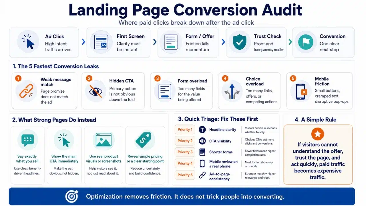
Optimization is not about tricking people into buying; it is about removing the friction that stops them.
7 Common Landing Page Mistakes That Destroy Conversions
1. Asking for Too Much Information Upfront
Every additional field on your lead form acts as a barrier between your prospect and your product. If you are offering a free downloadable guide, you do not need the user’s phone number, job title, and company size. When you ask for highly personal or professional details too early in the relationship, visitors will abandon the page to protect their privacy. Strip your forms down to the absolute essentials, which usually means just a first name and an email address.
2. Hiding the Primary Call-to-Action Below the Fold
Your visitor should not have to scroll, hunt, or guess what you want them to do next. If your primary call-to-action (CTA) button is buried at the very bottom of a massive wall of text, a significant portion of your traffic will never see it. The main button needs to be highly visible in the hero section the exact second the page loads, giving highly motivated buyers an immediate path to purchase.
3. Writing Clever Headlines Instead of Clear Ones
Marketers love to write punchy, abstract headlines that sound great in a pitch meeting but mean absolutely nothing to a stressed consumer. If a visitor cannot figure out exactly what software you sell or what service you provide within three seconds, they will leave. Clarity must always win over cleverness.
Review this comparison of poor headlines versus highly effective alternatives to see how clarity shifts the focus back to the user:
| Abstract Headline | Why It Fails | Clear Alternative |
| Synergy for Your Workflow | Means nothing to the reader | Cut Your Accounting Time in Half |
| Unleash Your Potential | Too vague and corporate | Get Certified in Python in 30 Days |
| The Future of Sleep | Does not explain the product | A Memory Foam Mattress for Back Pain |
4. Using Generic Corporate Stock Photography
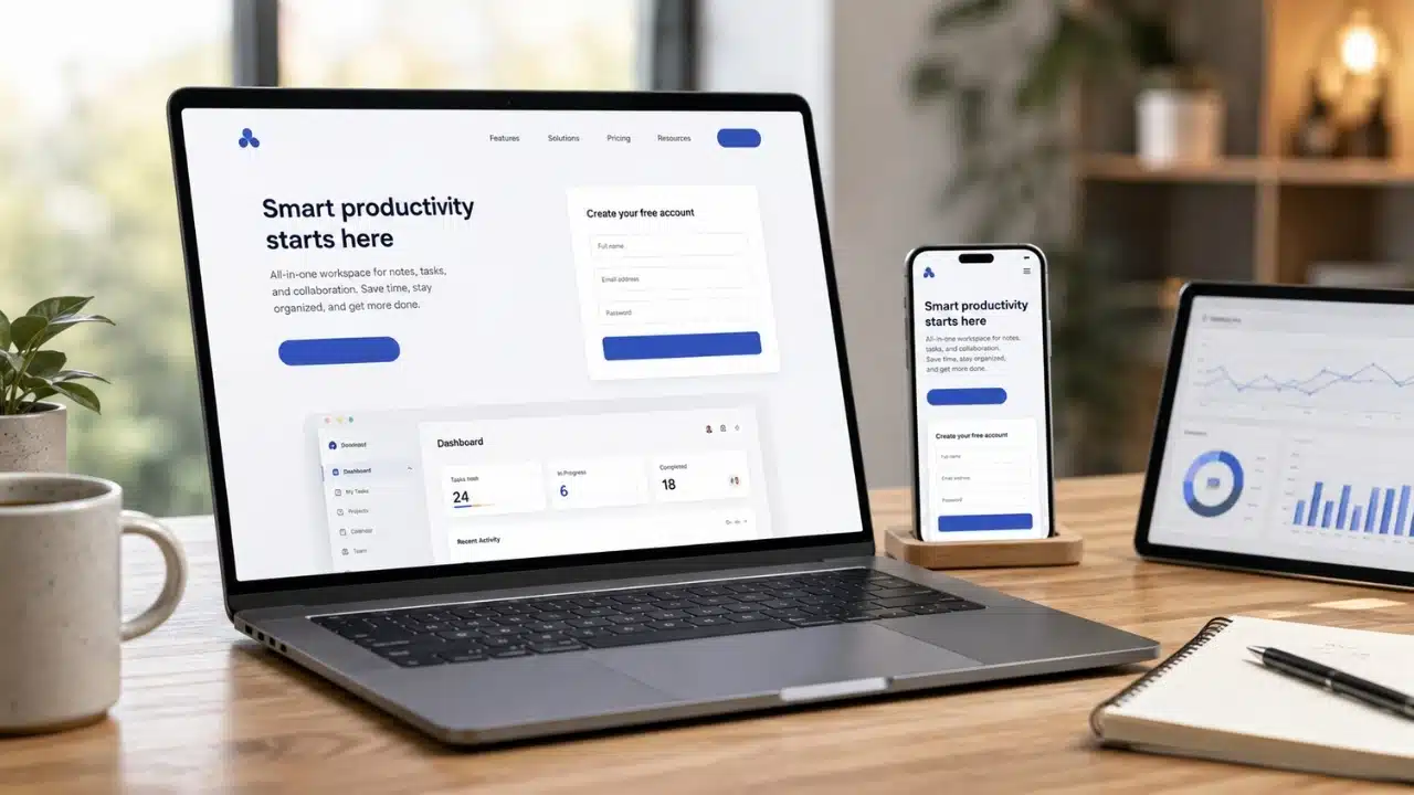
Trust is the currency of conversion. When a visitor lands on your site and sees a perfectly lit stock photo of people shaking hands in a glass boardroom, their brain immediately registers it as inauthentic. Real photos of your actual product, your team, or your software interface perform significantly better because they ground your claims in reality. If you must use visual assets, prioritize raw product screenshots over polished corporate models.
5. Forgetting Mobile Users in the Design Process
Most pages are designed by professionals sitting at large desktop monitors, which leads to a massive disconnect when the actual traffic arrives via smartphones. A layout that looks beautiful on a 27-inch screen often turns into a cramped, unreadable mess on a mobile device. Buttons become too small to tap, text requires pinching to read, and pop-ups completely hijack the screen. Design for the mobile experience first, not as an afterthought.
6. The Worst of All Landing Page Mistakes: Conflicting Goals
A landing page is not a homepage. A homepage is meant for exploration, but a landing page must have a singular, focused objective. One of the most destructive landing page mistakes is giving the visitor too many options. If you ask them to sign up for a newsletter, read your latest blog post, follow you on Twitter, and buy your premium software all on the same screen, they will likely do none of those things. The paradox of choice paralyzes buyers.
7. Burying the Realistic Pricing Details
Consumers are exhausted by software companies that force them to “Book a Demo” just to find out if the product costs $50 or $5,000. While enterprise sales often require custom quoting, refusing to offer even a baseline pricing tier creates immense friction for small and mid-market buyers. If a visitor assumes your product is out of their budget because you hid the price, they will leave and buy from a competitor who embraces transparency.
Why Ad-to-Page Consistency Matters
You can build the most beautiful, high-converting layout in the world, but if it does not match the advertisement that drove the click, it will fail. This is known as ad scent. If your Facebook ad promises “50% off winter boots,” but the user clicks through and lands on a generic homepage featuring summer sandals, they will instantly bounce. The headline, imagery, and offer on the destination page must perfectly mirror the promise made in the initial advertisement.
What to Fix First to Save Your Ad Spend
Do not try to overhaul your entire marketing funnel in one afternoon. If you are struggling with poor performance, start by looking for the most obvious friction points. Remove unnecessary fields from your forms, ensure your headline clearly states what you actually sell, and check how the page loads on your phone. Fixing these basic landing page mistakes will almost always yield an immediate improvement in your cost per acquisition and overall sales volume.
Frequently Asked Questions (FAQs) About Landing Page Mistakes
How long should my landing page be?
The length of your page should directly match the complexity and price of your offer. A simple free email newsletter sign-up requires very little copy, while a $2,000 professional certification course requires a long-form page to build trust, handle objections, and detail the curriculum.
No, you should remove all standard website navigation links from your dedicated campaign pages. A navigation menu gives visitors an easy escape route to wander over to your “About Us” or “Careers” pages, distracting them from the specific conversion goal.
What is a good conversion rate to aim for?
Conversion rates vary wildly by industry, traffic source, and the specific action you are asking for. A free webinar registration might easily hit a 15% conversion rate, while a direct sale for a high-ticket software subscription might be highly profitable at just 2%.