Your WordPress site should look great and load fast on phones. Many responsive wordpress themes claim that, yet some still slow down or break on small screens. Mobile traffic now makes up most visits. A slow theme costs clicks and search rankings.
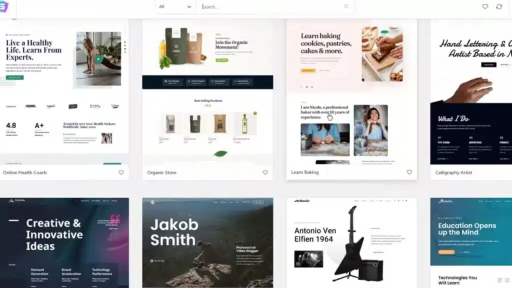
This guide spotlights 10 responsive WordPress themes built for mobile optimization. Each one was checked for speed, clean code, search engine optimization, and smooth use with page builders like Elementor Pro and Divi Builder. Ready to stop losing visitors and fix the phone experience? Keep reading.
Key Takeaways
- Mobile visitors are the majority today, so fast themes like the Astra theme help keep people engaged. Astra loads in under 2.1 seconds with a PageSpeed score of 93 out of 100.
- Lightweight themes such as Neve and GeneratePress keep sizes under 30 KB and requests under 15, which helps pages load quickly on weak connections.
- Divi offers deep customization without code. Kadence scores a perfect mobile SEO rating and hits a 2.6 second load time.
- WooCommerce-focused options like Storefront and Botiga ship touch-friendly layouts that make shopping easy on phones and tablets.
- Clean code, steady updates, and builder or SEO plugin support are key if you want strong Google rankings and low bounce rates on mobile.
What makes Astra lightweight and fast for mobile optimization?
Astra moves like a cheetah after lunch. The frontend is under 50 KB and makes only 12 HTTP requests. HTTP requests are the files a page asks the server to send, fewer requests usually mean faster loads.
Pages can load in about 2.1 seconds. A mobile PageSpeed score of 93 out of 100 looks great to search engines and readers. First Contentful Paint, the time until the first text or image appears, is about 2.1 seconds. Largest Contentful Paint, the time until the main content shows, lands near 1.8 seconds.
Engineers trimmed the code so WooCommerce integration stays smooth. Total Blocking Time is reported at zero, which keeps taps responsive on any device. Starter templates help you launch fast without big design files or heavy tools like Photoshop.
How does Divi offer versatile and mobile-friendly design options?
Divi makes building pages feel simple. The visual builder uses drag and drop, so you can switch layouts for phones, tablets, and desktops with no code. Change fonts, colors, and columns in a few clicks.
Mobile speed holds up well. The PageSpeed mobile score is 83 out of 100 and loads land around 3.2 seconds. Average pages weigh about 1.3 MB with 18 HTTP requests, which keeps things light over cellular networks.
Agencies get value from unlimited site usage and Divi Cloud for organizing projects. Built in marketing tools in the layout packs help bloggers and shops publish faster on small screens.
Why choose Hestia for a modern one-page responsive theme?
Hestia keeps the one-page style fresh and fast. It earns a PageSpeed mobile score of 89 out of 100 with a 2.5 second load time. Only 10 HTTP requests and a 687 KB page keep the site snappy on slow Wi Fi.
First Contentful Paint lands at 2.2 seconds; Largest Contentful Paint drops to 1.2 seconds. More than 100,000 small teams use Hestia today. The live customizer previews changes instantly, so you can shape your brand without guesswork.
Cumulative Layout Shift, the score for layout jumps while loading, sits near an ideal mark at 2.3 seconds. Time To Interactive, the point when a page responds to input, is a quick 1.6 seconds with zero blocking time. That helps scrolling feel smooth from top to bottom on any screen.
How is Neve SEO-friendly and optimized for mobile devices?
Neve gives mobile visitors a smooth ride. It scores 92 out of 100 on mobile with load times close to 2.2 seconds. First Contentful Paint is about 2.1 seconds and Largest Contentful Paint runs near 1.9 seconds. Cumulative Layout Shift sits steady at 1.9 seconds to prevent annoying page jumps.
Neve uses vanilla JavaScript and supports AMP, a format that strips pages down for quick loading, for stronger search engine optimization out of the box. With only nine HTTP requests and a 593 KB page size, it loads quickly even on spotty connections.
The flexible header and footer builder works with Elementor Pro and other page builders without slowing your site. The default theme size is only 28 KB, which is tiny compared to many themes on WordPress.org.
What customization features make OceanWP mobile-ready?
OceanWP gives you fine control over mobile views. Page level settings in the live customizer let you adjust header style, logo size, and menus for phones without code. The theme stays lean, scoring 87 out of 100 on mobile and loading in about 3.1 seconds.
WooCommerce integration works well on small screens. Product grids, carts, and checkout remain easy to tap. Free and premium extensions add sticky headers and off canvas menus that fit thumbs nicely.
OceanWP supports RTL languages for global sites and offers regular webinars. For anyone serious about responsive WordPress themes, it keeps every touchpoint friendly across devices.
Why is SeedProd ideal for landing pages and mobile usability?
SeedProd is built for fast landing pages. The drag and drop builder keeps layouts clean, so pages load quickly even on weak Wi Fi. With WP Rocket and SeedProd together, page size drops from 1.4 MB to about 780 KB.
HTTP requests fall from 16 to 8. Total Blocking Time goes to zero, and Cumulative Layout Shift improves from 2.6 seconds down to nothing. That means no jumping images and fewer distractions while people scroll.
Use it when you want a focused mobile funnel. Short pages, clear buttons, and quick load times help convert readers on phones and tablets.
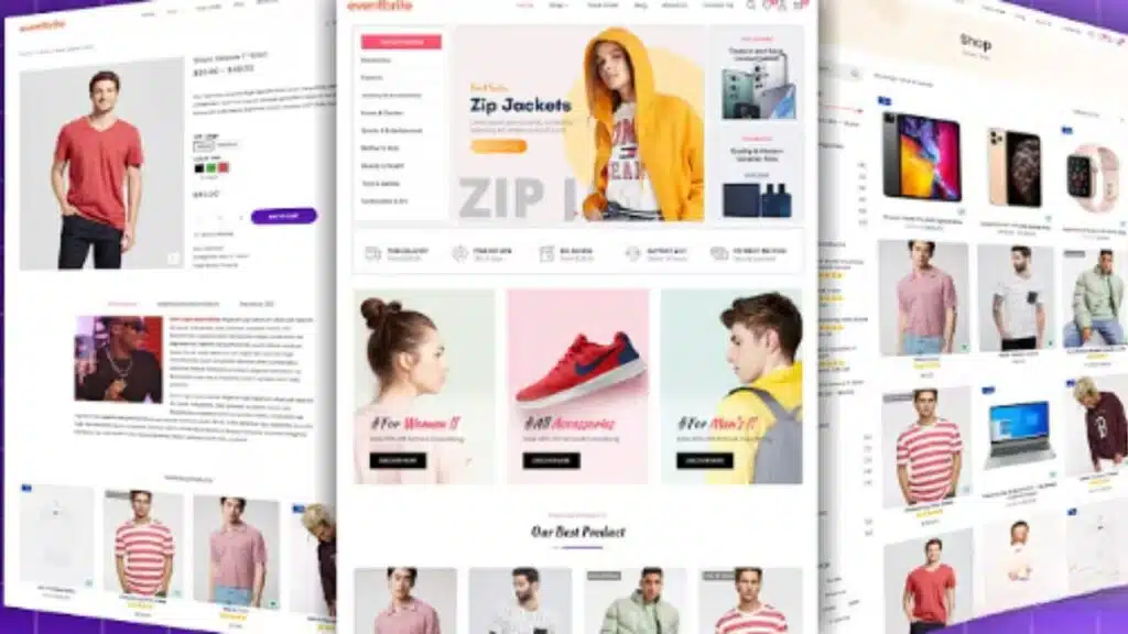
How does Botiga enhance mobile shopping with WooCommerce?
Botiga upgrades the mobile shopping experience for WooCommerce. Fast loads and touch friendly product grids make browsing simple. Checkouts stay clear, so shoppers finish without extra steps.
Starter templates look sharp across devices. Botiga works with SEO plugins like Yoast or Rank Math to help products rank. Mobile payment methods fit the layout, so buyers do not fight tiny buttons or pinch to zoom.
Frequent updates keep Botiga in sync with new WooCommerce features. That helps shops stay ahead in a busy market.
What mobile responsiveness features does Ultra provide?
Ultra brings more than 400 starter templates that flex to any screen. Pair it with WPBakery Page Builder or Visual Composer for layouts that hold up on small devices. Users rate Ultra 4.8 out of 5 from over 5,700 reviews.
The visual header and footer builder makes menus easy to tap. Global color and type tools improve readability, and Google Fonts add clarity. Touch friendly sliders let people swipe through images like flipping pancakes on a Saturday morning.
Accessibility support helps everyone. With trimmed layout shift, pages feel stable on popular mobile browsers.
Why is Sydney a budget-friendly and mobile-optimized theme?
Sydney gives you speed without a big price tag. PageSpeed Insights shows a 99 on mobile and 96 on desktop. GTmetrix reports a full load in 1.1 seconds, about seven requests, and a tiny 39 KB page size.
Business starter templates look polished on any screen. Use the live customizer to tweak headers and typography while keeping text readable on phones. Accessibility features make it easier to move through pages on touch devices.
Sydney supports mobile first indexing and pairs well with SEO plugins like Yoast or Rank Math. Strong install numbers and ratings back its reputation as a reliable budget choice.
How does GeneratePress support lightweight mobile performance?
GeneratePress stays fast thanks to a zipped size under 10 KB. Total page size is about 990 KB with 14 HTTP requests. The mobile PageSpeed score reaches 87 out of 100 and loads in about 2.9 seconds.
Time To Interactive runs at about 1.5 seconds with zero blocking time. First Contentful Paint lands near 3.3 seconds and Largest Contentful Paint at 1.9 seconds, so content appears without long waits.
The modular design lets you enable only what you need. That keeps things clean and smooth on older smartphones and slow networks.
What makes Kadence fast and feature-rich for mobile users?
Kadence is quick and flexible. It earns a mobile PageSpeed score of 88 out of 100 with 2.6 second loads. First Contentful Paint is about 2.3 seconds and Largest Contentful Paint comes in at 1.8 seconds. The Speed Index is 1.3 seconds.
Cumulative Layout Shift is reported at 2.9 seconds, which keeps text and images steady while you scroll. Pages average 899 KB and only 10 HTTP requests, so stores and blogs built with Gutenberg or Elementor Pro stay snappy.
Drag and drop controls make site wide changes easy. Mobile SEO checks in at a perfect 100. GTmetrix shows loads as quick as 1.4 seconds for nine simple requests and under 50 KB per visit. Time To Interactive is near 1,500 milliseconds, which means buttons respond fast.
How does Poseidon offer a clean magazine layout with mobile optimization?
Poseidon uses a clean magazine style that fits phone screens well. Pages load quickly and reduce layout shift, so headlines do not jump as you scroll.
Custom widget areas help you place stories and images where readers expect them on smaller screens. Touch friendly menus feel natural when you browse with your thumb. Google Fonts keep headlines sharp and easy to scan.
Poseidon works with the Gutenberg editor for block based layouts. Lightweight code helps big sites handle heavy mobile traffic.
Why is Hueman suited for content-driven blogs with responsive design?
Hueman puts your writing first. Adjustable sidebars adapt smoothly to phones and tablets. Fast loads help mobile visitors stick around.
Google Fonts keep headlines crisp. Built in schema, the data that helps search engines understand pages, improves rich results for your posts.
Touch navigation feels natural. It plays well with top SEO plugins and gets regular updates, so performance keeps improving for busy blogs.
How does Storefront integrate WooCommerce with mobile focus?
Storefront brings tight WooCommerce integration with a mobile first approach. Product pages and checkout flow smoothly, even with one thumb. Quick loads prevent abandoned carts.
Headers and footers adjust so menus are always easy to find. Product images look clear on small screens. Schema support helps search engine optimization and can boost clicks from search engines.
Storefront supports the full range of WooCommerce plugins and add ons. Updates ship alongside WooCommerce releases. Use the live customizer to tweak colors and buttons without touching code.
What mobile adaptability features does BeTheme include?
BeTheme ships with more than 650 prebuilt sites. You can import a demo that fits phones quickly. WooCommerce flows well with its dynamic query builder, so shopping feels easy on any device.
Mobile PageSpeed hits 79 out of 100 with loads at about 3.8 seconds. First Contentful Paint appears at 4.2 seconds and Largest Contentful Paint at 2.9 seconds. A Speed Index of 1.8 seconds and Time To Interactive at 1.2 seconds keep waiting to a minimum.
Updates arrive often to match new phone features and standards.
How does Avada provide fully customizable mobile-ready templates?
Avada is the top selling theme on Envato for good reason. Fusion Builder makes customization fast, even for beginners. Every template adapts to phones and tablets thanks to live design controls and a handy drag and drop builder.
Agencies love the one click demo import for quick project starts. On mobile, Avada scores 86 out of 100 with a 2.8 second load time. First Contentful Paint is 2.1 seconds and Largest Contentful Paint is 1.5 seconds.
Pages average about 1.1 MB with only 13 HTTP requests, so browsing feels smooth even on café Wi Fi. Fusion Builder lets you control fonts, colors, headers, widgets, and layouts right in the dashboard. No coding needed, and SEO friendly setups are easy.
Why choose Inspiro for video backgrounds with responsive design?
Inspiro brings mobile friendly video backgrounds without slowing the page. It ranks among the top SEO friendly themes for 2025, which helps phone speed and discovery.
It blends smoothly with the Gutenberg editor and the Elementor page builder, so you can place videos exactly where they work best. Built in schema can raise your search visibility on phones.
Touch navigation stays smooth during playback, so viewers keep watching. Custom overlays and adjustable fonts keep text readable over any clip. Updates come fast, and WooCommerce support makes selling next to video simple.
What makes Altitude Pro impactful for single-page mobile sites?
Altitude Pro shines on single page mobile sites. Loads are quick and sections are tuned for smooth scrolling, which makes thumb navigation easy and natural.
This StudioPress theme includes schema and structured data to help search engines rank the site. It works with the Gutenberg editor, so you can build responsive content blocks quickly.
Global color and typography controls keep branding consistent. Clean Genesis Framework code and steady updates support strong performance and conversion out of the box.
How does Spectra make complex designs mobile-friendly?
Spectra pairs well with Elementor Editor and block based builders. Google Fonts and global color controls adapt to any screen, so headlines and buttons stay readable.
It supports pinch to zoom, touch friendly sliders, and tabs that snap under your thumb. Speed holds up thanks to smart code minification, a process that strips extra characters to reduce file size.
Accessibility tools help more people use your site on phones and tablets. Built in schema supports mobile SEO, and WooCommerce integration keeps carts tidy on every device.
Why is Maxwell reader-focused and optimized for mobile blogs?
Maxwell favors readers. Clean, mobile first layouts highlight posts without clutter. Touch friendly menus and sharp previews make scrolling easy.
Pages load quickly, and fonts from Google keep text crisp on small screens. Layout options in the live customizer adapt to any device in a few clicks.
Low layout shift keeps content steady while loading. Regular updates help Maxwell meet modern mobile standards. It also works with SEO plugins like Yoast for better visibility on smartphones.
How does Tracks improve visual content with mobile responsiveness?
Tracks shapes images and galleries to fit any screen. Touch friendly sliders invite swipes, so people browse without effort. Media heavy pages still load fast, which reduces bounce.
It integrates with the Gutenberg editor for layout control without extra clutter. Global color and font settings carry your brand across devices.
Lightweight code helps performance on phones and tablets. Frequent updates keep pace with new mobile standards and hardware.
Why is Ashe perfect for blogs and shops on mobile devices?
Ashe is built for phones and tablets. It loads fast, pairs well with WooCommerce, and handles mobile shopping with ease. Posts are easy to read thanks to touch friendly menus and large share buttons.
Blog layouts adjust to any device, and photos still pop on small screens. You can tweak headers or use the Gutenberg editor and Elementor for deeper control.
Structured data helps stores show up better in search. With steady updates since 2018, Ashe tracks new WordPress versions and keeps features crisp on smartphones.
Takeaways
Choosing a theme feels a bit like finding shoes that fit. Fast picks like the Astra theme and the Neve theme give your site quick feet, which keeps mobile visitors happy.
Divi and Kadence add friendly drag and drop controls, while Hestia and Botiga keep stores and one pagers sharp on phones and tablets. If you run WooCommerce, Storefront or Botiga offer smooth carts and clear checkout on any screen.
Speed matters for search engine optimization and bounce rate. Lightweight themes with clean code usually score better on PageSpeed and rank higher. Pick from these responsive wordpress themes, then test your pages on a real smartphone before you launch.
FAQs
1. Which responsive WordPress themes work best for mobile optimization?
Astra theme, Neve theme, and Hestia theme stand out for mobile traffic. These lightweight themes load fast on phones and tablets. Genesis framework and Blocksy theme also offer strong mobile support.
2. Can I use drag-and-drop builders with these WordPress themes?
Yes, most of these WordPress themes play well with Elementor page builder, Divi builder, Visual Composer, and WPBakery Page Builder. You can build pages quickly using their drag-and-drop features.
3. Do any of the top ten responsive themes have WooCommerce integration?
Absolutely; Botiga theme, Ultra theme, Sydney theme, and Kadence theme all support WooCommerce integration right out of the box. Selling online gets easier when your store looks sharp on every device.
4. Are there free options among these recommended WordPress themes?
You bet; Astra offers a free version packed with starter templates while Hueman theme is another solid no-cost pick for bloggers or small businesses wanting advanced customization options without breaking the bank.
5. How do these responsive WordPress themes help SEO (search engine optimization)?
Mobile optimization boosts your search ranking since Google favors sites that look good everywhere. Themes like Hestia and Genesis framework are coded cleanly for speed which helps both users and search engines find what they need faster.
6. What extra features should I expect from modern mobile-optimized WordPress themes?
Expect parallax scrolling effects in Inspiro Theme or custom widgets in Responz Theme to spice up layouts without slowing things down. Live customizer tools let you tweak designs instantly so you see changes as you make them—no guesswork required!