

In today’s fast-paced digital world, ensuring that your website is mobile-friendly has become an absolute necessity. With mobile devices accounting for more than half of global web traffic, websites that aren’t optimized for mobile devices risk losing a significant portion of their audience.
If you want to stay ahead of the curve, it’s crucial to implement the best practices to make your website mobile-friendly.
This comprehensive guide will walk you through the 10 best practices that are essential for ensuring your website provides a seamless and optimized experience for mobile users.
Whether you’re a business owner, developer, or marketer, these practices will not only improve user engagement but also boost your site’s SEO rankings.
Introduction to Mobile-Friendly Websites
Mobile-friendly websites are not just a trend—they are a fundamental requirement. With more people using smartphones and tablets for internet browsing, Google has prioritized mobile-friendly sites in its ranking algorithms.
Google’s mobile-first indexing means that the mobile version of your website is considered the primary version, which makes mobile optimization more critical than ever.
How Google’s Mobile-First Indexing Affects Your Website
Google’s shift to mobile-first indexing has made it clear that websites that are not mobile-optimized will face significant SEO consequences. Mobile-first indexing means that Google predominantly uses the mobile version of the content for indexing and ranking.
If your site isn’t mobile-friendly, you’ll not only have a poor user experience but could also experience reduced rankings and traffic.
1. Use a Responsive Web Design

Responsive web design is an approach to web design that makes websites render well on a variety of devices and window or screen sizes. Whether someone is using a smartphone, tablet, or desktop computer, a responsive website ensures that the layout adapts to fit any screen size, providing an optimal viewing experience.
Benefits of Implementing a Responsive Design
- Improved User Experience: Mobile users won’t have to pinch and zoom to read your content, making navigation smoother.
- Better SEO: Google prefers responsive designs as they use a single URL for both mobile and desktop versions, which simplifies indexing and improves SEO.
- Cost-Effectiveness: Rather than creating separate mobile and desktop sites, a responsive design allows you to maintain a single site that works across all devices.
How to Check If Your Website is Responsive
Use Google’s Mobile-Friendly Test tool to check if your website passes mobile-friendly standards. It provides a simple way to determine if your website is optimized for mobile devices and offers suggestions for improvement.
2. Optimize Page Speed for Mobile Devices
In the mobile-first era, speed is a major factor in providing a good user experience. Studies show that 53% of mobile users will abandon a website if it takes longer than three seconds to load. Slow loading times lead to higher bounce rates, and ultimately, fewer conversions.
Tools to Test Mobile Page Speed
There are numerous tools available that can help you test your website’s speed on mobile devices. Some of the most popular options include:
- Google PageSpeed Insights: Provides a detailed analysis of how well your page performs on mobile devices and gives suggestions for improvements.
- GTmetrix: Offers insights into your page speed, loading times, and mobile optimization.
- Pingdom: Another excellent tool that provides detailed performance data and suggestions for improving load times.
Actionable Tips to Improve Mobile Load Time
- Compress Images: Large image files are one of the biggest culprits for slow load times. Compress your images using tools like TinyPNG to reduce their size without sacrificing quality.
- Minify CSS, JavaScript, and HTML: By reducing the size of your code files, you can significantly decrease load times.
- Enable Browser Caching: Use caching to store files locally in users’ browsers so they don’t have to reload the entire page each time they visit.
- Use a Content Delivery Network (CDN): CDNs distribute your content across multiple servers globally, making your website load faster for users no matter their location.
Mobile screens are much smaller than desktop screens, making navigation one of the most important aspects of mobile optimization. A cluttered or complicated navigation system can confuse users, leading them to leave your site prematurely.
How to Optimize Menus and Links for Small Screens
- Hamburger Menu: A collapsible menu (also known as a hamburger menu) is a space-saving solution that allows you to keep the navigation clean and organized.
- Sticky Navigation: Sticky menus stay at the top of the screen as users scroll, making it easy to access important links without having to scroll back to the top.
- Large, Touchable Buttons: Ensure that navigation buttons and links are large enough to be tapped easily on a mobile device.
Traditional navigation often includes long dropdowns or horizontal menus that work fine on desktops but can be cumbersome on mobile. In contrast, mobile-friendly navigation uses a simplified approach, often incorporating expandable menus, icons, or sidebars to reduce clutter.
4. Prioritize Mobile-First Content
Mobile readers have different expectations and behaviors than desktop users. They often scan content quickly, so it’s important to structure your content in a way that’s easy to digest on small screens.
- Shorter Paragraphs: Avoid long, dense paragraphs. Use short, digestible chunks of text.
- Bullet Points and Lists: Lists are a great way to break up content and make it scannable.
- Clear Headlines: Use clear, concise headings (H2, H3, H4) that guide users through the content quickly.
Use of Shorter Paragraphs and Clear Calls-to-Action
- Concise Writing: On mobile, users typically don’t have the patience for long, winding sentences. Keep your writing direct and to the point.
- Call-to-Action (CTA): Make your CTA buttons prominent and easy to tap. Avoid placing them too close to other content to reduce accidental clicks.
Interactive Element: Checklist for Mobile-Friendly Content
- Short, scannable paragraphs
- Optimized images with alt text
- Clear, actionable CTAs
- High-contrast text for readability
- Simplified navigation for mobile users
5. Optimize Images and Media for Mobile
Why Image Optimization is Crucial for Mobile Sites
Images are often one of the biggest files on a website. If not optimized, they can significantly slow down your site’s loading time, especially on mobile networks.
Techniques to Compress and Resize Images for Mobile
- Resize Images: Ensure that images aren’t larger than necessary. Resize them to match the dimensions required for your site.
- Compression: Use tools like TinyPNG or ImageOptim to compress images without compromising quality.
- Use Scalable Vector Graphics (SVG): SVG images are vector-based, meaning they scale well on any screen size without losing quality.
Tools for Quick Mobile Image Optimization
- TinyPNG: A user-friendly tool for compressing PNG and JPEG images.
- ImageOptim: For Mac users, ImageOptim is an excellent tool for compressing images without losing quality.
6. Avoid Pop-Ups and Intrusive Ads
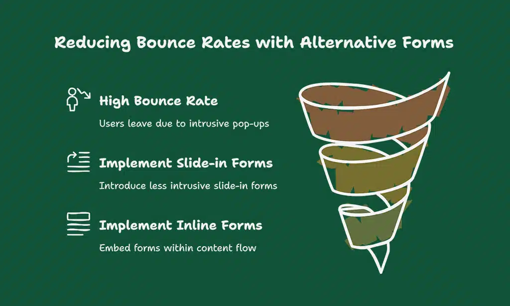
Pop-ups can be incredibly frustrating for mobile users, especially when they obscure content and are difficult to close on small screens. Google has even penalized websites that use intrusive pop-ups, further emphasizing their negative impact on user experience.
Alternatives to Pop-Ups on Mobile Devices
- Slide-in Forms: These forms appear on the side of the screen rather than blocking the main content.
- Inline Forms: Embedding forms directly within the content ensures they don’t interrupt the user’s flow.
Case Study: Effect of Pop-Ups on Conversion Rates
A study by HubSpot found that sites with pop-ups saw a 70% higher bounce rate compared to those without them, leading to a direct decline in conversion rates. Reducing or eliminating pop-ups can lead to a smoother user experience and better engagement.
7. Improve Touchscreen Usability
Mobile devices rely on touchscreens, so it’s important to design your website with easy-to-tap elements. Buttons and links should be big enough to be tapped accurately without zooming.
Designing Mobile Buttons and Links for Easy Taps
- Larger Buttons: Make sure your buttons are at least 44px by 44px to ensure they’re easy to tap.
- Spacing: Ensure there’s enough space between clickable elements to avoid accidental taps.
Example: Button Size and Placement for Mobile Users
A good example of effective button design is the “Buy Now” button on an e-commerce site. It should be large enough to be tapped comfortably with a finger and placed where it’s easily accessible.
8. Test Your Website Across Multiple Devices
Testing your website across various devices ensures that it works seamlessly on all screen sizes and operating systems. This helps identify issues that might not be obvious on a desktop or a single mobile device.
Tools to Simulate Mobile Devices for Testing
- BrowserStack: Allows you to test your website on real mobile devices, ensuring compatibility across different platforms.
- Responsinator: Helps you see how your website looks on different mobile devices and screen sizes.
Checklist for Comprehensive Device Testing
- Test across multiple devices (smartphones, tablets, etc.)
- Use browser developer tools to simulate different mobile devices
- Check touch responsiveness on interactive elements
- Ensure content is not cut off or misaligned
9. Ensure Mobile-Friendly Forms and Checkout Processes
Forms are an essential element of most websites, but they need to be mobile-optimized for a smooth experience. Ensure your forms are easy to fill out on small screens by using large form fields, clear labels, and simple layouts.
Simplifying the Checkout Process for Mobile Users
Mobile users prefer quick and easy checkout processes. Consider offering guest checkout options, reducing the number of form fields, and providing a streamlined payment system like mobile wallets (e.g., Apple Pay or Google Pay).
Interactive Element: Mobile-Friendly Form Checklist
- Large, easy-to-fill fields
- Auto-fill options for common information
- Simplified payment methods
- Visible and easy-to-use submit buttons
10. Implement AMP (Accelerated Mobile Pages)
AMP is a Google-backed project designed to make mobile pages load faster by stripping down unnecessary elements and optimizing content. By implementing AMP, you can significantly improve page load times, which is crucial for mobile users with slower internet connections.
Key Benefits of Implementing AMP for Mobile
- Faster Loading Times: AMP pages load significantly faster than regular web pages.
- Improved User Engagement: Faster pages lead to higher user engagement and lower bounce rates.
- Better SEO: Google rewards AMP pages with improved rankings.
How to Set Up AMP on Your Website
You can easily implement AMP on your website by installing a plugin if you use platforms like WordPress or integrating AMP HTML code manually into your web pages.
Wrap Up: How These Best Practices Improve Mobile User Experience
By implementing these best practices to make your website mobile-friendly, you can ensure that your site performs well on all devices, provides an optimal user experience, and ranks higher in search results. The mobile-friendly design is no longer optional; it’s an essential component of a successful online presence.
Recap of the 10 Best Practices
- Use responsive web design.
- Optimize page speed for mobile.
- Simplify navigation.
- Prioritize mobile-first content.
- Optimize images and media.
- Avoid intrusive pop-ups and ads.
- Improve touchscreen usability.
- Test across multiple devices.
- Ensure mobile-friendly forms and checkout.
- Implement AMP for faster mobile pages.
By focusing on these key practices, you’ll improve your website’s functionality, performance, and user experience across all mobile devices.
A mobile-friendly website isn’t just about meeting Google’s requirements; it’s about providing an exceptional experience for your users. As more people rely on mobile devices for their online activities, investing in these best practices to make your website mobile-friendly will pay off in terms of user satisfaction, conversions, and SEO.
So start optimizing today and ensure your website is ready for the future of digital browsing.