In the highly competitive world of Software as a Service (SaaS), understanding and tracking key metrics in real time is essential for sustained growth and customer satisfaction.
Metrics dashboards enable companies to monitor and analyze crucial data points that impact revenue, user engagement, retention, and overall business health.
This guide delves into 14 essential SaaS metrics dashboards every SaaS company should have for real-time monitoring.
With detailed explanations and actionable insights, you’ll discover how each dashboard can help drive strategic decisions, improve performance, and give your SaaS business a competitive edge.
1. Customer Acquisition Cost (CAC) Dashboard
The Customer Acquisition Cost (CAC) dashboard is essential for tracking how much it costs to acquire a new customer.
CAC includes expenses related to sales, marketing, advertising, and any other costs associated with converting a lead into a customer.
Monitoring CAC in real time is vital for understanding the efficiency of your acquisition strategy and optimizing marketing budgets.
Key Elements of a CAC Dashboard
- Marketing Spend
Shows the total marketing spend on different channels, such as social media, email marketing, and paid advertising. - Sales Expenses
Tracks the costs associated with the sales team, including salaries, tools, and other resources. - Cost per Acquisition by Channel
Breaks down CAC by acquisition channels to identify the most cost-effective strategies.
A CAC dashboard helps you control spending and refine your acquisition strategy, ensuring your customer growth is both sustainable and profitable.
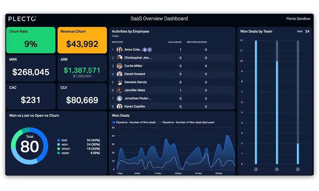
2. Monthly Recurring Revenue (MRR) Dashboard
Monthly Recurring Revenue (MRR) is a core SaaS metric that reflects the predictable revenue generated from customers on a monthly basis.
The MRR dashboard provides insights into revenue trends, showing how much your business is growing month-over-month.
MRR tracking is crucial for understanding the overall health and stability of your business.
Key Elements of an MRR Dashboard
- New MRR
Tracks revenue generated from new customers acquired during the month. - Expansion MRR
Monitors additional revenue from existing customers, such as upgrades or add-on purchases. - Churned MRR
Shows revenue lost due to customer cancellations or downgrades.
By monitoring MRR in real time, SaaS businesses can identify trends, forecast growth, and make informed decisions about scaling operations.
3. Customer Churn Rate Dashboard
Customer churn is one of the most critical metrics for SaaS companies, as it directly impacts revenue growth and customer retention.
The churn rate dashboard allows you to see the percentage of customers that cancel or do not renew their subscription within a specific period.
Monitoring churn rate helps identify retention issues and informs strategies to improve customer loyalty.
Key Elements of a Churn Rate Dashboard
- Monthly Churn Rate
Tracks the percentage of customers lost each month to provide a granular view of churn trends. - Reasons for Churn
Analyzes common reasons why customers leave, such as pricing, product issues, or competition. - Cohort Analysis
Examines churn rates by customer segment, subscription length, or product usage level.
By regularly monitoring the churn rate, SaaS businesses can focus on improving customer retention strategies and increasing long-term revenue.
4. Customer Lifetime Value (CLV) Dashboard
Customer Lifetime Value (CLV) measures the total revenue you can expect from a customer over the duration of their relationship with your business.
The CLV dashboard provides insights into the profitability of different customer segments and helps inform customer acquisition strategies, ensuring that the cost to acquire customers aligns with their lifetime value.
Key Elements of a CLV Dashboard
- Average Revenue per Customer
Tracks the average monthly revenue generated per customer, helping predict overall CLV. - Customer Retention Rate
Shows the percentage of customers retained over a specific period, impacting the expected customer lifespan. - CLV by Segment
Compares lifetime value across different customer segments or subscription plans.
A CLV dashboard helps SaaS companies focus on high-value customers, optimize pricing models, and improve customer satisfaction.
5. Net Promoter Score (NPS) Dashboard
Net Promoter Score (NPS) is a key metric for gauging customer loyalty and satisfaction.
The NPS dashboard collects and analyzes feedback from customers about how likely they are to recommend your product to others.
This metric provides valuable insights into the customer experience and highlights areas for improvement.
Key Elements of an NPS Dashboard
- NPS Score Over Time
Tracks the NPS score on a regular basis, showing changes in customer satisfaction. - Promoters, Passives, and Detractors
Segments responses into promoters (loyal customers), passives, and detractors (unhappy customers). - Customer Feedback
Analyzes qualitative feedback from customers to identify trends and areas for improvement.
Monitoring NPS in real time allows SaaS companies to proactively address issues, build stronger customer relationships, and improve retention.
6. Conversion Rate Dashboard
The conversion rate dashboard measures the percentage of leads or visitors that convert into paying customers.
This dashboard is essential for tracking the effectiveness of marketing and sales efforts, helping you understand which channels or strategies are most successful in driving conversions.
Key Elements of a Conversion Rate Dashboard
- Conversion Rate by Channel
Shows the conversion rate for different channels (e.g., organic, paid, social) to identify the best-performing sources. - Funnel Conversion
Tracks conversion rates at each stage of the sales funnel, from lead to qualified lead to customer. - Cost per Conversion
Calculates the cost associated with each conversion, helping optimize marketing budgets.
A conversion rate dashboard allows SaaS businesses to focus on high-converting channels and improve the overall efficiency of their marketing efforts.
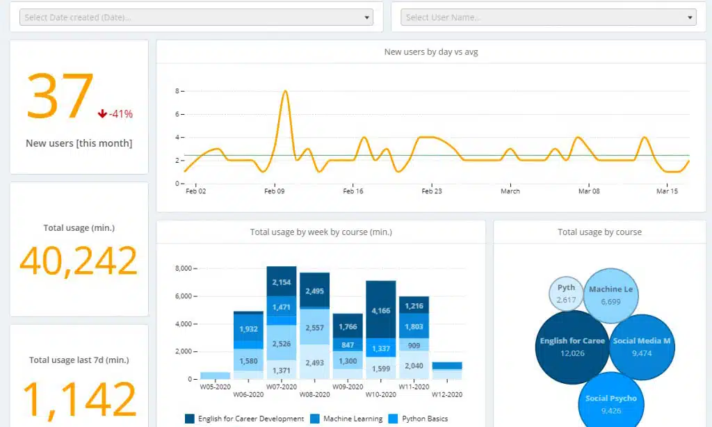
7. Product Usage Dashboard
The product usage dashboard helps you monitor how customers are engaging with your product, providing insights into feature adoption, user behavior, and engagement patterns.
This dashboard is critical for understanding customer needs, optimizing user experience, and improving product development.
Key Elements of a Product Usage Dashboard
- Active Users
Tracks daily, weekly, and monthly active users to understand engagement trends. - Feature Usage
Monitors the frequency of usage for different product features to identify popular and underutilized functionalities. - Session Duration and Frequency
Measures how often and how long customers use the product, highlighting engagement levels.
By analyzing product usage data, SaaS companies can make data-driven improvements to the product and deliver a better user experience.
8. Sales Pipeline Dashboard
The sales pipeline dashboard provides a visual representation of the sales process, showing the progress of leads through various stages of the sales funnel.
This dashboard helps sales teams understand where prospects are in the journey, which deals need attention, and where potential bottlenecks may exist.
Key Elements of a Sales Pipeline Dashboard
- Lead Stages
Tracks the movement of leads through stages like qualified lead, opportunity, and closed deal. - Conversion Rates by Stage
Measures conversion rates for each stage, helping identify points of friction or success in the pipeline. - Average Deal Size and Closing Time
Analyzes the average deal size and time to close, providing insights into revenue potential and sales efficiency.
The sales pipeline dashboard is essential for managing the sales process and ensuring a steady flow of deals through the funnel.
9. Support and Ticketing Dashboard
Customer support is a critical component of SaaS success, and the support and ticketing dashboard allows you to monitor how effectively your team is handling customer inquiries and issues.
This dashboard tracks key metrics like response times, ticket resolution rates, and customer satisfaction.
Key Elements of a Support Dashboard
- First Response Time
Measures how quickly your team responds to customer inquiries, which impacts customer satisfaction. - Ticket Resolution Time
Tracks the average time taken to resolve tickets, indicating support efficiency. - Customer Satisfaction (CSAT)
Analyzes customer feedback on support interactions to measure satisfaction and quality of service.
A support dashboard helps SaaS companies optimize their customer support processes and ensure high-quality service.
10. Revenue Churn Dashboard
Revenue churn, also known as MRR churn, measures the revenue lost from canceled subscriptions or downgrades.
Unlike customer churn, which focuses on the number of customers leaving, revenue churn tracks the financial impact of those losses, providing a more comprehensive view of revenue health.
Key Elements of a Revenue Churn Dashboard
- Churned Revenue by Segment
Tracks revenue churn by customer segment, plan type, or other demographics to identify patterns. - Downgrade Impact
Measures the financial effect of customers downgrading from higher-tier plans to lower-tier plans. - Retention Strategies
Analyzes the effectiveness of retention strategies, such as discounts or renewal incentives.
The revenue churn dashboard helps SaaS companies identify weaknesses in customer retention and take action to minimize revenue losses.
11. Free Trial Conversion Dashboard
Many SaaS businesses offer free trials to attract new users.
The free trial conversion dashboard tracks the rate at which trial users convert to paying customers, helping you understand the effectiveness of your trial offer and identify opportunities to improve the conversion process.
Key Elements of a Free Trial Conversion Dashboard
- Conversion Rate of Free Trials
Tracks the percentage of free trial users who convert to paying customers. - Trial Engagement
Monitors engagement levels during the trial period to understand how usage impacts conversion. - Trial to Paid Conversion by Segment
Compares conversion rates across different customer segments or user types.
Optimizing free trial conversions is key for increasing revenue and improving the effectiveness of lead generation efforts.
12. Cash Flow Dashboard
Cash flow is critical for SaaS businesses, especially for those relying on subscription revenue.
The cash flow dashboard helps monitor cash inflows and outflows, ensuring your business remains financially stable and capable of covering expenses.
Key Elements of a Cash Flow Dashboard
- Monthly Cash Inflows and Outflows
Tracks revenue received and expenses paid each month, providing an overview of financial health. - Operating Cash Flow
Measures the cash generated by core business operations, showing whether the business is profitable. - Forecasted Cash Flow
Provides future cash flow projections based on revenue trends, allowing for better financial planning.
A cash flow dashboard helps SaaS companies maintain financial stability and plan for future growth.
13. Customer Segmentation Dashboard
Customer segmentation is vital for SaaS businesses aiming to personalize their marketing, sales, and support efforts.
The customer segmentation dashboard provides a breakdown of customers based on factors like demographics, usage, and subscription plan, helping you tailor strategies for each segment.
Key Elements of a Customer Segmentation Dashboard
- Segmentation by Demographics
Groups customers based on demographics like age, location, and industry. - Usage-Based Segmentation
Analyzes customers by their level of product engagement, highlighting power users versus casual users. - Churn Rate by Segment
Tracks churn rates across segments to identify at-risk groups.
A segmentation dashboard enables SaaS companies to target their strategies more effectively and improve customer experience.
14. ARR (Annual Recurring Revenue) Dashboard
Annual Recurring Revenue (ARR) is a key metric for SaaS businesses focused on subscription-based revenue.
The ARR dashboard provides a long-term view of revenue stability, showing the predictable income generated from annual subscriptions.
Key Elements of an ARR Dashboard
- New ARR from Acquisitions
Measures ARR generated from newly acquired customers. - Expansion ARR
Tracks additional ARR from existing customers who upgrade or purchase add-ons. - Churned ARR
Shows ARR lost from customers who cancel or downgrade their subscriptions.
Monitoring ARR gives SaaS companies a reliable view of financial health and helps plan for long-term growth and stability.
Takeaway: Harnessing Real-Time Metrics Dashboards for SaaS Success
Real-time monitoring of SaaS metrics through these dashboards allows you to make data-driven decisions that drive growth, improve customer retention, and optimize financial performance.
By incorporating these 14 essential dashboards into your SaaS business, you gain a comprehensive understanding of critical metrics, ensuring your business remains agile, efficient, and ready to scale.