Selecting the right paint color can be one of the most transformative and challenging decisions when designing a room. The right hue can change the ambiance, create a specific mood, and even influence the perception of space.
Whether you’re opting for a crisp white, a moody dark hue, or a vibrant pop of color, the chosen shade can dramatically alter the feel and functionality of your space. With countless options available, finding the perfect color that enhances your decor and stands the test of time can be daunting.
To help you navigate this colorful journey, we have curated a list of 15 paint colors that designers have praised for their ability to transform any room. These shades range from classic neutrals to bold statement colors, offering unique aesthetic and functional benefits.
Whether you’re looking to refresh a living room, bedroom, kitchen, or any other space in your home, these carefully selected paint colors will inspire you to create a beautiful and timeless environment.
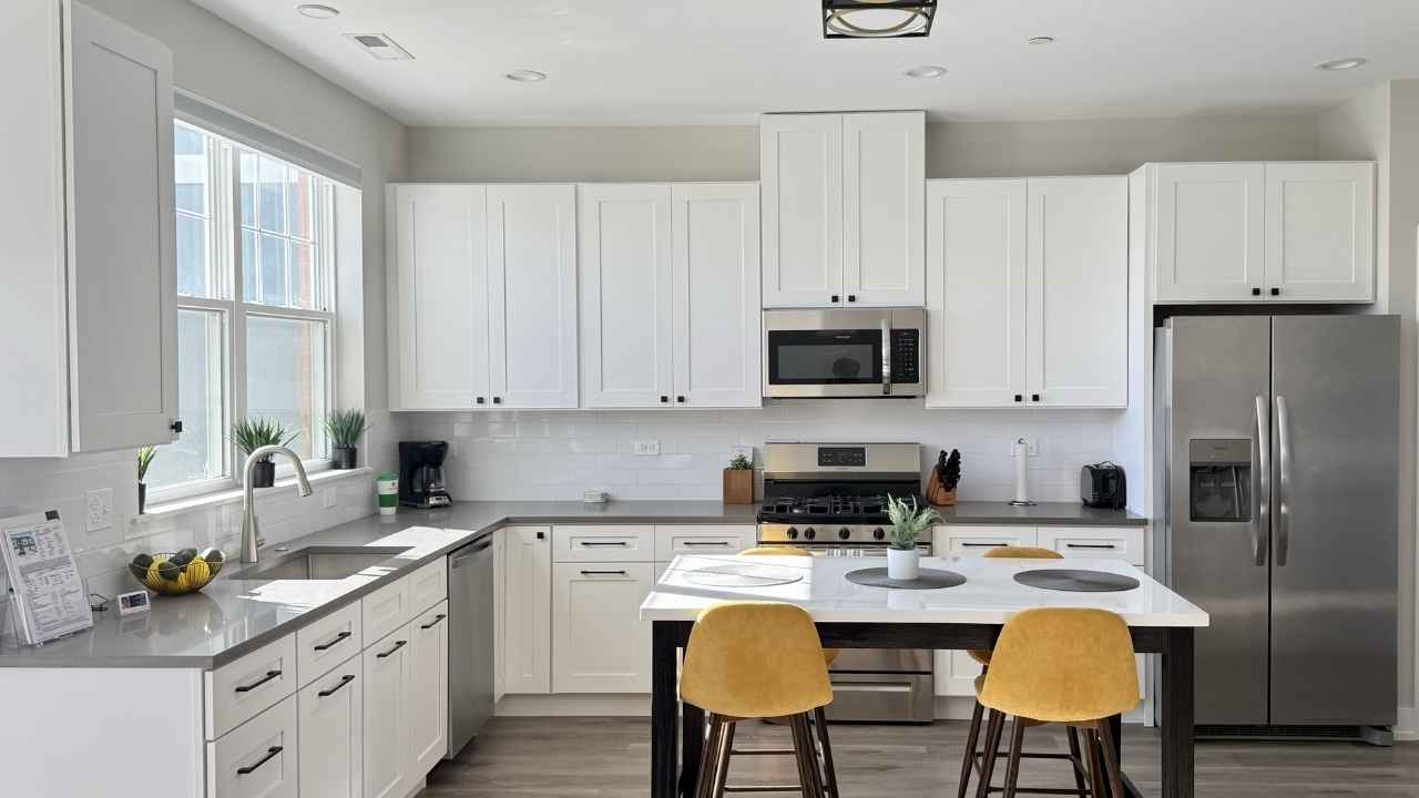
1. Creamy White: Benjamin Moore Chantilly Lace, OC-65
Like Benjamin Moore’s Chantilly Lace, creamy white paint brightens any room. This shade is neither cool nor warm, providing a balanced, clean backdrop that allows other design elements to stand out. It’s an ideal choice for living rooms and kitchens where you want to create an open and airy feel.
Chantilly Lace works well in modern and traditional spaces, offering a timeless appeal that complements various decor styles. This versatile color can also help small spaces appear larger and more inviting.
Moreover, it seamlessly blends with natural light, enhancing the overall brightness of a room without feeling sterile. The subtle undertones make it an excellent canvas for bold furniture or artwork, allowing you to experiment with different styles and accents.
Whether aiming for a minimalist look or a more eclectic vibe, Chantilly Lace provides a flexible foundation that can adapt to your evolving tastes and preferences.
2. Soft Blue: Farrow & Ball Green Blue, No. 84
Farrow & Ball’s Green Blue is a muted blue-green shade that brings any room a calming and sophisticated touch. This color is perfect for creating a serene environment in bathrooms or bedrooms, where tranquility is critical.
The soft hue pairs beautifully with darker tones and natural wood finishes, adding an elegant touch without overwhelming the space. It’s a versatile color can quickly adapt to various styles, from coastal chic to classic elegance, making it a favorite among designers.
The subtle depth of green-blue also makes it a perfect choice for spaces where you want to evoke a sense of peace and relaxation. Its ability to complement both light and dark furnishings allows for a balanced look, making your interiors feel cohesive and thoughtfully designed.
Whether used on walls or as an accent, this color enhances the overall ambiance of a room, making it feel both timeless and contemporary.
3. Warm White: Benjamin Moore Swiss Coffee, OC-45
Swiss Coffee by Benjamin Moore is a warm white that adds a cozy and inviting feel to any room. This off-white shade works well in new builds and older homes, offering a natural, airy appearance that enhances any space.
It’s an excellent choice for creating a neutral palette that allows other textures and colors in the room to shine. Swiss Coffee is particularly effective in living rooms and entryways, providing a timeless backdrop that can be easily updated with different decor elements over time.
The warmth of this color makes it perfect for spaces where you want to promote relaxation and comfort. Its adaptability ensures it can suit various interior styles, from modern to rustic.
By choosing Swiss Coffee, you’re investing in a versatile and enduring color that will enhance the aesthetic of your home for years to come.
4. Subtle Gray: Sherwin-Williams Portsmouth, SW 9644
Sherwin-Williams Portsmouth is a soft, nature-inspired gray that brings a sophisticated touch to any room. This color is perfect for high-traffic areas like kitchens and living rooms, where its subtle undertones can create a timeless and elegant look.
The muted gray shade pairs well with various colors, making it a versatile choice for any home. Whether aiming for a modern, minimalist aesthetic or a more traditional feel, Portsmouth provides a neutral backdrop that complements any design style.
The calming effect of this gray makes it an excellent choice for spaces where you spend a lot of time, ensuring that the atmosphere remains soothing and welcoming. Its versatility allows it to adapt to different lighting conditions, maintaining its beauty throughout the day.
By incorporating Portsmouth into your home, you choose a color that brings a sense of balance and harmony to your living spaces.
5. Bright White: Sherwin-Williams Snowbound, SW 7004
Snowbound by Sherwin-Williams is a bright white with a delicate balance of gray and yellow undertones, making it perfect for spaces that need a touch of warmth. This shade transitions beautifully from natural to artificial light, ensuring a consistent and inviting look throughout the day.
It’s ideal for interiors and exteriors, providing a clean, fresh appearance that enhances any space. Use Snowbound in living rooms, kitchens, or even as a trim color to create a cohesive and welcoming environment.
The versatility of Snowbound allows it to work well in both contemporary and traditional settings, providing a backdrop that highlights the best features of your decor. Its ability to reflect light helps to brighten up darker spaces, making your home feel more open and airy.
Choosing Snowbound ensures that your interiors remain timeless and elegant, providing a neutral canvas for your style to shine.
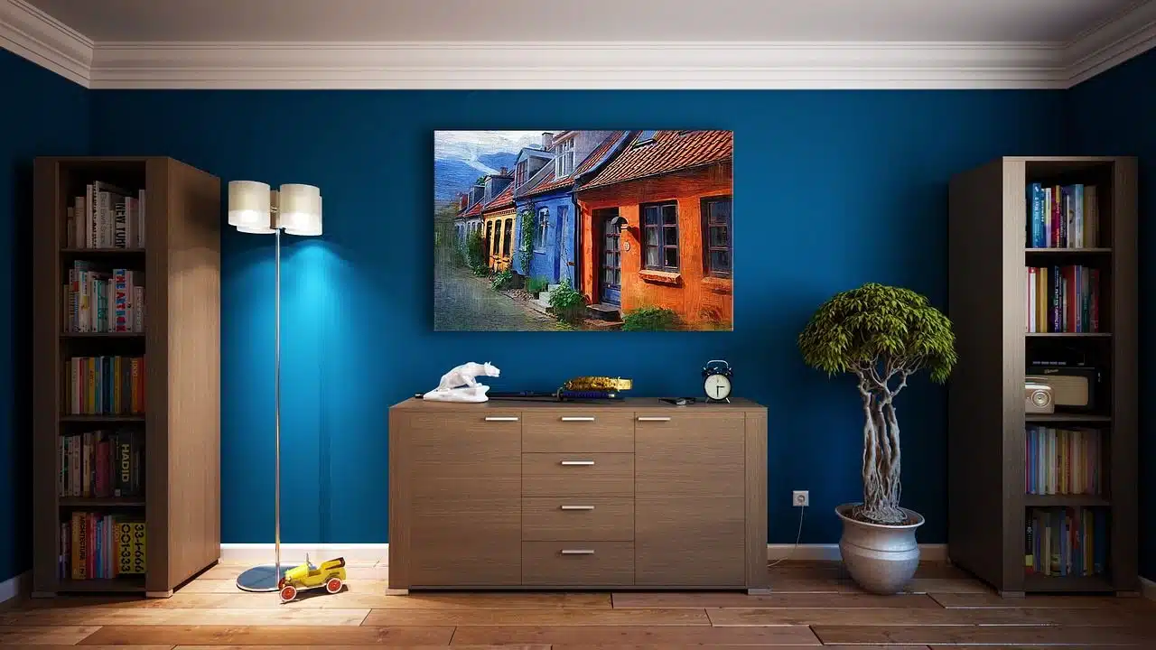
6. Classic Navy: Benjamin Moore Hale Navy, HC-15
Benjamin Moore’s Hale Navy is a bold, timeless navy blue that adds depth and sophistication to any room. This rich color is perfect for accent walls, cabinetry, or entire rooms, creating a dramatic and elegant statement.
Hale Navy pairs well with warm and cool tones, making it a versatile choice for any space. It’s particularly effective in dining rooms, studies, or bedrooms, where its deep hue can create a cozy and inviting atmosphere.
The classic navy shade also works well with metallic accents for a touch of luxury. By choosing Hale Navy, you’re investing in a color that can transform your interiors into sophisticated, stylish spaces that feel modern and timeless.
Its ability to make a bold statement without overwhelming the room ensures that it remains a favorite among designers and homeowners alike.
7. Muted Taupe: Sherwin-Williams Warm Winter
Sherwin-Williams Warm Winter is a muted taupe that brings any room an earthy, sophisticated touch. This neutral color is inspired by natural elements and pairs beautifully with deep blues and warm wooden accents.
It’s versatile and works well in living rooms, bedrooms, and entryways, creating a cozy and inviting atmosphere. The subtle undertones of Warm Winter make it an excellent backdrop for various decor styles, from modern to rustic, allowing you to update your space over time easily.
The warmth of this taupe ensures that your interiors feel comfortable and welcoming, making it a perfect choice for creating a relaxing environment. Its versatility allows it to adapt to different design elements, providing a cohesive and harmonious look for your home.
By incorporating Warm Winter into your decor, you choose a color that enhances the natural beauty of your living spaces.
8. Golden Yellow: Farrow & Ball Sudbury Yellow
Sudbury Yellow by Farrow & Ball is a vibrant yellow that brings energy and warmth to any room. This cheerful color is perfect for kitchens and dining areas, creating a lively and inviting atmosphere.
With white trim and natural wood accents, Sudbury Yellow can make any space more welcoming and bright. It’s an excellent choice for rooms that receive plenty of natural light, enhancing the sunny disposition of the space and adding a touch of cheerfulness to your home.
The vibrant hue of Sudbury Yellow ensures that your interiors feel lively and dynamic, making it an excellent choice for spaces where you entertain guests.
Its ability to uplift the mood of a room makes it a popular choice for areas where you want to create a positive and energetic environment. By choosing Sudbury Yellow, you’re investing in a color that brings a sense of happiness and warmth to your home.
9. Rich Cream: Farrow & Ball Dorset Cream
Dorset Cream by Farrow & Ball adds depth and warmth to any room with its rich, yellow undertones. This creamy neutral is ideal for living rooms and bedrooms, providing a soft backdrop that enhances other warm tones in the space.
It’s a timeless color can make any room feel more inviting and cozy, offering a versatile palette that works well with various decor styles. Dorset Cream is particularly effective in spaces with natural light, where its warm undertones can create a soothing and comfortable environment.
The richness of this cream ensures that your interiors feel luxurious and elegant, making it a perfect choice for creating a sophisticated atmosphere. Its adaptability allows it to suit both modern and traditional designs, providing a cohesive look that enhances the beauty of your home.
By incorporating Dorset Cream into your decor, you choose a color that brings comfort and elegance to your living spaces.
10. Light Yellow: Behr Frittata
Behr’s Frittata is a light yellow that adds a subtle warmth to a room without being overpowering. This shade is perfect for bedrooms and nurseries, creating a serene and cheerful environment.
Its soft hue makes it a versatile choice that can blend well with modern and traditional decor. Frittata works beautifully in spaces with plenty of natural light, enhancing the bright and airy feel of the room. It’s an excellent option for anyone looking to add a touch of warmth and happiness to their home.
The light yellow color makes your interiors feel fresh and inviting, making it a popular choice for spaces where relaxation is essential.
Its ability to complement a variety of design elements allows it to provide a harmonious look that enhances the overall aesthetic of your home. By choosing Frittata, you’re investing in a color that brings a sense of lightness and joy to your living spaces.
11. Deep Green: Sherwin-Williams Basil
Sherwin-Williams Basil is a deep green that brings a touch of nature indoors. This rich color is perfect for kitchens and living rooms, where it can create a warm and inviting atmosphere.
Paired with white or wood accents, Basil can make any space more grounded and sophisticated. The earthy undertones of this shade make it a versatile choice for various decor styles, from rustic to contemporary, adding a touch of elegance and tranquility to your home.
The depth of this green ensures that your interiors feel connected to nature, promoting a sense of Peace and relaxation. Its adaptability allows it to suit different design elements, providing a cohesive and harmonious look that enhances the beauty of your living spaces.
By incorporating Basil into your decor, you choose a color that brings a sense of calm and elegance to your home.
12. Dusty Pink: Farrow & Ball Blooth Pink
Farrow & Ball’s Blooth Pink is a soft, dusty pink that adds a delicate warmth to bedrooms and living spaces. This romantic hue creates a cozy and inviting environment, perfect for spaces where relaxation is essential.
The subtle undertones of Blooth Pink make it a versatile color that can complement various decor styles, from modern to vintage. It’s an excellent choice for anyone looking to add a touch of elegance and femininity to their home without overwhelming the space.
The softness of this pink ensures that your interiors feel gentle and soothing, making it a popular choice for creating a serene atmosphere.
Its ability to enhance other design elements allows it to provide a harmonious look that elevates the overall aesthetic of your home. By choosing Blooth Pink, you’re investing in a color that brings a sense of romance and warmth to your living spaces.
13. Soft Coral: Benjamin Moore Sheer Pink, 894
Sheer Pink by Benjamin Moore is a soft coral that adds a touch of elegance and warmth to any room. This light pink shade is perfect for living rooms and bedrooms, providing a gentle backdrop that enhances other warm tones in the space.
It’s a timeless color can make any room feel more inviting and cozy, offering a versatile palette that works well with various decor styles. Sheer Pink is particularly effective in spaces with natural light, where its warm undertones can create a soothing and comfortable environment.
The softness of this coral ensures that your interiors feel delicate and elegant, making it a perfect choice for creating a sophisticated atmosphere. Its adaptability allows it to suit both modern and traditional designs, providing a cohesive look that enhances the beauty of your home.
By incorporating Sheer Pink into your decor, you choose a color that brings a sense of elegance and warmth to your living spaces.
14. Dark Gray: Sherwin-Williams Iron Ore, SW 7069
Iron Ore by Sherwin-Williams is a dark gray that brings a sense of drama and sophistication to any room. This deep hue is perfect for accent walls, cabinetry, and entire rooms, creating a bold and timeless statement.
Its versatility allows it to coordinate well with warm and cool color schemes, making it a reliable choice for any space. Iron Ore is particularly effective in creating contrast and depth in a room, making it a favorite among designers for modern and industrial spaces.
The boldness of this gray ensures that your interiors feel striking and elegant, making it a perfect choice for creating a dramatic atmosphere. Its adaptability allows it to suit different design elements, providing a cohesive and harmonious look that enhances the beauty of your living spaces.
By incorporating Iron Ore into your decor, you’re choosing a color that brings a sense of sophistication and depth to your home.
15. Vibrant Yellow: Farrow & Ball Sudbury Yellow
Sudbury Yellow by Farrow & Ball is a vibrant yellow that brings energy and warmth to any room. This cheerful color is perfect for kitchens and dining areas, creating a lively and inviting atmosphere.
With white trim and natural wood accents, Sudbury Yellow can make any space more welcoming and bright. It’s an excellent choice for rooms that receive plenty of natural light, enhancing the sunny disposition of the space and adding a touch of cheerfulness to your home.
The vibrant hue of Sudbury Yellow ensures that your interiors feel lively and dynamic, making it an excellent choice for spaces where you entertain guests. Its ability to uplift the mood of a room makes it a popular choice for areas where you want to create a positive and energetic environment.
By choosing Sudbury Yellow, you’re investing in a color that brings happiness and warmth to your home.
Final thoughts
Choosing the right paint color can transform any room, making it more inviting, aesthetically pleasing, and reflective of your style.
From creamy whites and soft blues to deep greens and vibrant yellows, these 15 paint colors offer various options to suit any space.
Whether you’re looking to create a serene retreat or a lively gathering place, the right paint color can set the tone and enhance the overall feel of your home. Explore these timeless hues and find the perfect shade to elevate your interior design.