The bathroom is a vital space in your home—an oasis for self-care and relaxation. When remodeling or updating your bathroom, one of the most impactful features is the vanity.
Whether it’s a bold statement piece or a neutral foundation, the color of your bathroom vanity sets the tone for the entire room.
With design trends evolving constantly, it’s essential to stay updated on the latest choices and avoid outdated colors. In this article, we’ll explore 9 outdated bathroom vanity colors to avoid in 2025.
By understanding which vanity colors to steer clear of, you can ensure your bathroom remains fresh, inviting, and aligned with modern trends.
Why Bathroom Vanity Colors Matter in 2025
The color of your bathroom vanity plays a significant role in how your entire bathroom feels. With bathroom spaces becoming more minimalist and focused on clean lines, the right color can open up a room, making it feel more spacious and serene.
Conversely, the wrong vanity color can overpower the room and make it feel cluttered or outdated. As we enter 2025, it’s essential to embrace colors that offer a timeless appeal while integrating contemporary trends.
The Impact of Color on Bathroom Aesthetics and Value
Beyond aesthetics, the choice of vanity color also impacts the functionality and value of your home. A bathroom with an outdated color scheme can lower the overall appeal of the room and, by extension, your home’s value.
Conversely, choosing on-trend and sophisticated vanity colors can create a lasting impression, elevating both the beauty and potential resale value of your property.
Common Bathroom Vanity Color Mistakes to Avoid
Here are 9 outdated bathroom vanity colors to avoid in 2025, along with alternatives to consider for a fresh, modern look.
1. Golden Oak
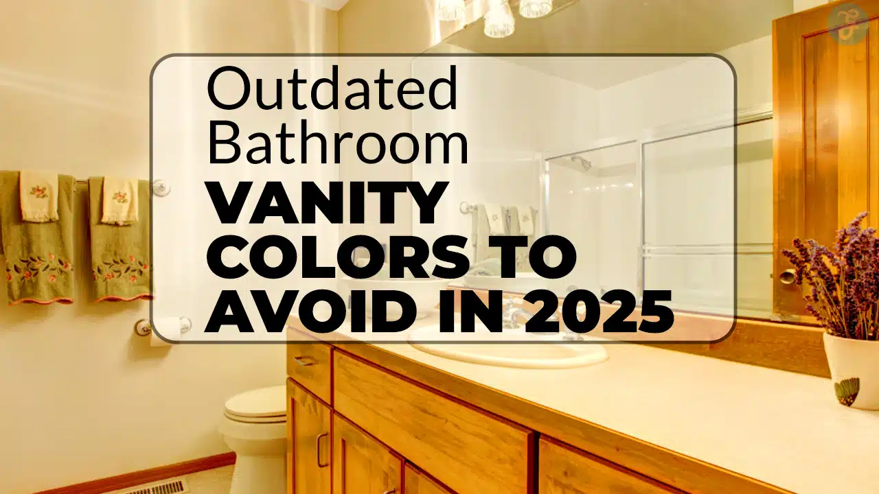
Golden oak was once a staple in bathroom design, especially in the 80s and 90s, beloved for its warmth and traditional charm. However, in 2025, this color feels outdated and overly heavy, particularly when contrasted with modern design trends favoring lighter and more neutral tones.
The yellow undertones of golden oak can create a dated atmosphere that no longer complements contemporary bathrooms that prioritize airiness and openness.
Golden oak also tends to clash with other design elements, making it harder to coordinate with modern fixtures and materials like brushed nickel or matte black hardware.
Alternatives to Golden Oak
Opt for cooler-toned woods like white oak or ash. These are far more modern and versatile, lending a Scandinavian-inspired or minimalist vibe to your bathroom. Alternatively, painted vanities in soft neutral shades like light gray or beige help achieve a more contemporary aesthetic.
| Color | Pros | Cons |
| Golden Oak | Classic, traditional, warm | Outdated, clashes with modern accents |
| White Oak | Light, fresh, versatile | Less bold in comparison to darker woods |
| Soft Gray | Modern, neutral, timeless | Needs complementary accents to avoid plainness |
2. Bright White
Bright white vanities have long been associated with cleanliness and simplicity. However, in 2025, they have lost their charm. Overly stark white vanities can create a cold, almost clinical feeling in your bathroom.
While they offer cleanliness, they also lack warmth and can feel uninviting, particularly in smaller or dimly lit spaces. Additionally, bright white can look harsh under certain lighting conditions, making it difficult to pair with other design elements.
How to Choose the Right Shade of White
Instead of ultra-bright white, opt for softer tones such as ivory, off-white, or eggshell. These shades provide a welcoming, warm feel while maintaining that bright, clean look. This softer approach to white makes the space feel more inviting and balances well with various accent colors and materials.
| Color | Pros | Cons |
| Bright White | Clean, crisp, minimalist | Harsh, cold undertones, too stark |
| Ivory | Soft, warm, timeless | Can appear yellowish with certain lighting |
| Eggshell | Elegant, warm, versatile | May not create enough contrast in large rooms |
3. Dark Mahogany
Dark mahogany has long been associated with luxury and richness in bathroom design. However, as trends in 2025 lean toward more open, airy spaces, the heavy nature of mahogany makes bathrooms feel closed in and smaller.
Additionally, the deep reddish-brown tones of mahogany absorb light, making the room feel darker than it should be, especially in smaller or windowless bathrooms.
Lighter, Airier Alternatives to Dark Mahogany
Consider switching to charcoal gray, navy blue, or light walnut for a more modern and sophisticated vibe. These colors can create a sense of depth and warmth without making the space feel enclosed or dark. Alternatively, whitewashed oak or light birch are great ways to bring in wood textures without the heaviness.
| Color | Pros | Cons |
| Mahogany | Luxurious, elegant, rich | Dark, overwhelming, heavy feel |
| Charcoal Gray | Modern, sophisticated, versatile | Can feel too cold in certain contexts |
| Whitewashed Oak | Light, airy, natural | Can seem too rustic for more polished designs |
4. Cherry Wood
Cherry wood, with its deep reddish hues, was often chosen for bathroom vanities due to its warmth and rich texture. However, its bold tone now feels outdated and mismatched with the cleaner, cooler tones that dominate bathrooms in 2025. Cherry wood can be overwhelming in small spaces and can clash with contemporary bathroom fixtures and colors.
Alternatives to Cherry Wood
For a more balanced, modern aesthetic, consider natural wood finishes like maple, birch, or walnut. These woods offer a warm yet understated feel that aligns with current design trends. If you prefer painted vanities, deep navy or forest green are striking alternatives that bring a contemporary, yet timeless, elegance.
| Color | Pros | Cons |
| Cherry Wood | Rich, warm, luxurious | Bold, clashes with modern elements |
| Maple | Neutral, light, sustainable | Can appear too plain without accents |
| Navy Blue | Bold, sophisticated, modern | Can dominate a small space if overdone |
5. Peachy Beige
Peachy beige tones were once synonymous with calm, earthy spaces, but in 2025, they feel dated. The yellowish tones of peachy beige can create a warm, almost overpowering effect that doesn’t blend well with other popular design trends that favor muted, cooler colors.
Alternatives to Peachy Beige
Opt for taupe, greige, or soft gray vanities for a more contemporary and versatile approach. These neutral tones bring balance and sophistication to your bathroom, working well with almost any accent color. If you love warm hues, consider dusty pinks or soft creams that bring warmth without the dated feel.
| Color | Pros | Cons |
| Peachy Beige | Soft, warm, neutral | Outdated, clashes with modern trends |
| Taupe | Timeless, sophisticated, versatile | Can feel too muted if not paired with other colors |
| Soft Gray | Clean, modern, versatile | Needs careful pairing with accents to avoid blandness |
6. Brass Yellow
Brass yellow once represented luxury and opulence in bathrooms, particularly for faucets and cabinet handles. However, this bright, yellow-toned finish has become outdated, often clashing with more neutral, modern designs. Additionally, brass yellow is difficult to maintain, tarnishing over time and requiring more upkeep.
Alternatives to Brass Yellow
Instead of brass yellow, consider using brushed gold, matte black, or chrome for a more refined, timeless aesthetic. These finishes blend seamlessly with modern fixtures and are easier to maintain.
| Color | Pros | Cons |
| Brass Yellow | Luxurious, classic look | Dated, difficult to maintain |
| Brushed Gold | Elegant, contemporary | Can be too flashy in some designs |
| Matte Black | Sleek, modern, versatile | Can feel too stark in smaller rooms |
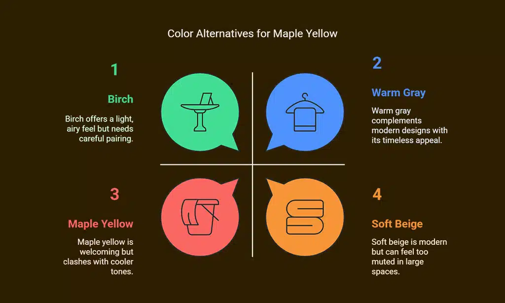
7. Maple Yellow
Maple yellow has a distinct golden tone that, while once considered warm and inviting, now feels out of place in a modern bathroom. The yellow undertones of maple yellow can make the space feel dated, and the color doesn’t pair well with the cooler tones that dominate today’s bathroom trends.
Alternatives to Maple Yellow
Try switching to warm greys, soft beige, or light wood finishes like birch or ash. These offer the same warmth without the outdated feel of maple yellow, and they work well with more neutral or bold accent colors.
| Color | Pros | Cons |
| Maple Yellow | Bright, warm, welcoming | Dated, clashes with cooler designs |
| Warm Gray | Subtle, timeless, sophisticated | Can feel too muted in larger spaces |
| Birch | Light, airy, sustainable | Needs careful pairing to avoid plainness |
8. Red Oak
Red oak is another wood that was once considered high-end but now feels too bold and aggressive for modern bathrooms. Its pronounced grain patterns and strong reddish tone don’t align well with the more neutral and clean aesthetics of current bathroom designs.
Alternatives to Red Oak
Switch to white oak, maple, or light walnut for a more modern, neutral alternative. These woods have a subtler, more refined appearance that works well in contemporary spaces. Alternatively, a painted vanity in a shade like deep blue or forest green can provide the same warmth and richness without the overpowering effect of red oak.
| Color | Pros | Cons |
| Red Oak | Rich, pronounced grain, traditional | Too bold, clashes with modern design |
| White Oak | Light, airy, modern | Can seem too neutral without accents |
| Deep Blue | Bold, modern, elegant | Too dominant in smaller spaces |
9. Lavender or Pastel Purple
Lavender and pastel purple were trendy in past decades but now feel out of place in today’s bathroom design landscape. These colors can make the space feel overly playful or juvenile, which detracts from the calming and serene atmosphere typically sought in modern bathrooms.
Alternatives to Lavender or Pastel Purple
To achieve a more mature and sophisticated look, consider shades like dusty rose, soft mint, or pale gray. These colors provide subtle color accents without feeling overly bold or out of place.
| Color | Pros | Cons |
| Lavender | Soft, calming, nostalgic | Outdated, too whimsical for modern bathrooms |
| Dusty Rose | Elegant, calming, modern | Requires balance with neutral tones |
| Pale Gray | Neutral, modern, sophisticated | Can feel too cold in the absence of warmth |
2025 Bathroom Vanity Trends to Embrace Instead
Now that we’ve covered outdated bathroom vanity colors to avoid, let’s explore top trends for 2025.
Soft Neutral Colors for a Fresh Look
Soft neutrals like taupe, light gray, and beige create a timeless, versatile base for any bathroom. These colors allow other elements, like flooring, countertops, and fixtures, to shine. Neutral-toned vanities also work well in any size bathroom, creating a balanced, harmonious space.
Bold and Dramatic Vanity Colors
If you want to make a statement, go for deep navy, charcoal gray, or forest green. These colors introduce drama without overwhelming the space. They also pair beautifully with gold or matte black fixtures, offering a sophisticated and contemporary look.
Natural Wood Finishes
Natural woods like walnut, white oak, and ash bring warmth and texture to the bathroom. These finishes, particularly in lighter shades, are popular for their ability to blend seamlessly with modern designs. Additionally, incorporating marble or granite countertops alongside these vanities creates a chic, modern feel.
Wrap Up
As we move into 2025, it’s important to avoid outdated bathroom vanity colors like golden oak, bright white, and dark mahogany, which no longer align with modern design trends.
Instead, consider embracing soft neutrals, bold dark shades, or natural wood finishes that are both fresh and timeless. These choices will help you create a bathroom that feels serene, stylish, and up-to-date with the latest design trends.
By updating your vanity color, you not only improve the look of your bathroom but also ensure that your space remains inviting and modern for years to come.
Whether you’re renovating or simply refreshing your space, choosing the right vanity color is a simple yet effective way to enhance the overall aesthetic and value of your bathroom.


