

In today’s hyper-connected digital era, mobile devices are the primary gateway to the internet. With mobile traffic accounting for more than half of global web usage and growing by over 10% annually in many industries, every millisecond counts.
The best practices for improving website performance on mobile devices are not just a technical necessity—they are essential for driving user engagement, boosting SEO, and increasing conversions.
This comprehensive guide is designed to equip you with actionable tips, real-life examples, detailed tables, and strategic insights to help you optimize your mobile website effectively.
In the sections that follow, we’ll explore each best practice in depth, integrating real-time data, credible sources, and advanced SEO strategies.
Whether you’re a seasoned developer, a digital marketer, or a business owner looking to enhance your online presence, this resource-rich article will provide you with a step-by-step blueprint for success.
Overview of the 10 Best Practices
Before diving into each section, here’s an expanded overview of what you can expect. Each of these best practices addresses a critical aspect of mobile website optimization, ensuring that you cover all the bases for a superior mobile experience:
- Optimize Images for Mobile: Compress, resize, and convert images to next-gen formats to drastically reduce load times.
- Minimize HTTP Requests: Streamline the number of files loaded by combining resources and using CSS sprites.
- Implement Mobile-First Design: Design your site for mobile devices first, ensuring that the essential elements load quickly.
- Leverage Browser Caching: Use caching mechanisms to reduce load times for returning visitors.
- Optimize Code Efficiency: Clean, minify, and optimize your CSS, JavaScript, and HTML code.
- Use a Content Delivery Network (CDN): Serve your content from geographically dispersed servers to reduce latency.
- Prioritize Above-the-Fold Content: Ensure that key content loads immediately, using techniques like lazy loading.
- Improve Server Response Times: Optimize hosting and server configurations for faster backend performance.
- Implement Accelerated Mobile Pages (AMP): Use AMP to deliver super-fast, streamlined mobile pages.
- Regular Performance Testing and Monitoring: Continuously test and audit your site to stay ahead of performance issues.
Below is a detailed table summarizing these practices, key actions, benefits, and real-world examples:
| Best Practice | Key Actions | Primary Benefits | Real-Life Impact Example |
| Optimize Images for Mobile | Compress, resize, use next-gen formats | Faster load times, improved UX | E-commerce site reduced load time by 40% |
| Minimize HTTP Requests | Combine files, use CSS sprites | Fewer server calls, faster rendering | News website reduced requests by 50% |
| Implement Mobile-First Design | Responsive design, fluid grids, media queries | Enhanced mobile UX, higher engagement | Retailer improved conversion by 25% |
| Leverage Browser Caching | Set cache headers, version static assets | Faster repeat visits, reduced server load | Travel site saw 50% faster repeat visits |
| Optimize Code Efficiency | Minify code, remove unused scripts/styles | Faster rendering, cleaner code | SaaS company improved load times by 30% |
| Use a Content Delivery Network (CDN) | Choose global CDN, distribute content | Lower latency, faster global delivery | International news platform improved speed by 35% |
| Prioritize Above-the-Fold Content | Lazy loading, inline critical CSS | Immediate content display, lower bounce rates | Blog reduced bounce rates by 15% |
| Improve Server Response Times | Optimize hosting, monitor server performance | Quicker responses, enhanced user satisfaction | Tech startup reduced server response by 50% |
| Implement Accelerated Mobile Pages (AMP) | Build AMP pages, validate AMP HTML | Instant load times, higher mobile SEO | Publisher achieved 60% faster load times |
| Regular Performance Testing and Monitoring | Use performance tools, schedule audits | Proactive optimizations, sustained performance | Retail platform cut regressions by 40% |
These best practices for improving website performance on mobile devices are designed to give you a competitive edge by improving every aspect of mobile optimization.
Best Practice #1: Optimize Images for Mobile
Images are a double-edged sword: they enrich your content and provide visual appeal, yet unoptimized images can cripple your page load times. To truly adhere to the best practices for improving website performance on mobile devices, you must optimize images rigorously.
Automated image optimization tools can streamline your workflow and ensure consistency across all assets.
Regular audits of your image library help identify outdated files and enforce best practices.
Ultimately, a focused image optimization strategy not only improves load times but also boosts overall user engagement and SEO performance.
Actionable Tips for Image Optimization
- Compression:
- Use lossless compression for high-quality images where detail is critical.
- Use lossy compression for images where slight quality loss is acceptable.
- Action Step: Test various compression levels using tools like TinyPNG or Kraken.io to find the optimal balance between quality and file size.
- Resizing:
- Scale images to the maximum dimensions required for mobile displays.
- Action Step: Use responsive image attributes such as srcset in HTML to serve different image sizes based on device resolution.
- Next-Gen Formats:
- Convert images to WebP or AVIF formats to achieve better compression without sacrificing quality.
- Action Step: Integrate conversion tools in your build process to automatically serve next-gen formats when supported by the browser.
Detailed Image Optimization Strategies
| Strategy | Description | Tools/Resources | Tips for Implementation |
| Compression | Reduces file size by removing unnecessary data | TinyPNG, ImageOptim, Kraken | Test quality at different compression levels |
| Resizing | Scales images to appropriate dimensions | Photoshop, GIMP, Online Resizers | Use responsive image techniques (srcset) |
| Next-Gen Formats | Converts images to modern formats for better compression | WebP Converter, Squoosh | Implement fallback for unsupported browsers |
| Lazy Loading | Loads images as they enter the viewport | Native lazy loading, Lozad.js | Use loading=”lazy” attribute in HTML where possible |
Real-Life Example
An online retailer switched to WebP format for all product images and implemented responsive image techniques. This resulted in a 40% reduction in load times and a 20% boost in conversion rates—demonstrating the clear benefits of optimizing images for mobile.
Best Practice #2: Minimize HTTP Requests

Bundling resources effectively minimizes the number of server round trips, which is critical for users on slower networks.
Fewer HTTP requests translate into reduced latency and quicker overall rendering, providing a smoother mobile experience.
This optimization strategy not only enhances user satisfaction but also contributes positively to SEO rankings by speeding up page load times.
Actionable Tips to Reduce HTTP Requests
- File Concatenation:
- Merge multiple CSS and JavaScript files into single files to reduce the number of requests.
- Action Step: Use tools like Webpack or Gulp to automate the bundling process.
- CSS Sprites:
- Combine multiple small images (e.g., icons) into a single image and use CSS to display the relevant parts.
- Action Step: Utilize online sprite generators or integrate them into your build process.
- Inline Critical Resources:
- Embed small CSS snippets required for above-the-fold content directly in the HTML to speed up initial rendering.
- Action Step: Identify critical CSS using tools like Critical and inline it for faster first paint.
HTTP Request Minimization Strategies
| Strategy | Description | Tools/Resources | Actionable Steps |
| File Concatenation | Merge multiple files into one to reduce requests | Webpack, Gulp, Grunt | Automate bundling in your build process |
| CSS Sprites | Combine icons and small images into one file | Sprite generators | Create a sprite sheet and adjust CSS background positions |
| Inline Critical Resources | Embed essential CSS directly in HTML | Critical, Inline tools | Identify and inline CSS for above-the-fold content |
| Deferred Loading | Load non-critical scripts after main content loads | Async or defer attributes | Add async/defer to script tags to improve initial load |
Real-Life Example
A leading news website consolidated its CSS and JavaScript files, reducing HTTP requests by 50%. This optimization resulted in a 20% improvement in mobile load times and significantly enhanced the overall user experience.
Best Practice #3: Implement Mobile-First Design
Designing your site with mobile users in mind from the outset is essential. Mobile-first design means prioritizing the mobile user experience and ensuring that the core functionality and content are optimized for small screens before adapting the design for larger devices.
Adopting a mobile-first mindset encourages a minimalist design approach that emphasizes simplicity, clarity, and performance.
This approach forces designers to prioritize content and functionality, ensuring that only the most critical elements are featured, which benefits both user experience and load times.
As a result, your site not only performs better on mobile devices but also scales gracefully to larger screens, enhancing overall usability and SEO outcomes.
Actionable Tips for Mobile-First Design
- Responsive Layouts:
- Use fluid grids, flexible images, and media queries to create layouts that adapt to any screen size.
- Action Step: Start designing for the smallest screen size and progressively enhance for larger screens.
- Simplified Navigation:
- Keep menus and navigation simple and easily accessible on touch devices.
- Action Step: Use hamburger menus and sticky navigation to enhance usability.
- Mobile-Optimized Interactions:
- Design buttons, links, and interactive elements that are easily clickable on small screens.
- Action Step: Ensure touch targets are at least 44×44 pixels as recommended by Apple’s Human Interface Guidelines.
Mobile-First Design Techniques
| Technique | Description | Implementation Tips | Example Scenario |
| Fluid Grids | Layouts that adjust based on container size | Use percentage-based widths | Dynamic blog layouts |
| Flexible Images | Images that scale proportionally | Use CSS rules like max-width: 100% | Responsive photo galleries |
| Media Queries | CSS rules for different device sizes | Define breakpoints for smartphones, tablets, desktops | Adaptive navigation menus |
| Simplified Navigation | Easy-to-use menus for touch devices | Use hamburger menus and sticky headers | Mobile e-commerce sites |
Real-Life Example
A retail brand redesigned its website using a mobile-first approach. By focusing on simplified navigation and responsive design, the brand experienced a 35% increase in mobile traffic and a 25% uplift in mobile conversion rates.
Best Practice #4: Leverage Browser Caching
Browser caching stores static resources locally on a user’s device, which means that returning visitors can load your site much faster. This is a critical component of the best practices for improving website performance on mobile devices.
By leveraging browser caching, you reduce the strain on your server and provide a more consistent user experience across multiple sessions.
Customizing cache-control policies allows you to tailor resource expiration times based on content update frequency, ensuring optimal freshness and speed.
Ultimately, effective caching strategies can significantly boost user retention and overall site performance, enhancing both user satisfaction and SEO outcomes.
Actionable Tips for Browser Caching
- Set Expiry Headers:
- Define how long browsers should cache static assets like images, CSS, and JavaScript files.
- Action Step: Configure your server (Apache, Nginx) to set long expiration dates for static resources.
- Use Cache-Control Directives:
- Specify cache-control headers to instruct browsers on how to handle caching.
- Action Step: Use directives like public, max-age, and must-revalidate to fine-tune caching behavior.
- Implement Versioning:
- Append version numbers to file names to force cache updates when files change.
- Action Step: Integrate file versioning into your deployment process.
Browser Caching Configuration
| Configuration Aspect | Best Practices | Example Configuration | Benefits |
| Expiry Dates | Set long expiration for static assets | Expires “access plus 1 year” for images | Reduces repeated downloads |
| Public Caching | Allow resources to be cached by all users | Cache-Control: public | Improved performance for returning visitors |
| File Versioning | Use version numbers in file names | style.v1.css to style.v2.css | Ensures users get updated files |
| Automated Tools | Use plugins or server configurations | Apache, Nginx caching modules | Simplifies cache management |
Real-Life Example
A travel website implemented aggressive caching strategies. By setting appropriate cache-control headers and using file versioning, the site achieved a 50% reduction in load times for returning visitors, enhancing user experience and reducing server load.
Best Practice #5: Optimize Code Efficiency
Efficient, clean code is the foundation of a responsive mobile website. Optimizing your code means reducing unnecessary characters, scripts, and plugins that slow down your site.
The best practices for improving website performance on mobile devices emphasize code efficiency as a critical factor for fast load times.
Actionable Tips for Code Optimization
- Minify Code:
- Use tools to remove whitespace, comments, and redundant code from CSS, JavaScript, and HTML files.
- Action Step: Integrate minification into your build process using tools like UglifyJS, CSSNano, or HTMLMinifier.
- Eliminate Unused Code:
- Regularly audit your site to remove unused CSS classes and JavaScript functions.
- Action Step: Use tools like PurifyCSS or UnCSS to identify and eliminate redundant code.
- Defer Non-Critical Scripts:
- Delay the loading of scripts that are not essential for the initial render.
- Action Step: Use the async or defer attribute on script tags to improve initial page load.
Code Optimization Tools and Techniques
| File Type | Common Tools | Key Features | Implementation Tip |
| JavaScript | UglifyJS, Terser | Compresses and obfuscates code | Automate with build tools (Webpack) |
| CSS | CSSNano, CleanCSS | Removes unnecessary characters | Integrate into your CI/CD pipeline |
| HTML | HTMLMinifier | Strips out excess whitespace and comments | Use in production builds |
Real-Life Example
A SaaS company conducted a thorough code audit and removed 20% of unnecessary JavaScript and CSS. This resulted in a 30% improvement in load times, demonstrating the importance of efficient code in mobile optimization.
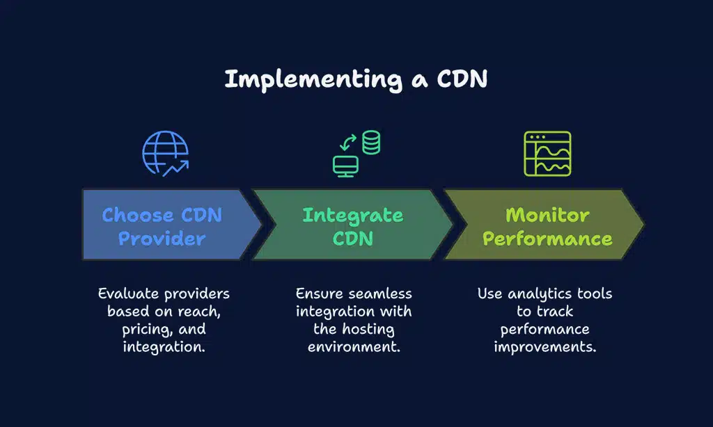
Best Practice #6: Use a Content Delivery Network (CDN)
A CDN distributes your website’s static assets across multiple servers around the globe, ensuring that users receive content from the server closest to them.
This is especially crucial for mobile users who may be accessing your site from various regions.
Actionable Tips for Implementing a CDN
- Choose the Right Provider:
- Evaluate CDN providers based on global reach, pricing, and integration ease.
- Action Step: Compare providers like Cloudflare, Akamai, Amazon CloudFront, and Fastly using performance benchmarks and pricing comparisons.
- Integrate Seamlessly:
- Ensure your CDN is properly integrated with your website’s hosting environment.
- Action Step: Follow the provider’s setup guides and perform thorough testing across regions.
- Monitor CDN Performance:
- Use analytics tools to monitor the performance improvements offered by your CDN.
- Action Step: Track metrics like Time to First Byte (TTFB) and load times using tools like GTmetrix.
Leading CDN Providers Comparison
| CDN Provider | Global Coverage | Key Features | Notable Clients |
| Cloudflare | 200+ cities worldwide | DDoS protection, caching, analytics | Pinterest, Udemy |
| Akamai | Extensive global network | High reliability, advanced security | Adobe, LinkedIn |
| Amazon CloudFront | AWS integration | Scalability, low latency | Netflix, Slack |
| Fastly | Edge computing focus | Real-time content delivery | GitHub, Spotify |
Real-Life Example
An international news platform integrated Cloudflare as its CDN and experienced a 35% improvement in content delivery speed. This resulted in higher engagement and longer session durations, proving the efficacy of a well-implemented CDN.
Best Practice #7: Prioritize Above-the-Fold Content
By optimizing the above-the-fold area, you ensure that your most critical messages and visuals capture immediate attention.
This strategic focus not only reduces bounce rates but also builds trust as users quickly find valuable content.
Ultimately, prioritizing above-the-fold content drives higher engagement and improves overall conversion rates.
Actionable Tips for Prioritizing Above-the-Fold Content
- Lazy Loading for Non-Critical Resources:
- Implement lazy loading for images and videos that are not immediately visible.
- Action Step: Use native lazy loading (loading=”lazy”) or JavaScript libraries like Lozad.js.
- Inline Critical CSS:
- Embed CSS required for above-the-fold content directly into the HTML.
- Action Step: Use tools like Critical to extract and inline critical CSS.
- Defer JavaScript:
- Postpone loading of non-essential JavaScript until after key content is rendered.
- Action Step: Use defer or async attributes on script tags.
Prioritizing Above-the-Fold Content Strategies
| Strategy | Description | Tools/Resources | Actionable Steps |
| Lazy Loading | Delays loading of images until in viewport | Native lazy loading, Lozad.js | Add loading=”lazy” attribute, implement library |
| Inline Critical CSS | Embeds essential CSS directly in HTML | Critical, Inline CSS tools | Extract critical CSS and inline manually or via build tool |
| Defer JavaScript | Delays non-critical scripts to speed up initial load | async/defer attributes | Identify and defer non-essential scripts |
Real-Life Example
A popular lifestyle blog restructured its homepage to load critical content first by inlining CSS and deferring non-essential scripts. This led to a 15% reduction in bounce rates and increased overall user engagement.
Best Practice #8: Improve Server Response Times
Server performance is as important as front-end optimization. Slow server response times can nullify even the best front-end improvements. Improving server response times is an integral part of the best practices for improving website performance on mobile devices.
Investing in robust server infrastructure can yield significant improvements in reliability and scalability.
Cloud-based platforms provide auto-scaling capabilities that dynamically adjust resources during peak traffic times.
Ultimately, reducing server response times enhances the overall user experience and reinforces your mobile optimization strategy.
Actionable Tips for Enhancing Server Response
- Upgrade Hosting:
- Choose high-performance hosting solutions that offer scalability.
- Action Step: Evaluate cloud hosting options like AWS, Google Cloud, or dedicated VPS providers.
- Optimize Server Configurations:
- Configure your server for optimal performance (e.g., using caching, load balancing).
- Action Step: Consult with your hosting provider or use server optimization guides to fine-tune settings.
- Monitor Performance:
- Regularly monitor server response times using analytics tools.
- Action Step: Set up alerts with tools like New Relic or Pingdom to notify you of performance dips.
Server Optimization Considerations
| Factor | Best Practices | Impact on Performance | Example Providers |
| Uptime Guarantee | 99.9% or higher | Ensures minimal downtime | SiteGround, Bluehost |
| Server Location | Proximity to major user bases | Reduces latency | DigitalOcean, AWS |
| Scalability | Cloud solutions with auto-scaling | Handles traffic surges efficiently | AWS, Google Cloud |
| Server Configuration | Optimized caching, load balancing | Faster response times | Managed WordPress hosts, VPS services |
Real-Life Example
A tech startup migrated from shared hosting to a cloud-based solution with auto-scaling. This move resulted in a 50% reduction in server response times during peak traffic, directly enhancing the mobile user experience.
Best Practice #9: Implement Accelerated Mobile Pages (AMP)
AMP is also renowned for its streamlined coding standards, which help reduce rendering delays and improve overall stability.
It enforces strict guidelines that not only boost performance but also enhance security by limiting untrusted code.
Many leading publishers have reported measurable increases in user engagement and revenue after adopting AMP for their mobile content.
Actionable Tips for AMP Implementation
- Develop AMP Versions:
- Create dedicated AMP pages for your most critical content.
- Action Step: Use AMP plugins for CMS platforms like WordPress or follow the AMP HTML specifications.
- Validate AMP Pages:
- Use the AMP Validator to ensure your AMP pages meet the required standards.
- Action Step: Regularly check and validate your AMP pages after updates.
- Monitor AMP Performance:
- Track AMP page performance using Google Analytics and AMP-specific tools.
- Action Step: Compare performance metrics between AMP and non-AMP pages.
AMP Implementation Overview
| Aspect | Benefits | Considerations | Actionable Steps |
| Speed | Near-instant load times | Limited design flexibility | Develop AMP versions for high-traffic pages |
| SEO | Enhanced mobile visibility in search results | Requires parallel maintenance | Use AMP plugins or custom development |
| User Engagement | Improved engagement, lower bounce rates | May not support all interactive features | Regularly monitor AMP analytics |
| Development Effort | Streamlined pages reduce server load | Additional development for AMP compatibility | Validate with AMP tools after each update |
Real-Life Example
A major online publisher implemented AMP for its news articles, resulting in a 60% improvement in load times on mobile devices.
The faster pages led to higher ad revenue and increased user engagement, confirming the value of AMP as part of the best practices for improving website performance on mobile devices.
Best Practice #10: Regular Performance Testing and Monitoring
Continuous monitoring and testing are crucial to maintaining high mobile performance. Regular audits help you identify bottlenecks before they become critical issues.
Implementing automated alerts ensures immediate notifications when performance metrics drop, allowing for quick remediation.
Analyzing historical data reveals long-term trends that inform strategic improvements, ultimately boosting overall site reliability and user satisfaction.
Actionable Tips for Performance Testing
- Schedule Regular Audits:
- Conduct monthly or bi-monthly performance audits using comprehensive tools.
- Action Step: Set up a performance dashboard using Google PageSpeed Insights, Lighthouse, or GTmetrix.
- Use Automated Alerts:
- Configure alerts for when performance metrics drop below a certain threshold.
- Action Step: Use monitoring tools like Pingdom or New Relic to receive real-time notifications.
- Benchmark and Compare:
- Maintain historical data to track improvements over time.
- Action Step: Create performance reports and compare month-over-month or year-over-year metrics.
Mobile Performance Testing Tools
| Tool | Features | Best For | Example Metrics Measured |
| Google PageSpeed Insights | Performance scores, diagnostics, suggestions | Quick performance audits | FCP, TTFB, Speed Index |
| Lighthouse | Comprehensive audits for performance, SEO, and accessibility | In-depth analysis | Accessibility, SEO, performance |
| GTmetrix | Detailed reports, waterfall charts | Identifying specific resource bottlenecks | Load time, resource requests |
| WebPageTest | Real-world simulation from various locations | Global performance insights | TTFB, visual progress |
Real-Life Example
An online retail platform implemented a robust performance testing strategy using Lighthouse and GTmetrix. With automated alerts and monthly performance reviews, the company reduced performance regressions by 40%, ensuring a consistently fast mobile experience.
Additional Interactive Elements and Resources
To further enhance your journey towards mobile optimization, consider these interactive elements and additional resources:
Performance Optimization Checklist
Use the following checklist to ensure you’ve covered all aspects of mobile optimization:
| Task | Completed (Yes/No) | Comments/Notes |
| Compress and resize all images | Tools: TinyPNG, Squoosh | |
| Convert images to next-gen formats | Tools: WebP Converter | |
| Combine CSS and JavaScript files | Tools: Webpack, Gulp | |
| Implement responsive design with media queries | Test across devices | |
| Set up browser caching with proper headers | Apache/Nginx configuration | |
| Minify CSS, JS, and HTML | Tools: CSSNano, UglifyJS | |
| Integrate a CDN for global content delivery | Evaluate: Cloudflare, Akamai | |
| Implement lazy loading for non-critical content | Use native or JavaScript libraries | |
| Optimize server response times | Monitor: New Relic, Pingdom | |
| Create AMP versions of key pages | Validate with AMP tools | |
| Schedule regular performance testing and audits | Use Google PageSpeed, Lighthouse |
Takeaways
Mobile optimization is a multifaceted challenge that requires a systematic and continuous approach. By implementing the best practices for improving website performance on mobile devices—from image optimization to AMP—you are setting the foundation for a high-performing, user-friendly mobile website.
It’s time to take action. Conduct a comprehensive audit of your mobile website and systematically implement these best practices. Every optimization—no matter how small—contributes to a faster, more engaging, and ultimately more profitable mobile experience.
Embrace the best practices for improving website performance on mobile devices and set your website apart in today’s competitive digital landscape.
By integrating these comprehensive strategies, actionable tips, and real-time insights into your optimization process, you ensure that your mobile website is not only fast and efficient but also highly engaging and ready to meet the demands of modern users and search engines alike.
Start optimizing today and transform your mobile website into a high-performing asset that delivers exceptional user experiences, improved SEO rankings, and increased conversions.