
Have you ever clicked on a website and felt lost right away? Maybe it took forever to load, or you couldn’t find what you needed. It’s frustrating, right, when the web just doesn’t work for you.
Here’s a crazy fact, users judge a site in less than a second. That’s super quick, and it shows how vital user experience, or UX design, really is. If your website usability isn’t up to par, folks might just click away.
Don’t worry, though, I’ve got your back with some easy fixes. In this post, we’ll cover 7 simple ways to boost your website user experience instantly. From page speed to responsive design, you’ll learn tips to keep visitors hooked.
Stick with me!
Key Takeaways
- Speed up your website loading time since 70% of users decide to buy based on page speed.
- Make navigation simple with menus of no more than seven items for better user experience.
- Design for mobile users as 71% of digital consumption happens on mobile devices.
- Use clear calls to action like “Grab Your Deal” to guide visitors easily.
- Add white space to improve comprehension by nearly 20%, as per Human Factors International studies.
Optimize Website Loading Speed

Folks, let’s talk about making your website zip along! A slow site can drive visitors away faster than a turtle in a race. Did you know that 70% of users base their buying choices on page speed? Keep your website loading within a few seconds, even with secure connections like HTTPS, to grab that attention.
Speeding things up is easier than you might guess. Optimize your hosting, shrink those hefty images or videos with image optimization, and tap into caching tricks using tools like a content delivery network.
Around 30% of user feedback highlights sluggish loading as a major gripe for some companies. So, tackle this head-on with smart web development moves, and watch your website usability soar!
Hey there, let’s talk about making your website navigation effortless for everyone. Think of your site as a map, and if it’s cluttered, folks get lost fast. Keep your menus clean with no more than seven items.
This helps users find what they need without frustration. Add internal links and a convenient search bar to guide them along. It’s like offering them a direct route to their destination.
Now, imagine this on a phone screen, small and challenging. That’s where hamburger menus come to the rescue for mobile usability. They hide options neatly, so users can tap with ease.
Since people form an opinion of a website in under a second, seamless navigation creates a strong first impression. Make every click matter with a clear path through your web design.
Stick to simplicity, and watch your user experience improve dramatically.
Make Your Design Mobile-Friendly
Crafting a mobile-friendly website is a must today. Did you know that mobile devices make up 71% of all digital consumption worldwide? That’s a huge chunk of users, and if your site isn’t ready for them, you’re missing out, big time.
Stats also show that folks are five times more likely to bounce off a site that doesn’t work well on their phones. So, let’s fix that, quick and easy.
Start by designing for smaller screens first, pals. Use readable fonts that don’t make users squint, and create touch-friendly navigation menus for fat fingers like mine. Tools like Google Analytics can help you track the percentage of mobile visitors, so you know how much to focus on responsive design.
Prioritize website usability on mobile devices, and watch your user experience soar like a kite on a windy day.
Use Clear and Actionable Calls to Action
Hey there, let’s chat about making your website super easy to use with clear calls to action, or CTAs. These are like bright signposts guiding folks to click, buy, or sign up. Stick to just one or two CTAs per page, and make them pop visually so nobody misses them.
This keeps the user experience, or UX, smooth and fuss-free.
Now, spell out exactly what you want visitors to do with your CTA. Say something direct like “Grab Your Deal” or “Join Us Now.” Clear calls to action enhance user experience by pointing users to the next steps without any guesswork.
With sharp website design and bold CTAs, you’re setting up a fantastic path for every visitor to follow.
Incorporate White Space for Better Visual Appeal
Got a website that feels too crowded? Adding white space in your website design can work wonders for user experience (UX). Think of it as giving your content room to breathe, like a cozy living room instead of a packed subway car.
White space, that empty area around text and images, boosts visual appeal and helps visitors focus on what matters. In fact, studies from Human Factors International show it can improve comprehension by nearly 20%.
That’s a big win for keeping folks engaged!
Now, picture your site as a clean canvas. Proper use of white space can bump up engagement by a solid 20%. Keep things simple with clear headlines, a tight color scheme, and limited fonts.
Toss in bullet points and plenty of open areas to guide the eye. This trick in user experience design makes your site feel less like a chore and more like a breeze to explore. Stick with this approach, and watch how your visitors linger longer!
Improve Content Readability
Hey, want your website to shine with easy-to-read content? Keep your words simple and clear, like chatting with a pal over coffee. Break up text with snappy bullet points or bold headings to guide the eye.
It’s like giving your readers a map through a busy city! Curious for more tips to hook your visitors? Stick around and keep reading!
Use clear and concise language
Let’s talk about making your words stand out on your website. In user experience (UX) design, clarity wins over elaborate language every time. UX writing prioritizes user understanding over clever tactics, so keep it straightforward.
Use simple language that everyone can understand, and emphasize customer advantages. This method helps with website usability and aligns with search engine optimization (SEO) best practices.
Keep your sentences short and impactful, just like I’m doing here. Avoid large, puzzling words that could confuse your readers. Imagine it as a casual chat over coffee, leading people through your content smoothly.
Clear web copy makes your site easy to browse, enhancing that vital user experience (UX).
Organize with bullet points or subheadings
Hey there, readers, let’s chat about making your website content pop. Organizing with bullet points or subheadings can truly boost your user experience (UX) by making info easy to grab.
- Break It Down with Bullets: Use bullet points to chop up big chunks of text. This helps with website usability, letting folks scan through fast. Think of it as giving them bite-sized pieces instead of a giant sandwich. It works wonders for blogs or landing pages.
- Guide with Clear Subheadings: Pop in subheadings to map out your content like a roadmap. They create a visual hierarchy, helping users spot key ideas above the fold. This trick keeps readers hooked on your website design.
- Boost Readability for All: Make sure your setup plays nice with tools like a screen reader. Clear headers, tagged with H1 or H2, help everyone navigate your site. It’s a big win for web accessibility and user experience (UX).
- Keep Navigation Simple: Well-organized content aids website navigation, cutting confusion. Subheadings act like signposts, pointing users to what they need. It’s like giving them a friendly nudge along the customer journey.
- Support Your Marketing Goals: Organized text aligns with your digital marketing plans. It highlights calls to action (CTA) clearly, pushing users toward your goals. Whether it’s a checkout process or an ebook download, structure matters.
- Enhance Visual Appeal: Pair bullet points with white space to avoid clutter. This combo makes your page look clean and inviting. It’s a neat way to improve aesthetics and keep internet users engaged.
- Tie to Brand Identity: Use consistent formatting in headers to build brand recognition. Stick to a color scheme or typographic hierarchy that screams “you.” It’s like wearing a signature hat, instantly recognizable on any mobile website.
Prioritize Consistency in Branding and Design
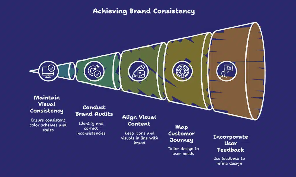
Sticking to a steady look across your site builds trust with visitors. Consistency in branding, like using the same color scheme and style sheets, helps with brand recognition. Think of it as wearing the same cool hat every day, people start to know it’s you! With tools like style guides, you can keep everything matching, from logos to fonts.
This isn’t just pretty, it ties into your digital marketing plan too.
Brand audits also play a big part here. They help spot any odd bits in your website design that might confuse users. Keep your icons and visual content in line with your vibe. Mapping the customer journey, as some experts suggest, lets you match your design to user needs at every step.
So, grab those tips from user feedback, like Dorothy Thompson advises, and make your site a cozy, familiar spot for everyone!
Ensure Accessibility for All Users
Hey there, let’s make your website a welcoming spot for everyone. Accessibility in user experience (UX) means designing so all folks, no matter their abilities, can use your site with ease.
Think about adding alt text for images. This simple step helps visually impaired users understand visual content through screen readers. It’s a small tweak with a big impact on website usability.
Now, consider mobile users too. Craft touch-friendly navigation menus to help those on small screens tap without frustration. Also, embrace responsive web design. This adapts your layout across devices, putting key content front and center on tiny screens.
By focusing on these details, you boost the website user experience for a wider crowd.
Use High-Quality, Original Imagery
Let’s chat about sprucing up your website with top-notch, original imagery. High-quality pictures grab attention and make your site pop, pulling visitors in like a magnet. They boost user engagement and add a fresh vibe, just as Dorothy Thompson pointed out with her focus on fresh content like images.
So, ditch those tired stock photos and go for something real and eye-catching.
Now, think about image optimization to keep things speedy. Use efficient file formats like WebP or AVIF, and compress those jpegs to shrink file size without losing pizzazz. Add alt text for accessibility, so everyone can enjoy your visual content.
With these tweaks, your website design shines, ramps up user experience, and strengthens brand recognition. Keep it lively, and watch your page speed stay snappy!
Collect and Implement User Feedback
Hey there, readers, let’s talk about improving your website by paying attention to your users. Gathering their feedback can genuinely elevate your website user experience, so join me in exploring this!
- Start by creating simple feedback forms or short surveys on your site, as Dorothy Thompson recommends, to understand why users might exit. These tools help identify frustrating problems, such as tricky layouts or confusing content, that cause people to leave high-exit pages.
- Try implementing a Customer Effort Score, or CES, to gauge how simple it is for users to achieve their goals on your site. Include open comment sections in these surveys for richer insights, allowing users to share what’s bothering them.
- Respond promptly to the user feedback you gather to enhance your website’s performance. If someone mentions the checkout process feels like a struggle, address it swiftly to iron out those difficult areas.
- Pay attention to frequent complaints about page speed or mobile-friendly website design through these responses. Hearing directly from users helps you zero in on the exact spots where your site needs improvement.
- Be sure to engage with users at various interaction points to gain a complete view of their user experience, or UX. Their input is invaluable, helping you refine every aspect of your digital presence.
- Use this feedback to foster confidence and strengthen brand awareness by demonstrating that you care about their opinions. When users notice changes based on their input, they feel included, and that’s a victory!
Test and Iterate Regularly
Let’s discuss improving your website continuously. Testing and refining can significantly enhance your user experience (UX) effortlessly.
- Begin by conducting routine evaluations of your website’s performance. This involves searching for errors or issues after the site goes live. Consistent testing helps identify problems quickly, ensuring your visitors enjoy a seamless experience. Consider it a regular tune-up for your site, keeping it operating smoothly for all users.
- Collect user opinions frequently to understand what’s effective and what isn’t. Request feedback from your visitors through surveys or brief polls. Their insights are invaluable, guiding you on where to make adjustments to the website user experience. Use this information to address frustrations at critical interactions.
- Monitor page speed during evaluations. A slow-loading site can turn visitors away, so assess load times with tools like Google PageSpeed Insights. If delays are detected, consider compressing files or refining images. Speed plays a crucial role in UX design, so prioritize this aspect.
- Refresh content to keep it lively and captivating. Did you know nearly 25% of small business websites are updated less than once a year? Avoid being part of that statistic. Introduce new articles, images, or videos regularly. Updated visual content encourages visitors to return.
- Evaluate your website’s structure for simplicity. If users struggle to locate what they need, they’ll abandon the site. Conduct user testing to identify problem areas. Adjust those sections to make exploration effortless and enhance overall website usability.
- Ensure your site performs well on mobile devices. A mobile-compatible website is essential in today’s landscape. Test it across phones and tablets to detect any unusual layouts. Adaptive design ensures satisfaction for users on any screen size.
- Examine your calls to action (CTA) during assessments. Are they straightforward and engaging? Observe if users complete the desired actions or encounter obstacles. Refine the phrasing or positioning to increase engagement and influence behavior.
- Experiment with the color palette and visual organization during refinements. Try different styles to determine what captures interest. Effective design isn’t just attractive; it intuitively directs users. Minor adjustments here can elevate the entire brand experience.
- Be sure to assess compatibility across platforms like WordPress or others in use. Various systems may reveal discrepancies or unusual appearances. Address these early with cross-verifications and adjustments to cascading style sheets (CSS). This maintains uniformity for all users.
- Lastly, establish a timeline for consistent updates and evaluations. Don’t allow your site to become outdated. Schedule content additions and testing on a monthly or weekly basis. This practice strengthens your digital marketing efforts and fosters brand awareness over time.
Takeaways
Hey there, wrapping up our chat on boosting website UX is a blast! Think of your site as a friendly shop; make it easy to roam and folks will stick around. Got a tip or two from our list? Put them to work today, and watch your visitors smile.
Drop a comment with your results, I’m all ears!
FAQs
1. How can I boost website user experience right away with design tweaks?
Hey, let’s chat about sprucing up that website design, shall we? A sharp visual hierarchy, paired with a bold color scheme, can guide eyes to key calls to action (CTA) like a moth to a flame. Toss in some white space, and boom, your user experience (UX) feels less like a cluttered attic and more like a breezy open house.
2. Why does page speed matter so much for user experience?
Listen up, page speed isn’t just a techy detail, it’s the heartbeat of website usability. Slow loading drags down user experiences faster than a turtle in a race, so focus on image optimization and minifying code to keep things zippy.
3. What’s the big deal with a mobile-friendly website for UX design?
A mobile-friendly website isn’t just nice, it’s a must for solid user experience (UX). Responsive design makes sure your site fits any screen, keeping website navigation smooth whether on a phone or desktop. Without it, you’re basically telling half your crowd to take a hike.
4. How do I make calls to action pop for better website functionality?
Alright, wanna make those calls to action (CTA) scream for attention? Place them where eyes naturally land, using visual content or a standout typographic hierarchy, and watch how they nudge user motivations at key touchpoints.
5. Can user feedback really shape a better website user experience?
You bet, pal, user feedback is like a treasure map for improving user experience (UX). It shows where website navigation stumbles or where the checkout process feels like a maze, so you can fix pain points and keep folks coming back for more.
6. How does brand recognition tie into UX design and digital marketing?
Hey there, brand recognition is your secret sauce in UX design and a killer marketing strategy. A consistent color scheme and visual content across touchpoints make your site feel familiar, building trust faster than a handshake at a small-town diner. Plus, it helps bloggers and search engines link your vibe to keyword search results, boosting your digital marketing game.