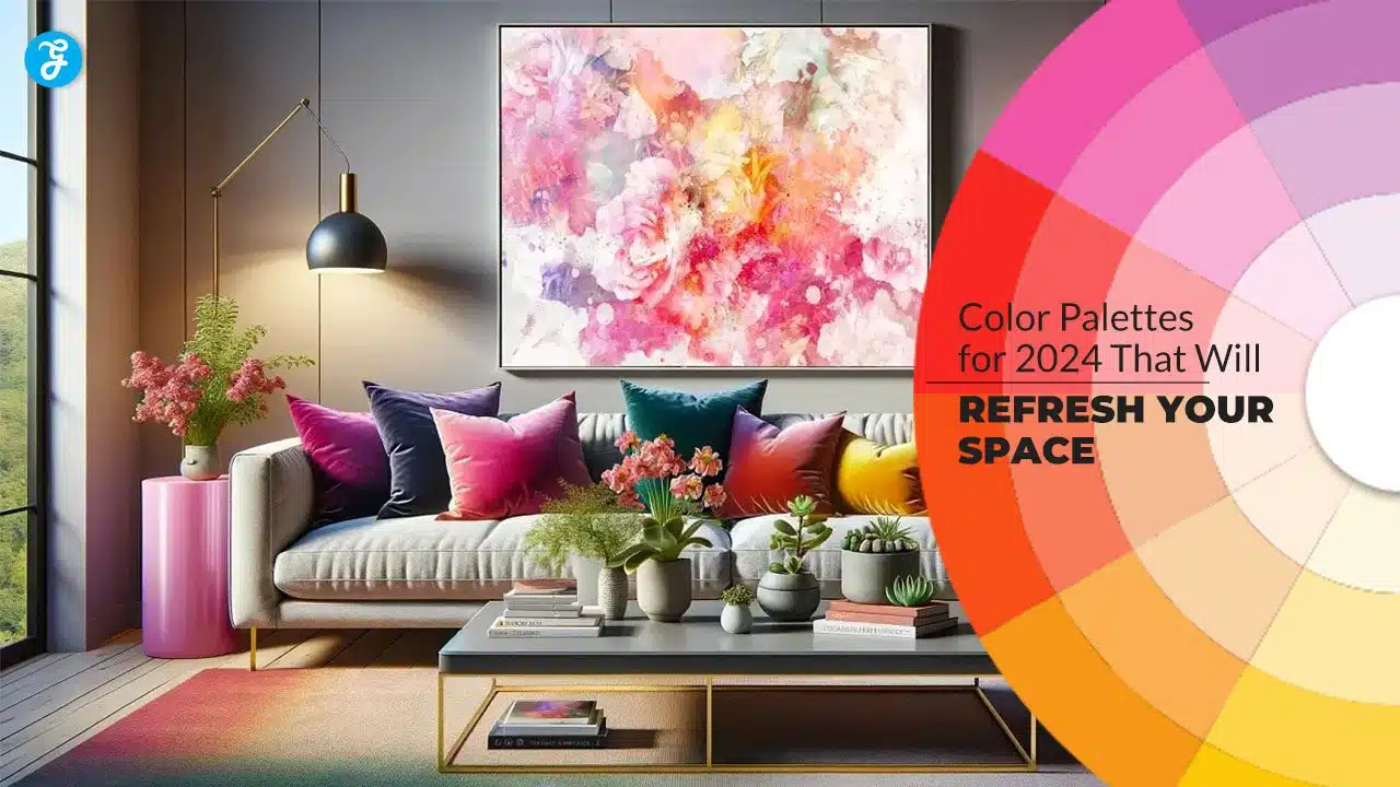
The colors you choose for your home go beyond aesthetics—they influence mood, energy, and even productivity. Each year, design experts and trendsetters unveil new palettes that resonate with modern sensibilities, and 2025 is no exception. This year, the focus is on harmonizing interiors with nature, embracing bold self-expression, and prioritizing comfort through calming tones.
Whether you want to give a single room a facelift or completely transform your living space, these 12 color palettes for 2025 will provide inspiration. Let’s explore how to use these palettes effectively and refresh your home with modern, meaningful color choices.
1. Earthy Neutrals: A Return to Nature
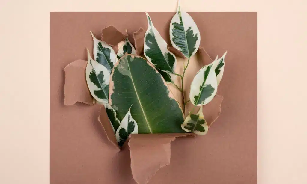
Earthy neutrals like beige, taupe, sand, and terracotta are timeless, offering a sense of warmth and grounding. These tones reconnect your space to natural elements, creating a calm, lived-in vibe.
Why It’s Popular in 2025
- Sustainability Movement: Earthy tones are associated with eco-conscious living.
- Adaptability: These hues complement a variety of interior styles, from rustic to modern minimalism.
Ways to Use Earthy Neutrals
- Living Room: Paint walls beige and accessorize with terracotta vases and throw pillows.
- Bedroom: Pair taupe walls with linen bedding in soft creams and browns.
- Accents: Add clay pots, jute rugs, or bamboo decor to enhance the natural feel.
Pro Tip: Layer different shades of neutrals for depth and sophistication.
2. Moody Blues: The Power of Deep Tones
Rich blues, including navy, indigo, and cobalt, bring elegance and calm to interiors. These hues are versatile enough to create intimate settings or bold statements.
Why It Works in 2025
- Sophistication: Deep blues are luxurious yet approachable.
- Balance: These tones offer serenity while making a strong visual impact.
How to Incorporate Moody Blues
- Accent Walls: Use navy paint to create a striking backdrop for lighter furniture.
- Furniture: Invest in a plush indigo sofa or navy velvet chairs.
- Decor: Pair deep blue ceramics with brass or gold accents for a luxe look.
Best Pairings: Metallic finishes, soft whites, or warm woods.
3. Sunlit Yellows: Cheerful and Inviting
Yellow symbolizes joy and energy, making it perfect for spaces that need a burst of vibrancy. For 2025, muted sunflower and marigold yellows are trending over brighter neon tones.
Why It’s Trending
- Optimism: Post-pandemic design trends favor colors that uplift the spirit.
- Versatility: Yellow works in both modern and traditional interiors.
Styling Tips
- Kitchen: Paint cabinets in soft marigold for a retro-modern vibe.
- Accessories: Use mustard-yellow throw blankets or rugs to brighten neutral rooms.
- Walls: Pair yellow with gray for a sophisticated contrast.
Pro Tip: Balance yellow with cooler tones like blue or green to avoid overwhelming the space.
4. Forest Greens: Deep, Grounding, and Luxurious
Forest green is making waves as a rich and dramatic color choice. This shade evokes the lushness of the outdoors and pairs seamlessly with natural materials.
Why It’s a Must-Try in 2025
- Biophilic Design: Reflects the growing trend of incorporating natural elements indoors.
- Versatility: Works for both modern and traditional spaces.
Forest Green in Design
- Dining Room: Paint the walls forest green and accent with wooden dining furniture.
- Living Room: Pair green velvet sofas with brass light fixtures.
- Kitchen: Use green tiles for a bold backsplash.
Complementary Colors: Warm neutrals, light beiges, or metallics like gold.
5. Soft Pastels: Subtle Yet Impactful
Pastel shades such as blush pink, mint green, and baby blue bring a gentle, calming ambiance to interiors. They’re ideal for adding color without overpowering a room.
Why It’s Gaining Popularity
- Calming Aesthetic: Perfect for stress-free environments.
- Versatility: Works for minimalist, Scandinavian, or vintage-inspired spaces.
How to Style Pastels
- Wall Paint: Use blush pink or lavender for bedrooms or nurseries.
- Furniture: Incorporate pastel-colored chairs or poufs for a playful touch.
- Accessories: Mix pastel cushions or artwork into a neutral room.
Pro Tip: Pair pastels with crisp whites and metallic accents for a modern edge.
6. Rich Jewel Tones: Vibrancy with Elegance
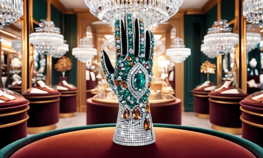
Jewel tones like emerald, ruby, and sapphire make a bold statement in 2025 interiors. These colors exude luxury while adding depth and dimension.
Why They’re Trending
- Opulence: Jewel tones are synonymous with sophistication.
- Seasonal Flexibility: These colors feel cozy in winter and vibrant in summer.
Using Jewel Tones
- Furniture: Add an emerald-green armchair or sapphire-blue ottoman.
- Walls: Use jewel-toned wallpaper with intricate patterns.
- Decor: Combine with metallics like brass or copper for an upscale look.
Best Rooms: Living rooms, formal dining areas, or reading nooks.
7. Warm Greys: The New Neutral
Warm greys strike a balance between stark whites and bold charcoals, offering a neutral base that feels both modern and cozy.
Why It’s Ideal for 2025
- Adaptability: Complements virtually any design style.
- Subtle Warmth: Perfect for creating a welcoming space.
Styling Ideas
- Walls: Use warm grey as a neutral backdrop for bold art pieces.
- Furniture: Opt for a grey upholstered sofa or bed frame.
- Decor: Pair with soft pastels or metallics for a layered look.
Best Use Cases: Hallways, bathrooms, and multi-purpose rooms.
8. Bold Reds: Vibrant and Dramatic
Fiery reds like crimson, brick red, and burgundy are making a comeback as accent colors. They are bold, passionate, and demand attention.
Why It’s Trending
- Energy Boost: Adds life and excitement to neutral interiors.
- Statement Making: Perfect for focal points in minimalist rooms.
Using Bold Reds
- Accent Walls: Paint a single wall in crimson to create a dramatic effect.
- Furniture: Choose a burgundy armchair or red lacquered table for visual impact.
- Decor: Incorporate red vases, artwork, or textiles.
Pro Tip: Balance red with softer tones like cream or beige for a harmonious look.
9. Ocean-Inspired Hues: Relaxation Redefined
Soft blues and greens, such as seafoam, aqua, and turquoise, bring the tranquility of the ocean indoors.
Why It Works
- Calming Influence: Creates a serene and peaceful environment.
- Natural Connection: Complements coastal and tropical aesthetics.
Styling Ocean-Inspired Hues
- Bathrooms: Use seafoam tiles for a spa-like feel.
- Bedrooms: Paint walls aqua and accessorize with crisp white bedding.
- Living Areas: Add turquoise accents through cushions or glass decor.
Complementary Colors: Sandy beiges, crisp whites, or natural wood tones.
10. Burnt Oranges: Vibrant Earthiness
Burnt orange is a warm, earthy hue that adds vibrancy while maintaining a grounded feel.
Why It’s Trending in 2025
- Warmth and Energy: Perfect for making a space feel lively yet welcoming.
- Versatile Pairing: Works well with neutrals and dark shades alike.
Burnt Orange in Design
- Walls: Use burnt orange as an accent wall in living rooms.
- Decor: Incorporate orange rugs, cushions, or lamps.
- Furniture: Opt for a burnt orange velvet sofa for a bold statement.
Pro Tip: Pair burnt orange with navy blue or forest green for a trendy, cohesive look.
11. Crisp Whites: Timeless Elegance
Crisp whites remain a favorite for their versatility, ability to make spaces feel larger, and compatibility with any color palette.
Why It’s Always in Style
- Clean Aesthetic: Enhances light and creates a spacious feel.
- Flexibility: Acts as a perfect backdrop for any decor style.
How to Use Crisp Whites
- Walls: Choose pure white for a minimalist look.
- Trim and Moldings: Use white paint to highlight architectural details.
- Furniture: Pair white couches with colorful throw pillows.
Pro Tip: Layer different shades of white, such as off-white or cream, for added dimension.
12. Muted Metallics: Subtle Glamour
Muted metallics like bronze, champagne, and pewter bring understated luxury to interiors without overpowering the space.
Why It’s Trending
- Modern Elegance: Adds a reflective quality that elevates decor.
- Versatility: Complements almost any color palette.
How to Style Muted Metallics
- Lighting Fixtures: Use bronze or champagne-colored pendant lights.
- Decor: Add metallic vases, mirrors, or trays for a subtle shine.
- Furniture: Opt for tables or chairs with metallic frames.
Best Use: Bedrooms, dining rooms, and entryways.
2025 Color Palettes at a Glance
| Palette Name | Key Features | Best Rooms | Pairing Suggestions |
|---|---|---|---|
| Earthy Neutrals | Warm, natural tones | Living rooms, bedrooms | Wood, terracotta, jute |
| Moody Blues | Deep, calming hues | Offices, bedrooms | Gold, brass, soft whites |
| Sunlit Yellows | Cheerful, vibrant shades | Kitchens, playrooms | Gray, white, light wood |
| Forest Greens | Rich, grounding tones | Dining rooms, libraries | Dark wood, metallics |
| Soft Pastels | Subtle, calming hues | Bedrooms, nurseries | White, floral prints |
| Rich Jewel Tones | Luxurious, dramatic colors | Living rooms, formal spaces | Velvet, metallics |
| Warm Greys | Neutral, cozy tones | Bathrooms, hallways | Wooden accents, art pieces |
| Bold Reds | Vibrant, passionate hues | Dining rooms, focal spaces | Neutral walls, light furniture |
| Ocean-Inspired Hues | Coastal, serene tones | Bathrooms, guest rooms | Driftwood, seafoam accents |
| Burnt Oranges | Warm, earthy shades | Living rooms, patios | Navy blue, cream, green |
| Crisp Whites | Clean, versatile tones | Kitchens, open spaces | Bright accents, bold decor |
| Muted Metallics | Subtle, reflective hues | Dining rooms, bedrooms | Light fixtures, mirrors |
Takeaway
The 12 color palettes for 2025 offer something for every style and personality. Whether you’re drawn to the calming appeal of earthy neutrals or the bold impact of jewel tones, these palettes can transform your space into a modern masterpiece.
When choosing colors, consider your room’s purpose, the lighting, and your personal preferences. Don’t be afraid to experiment, layering textures and combining complementary shades for added depth. With these palettes, your home will feel refreshed, inspiring, and ready for the year ahead.