Next-gen Console leaks confirmed by credible sources surfaced yesterday, claiming “Project O,” a late-2026 console platform, will introduce a glasses-free 3D “holographic UI.” This matters because console interfaces are no longer just menus.
They are platform layers for monetization, accessibility, esports viewing, and creator tools. If the interface paradigm changes, developers must redesign how games look, perform, and communicate information.
Key Takeaways
- A “holographic UI” is likely a depth-layered interface design powered by multi-view rendering or light-field-style display methods, not sci-fi holograms floating in midair.
- If the claim is real, the biggest impact may land on developers first: new HUD rules, new QA matrices, and stricter performance budgets for UI compositing.
- Esports could be the surprise winner: depth-separated overlays and replay layers can make complex games easier to understand for casual viewers without cluttering the action.
- A late-2026 timeline, if accurate, suggests this may be a premium tier, an optional mode, or a hybrid device strategy rather than a total “replace everything” console jump.
- The adoption risk is high because mainstream 3D waves failed before. Comfort, readability, and accessibility will decide whether this becomes a feature people keep on.
- Even if the leak is wrong, the direction is plausible: platform holders are searching for visible differentiation as gaming ecosystems collide across console, PC, cloud, and mobile.
How We Got Here: From 3D Hype Cycles To Spatial Interfaces
If “Project O” truly targets a glasses-free 3D user interface, it is stepping into a cultural memory that is both excited and skeptical. The industry has tried “the future of depth” multiple times. The reason this leak feels different is not that humans suddenly love 3D. It is the ecosystem around displays, interaction design, and content distribution that has evolved.
The most useful historical comparison is glasses-free 3D in handheld gaming. That era proved that depth can work without headsets or glasses, but it also proved how fragile the experience can be. The viewing “sweet spot,” changes in head position, fatigue, and readability issues were not edge cases. They were core user experience constraints. The lesson for a console UI is simple: if the first hour is uncomfortable, the feature dies—even if it is technically impressive.
Then came the bigger consumer attempt: 3D TV. The pitch was obvious—cinema depth at home. The outcome was also obvious: limited content pull, awkward glasses, user fatigue, and a feature that many households ignored after a week of curiosity. When major manufacturers backed away from 3D in mass-market TVs, it left behind a durable warning label: depth effects rarely survive daily habits unless they remove friction rather than add it.
Why Would a Console Platform Revisit this Now?
Because the 2020s introduced a different kind of “3D” story: spatial computing metaphors. Depth layering became a language for organizing information, not just a spectacle. We see that in AR/VR interface patterns, in advanced display prototypes, and in premium monitors that use multi-view or tracking techniques to make glasses-free depth more convincing. In other words, “3D” stopped being only a movie gimmick and started becoming an interface idea.
That shift matters because a console UI is fundamentally an information problem. Games are more complex. Social features are deeper. Storefronts are denser. Competitive modes require clarity. Streaming and capture workflows have turned players into publishers. If platform holders believe the UI is now part of the product’s identity, then a depth-first UI becomes a plausible strategic bet.
| Milestone | What Shipped | What Users Learned | Why It Matters For A 2026 UI Claim |
| 1990s | Early consumer “virtual” devices | Novelty can’t overcome discomfort | Comfort is the product, not the effect |
| 2011 | Mainstream glasses-free handheld 3D | Depth can work, but viewing constraints are real | UI must be stable under head motion |
| 2016–2017 | 3D TV retreats from mass market | Content and friction killed adoption | “Wow” doesn’t scale without utility |
| 2020s | Premium tracked / multi-view displays | Rendering and tracking improve depth quality | “3D” becomes more usable, but cost rises |
| 2024–2025 | Esports viewership and venues expand | Audiences are huge, presentation matters | UI innovations can become viewing formats |
What Do the Next-Gen Console Leaks Claim?
The leak is specific in two ways: it names a platform codename (“Project O”), and it names a feature (“holographic UI,” glasses-free 3D), with a late-2026 timeframe.
The two questions that matter are:
- What does “holographic UI” actually mean in shippable consumer hardware?
- Is this a core default experience or an optional premium mode?
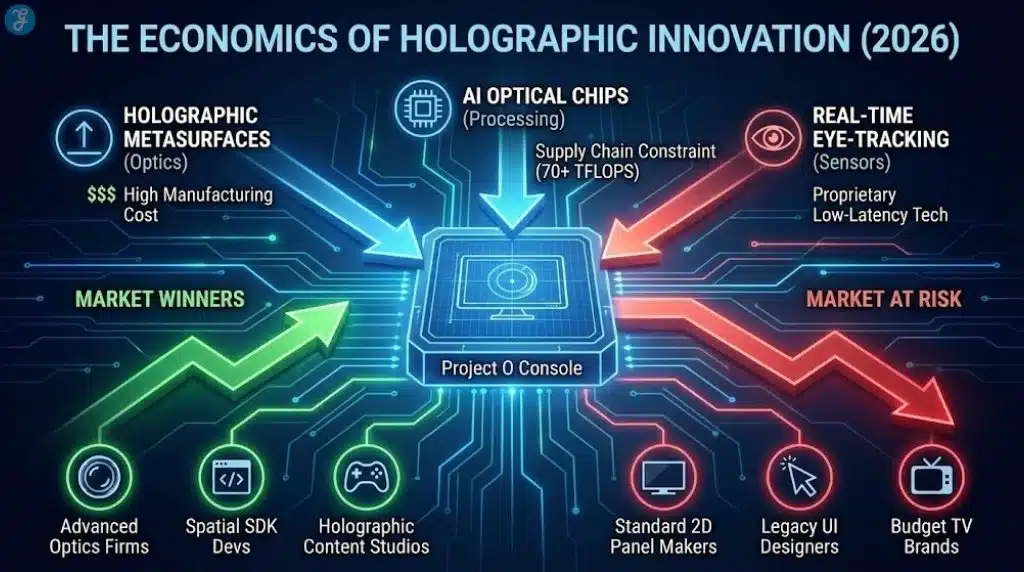
If the UI is truly glasses-free 3D, then it is unlikely to be purely software. Some form of display capability or certified display ecosystem becomes part of the story. That immediately raises the risk profile for console makers because they do not control what TV sits in a user’s living room.
So the most realistic interpretation, even if the leak is broadly true, is that “holographic UI” would exist on a spectrum:
- a depth-layered UI design language on normal screens (lowest risk)
- a certified mode on compatible displays (moderate risk)
- a bundled accessory or premium SKU that guarantees the effect (higher cost, higher control)
- a full default generation shift that assumes depth is standard (highest risk, least likely)
If “late 2026” is accurate, the economics and logistics strongly favor an optional mode or premium tier rather than an industry-wide forced standard.
What “Holographic UI” Most Likely Means In Practice
“Holographic” is branding. Engineers would describe the mechanism more precisely: multi-view presentation, light-field-like rendering, or tracked perspective shifts. In consumer terms, there are four realistic ways this could appear.
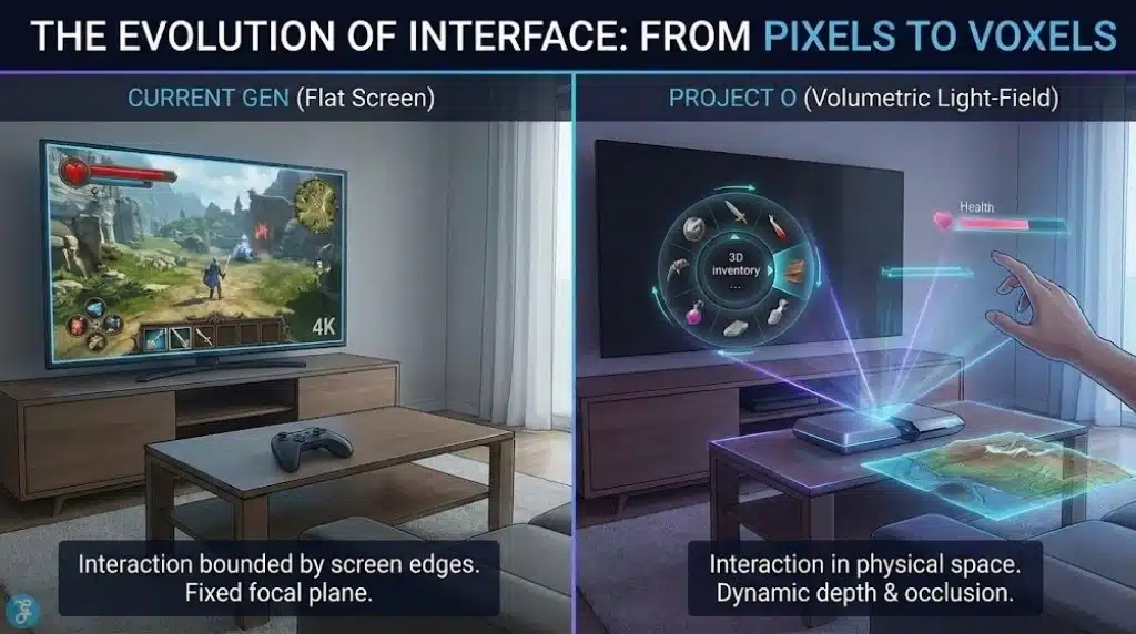
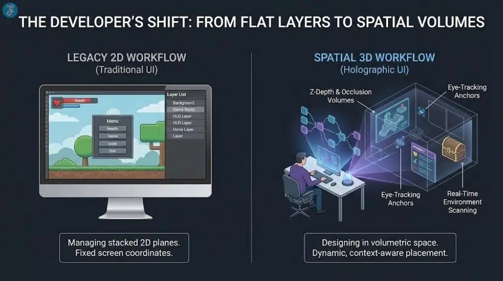
Depth-Layered UI On Conventional Screens
This is the most plausible mass-market interpretation. The UI uses parallax motion, layered panels, animated focus, and depth cues that feel spatial without requiring specialized hardware. The “3D” is perceptual rather than stereoscopic. It is a spatial UI language that improves navigation and reduces clutter.
Pros: works everywhere, low fragmentation.
Cons: risks being called “fake holographic,” limited wow factor.
Certified Glasses-Free 3D Mode On Compatible Displays
Here, the console detects or pairs with certain displays that can present a real multi-view or tracked 3D effect. The OS UI renders with depth; games can opt in.
Pros: real depth without forcing every user to buy new TVs.
Cons: market confusion, uneven experiences, support burden.
A Bundled Peripheral Or “Console + Display” Strategy
This could be a dock, a dedicated monitor, or a console SKU that includes the required display tech. It would echo how some hardware ecosystems create “reference experiences” that show what the platform can do.
Pros: quality control, consistent first impression.
Cons: higher price, limited addressable market.
A Full Default Generational Shift
This is the boldest and least likely option. It assumes the next wave of displays makes glasses-free 3D common.
Pros: unified standard, big differentiation.
Cons: massive adoption risk, consumer backlash potential.
| Approach | Hardware Requirement | Developer Burden | Consumer Risk Level | Most Likely Role |
| Spatial UI language on 2D screens | None | Low–Medium | Low | Default interface style |
| Certified glasses-free 3D mode | Compatible displays + tracking | Medium–High | Medium | Premium optional mode |
| Bundled accessory/premium SKU | Controlled hardware | High | Medium–High | Showcase product |
| Full default 3D UI generation | Broad display adoption | Very High | Very High | Unlikely for 2026 |
What Changes For Game Developers: The Hidden Work Behind A New UI Paradigm
A console UI shift is not a cosmetic update. It becomes a new set of “platform expectations.” Developers may not be forced to ship fully 3D menus, but they will be pressured to make their games behave well with a new system layer.
1) HUD Design Becomes A Depth-Comfort Problem
In 2D, HUD design is mostly about hierarchy: what’s important, what’s not, where the eye goes. In depth UI, designers must also manage comfort zones. Bad depth placement can fatigue eyes. Rapid focus shifts between layers can feel unpleasant. Small text can become harder to read if depth cues and background movement conflict.
The UI is where players spend a surprising amount of time: inventories, maps, loadouts, cosmetics, crafting, skill trees, and party systems. If those screens become uncomfortable, the player blames the game even if the platform introduced the paradigm.
2) UI Performance Budgets Tighten
Many studios already struggle to keep menus smooth because menus can be heavy: web-like frameworks, animations, and dynamic rendering. If the platform introduces depth compositing or multi-view rendering, the UI becomes more expensive. That can expose weak optimization in UI code and cause frame-time spikes exactly where players notice them most: navigation and transitions.
3) QA Expands Into New Failure Modes
Depth UI introduces bugs that flat UI rarely faces:
- depth misalignment after resolution changes
- ghosting or shimmer on certain displays
- discomfort for certain viewing distances
- inconsistent UI scale when head position changes
- capture/stream issues if the system renders multi-view output
This increases test matrices and certification risk.
4) Accessibility Is A Make-Or-Break Factor
If depth UI reduces readability for any meaningful segment of players—vision differences, motion sensitivity, migraine triggers—platform holders will need strong system-level controls:
- a global “flat mode” toggle
- large text, high contrast, simplified motion
- per-app overrides
- clear defaults that do not punish users who opt out
If the platform gets this wrong, backlash will be swift. If it gets it right, it could set a new standard for inclusive interface design.
| Pipeline Area | What Changes With Depth UI | Why It Costs More | Practical Mitigation |
| HUD placement | Depth-safe layout rules | More design iterations | Conservative depth, strong defaults |
| UI rendering | More compositing, maybe multi-view | Higher GPU/CPU overhead | Keep depth mostly OS-side |
| Certification | More edge cases | More failures late in the cycle | Automated UI tests + safe fallback |
| Streaming/capture | Multi-view may confuse encoders | Creator friction | Flat capture output by default |
| Accessibility | Some users must opt out | PR and compliance risk | Clear, persistent toggles |
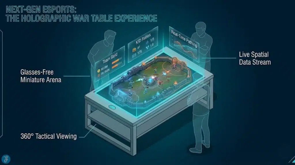
Why eSports Might Be The Real Target
The most forward-looking interpretation is that “holographic UI” is a viewing product hidden inside a console product.
Esports has matured into a global entertainment category where presentation is part of the value. For many games, the experience of watching is not the same as playing. UI is the translator between the match and the audience.
A depth-capable UI can, in theory, solve a long-standing esports problem: how to show more information without turning the screen into a spreadsheet.
Depth-Separated Overlays
Instead of stacking everything flat (health bars, minimaps, cooldowns, economy, objectives), the viewer could experience the match with overlays in “layers.” The core action stays clean. The tactical layer becomes something you can emphasize, fade, or reconfigure.
Spatial Replays And “Explainer Modes”
Replays could use depth cues to illustrate lines of sight, positioning, routes, and priority targets. Think of it as a step toward sports-style analysis that is easier for casual audiences to follow.
Venue Experiences
If esports continues moving into arena-style presentation, depth UI could become a premium in-venue viewing product. The same match could be presented differently in a stadium than on a stream: more immersive, more guided, more sponsor-integrated.
This matters because platform holders and publishers constantly search for new monetizable surfaces that do not feel like intrusive ads. A “new UI layer” can become a new monetization layer, for better or worse.
The Business Logic: Differentiation In An Era Of Platform Convergence
Even without citing any single forecast, the industry direction is visible:
- Gaming ecosystems are converging across console, PC, handheld, cloud, and mobile.
- Subscriptions, microtransactions, and live services shape revenue more than boxed releases.
- Platforms compete for time, creators, communities, and spending—not just hardware sales.
In that environment, a console needs reasons to exist beyond “it runs games well.” Performance still matters, but it is no longer sufficient differentiation when many players can get “good enough” visuals elsewhere.
A visually distinctive UI is a branding weapon. It changes the daily experience. It influences retention. It affects store discovery. It creates new surfaces for social and creator workflows. If “Project O” is real, the “holographic UI” may be less about immersion and more about a platform strategy: a new interface layer that makes the console feel meaningfully different from a generic streaming box or cloud app.
| Strategic Goal | How Depth UI Helps | Where It Backfires |
| Differentiation | Makes the platform feel “next-gen” instantly | If it feels gimmicky or uncomfortable |
| Storefront + monetization | More room for rich discovery | If it increases ad-like clutter |
| Creator workflows | New capture modes, new presentation styles | If capture becomes inconsistent |
| Esports growth | Better overlays and “explainer” modes | If broadcast pipelines cannot translate it |
| Accessibility leadership | Depth UI could include smarter readability controls | If defaults harm sensitive users |
Neutral Reality Check: The Strongest Counterarguments
Here are 4 strong counterarguments:
Counterargument 1: Consumers Already Rejected 3D
This is the biggest obstacle. Past 3D failures were not because people hated depth. They were because the value did not justify the friction. A console UI is used every day. That makes comfort requirements stricter than movies.
Counterargument 2: Fragmentation Will Kill Developer Support
If only a small percentage of users experience true glasses-free depth, studios will build for the majority. The feature risks becoming “nice to have” and slowly neglected.
Counterargument 3: Competitive Integrity Requires Consistency
Competitive communities prefer stable, readable, low-latency UI. Any depth effect that introduces variability can create arguments about fairness, visibility, and distraction. A tournament-standard “flat mode” would likely be required.
Counterargument 4: The UI Is The Wrong Place To Take Risks
Players forgive experimental graphics modes. They rarely forgive annoying menus. If the first week with a new console feels harder to use than the old one, the narrative becomes negative fast.
What Next: The Signals That Will Confirm Or Debunk This In 2026
If “Project O” is real, or if the platform direction is real even when the codename is not, credible confirmation will likely appear in predictable places.
Milestones To Watch
- SDK and dev documentation hints: references to depth compositing, multi-layer UI, or new interface guidelines.
- Engine toolchain updates: plug-ins or templates aimed at depth-safe HUD and overlays.
- Display partner announcements: certifications, compatibility standards, or “gaming mode” features tied to consoles.
- Esports production experiments: new overlay formats, replay tools, or “alternate spectator feeds.”
- Policy and privacy language: if tracking is involved, platform holders will need clear rules and user controls.
Most Likely Outcome If The Leak Is Partly True
The highest-probability path is not “every screen becomes holographic.” It is:
- a new spatial UI design language as the default
- a premium glasses-free mode on compatible hardware
- a push for esports and spectator formats that can later scale outward
Why This Matters Even If The Leak Is Wrong
The value of this leak is not only whether “Project O” exists. It is what it reveals about where platform competition may be going.
Console makers need visible differentiation in an era where players are trained to expect cross-play, cross-progression, and instant access. The interface is now the storefront, the social hub, the creator studio, and the spectator gateway. A “holographic UI” concept is best understood as an attempt to upgrade that layer—not just to impress users, but to reshape how users discover games, engage with communities, and watch competition.
If platform holders treat depth UI as spectacle, it will repeat the 3D cycle: a short wave of novelty followed by mass indifference. If they treat it as ergonomics and clarity—an interface that makes complex information easier to understand—then it can become a real generational shift, especially for esports and viewing experiences.
The defining test will be mundane: does it feel better after 30 days? If the answer is yes, “holographic UI” becomes a platform advantage. If the answer is no, it becomes a toggle people disable and forget.