
Starting a web design project, only to get bogged down by clunky tools that slow you down and frustrate your team. You want to create stunning landing pages with great user experience, but switching between apps for prototyping and web development feels like herding cats.
Many beginners face this hassle, juggling software that doesn’t play nice together, leading to wasted time and subpar results.
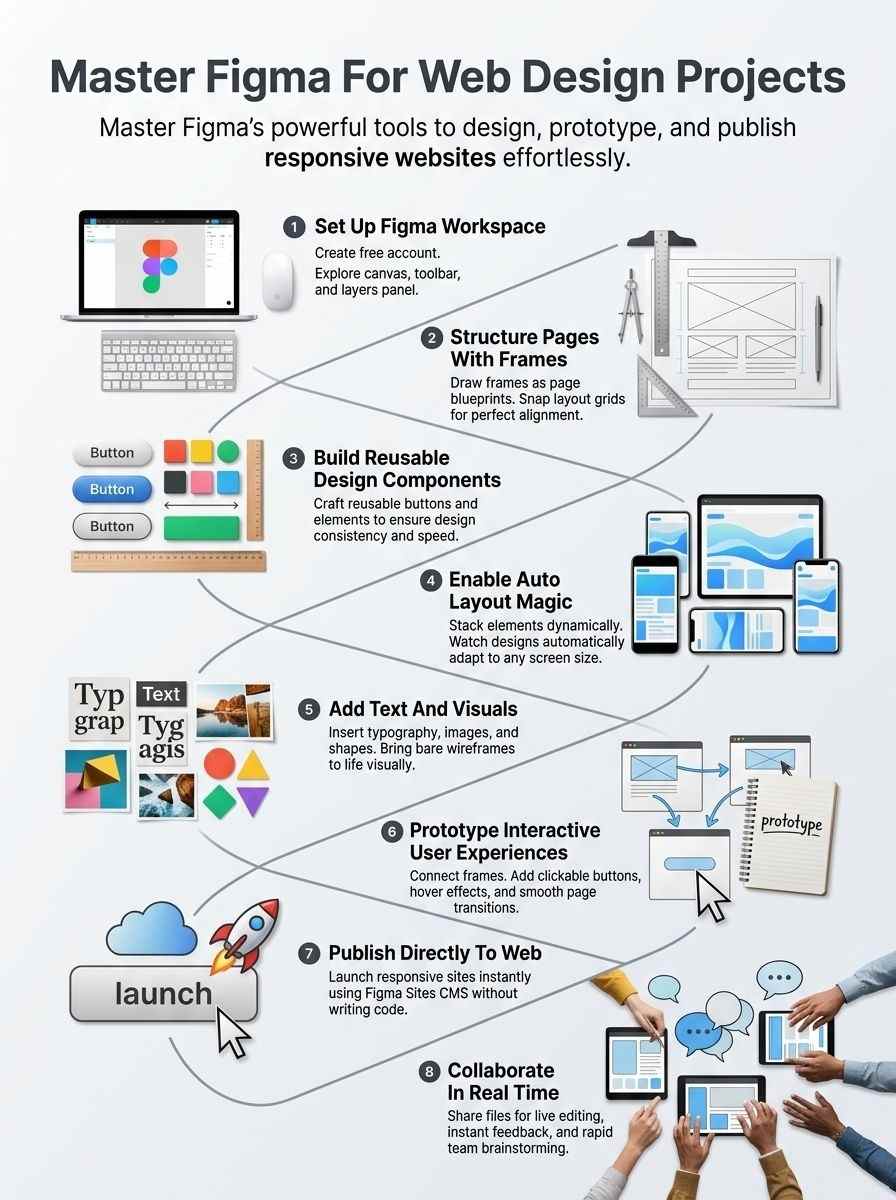
Figma changes that game; it lets you design, prototype, and even publish websites all in one spot, like a swiss army knife for UI and UX design. This guide walks you through using Figma for responsive web design, from auto layout tricks to building prototypes with ease.
You’ll learn to craft dynamic designs and responsive layouts that wow users. Ready to level up your skills?
Getting Started with Figma for Web Design
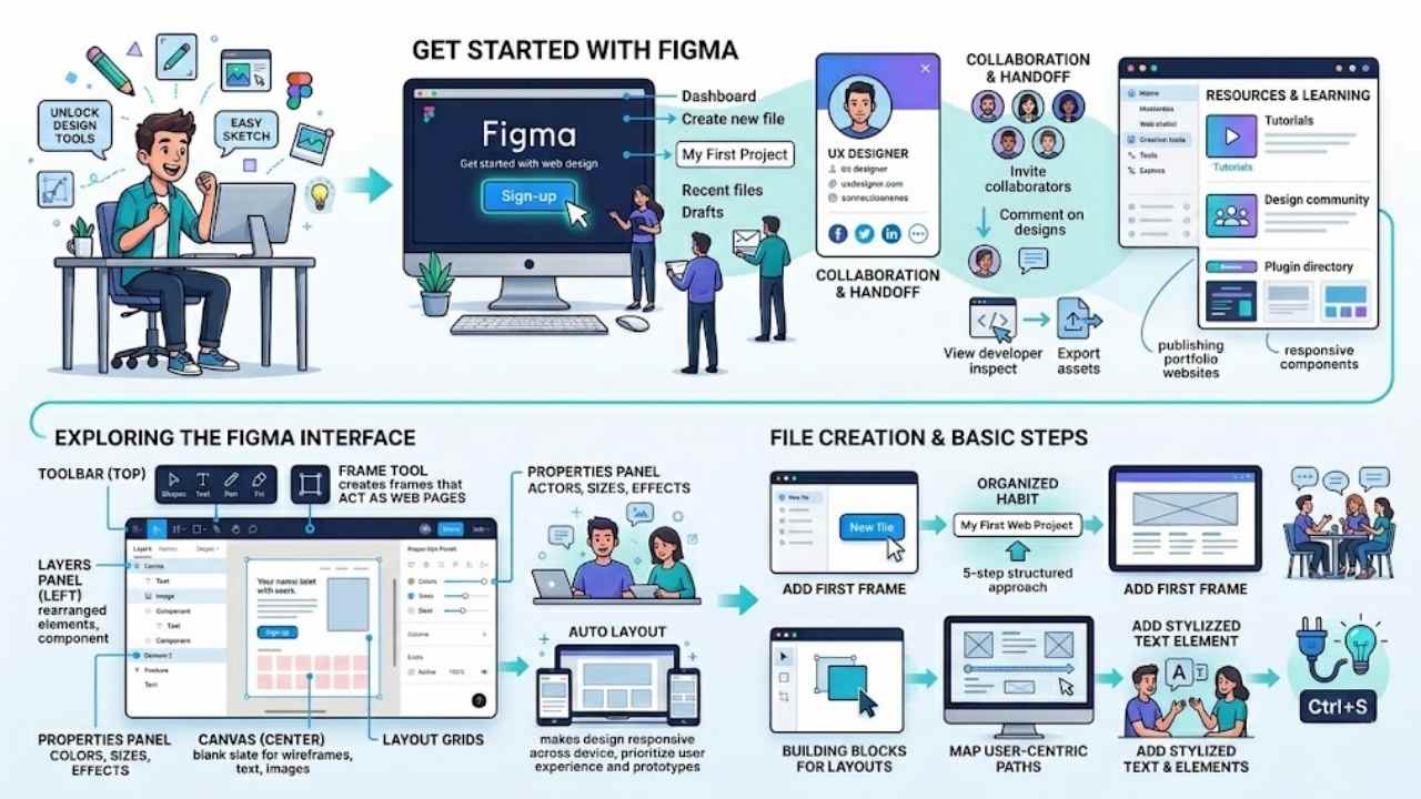
Jump right in by signing up for a free account on Figma’s site, and you’ll feel like a kid in a candy store with all those design tools at your fingertips. Once you’re in, poke around the canvas, toolbar, and layers panel to get comfy, then whip up your first project file to see how easy it is to sketch out a simple webpage mockup that sparks your creativity.
Setting up your Figma account
You love creating stunning websites, and Figma makes it easy. Start by setting up your account to unlock tools like Figma Sites for building responsive layouts.
- Head to the Figma website and click the sign-up button to create a free account, which gives you instant access to features like Sites CMS for publishing portfolio websites as a UX designer.
- Enter your email and a strong password during registration, so you can explore user interface tools right away and use responsive components for your first UI/UX design project.
- Verify your email after signing up, opening the door to website builder options that let you design, prototype, and launch sites without extra software.
- Choose a plan if you need more than the free version, like the professional one for teams, and think about how Figma Sites helps with auto layout for different devices.
- Log in to your new account and customize your profile, adding details that connect you with other designers, maybe even from Codecademy courses on web design.
- Check out the dashboard once inside, where you find design statistics and tools for creating visually appealing web pages that focus on user experience.
- Invite team members if you work with others, fostering real-time collaboration on projects involving responsive components and interactive prototypes.
- Explore starter templates in Figma to jumpstart your web design, pasting in existing ideas to build sites quickly with Sites CMS features.
Exploring the Figma interface
Jump into Figma’s main screen, and you’ll spot the toolbar at the top. It holds tools for shapes, text, and pens. Pick one, like the rectangle tool, to draw frames that act as your web pages.
On the left, the layers panel lists all your elements, easy to click and rearrange. Drag a layer up or down to change its order. The right side shows the properties panel. Adjust colors, sizes, and effects there with simple sliders.
Figma’s interface feels like a playground for ideas, where you sketch wireframes as a key step in that five-step beginner’s guide to web design.
See the canvas in the center? That’s your blank slate for creating visually appealing web pages. Add text and images by clicking icons in the toolbar. Group items into components for reuse, perfect for design systems.
Turn on layout grids to keep things neat and user-centric. Figma prioritizes user experience with these tools, letting you build prototypes right in the interface. Play around, and watch how auto layout makes designs responsive, adapting to screens like magic.
This setup helps you structure frames and add interactions without hassle.
Creating your first design file
You need to create your first design file to kick off web design in Figma. This step sets the foundation for visually appealing, user-centric web pages and apps.
- Open Figma after setting up your account, and click the “New file” button in the dashboard to begin. Figma provides effective tools for this, like easy canvas setup, which helps prioritize user experience right from the start. Think of it as planting the seed for your digital garden, where ideas grow into full sites.
- Name your file something clear, like “My First Web Project,” to keep things organized from day one. A beginner’s guide to Figma for web design follows a 5-step structured approach, and this naming habit fits right in, making collaboration smoother later. I once forgot to name a file, and it turned into a messy hunt, like searching for socks in a dark drawer.
- Add your first frame by selecting the frame tool from the toolbar, then drag it onto the canvas to represent a web page. Frames act as the building blocks, letting you structure layouts that adapt to user needs. Figma’s methods here shine, turning simple drags into responsive designs that feel intuitive.
- Build wireframes inside the frame, sketching basic layouts with shapes and lines as the crucial second step in the workflow. Wireframes map out user-centric paths, much like a roadmap for a road trip, ensuring your web app flows well. Designers love this for spotting issues early, avoiding redesign headaches down the line.
- Experiment with text and elements by clicking the text tool, typing sample content, and adjusting fonts to match your vision. This ties into Figma’s focus on user experience, where every word and icon enhances appeal. Imagine chatting with a friend over coffee; that’s the natural feel you aim for in your designs.
- Save your progress often by hitting Ctrl+S, or let Figma’s auto-save handle it, keeping your work safe as you explore. In the 5-step approach for beginners, this habit prevents lost ideas, especially when you’re deep in creative flow. One time, a power outage taught me this lesson the hard way, but now it’s second nature.
Key Features of Figma for Web Design
Figma packs a punch with tools that make web design feel like a breeze, you know, turning complex ideas into sleek pages without the usual headaches. Dive right in to see how these gems, like smart grids and flexible setups, can supercharge your projects and keep things flowing smooth as butter.
Frames and Layout Grids
Frames act as the building blocks in your web design projects. They let you create sections that mimic actual web pages. You draw these frames to hold all your elements, like text and images.
Layout grids snap right onto those frames. These grids help you align everything neatly, just like a blueprint guides a builder. Designers love how grids keep designs consistent across different screens.
Think of them as invisible lines that prevent chaos on your canvas.
Grids are the unsung heroes of clean design; they turn wild ideas into structured masterpieces.
Use grids to set up columns and rows that adapt easily. This setup supports responsive designs that fit phones and desktops alike. You toggle grids on with a quick click in the interface.
They guide where you place buttons or headers. Building wireframes becomes a breeze this way, especially as a key step in the workflow. Auto layout pairs well with these tools for even smoother results.
Components and Design Systems
Figma lets you create components, those reusable building blocks that save time in web design projects. Think of them like Lego pieces; you build one button, then reuse it everywhere.
This keeps your designs consistent, just like a well-oiled machine. Designers craft these for headers, footers, or forms, and they tie into design systems for a unified look. You group them in libraries, share with teams, and update once to change all instances.
Oh, and get this, Figma’s tools prioritize user experience, making your web pages visually appealing and user-centric. Web design involves creating those pages and apps, after all.
Design systems in Figma act as your blueprint for efficiency. You set up styles for colors, typography, and spacing, then apply them across projects. This speeds up workflows, especially in a beginner’s five-step approach where wireframes come second.
Responsive components adapt to screens, thanks to auto layout features. Paste existing designs into Figma Sites, build quickly with text and layouts. Intuitive prototyping tools add interactions, and you publish straight to the web.
Teams collaborate in real-time, leveraging templates for that extra boost.
Auto Layout for Responsive Design
Auto Layout in Figma changes the game for responsive design. You stack elements like text and images, and they adjust on their own. Think of it as a flexible puzzle that fits any screen, from phones to desktops.
Users build sites fast with these tools in Figma Sites. Responsive components snap into place, saving you hours of tweaks.
Picture your layout bending like a rubber band to match devices. Auto layout features handle the heavy lifting for web pages. They adapt automatically to different sizes, keeping things user-friendly.
Designers paste in old work and watch it transform into interactive experiences. This setup lets you focus on creativity, not code hassles.
Designing a Website in Figma
Jump right in, folks, by sketching out those main artboards like building blocks in a sandbox, toss in some words, pictures, and shapes to bring your vision alive, then wire up prototypes with clicks and swipes that feel like magic tricks—stick around for the full scoop on making your site pop!
Creating and structuring frames
Frames form the backbone of your web design in Figma, acting like digital canvases that hold your site’s structure. You structure them to mimic real web pages, making your designs both functional and easy to prototype.
- Start by selecting the frame tool in Figma’s toolbar, then drag to create a rectangle that represents your webpage’s main area, much like sketching a blueprint for a house you plan to build. This step sets the stage for visually appealing and user-centric web pages, as web design focuses on creating those elements.
- Choose the right device preset from Figma’s options, like desktop or mobile, to ensure your frame matches common screen sizes, because Figma Sites features responsive layouts that automatically adapt to different devices. View it as fitting puzzle pieces together seamlessly, no matter the puzzle board’s size.
- Add layout grids to your frame by clicking the grid icon in the properties panel, which helps align elements precisely and keeps your design organized. Figma provides effective tools for this, prioritizing user experience in web applications.
- Nest frames inside one another to structure sections like headers, footers, and content areas, creating a hierarchy that mirrors a website’s flow. Think of it as stacking building blocks, where each block serves a clear purpose in the entire tower.
- Use auto layout on your frames to make them responsive, allowing elements to adjust dynamically as you resize, just like how Figma Sites lets you build websites quickly with responsive components. This ties into the beginner’s guide, where building wireframes is a crucial second step in the Figma web design workflow.
- Apply constraints to elements within frames so they stay positioned correctly during resizing, preventing chaos when prototyping interactions. It’s like telling your design, hey, stick to your spot, even if things get shaky.
- Duplicate frames to create multiple pages or variants, speeding up your workflow by reusing structures across your site. Figma enables this efficiency, and you can paste existing designs into Figma Sites to accelerate the process.
- Label your frames clearly in the layers panel for easy navigation, especially when collaborating with your team in real-time. Imagine chatting with a friend about a shared drawing, you wouldn’t want confusion over which part is which, right?
- Test your structured frames by switching to prototype mode, adding interactions that bring your design to life with intuitive prototyping tools built into Figma Sites. This helps create interactive website experiences before you publish.
- Refine frame sizes and properties based on feedback, ensuring they support text, images, and other elements for a polished look. Designers can then publish completed designs directly to the web through Figma Sites, keeping the entire workflow within the Figma ecosystem.
Adding text, images, and elements
You add text, images, and elements to bring your web design to life in Figma. This step creates visually appealing and user-centric web pages that prioritize user experience.
- Drag the text tool from the toolbar to place words on your frame, like typing a headline that grabs attention, and Figma’s tools make it easy to style fonts for that user-centric feel.
- Import images by clicking the image tool or pasting from your clipboard, turning plain designs into eye-catching web applications, just as web design demands visual appeal.
- Use shapes and vectors as basic elements to build buttons or icons, which Figma supports with effective methods for a smooth user experience.
- Apply colors and effects to these elements, enhancing the visual look, because Figma provides tools that focus on creating engaging, user-friendly pages.
- Group text and images together for better organization, a trick that helps when designing complex web layouts that adapt well.
- Adjust sizes and positions actively, ensuring every piece fits perfectly, much like piecing together a puzzle for that polished web application vibe.
Prototyping and adding interactions
Prototyping turns your static designs into interactive experiences that feel alive. Figma makes this step easy and fun, letting you test ideas before they hit the web.
- Click the prototype tab in Figma to start linking frames together, like connecting dots in a treasure map, so users can click through your site as if it were real.
- Add interactions by dragging connection lines from one element to another, such as a button that jumps to a new page when clicked, helping you spot flow issues early on.
- Use Figma’s intuitive prototyping tools to create smooth transitions, like fades or slides, which make your website feel dynamic and user-friendly.
- Test responsive designs in prototype mode, where auto layout adjusts elements for different devices, ensuring everything looks great on phones or desktops.
- Incorporate hover effects or animations to elements, turning a simple menu into an engaging dropdown that surprises and delights visitors.
- Share your prototype with team members for real-time feedback, sparking conversations that refine the user experience before any code gets written.
- Figma Sites builds in these prototyping features, so you design, prototype, and even publish without leaving the platform, saving you tons of time.
- Prioritize user-centric interactions, like easy navigation, because Figma tools help develop web designs that focus on what people actually need.
- Paste existing designs into Figma Sites to speed up prototyping, then add quick interactions that make your site responsive and interactive in no time.
- Follow a structured approach in Figma, where prototyping comes after wireframes, building on those basics to create full, clickable mockups.
Using Figma Sites for Web Development
Imagine flipping your Figma sketches into a full-blown site, no heavy coding required. You can craft flexible page setups, toss in smooth transitions and effects, then launch it all through their built-in content manager, sparking your project’s real magic.
Turning designs into responsive layouts
Figma Sites lets you transform your designs into responsive layouts with ease. Paste your existing work right into the platform, and watch it speed up the process. You build sites fast by using responsive components, text, and auto layout tools.
These features make everything adapt to phones, tablets, and desktops automatically. Think of it like fitting a puzzle piece that shifts shape on its own, no extra hassle involved.
Designers love how this keeps the flow smooth, all inside Figma’s world.
Grab those intuitive prototyping tools in Figma Sites to add real interactions. Your layouts come alive, responding to clicks and hovers just like a live site. Publish straight to the web when you’re set, no jumping between apps.
This setup prioritizes user experience, making web pages feel natural on any device. It’s like giving your design wings, ready to fly across screens without a glitch.
Adding interactions and animations
Figma Sites makes adding interactions and animations a breeze for your web projects. You stay within one tool, turning static designs into lively experiences that wow users.
- Figma Sites packs intuitive prototyping tools that let designers craft interactive website experiences, like clickable buttons or smooth page transitions, right inside the platform.
- Add animations to elements, such as fading in text or sliding images, using Figma’s built-in features that keep everything responsive across devices.
- Designers publish completed designs straight to the web via Figma Sites, maintaining the whole workflow in the Figma ecosystem without jumping to other apps.
- Responsive layouts in Figma Sites adapt automatically to various screen sizes, so your interactions and animations look sharp on phones, tablets, or desktops.
- Paste existing designs into Figma Sites to speed up adding interactions, like hover effects that make buttons pop, or scroll animations that guide users through content.
- Build quick prototypes with these tools, imagine a menu that drops down smoothly, all while focusing on user-centric web pages that prioritize experience.
- Figma Sites handles the heavy lifting for animations, think of it as giving your site a heartbeat, without needing extra software or coding know-how.
- Create engaging flows, for instance, linking frames with transitions that mimic real navigation, boosting the site’s appeal and usability.
Publishing websites with Figma Sites CMS
You love designing websites, right? Figma Sites CMS makes publishing them a breeze, all without leaving the platform.
- Designers publish completed designs straight to the web via Figma Sites, keeping the whole workflow inside the Figma ecosystem, like staying in your cozy home office instead of running errands.
- Paste existing designs into Figma Sites to speed up the website creation process, saving you time as if copying a favorite recipe into a new cookbook.
- Build websites fast with responsive components, text, and auto layout features in Figma Sites, turning your ideas into live pages quicker than a cat chasing a laser pointer.
- Figma Sites offers responsive layouts that adjust automatically to various screen sizes and devices, so your site looks great on phones or laptops, no extra tweaks needed.
- Use intuitive prototyping tools built into Figma Sites to craft interactive website experiences, adding that wow factor like a magician pulling off a seamless trick.
- Figma Sites lets users design, prototype, and publish websites right in the Figma platform, ditching the need to switch tools and making your life simpler, almost like having a personal assistant handle the boring parts.
Best Practices for Figma Web Design Projects
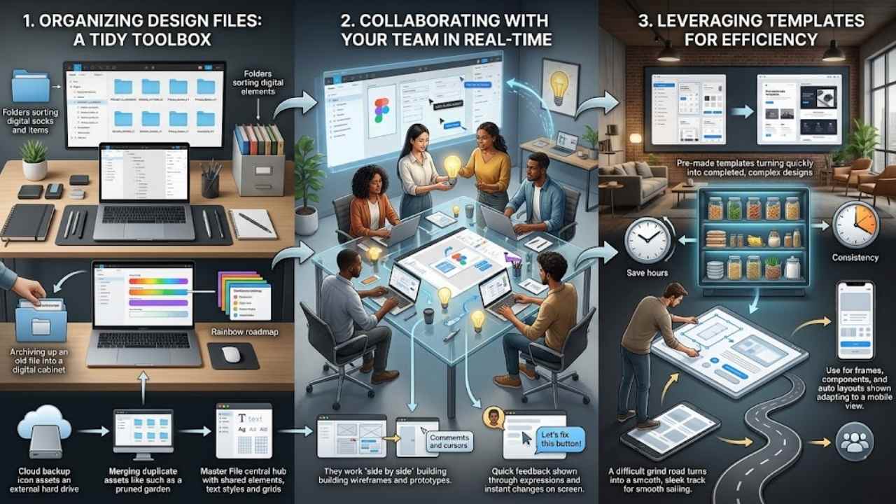
Keep your files tidy, like a well-organized toolbox, so you can grab what you need fast and avoid that frustrating hunt for lost layers. Team up in real time, sharing screens as if you’re all in the same room, tossing ideas back and forth to spark creativity and catch errors early.
Organizing your design files
Organizing your design files in Figma keeps chaos at bay, like tidying a messy desk before a big project. You save time, avoid frustration, and boost your web design flow, especially when juggling prototypes and responsive layouts.
- Name files with clear labels that include project names and dates, so you spot them fast in a crowded library; think of it as giving each file its own ID badge, and this ties into Figma’s ecosystem where you can paste existing designs into Figma Sites for quick website builds.
- Group related elements into folders within your Figma account, much like sorting socks in a drawer, which helps when collaborating in real-time with teams on user-centric web pages.
- Use consistent naming for components and design systems, avoiding mix-ups that slow you down; for example, label buttons as “Primary_Button_V1” to make auto layout for responsive design a breeze, aligning with Figma’s tools that adapt to different screen sizes.
- Archive old versions regularly to declutter your workspace, freeing up space for new ideas; this practice supports turning designs into responsive layouts without digging through junk, and Figma Sites lets you publish directly while keeping everything in one spot.
- Leverage templates to start fresh files efficiently, cutting setup time in half; it’s like having a ready-made blueprint, and this works well with Figma’s intuitive prototyping tools for interactive experiences.
- Color-code layers and frames for quick visual cues, turning your file into a rainbow roadmap; pair this with auto layout features to ensure designs stay user-friendly across devices, as Figma provides effective methods for prioritizing user experience.
- Add notes and comments in files for team insights, fostering that real-time collaboration vibe; imagine chatting over coffee, but digitally, and it accelerates pasting designs into Figma Sites for faster website creation.
- Review and merge duplicate assets often, streamlining your library like pruning a garden; this step is key in the beginner’s 5-step approach to Figma web design, where building wireframes follows research, and it enhances publishing with Figma Sites CMS.
- Back up files to external drives or cloud services, guarding against surprises; you know, better safe than sorry, especially since Figma enables designing, prototyping, and publishing without tool switches, keeping your workflow smooth.
- Set up a master file for shared elements like text styles and grids, acting as a central hub; this organizes chaos into order, supporting responsive components in Figma Sites that automatically fit various devices.
Collaborating with your team in real-time
Figma lets you work with others at the same time, like passing notes in class but way more productive. Invite team members to your design file, and everyone edits together. Changes show up instantly, no waiting around.
This setup fits web design projects perfectly, where quick feedback keeps things moving. Picture your group huddled around a digital canvas, sketching ideas as they pop up. Figma’s tools make this easy, turning solo work into a group jam session.
You build wireframes and prototypes side by side, focusing on user experience from the start.
Teams love how Figma handles real-time updates, especially for responsive layouts in web projects. One person tweaks a frame, and others see it right away. Add comments or cursors to point out spots, like saying, “Hey, let’s fix this button.” This boosts efficiency, as you leverage templates and auto layout features without delays.
Designers paste existing work into shared files, speeding up the process. It feels like magic, keeping everyone on the same page for better results. Figma’s ecosystem supports this flow, from start to publish.
Leveraging templates for efficiency
Templates speed up your web design work in Figma, like a trusty shortcut on a busy road. Grab pre-made ones from the community or create your own, then drop them into projects to skip starting from scratch.
This trick saves hours, especially when you paste existing designs into Figma Sites for quick website builds. Think of it as borrowing a chef’s recipe; you tweak it for your taste but get dinner on the table faster.
Teams love how templates keep everyone on the same page with consistent styles, boosting that real-time collaboration vibe. Use them for frames, components, and auto layouts that adapt to screens, making responsive sites a breeze.
One designer I know cut her project time in half by reusing a layout grid template; it turned a grind into smooth sailing.
Final Thoughts
You’ve journeyed through setting up Figma, mastering frames and auto layout for responsive designs, and even publishing sites with Figma Sites CMS. These steps make web design straightforward and quick, letting you build user-friendly pages without extra tools.
Master them, and you’ll craft sites that wow users and boost engagement in no time. Explore Figma’s community forums or grab free templates to keep learning. Go ahead, fire up Figma today and turn your ideas into stunning web realities, like a pro turning sketches into skyscrapers.
Frequently Asked Questions (FAQs) About Using Figma for Web Design Projects
1. What’s Figma, and how do I kick off a web design project with it?
Figma is this cool online tool that lets you design websites right in your browser, no downloads needed. Just sign up for a free account, create a new file, and start sketching your ideas like you’re drawing on a digital napkin. It’s like having a magic canvas that grows with your creativity, perfect for beginners jumping into web design projects.
2. How can I team up with others on Figma for my web design work?
Sharing is a breeze in Figma; invite your crew by email, and they can edit in real time, like passing notes in class but way more productive. Watch changes happen live, add comments for feedback, and avoid those email chains that go on forever.
3. What’s the trick to making prototypes in Figma that wow clients?
Start by linking your screens with simple interactions, like clicks that jump to new pages; it’s like building a choose-your-own-adventure book for your site. Add transitions for that smooth feel, test it on devices, and iterate based on what feels clunky.
4. How do I get my Figma designs out into the world for actual web building?
Export assets like images or code snippets directly from Figma; just select what you need and choose your format. Hand them off to developers with built-in specs, saving everyone headaches down the road.